The Visual Language Evolution: Typography's Journey from Cave Walls to Digital Displays
Exploring how human communication evolved from primitive markings to sophisticated digital typefaces
The Origins of Visual Communication
When I explore the roots of typography, I'm always fascinated by how our modern communication systems evolved from such humble beginnings. The journey begins with our ancestors who, some 20,000 years ago, created cave paintings that represented the first attempts at visual communication. These weren't just artistic expressions – they were humanity's first effort to record information and share ideas through visual means.
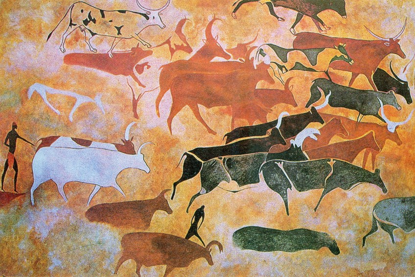
The progression from these pictograms to more abstract symbols marks the first crucial step in typography's evolution. I find it remarkable that these early visual systems laid the groundwork for what would eventually become standardized writing. By 3,500 B.C., the Sumerians had developed what many historians consider the first formal writing system – cuneiform. Using wedge-shaped marks pressed into clay tablets, they created a standardized visual language that could be learned and replicated.
Evolution of Writing Systems Timeline
The journey from pictorial representation to abstract symbols spanned thousands of years:
I've found that when teaching the evolution of these ancient writing systems, visual aids are incredibly powerful. Using symbol visuals in art and design techniques, we can recreate the progression from pictographic to abstract communication in a way that resonates with modern audiences. Tools like PageOn.ai's AI Blocks make it possible to visualize these ancient systems in an educational context, helping students grasp how our modern typography has such deep historical roots.
From Handcrafted to Mechanical: Typography's Transformation
The journey from hand-drawn symbols to mechanical reproduction represents one of the most significant leaps in typography's evolution. I've always been captivated by Egyptian hieroglyphs – not just for their beauty, but for how they combined pictorial representation with phonetic elements, creating a sophisticated system that influenced countless writing systems that followed.

By the 12th century, we see the emergence of Gothic scripts across Europe. These weren't just functional – they were deeply embedded in cultural and religious identity. The blackletter style, with its dramatic thick and thin strokes, wasn't merely aesthetic; it represented authority, scholarship, and tradition. When I examine these scripts, I'm reminded that typography has always been more than just letters – it's a visual expression of cultural values.
Then came the moment that would forever change the course of typography: Gutenberg's development of movable type in the 15th century. I cannot overstate the revolutionary impact of this innovation. Suddenly, text could be produced at scale, with consistency and relative speed. What was once the domain of skilled scribes became mechanized, setting the stage for typography to evolve from craft to technology.
flowchart TD
    A[Hand-Drawn Symbols] -->|Standardization| B[Formal Writing Systems]
    B -->|Religious Preservation| C[Gothic Scripts]
    C -->|Mechanical Innovation| D[Gutenberg's Printing Press]
    D -->|Mass Production| E[Typographic Standardization]
    D -->|Accessibility| F[Wider Literacy]
    D -->|Consistency| G[Typeface Development]
When researching historical typefaces for presentations, I've found that academic resources on typography's evolution provide invaluable context. Tools like PageOn.ai's Deep Search can help integrate authentic historical examples into educational materials, making the progression from handcrafted to mechanical typography more tangible for students and clients alike.
The Birth of Typeface Families
The 16th century marked a pivotal moment in typography with the development of Roman Type and its distinctive serifs. I've always been fascinated by how these small decorative strokes at the ends of letterforms were initially a byproduct of the stone carving process used by ancient Romans for their monumental inscriptions. When early printers like Claude Garamond began creating metal type, they deliberately incorporated these serifs, establishing a design feature that continues to influence typography today.

The Baroque period of the 18th century introduced a new wave of typographic innovation. Designers like William Caslon and John Baskerville created typefaces with increased contrast between thick and thin strokes, greater precision, and improved readability. Their work established principles of type design that continue to influence modern fonts for designers even in today's digital environment.
Perhaps one of the most significant shifts came in the 19th century with the emergence of sans-serif typefaces. I remember being struck by how revolutionary these designs must have appeared to contemporaries – letters stripped of their decorative elements, presenting a stark, industrial aesthetic that reflected the modernist ethos of the time. These sans-serif designs weren't just stylistic choices; they represented a philosophical stance about clarity, efficiency, and the future.
Typeface Style Evolution
The development of major typeface categories across centuries:
When I'm explaining these historical progressions to clients or students, I find that visualizing typeface evolution timelines helps immensely. PageOn.ai's structured content blocks make it possible to create clear, engaging visual narratives that show how type styles evolved in response to technological capabilities, cultural movements, and practical needs. Understanding this evolution gives designers a deeper appreciation for the typefaces we use daily.
Typography Through Art Movements
Art movements throughout history have profoundly shaped typography, creating distinctive visual languages that continue to influence design today. I'm particularly drawn to the Art Nouveau period (1890-1910), when typography broke free from rigid Victorian constraints. Designers like Alphonse Mucha embraced organic, flowing letterforms that mirrored the movement's fascination with natural forms. These sinuous, decorative typefaces weren't just aesthetic choices – they represented a rebellion against industrialization and a celebration of craftsmanship.

The Bauhaus movement (1919-1933) took typography in a dramatically different direction. When I study the work of designers like Herbert Bayer and László Moholy-Nagy, I'm struck by their radical pursuit of geometric simplicity. Their sans-serif designs stripped away ornamentation in favor of clean lines and functional forms. The Bauhaus philosophy that "form follows function" revolutionized typography, establishing principles of clarity and efficiency that continue to guide typography best practices today.
Art Deco typography (1920s-1930s) emerged as a celebration of modernity, luxury, and technological progress. I've always admired how Art Deco typefaces combined geometric precision with dramatic flair – tall, condensed letterforms with strong verticals and bold, stylized shapes. These designs captured the optimism and glamour of the Jazz Age while remaining highly functional for advertising and signage. The influence of Art Deco typography remains evident in contemporary design, particularly in industries seeking to evoke elegance and sophistication.
flowchart TD
    A[Art Movements] --> B[Art Nouveau]
    A --> C[Bauhaus]
    A --> D[Art Deco]
    B --> B1[Organic Forms]
    B --> B2[Decorative Elements]
    B --> B3[Hand-Drawn Quality]
    C --> C1[Geometric Simplicity]
    C --> C2[Sans-Serif Dominance]
    C --> C3[Functional Minimalism]
    D --> D1[Bold Geometric Forms]
    D --> D2[Strong Verticals]
    D --> D3[Decorative Modernism]
I've found that creating mood boards of typography across art movements is an effective way to help clients understand these historical influences. PageOn.ai's Vibe Creation feature makes it possible to curate visual collections that showcase how different movements approached typography, providing inspiration for contemporary design projects. By understanding these historical contexts, designers can make more informed choices about which typographic styles will best convey their intended message and emotional tone.
The Digital Typography Revolution
The late 20th century marked a seismic shift in typography as we transitioned from physical to digital type. I remember when this revolution first began – suddenly, fonts were no longer physical objects but digital files that could be instantly replicated, modified, and shared. This transformation fundamentally changed how designers approached typography, opening up unprecedented creative possibilities while simultaneously presenting new technical challenges.

Font software played a crucial role in democratizing typography creation. Tools like Fontographer (1986) and later FontLab and Glyphs gave designers the ability to create their own typefaces without the specialized equipment and technical expertise previously required. I've witnessed how this democratization led to an explosion of new typefaces, as designers from diverse backgrounds could now contribute to the typographic landscape. This accessibility transformed typography from a specialized trade to a widely accessible creative medium.
The development of web fonts in the early 2000s represented another pivotal moment in typography's evolution. Before web fonts, designers were limited to a handful of "web-safe" fonts that could be reliably displayed across different operating systems. I remember the frustration of those limitations – and the excitement when services like Typekit (now Adobe Fonts) began offering ways to embed custom fonts in websites. This innovation dramatically expanded the typographic possibilities of the web, allowing designers to maintain consistent brand identities across print and digital media.
Digital Typography Milestones
Key developments that transformed typography in the digital age:
I've found that when explaining these technical developments to clients and students, visual narratives are incredibly effective. Using PageOn.ai to transform typography concepts into clear visual stories helps bridge the gap between technical understanding and practical application. By visualizing how digital typography has evolved, we can better appreciate both how far we've come and the exciting possibilities that lie ahead for typographic innovation.
The Helvetica Phenomenon
Few typefaces have achieved the cultural status of Helvetica. Designed in 1957 by Max Miedinger and Eduard Hoffmann, this Swiss sans-serif typeface has become so ubiquitous that it's practically invisible in our visual landscape. I'm continually fascinated by how one typeface managed to become the foundation for over 50 major brand logos, from American Airlines to Toyota, Microsoft to Panasonic. This unprecedented adoption speaks to Helvetica's remarkable versatility and perceived neutrality.

The cultural significance of ubiquitous typefaces extends beyond mere aesthetics. When a typeface becomes as widespread as Helvetica, it begins to shape our expectations of what typography should look like. I've observed how this creates a tension in design – on one hand, Helvetica offers clarity, legibility, and a certain timeless quality; on the other hand, its very ubiquity can make it feel generic or corporate. This tension between universality and distinctiveness represents one of the central challenges in contemporary typography.
The Helvetica Paradox
| Advantage | Challenge |
|---|---|
| Universal recognition | Lack of distinctiveness |
| Exceptional legibility | Perceived as corporate/impersonal |
| Versatility across applications | Difficulty in brand differentiation |
| Perceived neutrality | Can feel sterile or lacking personality |
| Historical significance | May appear dated or unoriginal |
When analyzing Helvetica's impact across different industries, I've found that visual comparisons are particularly illuminating. PageOn.ai's visual organization tools make it possible to create side-by-side analyses of how different brands utilize the same typeface while maintaining distinct identities. These comparisons reveal how factors like spacing, scale, color, and context can dramatically alter our perception of even the most familiar typefaces.
The Helvetica phenomenon teaches us an important lesson about typography: that a typeface's impact depends not just on its inherent design qualities but on how and where it's used. This understanding is crucial for designers seeking to balance the benefits of familiarity with the need for distinctive brand expression. By studying Helvetica's widespread adoption, we gain insights into both the power and the limitations of typography in visual communication.
Typography in the Modern Digital Landscape
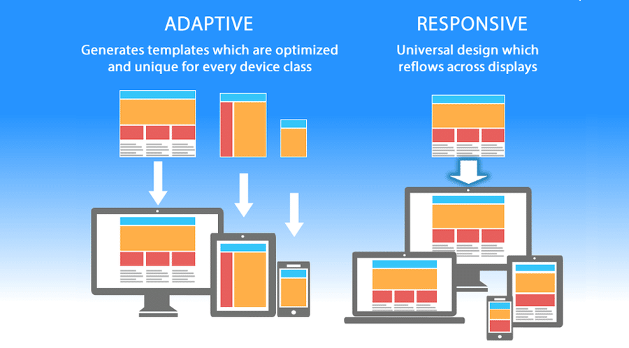
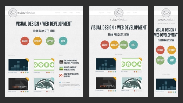
In today's multi-device world, responsive typography has become essential rather than optional. I've witnessed this shift firsthand – as we moved from fixed-width websites to fluid layouts, typography needed to adapt accordingly. The challenge is no longer just selecting the right typeface but ensuring that text remains legible and aesthetically pleasing across devices ranging from large desktop monitors to tiny smartwatches. This has fundamentally changed how we approach typographic design.
Variable fonts represent one of the most exciting recent developments in typography. Unlike traditional font files that contain a single weight or style, variable fonts exist on a continuum of design variations. I'm continually impressed by how this technology allows a single font file to adapt to different contexts – adjusting weight, width, or other attributes dynamically. This not only improves performance by reducing the number of font files needed but opens up new creative possibilities for responsive design.
Artificial intelligence is increasingly playing a role in contemporary typeface development. From tools that help designers perfect letterforms to algorithms that generate entirely new typefaces, AI is changing how we create and interact with typography. I've been following these developments with both excitement and caution – while AI offers powerful new capabilities, I believe the most successful applications will be those that augment human creativity rather than attempting to replace it.
flowchart TD
    A[Modern Digital Typography] --> B[Responsive Typography]
    A --> C[Variable Fonts]
    A --> D[AI in Type Design]
    B --> B1[Fluid Sizing]
    B --> B2[Viewport Adaptability]
    B --> B3[Optimal Reading Experience]
    C --> C1[Single File, Multiple Styles]
    C --> C2[Performance Benefits]
    C --> C3[Dynamic Adaptation]
    D --> D1[Automated Refinement]
    D --> D2[Style Transfer]
    D --> D3[Generative Typography]
When demonstrating responsive typography principles to clients, I've found that interactive examples are far more effective than static images. PageOn.ai's fluid content blocks provide an excellent way to show how typography can adapt to different contexts while maintaining readability and visual harmony. By creating demonstrations that respond in real-time, we can help clients understand the importance of flexible typographic systems in today's multi-device environment.
The evolution of typography in the digital landscape reflects broader technological trends toward adaptability, personalization, and intelligent systems. As designers, our challenge is to harness these capabilities while maintaining the fundamental principles of good typography – legibility, hierarchy, and text contrast that enhances rather than hinders communication. By balancing innovation with established best practices, we can create typographic experiences that are both cutting-edge and effective.
The Human Element in Typography's Future
As typography continues its digital evolution, I've become increasingly aware of the importance of preserving its human touch. There's a fascinating paradox at play: as our technical capabilities advance, many designers are looking backward, seeking to recapture the warmth and character of traditional typographic craftsmanship. I believe this represents more than mere nostalgia – it reflects a fundamental human desire for authenticity and connection in an increasingly digital world.

Digital tools have, somewhat surprisingly, helped revive interest in traditional typographic practices. I've observed how technologies like high-resolution displays and advanced rendering engines have made it possible to faithfully reproduce the subtle imperfections and organic qualities of hand-crafted type. Meanwhile, communities of designers are rediscovering techniques like letterpress printing and sign painting, finding value in the physicality and craftsmanship these approaches embody.
Understanding typographic history has become increasingly important for modern designers. When I work with young designers, I emphasize that knowledge of typography's evolution provides more than historical context – it offers a rich vocabulary of forms and approaches that can inform contemporary work. By studying how typographers of the past solved design problems with limited technology, we often discover elegant solutions that remain relevant despite our vastly different tools.
Balancing Technology and Tradition
How designers perceive the importance of different elements in typography:
I've found that PageOn.ai offers a unique approach to bridging the gap between technical typography knowledge and intuitive visual understanding. By transforming complex typographic principles into clear visual narratives, we can help both designers and non-designers appreciate the nuances of type design and make more informed choices. This visual approach to typography education honors both the technical precision of digital tools and the intuitive, human aspects of typographic expression.
The future of typography will likely be defined not by technology alone, but by how we use that technology to express human ideas and emotions. As typography for beginners becomes increasingly accessible through digital tools, I believe we'll see a growing appreciation for both innovation and tradition. The most compelling typographic work will continue to be that which uses new capabilities to achieve timeless goals: clarity, expression, and meaningful communication.
Practical Applications of Typography Knowledge
Typography's rich history offers more than academic interest – it provides practical insights that can be applied across diverse industries. I've seen how financial services leverage traditional serif typefaces to convey stability and trustworthiness, while technology companies often opt for clean sans-serifs to suggest innovation and efficiency. Understanding these historical associations allows designers to make strategic choices that align with brand values and audience expectations.
Typography best practices differ significantly between print and digital media. In print, where reading conditions are relatively controlled, designers can work with smaller type sizes and more subtle hierarchical distinctions. Digital environments demand greater consideration of screen resolution, viewing distance, and environmental factors. I've found that successful cross-media typography requires understanding these differences while maintaining a consistent brand voice across all touchpoints.
Text contrast techniques represent one of the most powerful tools in a designer's toolkit. By manipulating size, weight, color, and spacing, we can create visual hierarchies that guide the reader's eye and emphasize key information. I've observed how even subtle variations in these elements can dramatically affect readability and user experience. The most effective designs use contrast purposefully, creating clear relationships between different levels of information while maintaining overall harmony.
Typography Applications Across Industries
| Industry | Common Typography Approach | Strategic Purpose |
|---|---|---|
| Finance | Traditional serifs, conservative spacing | Convey stability, trustworthiness, heritage |
| Technology | Clean sans-serifs, ample whitespace | Suggest innovation, efficiency, forward-thinking |
| Luxury | High-contrast serifs, refined spacing | Communicate elegance, exclusivity, attention to detail |
| Healthcare | Humanist sans-serifs, clear hierarchy | Project approachability, clarity, professionalism |
| Entertainment | Expressive display faces, dynamic layouts | Create excitement, personality, memorability |
Creating comprehensive typography guides has become an essential practice for organizations seeking to maintain consistent visual communication. I've developed such guides for clients across various industries, and I've found that PageOn.ai's visualization capabilities make it possible to transform complex typographic principles into accessible visual references. These guides serve not just as technical documentation but as educational tools that help team members understand the strategic thinking behind typographic choices.
Transform Your Typography Understanding with PageOn.ai
Turn complex typographic concepts into clear, engaging visual narratives that educate and inspire. Whether you're teaching typography history or explaining font choices to clients, PageOn.ai helps you communicate with impact.
Start Creating with PageOn.ai TodayThe Enduring Legacy of Typography
As we've explored typography's remarkable journey from cave paintings to digital fonts, I'm struck by how this evolution reflects our broader human story. Typography has always been more than just the design of letterforms – it's a visual record of our technological progress, cultural values, and communication needs. Understanding this rich history gives us a deeper appreciation for the typefaces we encounter daily and the centuries of innovation they represent.
The most exciting aspect of typography's evolution is that it continues today. We stand at a fascinating juncture where cutting-edge digital capabilities are being combined with renewed appreciation for traditional craftsmanship. This balance between innovation and tradition offers endless possibilities for expressive, effective communication.
For those looking to deepen their understanding of typography, visual tools like PageOn.ai provide an invaluable bridge between technical knowledge and practical application. By transforming complex typographic concepts into clear visual narratives, we can make this rich field more accessible to designers and non-designers alike, ensuring that typography's evolution continues with informed, intentional choices that honor its remarkable heritage.
You Might Also Like
Revolutionizing Market Entry Presentations with ChatGPT and Gamma - Strategic Impact Guide
Learn how to leverage ChatGPT and Gamma to create compelling market entry presentations in under 90 minutes. Discover advanced prompting techniques and visual strategies for impactful pitches.
Building New Slides from Prompts in Seconds | AI-Powered Presentation Creation
Discover how to create professional presentations instantly using AI prompts. Learn techniques for crafting perfect prompts that generate stunning slides without design skills.
Revolutionizing Slide Deck Creation: How AI Tools Transform Presentation Workflows
Discover how AI-driven tools are transforming slide deck creation, saving time, enhancing visual communication, and streamlining collaborative workflows for more impactful presentations.
Stock Photos in Presentations: Bringing Vibrancy and Depth to Visual Storytelling
Discover how to transform your presentations with strategic stock photography. Learn selection techniques, design integration, and visual consistency to create compelling visual narratives.