Beyond The Pitch: Visualizing Startup Traction Metrics That Win VC Funding
The New Landscape of Venture Capital Metrics
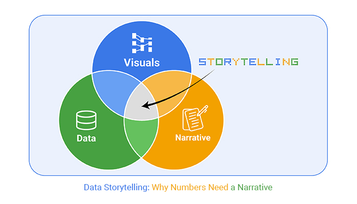
I've spent years analyzing what makes venture capitalists take notice of startups. In today's competitive funding environment, it's not just about having good metrics—it's about visualizing them in ways that tell a compelling growth story and demonstrate your true potential.
The New Landscape of Venture Capital Metrics
I've witnessed firsthand how venture capital has evolved dramatically over the past decade. The metrics that once impressed investors are no longer sufficient in today's data-driven environment. Modern VCs are looking beyond simple growth numbers to understand the fundamental health and potential of your business.
The shift from traditional to modern traction indicators reflects a deeper understanding of what truly predicts startup success. While VCs once focused primarily on top-line revenue growth, today's investors conduct much more sophisticated analyses that consider efficiency, sustainability, and market dynamics.
I've found that visual representation of metrics creates significantly stronger investor narratives. When I present complex data relationships through clear visualizations, investors grasp our business model and growth trajectory much faster than when reviewing spreadsheets or bullet points.
Evolution of VC Metric Priorities
In the current economic climate, I've noticed VCs have become increasingly focused on capital efficiency and clear paths to profitability. The days of growth at all costs are behind us. Today's investors want to see that you can grow efficiently and sustainably.
Perhaps the most critical distinction I make when preparing for investor meetings is separating vanity metrics from actionable insights. Vanity metrics might look impressive but don't necessarily correlate with business success or inform strategic decisions. Actionable insights, on the other hand, reveal meaningful patterns that drive business strategy.
Key Takeaway
The most successful fundraising presentations I've created don't just show impressive numbers—they visualize the relationships between metrics to tell a coherent story about business health and potential.
As a founder preparing for fundraising, I've learned that my startup one pager for investors must highlight these new-era metrics in visually compelling ways that immediately communicate our business strength.
Core Revenue Metrics That Command VC Attention
In my experience pitching to VCs, I've found that Monthly Recurring Revenue (MRR) remains the north star metric for subscription-based businesses. However, it's not just the absolute number that matters—it's the consistency and trajectory of growth that truly captures investor attention.
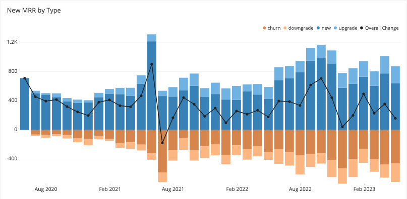
When I meet with potential investors, I make sure to visualize our 10-20% month-over-month growth trajectory. This isn't just about showing good numbers—it's about demonstrating consistent, predictable growth that suggests product-market fit and scaling potential.
MRR Growth Expectations by Funding Stage
The relationship between Customer Acquisition Cost (CAC) and Lifetime Value (LTV) has become increasingly important in my investor presentations. I've found that visualizing this relationship helps investors quickly understand our unit economics and the sustainability of our growth strategy.
graph TD
    A[Customer Acquisition] -->|CAC $X| B[New Customer]
    B --> C{Customer Journey}
    C -->|Retention| D[Ongoing Revenue]
    C -->|Churn| E[Lost Customer]
    D -->|Expansion| F[Increased ARPU]
    D -->|Referrals| G[New Customers at Lower CAC]
    D --> H[Extended Customer Lifetime]
    F & G & H --> I[Increased LTV]
    I -->|LTV:CAC Ratio| J[Unit Economics]
    J -->|Target 3:1 or higher| K[Sustainable Growth]
Creating compelling visual breakdowns of revenue streams has been crucial for demonstrating business resilience to our investors. When I show how our revenue is diversified across different customer segments, product lines, or geographies, it helps investors see that we're building a robust business that can withstand market fluctuations.
Growth Rate Visualization Techniques
I've found that comparative growth charts against industry benchmarks are particularly effective when speaking with VCs. These visualizations immediately show whether we're outperforming our peers and help contextualize our growth story within the broader market landscape.
Comparative Growth Analysis
Cohort analysis visualizations have been among my most powerful tools for telling our retention story. By showing how different customer cohorts behave over time, I can demonstrate improving retention rates, expansion revenue, and the effectiveness of our product and customer success initiatives.
When presenting to VCs, I use forecasting models that demonstrate our scaling potential. These visualizations show not just where we've been, but where we're going—and most importantly, how we'll get there. This helps investors see the future value of their investment.
Using startup pitch deck tools like PageOn.ai, I've transformed complex growth data into clear visual narratives that immediately resonate with investors. The ability to create dynamic, interactive visualizations has given my presentations an edge that static slides simply can't match.
Efficiency Metrics: The New VC Obsession
In today's funding climate, I've noticed a significant shift in VC focus toward efficiency metrics. While growth remains important, how efficiently you achieve that growth has become equally if not more critical in investor evaluations.

Unit economics visualization has been essential in my investor presentations. Making the path to profitability clear through visual models helps investors understand exactly when and how our business becomes self-sustaining at the individual customer level.
graph LR
    A[Revenue Per Customer] --> B{Unit Profitability}
    C[Cost to Serve] --> B
    D[Acquisition Cost] --> B
    B -->|Profitable| E[Positive Unit Economics]
    B -->|Unprofitable| F[Negative Unit Economics]
    E --> G[Scale to Growth]
    F --> H[Optimize Costs]
    F --> I[Increase Pricing]
    H & I --> B
Burn rate and runway presentations have become increasingly important in my fundraising efforts. VCs want to see that we're managing our cash responsibly and have sufficient runway to achieve meaningful milestones before needing additional capital.
Cash Efficiency Comparison
The cash efficiency ratio has gained prominence in tighter funding markets, and I make sure to highlight this in my presentations. This metric—how much revenue growth we generate for each dollar spent—has become a key indicator of management quality and business model strength.
Visual representations of operational leverage and scaling economics help me demonstrate to investors that our business will become more profitable as it grows. These visualizations show how fixed costs are spread across a larger revenue base, improving margins as we scale.
Efficiency Storytelling Through Data
I've found that creating visual cause-and-effect relationships between spend and outcomes is particularly effective when discussing efficiency with investors. These visualizations help demonstrate that we're investing capital strategically and seeing measurable results from our spending decisions.
Milestone-to-capital ratios have become an important part of my investor presentations. By visualizing the return on investment for each round of funding, I can show that we're using capital efficiently to achieve meaningful business milestones.
Comparative efficiency metrics against competitors and industry standards help contextualize our performance. When I show that we're acquiring customers more efficiently or achieving higher margins than our peers, it strengthens our case for investment.
Using entrepreneurial decision mapping through PageOn.ai's AI Blocks, I've built dynamic unit economic models that allow investors to visualize different scenarios and understand the sensitivity of our business to various factors. This interactive approach has been much more engaging and persuasive than static projections.
Pre-Revenue Traction Indicators Worth Visualizing
For early-stage startups, I've learned that demonstrating traction before significant revenue is crucial. User engagement metrics that predict future revenue potential have been particularly valuable in my early fundraising conversations.
Pre-Revenue Traction Indicators
Visual representation of pilot programs and early adoption has been effective in my investor discussions. By showing the engagement and feedback from early users or customers, I can demonstrate product-market fit even before scaling revenue.

Waitlist growth and activation metrics have been powerful signals of market demand in my early fundraising efforts. Visualizing not just the size but the growth rate of our waitlist, along with conversion rates when users are activated, helps demonstrate market pull for our solution.
Product development milestones mapped against market opportunities have helped me show investors that our roadmap is strategically aligned with market needs and revenue potential.
Alternative Traction Visualization Strategies
Strategic partnership mapping and ecosystem positioning have been valuable alternatives to traditional traction metrics in my investor presentations. By visualizing our relationships with key players in the industry, I can demonstrate our strategic position and potential for accelerated growth.
flowchart TD
    A[Your Startup] --> B[Enterprise Partner 1]
    A --> C[Enterprise Partner 2]
    A --> D[Technology Partner]
    B --> E[Market Access]
    B --> F[Credibility]
    C --> G[Distribution Channel]
    C --> H[Co-development]
    D --> I[Technical Integration]
    D --> J[Product Enhancement]
    E & F & G & H & I & J --> K[Accelerated Growth]
Team capability visualization has been an effective way to connect expertise to execution in my pitches. By showing how our team's experience directly relates to the challenges we're solving, I can build investor confidence in our ability to execute on our vision.
Market validation indicators beyond traditional metrics have helped me demonstrate traction even when revenue is limited. These might include expert endorsements, industry recognition, or early customer testimonials that signal market acceptance.
Using PageOn.ai to transform qualitative traction into compelling visual stories has given my early-stage pitches much more impact. I've been able to create professional visualizations of customer feedback, product usage patterns, and market validation that tell a convincing story about our potential, even before we have significant revenue numbers to share.
Industry-Specific Metric Visualization
I've found that different industries require different approaches to metric visualization. For B2B SaaS companies, visualizing enterprise customer acquisition and expansion has been particularly important in my investor presentations.
B2B SaaS: Customer Expansion Visualization
For consumer apps, I focus on engagement and retention visualization techniques. These metrics are often more predictive of long-term success than simple user acquisition numbers and help investors understand the true health of the user base.
When presenting marketplace startups to investors, I emphasize supply/demand equilibrium and transaction metrics. The health of a marketplace depends on having the right balance, and visualizing this helps investors understand the dynamics of the platform.
graph TD
    A[Marketplace Platform] --> B[Supply Side]
    A --> C[Demand Side]
    B --> D[Supply Growth]
    C --> E[Demand Growth]
    D & E --> F{Equilibrium?}
    F -->|Yes| G[Healthy Marketplace]
    F -->|No| H[Imbalanced Marketplace]
    G --> I[Transaction Growth]
    G --> J[Price Stability]
    G --> K[User Satisfaction]
    H --> L[Supply/Demand Adjustment]
    L --> F
For hardware startups, I focus on production scalability and margin improvement trajectories in my visualizations. These metrics help investors understand how the economics of the business will improve as we reach scale.
Using tools for industry insights like PageOn.ai, I've been able to create industry-specific visualizations that speak directly to the metrics that matter most in our particular sector. This targeted approach has been much more effective than generic metric presentations.
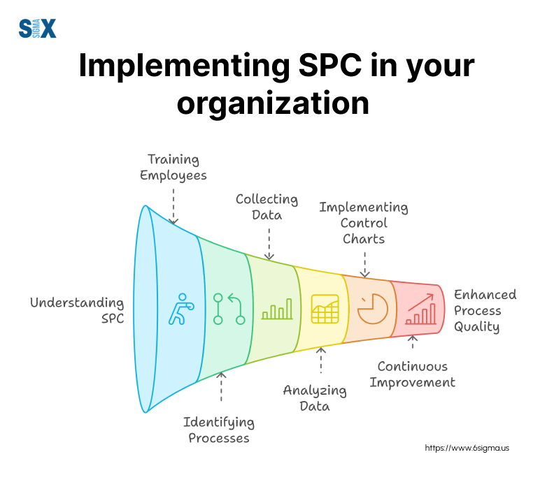
Creating Your Metrics Dashboard for Maximum Impact
I've learned that designing an investor-ready metrics visualization system requires careful thought about what to highlight and how to present it. The most effective dashboards I've created focus on a small number of high-impact metrics that tell a coherent story about our business.

In my experience, the debate between real-time vs. milestone-based reporting structures often comes down to the stage of the company and the preferences of the investors. For early-stage startups, I've found that milestone-based reporting often makes more sense, while more mature companies benefit from real-time dashboards.
Metric Importance by Funding Stage
Contextualizing metrics against fundraising stages has been crucial in my presentations. The metrics that matter for a seed round are different from those that matter for a Series B, and I make sure to focus on the right metrics for our current stage.
Using growth strategies visualization with PageOn.ai's Deep Search, I've integrated industry benchmarks into our metrics story. This has helped me show investors not just how we're performing in absolute terms, but how we compare to successful companies at similar stages.
From Metrics to Narrative: The Visualization Advantage
I've found that transforming data points into a compelling growth story is what truly captivates investors. It's not enough to show good numbers—those numbers need to tell a coherent story about where the business has been and where it's going.
Visual techniques that demonstrate pattern recognition have been particularly effective in my investor presentations. By highlighting trends, correlations, and causal relationships, I can help investors see the underlying dynamics of our business and market.
graph TD
    A[Raw Data] --> B[Data Visualization]
    B --> C[Pattern Recognition]
    C --> D[Insight Generation]
    D --> E[Strategic Narrative]
    E --> F[Investor Understanding]
    F --> G[Funding Decision]
    H[Static Spreadsheets] --> I[Limited Comprehension]
    I --> J[Missed Connections]
    J --> K[Incomplete Story]
    K --> L[Investment Hesitation]
    style A fill:#f9f9f9,stroke:#333,stroke-width:1px
    style B fill:#fff2e6,stroke:#FF8000,stroke-width:2px
    style C fill:#fff2e6,stroke:#FF8000,stroke-width:2px
    style D fill:#fff2e6,stroke:#FF8000,stroke-width:2px
    style E fill:#fff2e6,stroke:#FF8000,stroke-width:2px
    style F fill:#ffe0b3,stroke:#FF8000,stroke-width:2px
    style G fill:#ffcc80,stroke:#FF8000,stroke-width:2px
    style H fill:#f9f9f9,stroke:#333,stroke-width:1px
    style I fill:#f9f9f9,stroke:#333,stroke-width:1px
    style J fill:#f9f9f9,stroke:#333,stroke-width:1px
    style K fill:#f9f9f9,stroke:#333,stroke-width:1px
    style L fill:#f9f9f9,stroke:#333,stroke-width:1px
Showing inflection points and catalysts for growth has been a powerful way to demonstrate momentum in my fundraising efforts. By visualizing the key moments when our business accelerated and explaining what drove those changes, I can help investors understand what's driving our success.
PageOn.ai has helped me translate complex metrics into clear investor narratives. The platform's ability to create visually compelling, data-driven stories has made it much easier to communicate our business trajectory in a way that resonates with investors.
Impact of Visual Storytelling on Investor Comprehension
The visualization advantage has been clear in my fundraising experiences: meetings where I use strong visual narratives consistently lead to more engaged discussions, better questions, and ultimately, higher investor interest than those relying primarily on spreadsheets and bullet points.
Implementation Guide: Building Your Metrics Visualization Strategy
Based on my experience, I've developed a systematic approach to creating investor-ready metric visualizations. The right tools and templates can make this process much more efficient and effective.
I've found that frequency and format guidelines for metric updates are critical to maintain investor confidence. For most metrics, monthly updates are sufficient, though some high-velocity metrics might warrant weekly tracking. The format should be consistent over time to allow for easy comparison.
flowchart TD
    A[Identify Key Metrics] --> B[Set Up Data Collection]
    B --> C[Create Baseline Visualizations]
    C --> D[Establish Update Schedule]
    D --> E{Fundraising Active?}
    E -->|Yes| F[Weekly Updates + Highlights]
    E -->|No| G[Monthly Comprehensive Updates]
    F & G --> H[Review & Refine]
    H --> I[Share with Investors]
    I --> J[Collect Feedback]
    J --> K[Iterate Visualization Strategy]
    K --> D
Through trial and error, I've identified common pitfalls in metric presentation and how to avoid them. These include overwhelming investors with too many metrics, focusing on vanity metrics that don't drive decisions, inconsistent presentation formats, and failing to provide context for the numbers.
Common Pitfalls to Avoid
- Presenting too many metrics (aim for 5-7 key indicators)
- Highlighting vanity metrics over actionable insights
- Inconsistent formatting that makes comparison difficult
- Missing context or benchmarks for proper interpretation
- Overly complex visualizations that obscure the main message
Leveraging PageOn.ai has allowed me to maintain dynamic, updated metric visualizations with minimal effort. The platform's automation features ensure that our visualizations are always current, while its templates and design tools help maintain a consistent, professional appearance across all our investor communications.
By implementing a systematic approach to metrics visualization, I've been able to create a more compelling narrative for investors, highlight our progress more effectively, and ultimately increase our chances of securing funding.
Transform Your Traction Metrics into Funding Success
Stop presenting raw numbers and start telling your growth story visually. PageOn.ai helps you create compelling metric visualizations that capture investor attention and clearly communicate your startup's potential.
Start Visualizing Your Metrics TodayYou Might Also Like
Bridging Worlds: How Diffusion Models Are Reshaping Language Generation | PageOn.ai
Explore the revolutionary convergence of diffusion models and language generation. Discover how diffusion techniques are creating new paradigms for NLP, bridging visual and linguistic domains.
The AI Superpower Timeline: Visualizing US-China AI Race & Tech Developments
Explore the narrowing US-China AI performance gap, historical milestones, technical battlegrounds, and future projections in the global artificial intelligence race through interactive visualizations.
Visualizing the AI Revolution: From AlphaGo to AGI Through Key Visual Milestones
Explore the visual journey of AI evolution from AlphaGo to AGI through compelling timelines, infographics and interactive visualizations that map key breakthroughs in artificial intelligence.
How AI Saves Marketing Teams 5+ Hours Weekly While Boosting Productivity 83% | Visual Content Revolution
Discover how AI transforms marketing workflows, saving 5+ hours weekly and boosting productivity by 83%. Learn visual content strategies that eliminate manual tasks and accelerate campaigns.