Creating a One-Page Pitch Template That Drives Conversions
Master the art of condensing your value proposition into a single, powerful page that captivates and converts your audience
Understanding the Power of One-Page Pitches
I've found that there's something incredibly powerful about distilling your entire business proposition into a single page. In today's fast-paced business environment, attention is a scarce resource, and a well-crafted one-pager can be the difference between capturing interest and losing your audience entirely.

In my experience working with various businesses, one-pagers have become essential communication tools for several key reasons:
- They force clarity and precision in your messaging
- They respect your audience's time constraints
- They create a single source of truth that can be easily shared
- They demand visual thinking that often reveals new insights about your offering
Different Types of One-Pagers
| Audience | Primary Focus | Key Elements |
|---|---|---|
| Investors | ROI & Growth Potential | Market size, traction metrics, financial projections |
| Customers | Benefits & Solutions | Problem solving, testimonials, clear pricing |
| Internal Teams | Alignment & Clarity | Processes, responsibilities, objectives |
When I'm working with complex business ideas, I've found that real estate JV pitch deck templates often provide excellent structural inspiration, even for other industries. The real estate sector has mastered the art of visual storytelling for complex partnerships.
PageOn.ai's Vibe Creation feature has been a game-changer in my workflow. It helps me translate complex business concepts into clear visual narratives by automatically suggesting color schemes, layouts, and visual elements that match the emotional tone I want to convey.
Essential Elements of High-Converting One-Page Templates
In my years of creating one-page pitches, I've identified several critical elements that consistently drive higher conversion rates. The most effective one-pagers combine strategic design with compelling content to create an irresistible call to action.
Anatomy of a High-Converting One-Pager
flowchart TD
    A[Attention-Grabbing Headline] --> B[Clear Value Proposition]
    B --> C[Problem Statement]
    C --> D[Your Unique Solution]
    D --> E[Benefits & Proof Points]
    E --> F[Social Proof/Testimonials]
    F --> G[Clear Call to Action]
    style A fill:#FF8000,color:white
    style G fill:#FF8000,color:white
Headlines That Convert
I've found that the most effective headlines follow a simple formula: they combine a clear benefit with an emotional trigger. For example, instead of "Project Management Software," try "Finish Projects 30% Faster While Reducing Team Stress."
Strategic Use of White Space
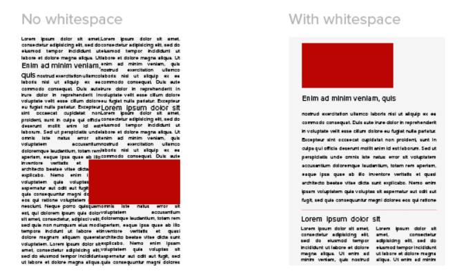
White space isn't empty space—it's breathing room for your content. In my designs, I ensure there's enough margin between elements to create a sense of clarity and focus. This prevents the cognitive overload that kills conversion rates.

Bullet Points vs. Paragraphs
Through my testing, I've discovered that bullet points work best for:
- Feature lists
- Quick benefit summaries
- Process steps
While short paragraphs are more effective for:
- Emotional storytelling
- Context setting
- Detailed explanations (when necessary)
When creating sales presentation templates, I've noticed that maintaining this balance between concise bullet points and narrative paragraphs significantly improves engagement.
PageOn.ai's AI Blocks feature has revolutionized how I structure information in my one-pagers. The tool intelligently suggests the most effective way to organize content blocks based on the type of information I'm presenting, ensuring a logical flow that guides the reader naturally through the page.
Designing Your One-Pager for Different Audiences
I've learned that the most effective one-pagers are those that are precisely tailored to their intended audience. The same information needs to be presented differently depending on whether you're pitching to investors, customers, or internal teams.
Audience Focus Distribution
The chart below shows how content emphasis should shift based on your audience:
Investor-Focused Templates
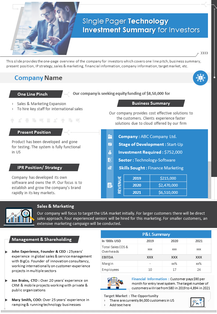
When I create one-pagers for investors, I focus heavily on market opportunity, traction metrics, and return on investment. Investors are primarily concerned with the business case and growth potential.
Key elements I always include:
- Market size and growth rate
- Competitive advantage
- Revenue model and unit economics
- Traction to date
- Team expertise and track record
For financial details, I've found that financial slides for pitch decks can be effectively condensed into one-pager format by focusing on the most compelling metrics.

Customer-Centric Designs
When designing for customers, I shift my focus to benefits, social proof, and clear calls to action. Customers care most about how my product or service solves their specific problems.
Elements I prioritize:
- Problem statement that resonates with their pain points
- Solution overview with clear benefit statements
- Social proof from similar customers
- Simple pricing structure
- Low-friction call to action
Internal Alignment Documents
For internal teams, my one-pagers focus on creating visual clarity around processes, responsibilities, and objectives. These documents serve as quick-reference guides that keep everyone aligned.
PageOn.ai's Deep Search feature has been invaluable in helping me find the perfect visuals for specific audience segments. The AI understands the nuances between what appeals to investors versus customers, suggesting imagery that resonates with each group's specific priorities and concerns.
Visual Elements That Drive Conversion
In my experience, the visual elements of a one-pager are just as important as the content itself. The right visuals can dramatically increase comprehension, retention, and emotional connection with your pitch.
Color Psychology for Conversion
I've tested various color schemes and found that certain colors consistently perform better for specific industries:
When selecting colors for my one-pagers, I consider these psychological associations:
- Blue: Trust, security, professionalism (ideal for B2B services)
- Green: Growth, health, wealth (effective for financial or wellness products)
- Orange: Energy, enthusiasm, affordability (works well for creative services)
- Red: Urgency, passion, importance (use sparingly for key CTAs)
- Purple: Luxury, creativity, wisdom (effective for premium offerings)
Typography That Enhances Readability
In my design work, I've found that typography plays a crucial role in how information is processed. For one-pagers, I recommend:
Headings
- Sans-serif fonts (Arial, Helvetica, Montserrat)
- Bold weight for emphasis
- Size: 18-24pt for main heading
- High contrast with background
Body Text
- Highly readable fonts (Open Sans, Roboto)
- Size: 10-12pt
- Line spacing: 1.5x font size
- Paragraph width: 50-75 characters

Strategic Placement of Visual Elements
I follow this visual hierarchy pattern for maximum impact:
flowchart TD
    A[Visual Focal Point] --> B[Main Headline]
    B --> C[Subheading/Value Proposition]
    C --> D[Supporting Content Blocks]
    D --> E[Social Proof/Testimonials]
    E --> F[Call to Action]
    style A fill:#FF8000,color:white
    style F fill:#FF8000,color:white
For digital one-pagers, I often recommend turning pitch decks into videos or adding subtle interactive elements that increase engagement without overwhelming the viewer.
PageOn.ai has been incredibly helpful for experimenting with different visual combinations without requiring design expertise. The platform's AI-powered suggestions help me identify the most effective visual arrangements for different types of content and audiences.
Crafting Compelling Content That Converts
In my years of creating one-page pitches, I've discovered that even the most beautiful design will fail without compelling content. The words you choose and how you structure them are critical to driving conversions.
Writing Headlines That Capture Attention
"Your headline has one job: to stop your ideal customer in their tracks and make them want to read more."
I've tested hundreds of headlines and found these formulas consistently perform well:
| Formula | Example | Best For |
|---|---|---|
| How to [Achieve Desire] Without [Pain Point] | "How to Double Your Leads Without Increasing Ad Spend" | B2B Services |
| [Number] Ways to [Solve Problem] | "5 Ways to Cut Production Costs by 30%" | Process Improvements |
| The [Adjective] Way to [Achieve Result] | "The Stress-Free Way to Launch Your Product in 30 Days" | Consumer Products |
| [Do Something] Like [Admired Entity] | "Pitch Your Startup Like Silicon Valley's Top Founders" | Aspirational Offers |
Developing a Natural Narrative Flow
I structure my one-pagers following this proven narrative arc:
flowchart LR
    A[Problem/Pain] --> B[Agitation]
    B --> C[Solution]
    C --> D[Benefits]
    D --> E[Proof]
    E --> F[Action]
    style A fill:#FF8000,color:white
    style F fill:#FF8000,color:white
This structure works because it follows the natural decision-making process:
- Identify a problem the reader recognizes
- Amplify the pain of not solving it
- Present your solution as the logical answer
- Explain specific benefits they'll receive
- Provide proof that it works
- Make taking the next step easy and compelling

Balancing Technical Details with Accessible Language
I've learned that finding the right balance between technical specificity and accessibility is crucial. For technical products or services, I follow the 80/20 rule:
- 80% of the content should be accessible to non-experts
- 20% can include technical details to establish credibility with knowledgeable readers
Using Social Proof Strategically
In my testing, I've found that the most effective social proof follows this formula:
Specific Result + Timeframe + Attribution = Powerful Testimonial
"We increased our conversion rate by 37% within the first month of implementing this solution."
— Sarah Chen, Marketing Director, TechCorp
PageOn.ai's Agentic capabilities have been tremendously helpful in refining my messaging for maximum impact. The AI analyzes my content and suggests improvements that make the narrative more compelling and conversion-focused, often identifying weaknesses in my argument structure that I hadn't noticed.
From Template to Customized Asset
While templates provide an excellent starting point, I've found that the most effective one-pagers are those that have been thoughtfully customized to reflect your unique brand and value proposition.
Selecting the Right Base Template
When choosing a template, I consider these key factors:
When selecting a template for free stock pitch deck templates, I look for designs that provide sufficient space for financial data while maintaining visual appeal.
Personalization Strategies
To make templates truly reflect my brand identity, I focus on these key areas:
Visual Identity
- Replace template colors with brand palette
- Use consistent typography
- Add branded graphic elements
- Include logo subtly but visibly
Content Voice
- Rewrite template text in brand voice
- Use industry-specific terminology
- Incorporate brand storytelling
- Adapt messaging to target audience
Custom Elements
- Add unique data visualizations
- Include case-specific testimonials
- Create custom iconography
- Design bespoke section dividers

Adaptation Techniques for Different Industries
In my experience working across sectors, I've developed these industry-specific adaptation strategies:
| Industry | Key Adaptation | Visual Focus |
|---|---|---|
| Technology | Simplify complex features into benefit statements | Clean, modern interface screenshots |
| Real Estate | Emphasize location and return metrics | High-quality property imagery and location maps |
| Financial Services | Focus on security, stability, and growth | Data-driven charts showing performance |
| Healthcare | Balance technical accuracy with emotional benefits | Human-centered imagery showing positive outcomes |
Common Pitfalls to Avoid
Through my template customization work, I've identified these frequent mistakes:
- Over-customization: Changing so much that you lose the template's tested structure
- Inconsistent styling: Mixing different visual languages within one document
- Information overload: Trying to fit too much content into the one-page format
- Poor hierarchy: Failing to clearly prioritize what information matters most
- Generic messaging: Not sufficiently tailoring the content to your specific audience
PageOn.ai has streamlined my customization process through intuitive AI assistance. The platform analyzes my brand assets and automatically suggests appropriate modifications to templates, ensuring consistency while saving significant design time.
Testing and Optimizing Your One-Page Pitch
I've learned that the most effective one-pagers are those that have been rigorously tested and optimized. By measuring performance and making data-driven improvements, you can significantly increase conversion rates over time.
Key Metrics to Track
When evaluating the effectiveness of my one-pagers, I track these critical metrics:
For digital one-pagers, I also track these specific metrics:
- Click-through rate (CTR): Percentage of viewers who click your CTA
- Heat map analysis: Where viewers focus their attention
- Scroll depth: How far down the page viewers scroll
- Device distribution: Which devices are used to view your one-pager
- Bounce rate: Percentage who leave immediately
A/B Testing Strategies

In my testing process, I follow these principles:
- Test one element at a time: Isolate variables for clear results
- Prioritize high-impact elements: Headlines, CTAs, and hero images typically have the biggest effect
- Use sufficient sample sizes: At least 100 views per variation for statistical significance
- Document all changes: Keep detailed records of what was tested and the results
- Test with your actual target audience: Results from the wrong audience can be misleading
Gathering and Incorporating Feedback
I've developed a systematic approach to collecting actionable feedback:
flowchart LR
    A[Collect Feedback] --> B[Categorize by Theme]
    B --> C[Prioritize by Impact]
    C --> D[Implement Changes]
    D --> E[Test Results]
    E --> A
    style A fill:#FF8000,color:white
    style E fill:#FF8000,color:white
Specific feedback questions I ask:
- "What was the first thing that caught your attention?"
- "What questions were left unanswered after reading?"
- "On a scale of 1-10, how compelling was the call to action?"
- "What was the main message you took away from this?"
- "What would make you more likely to respond to this pitch?"
Iterative Improvement Process
My optimization cycle typically follows this timeline:
- Week 1: Launch initial version and collect baseline metrics
- Week 2: Gather feedback and identify top improvement opportunities
- Week 3: Implement highest-impact changes and begin A/B testing
- Week 4: Analyze results and standardize successful variations
- Ongoing: Continuous testing of secondary elements
PageOn.ai has dramatically improved my testing efficiency by enabling me to quickly generate variations for A/B testing. The platform's AI can automatically create multiple versions of my one-pager with different headlines, layouts, or visual elements, allowing me to test more options in less time.
Implementation and Distribution Strategies
In my experience, even the most perfectly crafted one-pager will fail if it doesn't reach the right audience through the right channels. Effective distribution is just as important as the content itself.
Digital Distribution Channels
I've analyzed the effectiveness of different digital channels for one-pager distribution:
For each digital channel, I optimize my one-pager distribution using these tactics:
- Embed directly in email body when possible
- Use compelling subject line referencing content
- Include personalized introduction
- Follow up within 2-3 days if no response
- Share as native document for better visibility
- Tag relevant decision-makers
- Include brief personal message with key insight
- Follow industry hashtags for wider reach
Website
- Create dedicated landing page with tracking
- Optimize page load speed for mobile
- Include interactive elements when appropriate
- Add clear next steps for interested visitors
Social Media
- Extract key visuals for platform-specific posts
- Create teaser content that links to full one-pager
- Use platform-specific formatting (carousels, etc.)
- Schedule multiple posts highlighting different aspects
Print Considerations
For physical one-pagers, I ensure these elements are optimized:
- Paper quality: Heavier stock (at least 100lb) communicates value
- Color calibration: Test print to ensure colors match digital design
- Margins: Allow for printing limitations (minimum 0.25" margin)
- QR codes: Include for easy access to digital versions or additional information
- Finishing touches: Consider spot gloss, embossing, or unique folds for premium pitches

Integrating One-Pagers into Marketing and Sales Funnels
I position one-pagers strategically within the customer journey:
flowchart TD
    A[Awareness] --> B[Interest]
    B --> C[Consideration]
    C --> D[Decision]
    D --> E[Retention]
    A1[Blog/Social Content] --> A
    B1[One-Pager] --> B
    C1[Case Studies/Demos] --> C
    D1[Proposal/Pricing] --> D
    E1[Success Stories] --> E
    style B1 fill:#FF8000,color:white
Follow-up Strategies
After distributing a one-pager, I use these follow-up approaches to maximize conversion:
- Timing: Follow up 2-3 days after initial distribution
- Personalization: Reference a specific element from the one-pager
- Value-add: Provide additional information not included in the one-pager
- Clear CTA: Suggest a specific next step (call, meeting, demo)
- Multiple channels: If email doesn't work, try LinkedIn or phone
PageOn.ai has been instrumental in helping me create format variations optimized for different distribution channels. The platform automatically adapts my one-pager designs for various contexts—whether I need a high-resolution print version, an interactive digital format, or social media-friendly assets—while maintaining visual consistency across all versions.
Transform Your Visual Expressions with PageOn.ai
Create stunning one-page pitches that capture attention and drive conversions. PageOn.ai's intelligent design tools make it easy to build professional, high-converting templates without design expertise.
Start Creating with PageOn.ai TodayFinal Thoughts
Throughout my journey creating one-page pitches, I've discovered that the most successful templates strike a perfect balance between visual appeal and compelling content. They condense complex value propositions into clear, actionable information that resonates with specific audiences.
The process of creating an effective one-pager is iterative—requiring testing, feedback, and continuous refinement. But the investment pays off through higher conversion rates, clearer communication, and more efficient sales processes.
As you develop your own one-page pitch templates, remember that simplicity and focus are your allies. Every element should serve a strategic purpose, guiding your audience toward the desired action.
With PageOn.ai's intuitive visualization tools, you can transform complex ideas into compelling visual narratives that drive real business results—all without requiring advanced design skills or excessive time investment.
You Might Also Like
Transform Raw Text Data into Compelling Charts: AI-Powered Data Visualization | PageOn.ai
Discover how AI is revolutionizing data visualization by automatically creating professional charts from raw text data. Learn best practices and real-world applications with PageOn.ai.
Multi-Format Conversion Tools: Transforming Modern Workflows for Digital Productivity
Discover how multi-format conversion tools are revolutionizing digital productivity across industries. Learn about essential features, integration strategies, and future trends in format conversion technology.
From What to Why in Business Presentations: Purpose-Driven Storytelling Strategy
Transform your business presentations from data-heavy information delivery to purpose-driven storytelling that engages audiences and drives decisions with these expert strategies.
Mastering Visual Harmony: Typography and Color Selection for Impactful Presentations
Learn how to create professional presentations through strategic typography and color harmony. Discover font pairing, color theory, and design principles for slides that captivate audiences.
