Transforming Presentations: Creating Interactive Visual Experiences That Captivate Any Audience
Discover how to engage your audience with dynamic, interactive slides that transform ordinary presentations into memorable experiences
I've seen countless presentations fall flat despite containing valuable information. The culprit? Static, uninspiring slides that fail to maintain audience attention. In today's digital age, where interactivity is expected, traditional presentations simply don't cut it anymore. That's why I'm excited to share my insights on transforming ordinary slides into dynamic, engaging experiences that captivate any audience.
Throughout this guide, I'll walk you through the psychology behind audience engagement, essential visual elements, interactive techniques, and practical implementation strategies. Whether you're an educator, business professional, or anyone who needs to present information effectively, you'll discover how to create presentations that not only inform but truly engage your audience.
The Psychology of Audience Engagement in Presentations
I've always been fascinated by why some presentations captivate audiences while others lead to a sea of glazed eyes. Understanding the psychological principles behind audience engagement has transformed how I approach presentation design.

Why Traditional Static Slides Fail
Traditional static slides often fail because they don't align with how our brains naturally process information. When faced with slide after slide of unchanging content, our brains quickly enter a state called attentional blink – a phenomenon where we essentially tune out to conserve mental energy. I've found that the typical audience attention span begins to wane dramatically after just 10 minutes of passive viewing.
Cognitive Benefits of Interactive Elements
Interactive elements fundamentally change how information is processed by our brains. When I incorporate interactive components in my presentations, I'm not just making them more entertaining – I'm leveraging several key cognitive principles:
- Active processing: When audiences interact with content, they shift from passive reception to active engagement, which dramatically increases retention.
- Dual coding theory: Information presented both visually and interactively is processed through multiple neural pathways, creating stronger memory traces.
- Emotional connection: Interactive elements often trigger emotional responses, which the brain prioritizes for long-term storage.
The Attention Balance
While interactivity boosts engagement, I'm always careful to maintain the delicate balance between stimulation and overload. Too many interactive elements can overwhelm the cognitive resources of your audience, creating what psychologists call cognitive load. The key is strategic implementation at precisely the right moments.
Audience Attention Mapping
This chart illustrates typical attention patterns during presentations and how interactive elements can counteract attention drops:
Key Moments for Interactive Intervention
In my experience, there are predictable moments when audience attention typically wanes. I strategically place interactive elements at these critical junctures:
- 10-minute mark: Research shows attention significantly drops around this point, making it ideal for an interactive poll or activity.
- After complex information: Following dense or technical content, I always include an interactive element to process and reinforce understanding.
- Before key takeaways: Interactive elements just before crucial points prepare the brain to receive and prioritize important information.
- Transitions between topics: These natural breaks are perfect for brief interactive moments that reset attention.
By understanding these psychological principles, I've been able to create presentations that maintain high levels of engagement throughout. The science is clear: interactive elements aren't just entertaining—they're essential for effective information transfer and retention.
Essential Elements of Visually Captivating Slides
Creating visually captivating slides isn't just about making things look pretty—it's about using visual design strategically to enhance understanding and retention. I've found that following certain visual principles consistently leads to more effective presentations.
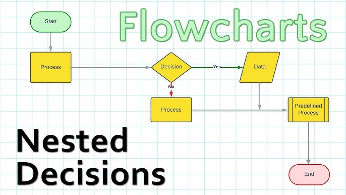
The One Idea Per Slide Principle
One of the most transformative approaches I've adopted is the "one idea per slide" principle. When I limit each slide to a single concept, I give that idea room to breathe and my audience space to process it. This approach has dramatically improved the clarity and impact of my presentations.
❌ Too Many Ideas
A cluttered slide with multiple concepts, statistics, images, and bullet points competing for attention.
✅ One Clear Idea
A focused slide with a single concept, supported by a relevant visual and minimal text.
Strategic Use of Whitespace
I've learned that what I don't put on a slide is just as important as what I do include. Whitespace (or negative space) isn't empty—it's purposeful. It gives visual elements room to stand out and provides cognitive space for the audience to process information. When I create visually appealing presentations, I make sure to leave at least 40% of each slide as whitespace.

Creating Visual Hierarchies
I design each slide with intentional visual hierarchy—guiding the audience's eyes exactly where I want them to look first, second, and third. This creates a natural visual journey through the content.
Visual Hierarchy Flow
How audience attention naturally flows through a well-designed slide:
                    flowchart TD
                        A[Visual Anchor
Large Image/Graphic] -->|1st| B[Main Heading
Large, Bold Text]
                        B -->|2nd| C[Key Message
Highlighted Text]
                        C -->|3rd| D[Supporting Details
Smaller Text]
                        C -->|Alternative Path| E[Call to Action
Button/Prompt]
                        style A fill:#FF8000,color:white
                        style B fill:#FF9933,color:white
                        style C fill:#FFB366,color:white
                        style D fill:#FFE6CC,color:black
                        style E fill:#FF6600,color:white
Using PageOn.ai's AI Blocks, I can quickly assemble these visually cohesive layouts without needing extensive design expertise. The system intelligently suggests optimal placement for elements based on visual hierarchy principles.
Color Psychology and Visual Impact
Color isn't just decorative—it's a powerful communication tool that I leverage deliberately in my presentations. Each color evokes specific emotions and associations that can reinforce my message.
Blue
Trust, stability, professionalism
Ideal for: Corporate presentations, data slides
Orange
Energy, enthusiasm, creativity
Ideal for: Creative concepts, calls to action
Green
Growth, harmony, environmental
Ideal for: Sustainability topics, positive trends
I also apply contrast techniques strategically to highlight key information. When I want something to stand out, I create visual tension through contrasting colors, sizes, or shapes. This draws the audience's eye exactly where I want it to go.
By implementing consistent color coding throughout my presentations, I help the audience track concepts visually. For instance, all financial data might appear in green, while competitive analysis always appears in blue. This visual shorthand reduces cognitive load and improves comprehension. Using PageOn.ai's Deep Search, I can quickly find complementary visual assets that maintain my color story across the entire presentation.
Interactive Elements That Transform Audience Experience
In my experience, adding interactive elements to presentations transforms passive viewers into active participants. This shift fundamentally changes the dynamics of information sharing and dramatically increases retention and engagement.

Comparing Interactive Presentation Tools
I've experimented with numerous interactive presentation tools, each with distinct strengths for different presentation contexts:
| Tool | Best For | Key Features | Limitations |
|---|---|---|---|
| Prezi | Non-linear storytelling, spatial relationships | Zooming interface, motion path animation, spatial context | Steeper learning curve, can cause motion sickness if overused |
| Mentimeter | Audience polling, live feedback | Real-time polls, word clouds, Q&A sessions | Limited design customization, requires audience devices |
| PowerPoint | Corporate settings, complex animations | Familiar interface, advanced animations, embedded media | Can feel traditional, limited real-time interaction |
| Google Slides | Collaborative creation, simple interfaces | Real-time collaboration, Q&A feature, easy sharing | Fewer animation options, limited offline functionality |
| PageOn.ai | AI-powered creation, visual storytelling | Conversational creation, integrated multimedia, visual cohesion | Newer platform, learning AI collaboration |
While each tool has its strengths, I've found that PageOn.ai simplifies the creation process through conversational interaction. Instead of navigating complex menus, I can simply describe the interactive element I want to create, and the AI helps bring it to life.
Clickable Navigation Systems
One of my favorite interactive techniques is implementing clickable navigation systems that allow audience-directed exploration of content. This approach is particularly effective when I'm creating interactive slides for teaching complex topics with multiple layers of information.
Interactive Navigation Structure
A sample clickable navigation system for a product presentation:
                    flowchart TD
                        A[Main Menu] --> B[Product Features]
                        A --> C[Case Studies]
                        A --> D[Pricing Options]
                        A --> E[Implementation]
                        B --> B1[Feature 1]
                        B --> B2[Feature 2]
                        B --> B3[Feature 3]
                        C --> C1[Case Study A]
                        C --> C2[Case Study B]
                        D --> D1[Basic Plan]
                        D --> D2[Pro Plan]
                        D --> D3[Enterprise]
                        E --> E1[Timeline]
                        E --> E2[Requirements]
                        E --> E3[Support]
                        B1 & B2 & B3 & C1 & C2 & D1 & D2 & D3 & E1 & E2 & E3 -.-> A
                        style A fill:#FF8000,color:white,stroke:#FF8000,stroke-width:2px
                        style B fill:#FFB366,color:white
                        style C fill:#FFB366,color:white
                        style D fill:#FFB366,color:white
                        style E fill:#FFB366,color:white
Polls and Real-Time Feedback Integration
Integrating polls and real-time feedback mechanisms has revolutionized how I connect with my audience. These tools transform one-way presentations into dynamic conversations.

When creating interactive slides for students, I've found that embedding polls directly into my presentations dramatically increases participation. PageOn.ai makes this process seamless by allowing me to integrate feedback mechanisms without complex coding.
One particularly powerful approach I've adopted is implementing branching content paths based on audience responses. This creates a truly adaptive presentation experience:
- I present a concept or problem
- The audience votes on their preferred approach or solution
- Based on the majority response, I navigate to the corresponding content branch
- This creates a personalized experience that addresses the specific interests or needs of that particular audience
Multimedia Enhancement Strategies
Strategic incorporation of multimedia elements has become central to my presentation approach. When used thoughtfully, video, audio, and animation can dramatically enhance understanding and retention.
I've found that elevating presentations with audio and visuals requires careful balance. Too much multimedia can overwhelm, while too little misses opportunities for engagement. My approach focuses on:
- Interactive hotspots: Creating clickable areas that reveal additional information on demand, allowing audience members to explore details relevant to their specific interests.
- Progressive animations: Building complex concepts step-by-step through animated sequences that align with my verbal explanation.
- Strategic video integration: Using brief video clips (under 60 seconds) to demonstrate concepts that are difficult to convey through static images or text.
PageOn.ai's Deep Search functionality has been invaluable for quickly finding and integrating relevant multimedia elements that enhance my presentations without overwhelming my audience.
Crafting Non-Linear Presentation Experiences
Moving beyond the traditional slide-by-slide format has been one of the most transformative changes in my presentation approach. Non-linear presentations allow for dynamic content exploration based on audience interest, creating a more engaging and personalized experience.

Designing Modular Content Blocks
I've found that thinking of presentations as collections of modular content blocks rather than sequential slides fundamentally changes how I structure information. Each module is self-contained but can connect with others in multiple ways, allowing for flexible presentation paths.
When creating interactive PowerPoint slides for eLearning, this modular approach allows me to adapt to different learning styles and knowledge levels within the same presentation.
Modular Content Structure
How modular content blocks can be arranged for flexible presentation paths:
                    flowchart TD
                        subgraph Core Content
            	            A[Introduction]
            	            B[Key Concept 1]
            	            C[Key Concept 2]
            	            D[Conclusion]
                        end
                        subgraph Optional Modules
            	            E[Case Study A]
            	            F[Technical Deep Dive]
            	            G[Industry Application]
            	            H[Future Trends]
                        end
                        A --> B
                        B --> C
                        C --> D
                        B -.-> E
                        B -.-> F
                        C -.-> G
                        D -.-> H
                        E --> C
                        F --> C
                        G --> D
                        H --> D
                        style A fill:#FF8000,color:white
                        style B fill:#FF9933,color:white
                        style C fill:#FF9933,color:white
                        style D fill:#FF8000,color:white
                        style E fill:#FFB366,color:white
                        style F fill:#FFB366,color:white
                        style G fill:#FFB366,color:white
                        style H fill:#FFB366,color:white
Interactive Tables of Contents
Creating interactive tables of contents has transformed how my audiences navigate through complex presentations. Rather than forcing everyone through the same linear path, I provide a menu of options that allows participants to focus on the content most relevant to their needs.
Interactive TOC Implementation Tips:
- Design a visually appealing home slide with clear navigation options
- Use consistent icons or visual cues for different content categories
- Include a persistent "return to menu" button on all content slides
- Consider adding progress indicators to show which sections have been viewed
- Use animations to make the navigation experience feel responsive
"Choose Your Own Adventure" Presentation Structures
One of my most engaging presentation approaches involves creating "choose your own adventure" structures where the audience collectively decides which direction to take the presentation. This creates a sense of ownership and ensures the content addresses their specific interests.
PageOn.ai's AI Blocks feature has been invaluable for quickly restructuring presentation flow based on real-time audience needs. Rather than manually rebuilding slide sequences, I can use natural language commands to reorganize content modules, ensuring the presentation remains coherent regardless of the path taken.
This approach is particularly effective for complex topics where different audience members may have varying levels of prior knowledge or interest in specific aspects. By allowing the audience to guide the journey, I ensure that the presentation remains relevant and engaging for everyone present.
Data Visualization for Maximum Impact and Clarity
Transforming complex data into compelling visual stories has become one of my core presentation strategies. When done effectively, data visualization doesn't just communicate information—it reveals insights that might otherwise remain hidden in spreadsheets and tables.
Interactive Charts and Graphs
Static charts have their place, but I've found that interactive visualizations dramatically increase audience engagement with data. These allow for exploration of different dimensions and perspectives on the same dataset.
Engagement Metrics by Content Type
Comparing audience engagement across different presentation content formats:
Comparative Visualizations
When presenting comparative data, I focus on creating visualizations that highlight key relationships rather than just displaying numbers. This approach helps audiences quickly grasp the significance of differences and similarities.
Presentation Tool Comparison
Comparing key features across popular presentation platforms:
Animated Data Stories
One of my most effective techniques is creating animated data stories that build understanding sequentially. Rather than presenting a complete visualization all at once, I reveal data progressively to guide the audience through a logical narrative.
Steps for Creating Animated Data Stories:
- Start with a clear, simple baseline (e.g., a single trend line or bar)
- Add context elements one by one (axes, labels, categories)
- Introduce comparative data points sequentially
- Highlight key insights with animations (zooms, color changes)
- Conclude with the complete visualization and core takeaway
PageOn.ai has transformed how I create data visualizations by allowing me to convert raw data into compelling visual narratives without specialized skills. I can simply describe the story I want to tell with my data, and the AI helps generate appropriate visualizations that highlight the key relationships and insights.
From Concept to Execution: Building Your Interactive Presentation
Creating truly engaging interactive presentations requires a structured approach. Over the years, I've developed a systematic process that helps me transform initial concepts into polished, audience-centered experiences.

Establish Clear Goals and Audience Focus
Before I design a single slide, I always clarify two fundamental questions:
1. What specific outcome am I trying to achieve with this presentation?
Examples: Inform about a new process, persuade stakeholders to approve a project, train team members on a skill
2. Who exactly is my audience and what matters most to them?
Consider: Knowledge level, primary concerns, attention span, decision-making authority, cultural context
This audience-centered approach ensures that every interactive element I include serves a specific purpose rather than just being decorative. It's the difference between engagement that enhances understanding and distractions that detract from your message.
Develop a Visual Storyboard
Once I've clarified my goals and audience, I create a visual storyboard that maps the journey I want to take my audience on. This storyboard specifically identifies:
- Key messages that require emphasis
- Natural points for interactive elements
- Potential attention drops that need engagement boosts
- Opportunities for audience-directed exploration
- Visual metaphors that can unify the presentation
Visual Storyboard Process
Mapping the audience journey through your presentation:
                    flowchart LR
                        A[Audience
Need/Problem] --> B[Opening
Hook]
                        B --> C[Context
Setting]
                        C --> D[Key
Message 1]
                        D --> E[Interactive
Element]
                        E --> F[Key
Message 2]
                        F --> G[Case
Study]
                        G --> H[Audience
Participation]
                        H --> I[Call to
Action]
                        style A fill:#FFE6CC,color:black
                        style B fill:#FF8000,color:white
                        style C fill:#FFB366,color:white
                        style D fill:#FF8000,color:white
                        style E fill:#FFB366,color:white
                        style F fill:#FF8000,color:white
                        style G fill:#FFB366,color:white
                        style H fill:#FFB366,color:white
                        style I fill:#FF8000,color:white
Implement a Consistent Visual Language
Consistency in visual elements creates a professional, cohesive experience that helps audiences focus on your content rather than being distracted by design inconsistencies.
Elements of Visual Consistency
- Color palette (3-5 colors maximum)
- Typography (2-3 fonts maximum)
- Icon style (outline vs. filled, rounded vs. sharp)
- Image treatment (filters, frames, shadows)
- Animation style and timing
Interactive Element Consistency
- Consistent navigation cues
- Uniform interaction patterns
- Standardized feedback mechanisms
- Predictable animation behaviors
- Coherent transition effects
PageOn.ai's Vibe Creation feature has been transformative for my workflow. It allows me to rapidly generate cohesive visual concepts from my presentation ideas, ensuring all elements work together harmoniously without requiring deep design expertise.
Test and Refine
Before delivering any interactive presentation, I always conduct testing with a small group that represents my target audience. This reveals usability issues and helps refine the experience.
Key Questions for Testing:
- Are interactive elements intuitive, or do they require explanation?
- Do transitions and animations enhance understanding or distract?
- Is the pacing appropriate for the content complexity?
- Are interactive moments placed where engagement naturally drops?
- Does the navigation system make sense to first-time viewers?
Based on testing feedback, I refine the presentation to ensure all interactive elements enhance rather than detract from the core message. This iterative process is essential for creating presentations that truly resonate with audiences.
Case Studies: Interactive Presentations That Drove Results
Learning from successful examples has been instrumental in developing my own interactive presentation approach. I've studied numerous cases where interactive elements transformed ordinary presentations into extraordinary experiences with measurable outcomes.
Educational Context: Medical Training Simulation
Challenge:
A medical school needed to train students on complex diagnostic procedures without patient risk.
Interactive Approach:
Created an interactive presentation with branching scenarios where students could select different diagnostic paths and immediately see consequences of their decisions.
Key Elements:
- Decision points with multiple-choice options
- Simulated patient responses based on choices
- Interactive anatomical models
- Real-time feedback on diagnostic accuracy
Results:
Students showed 32% higher diagnostic accuracy in subsequent practical assessments compared to traditional training methods.
Corporate Context: Product Launch Presentation
Challenge:
A technology company needed to introduce a complex new product to potential enterprise clients.
Interactive Approach:
Developed an interactive demo embedded within the presentation that allowed audience members to explore product features relevant to their specific industry challenges.
Key Elements:
- Industry-specific entry points
- Interactive product demonstrations
- Live data visualization of potential ROI
- Audience polling to address specific concerns
Results:
Sales cycle shortened by 40% and post-presentation meeting requests increased by 65% compared to previous product launches.

Technical Context: Engineering Design Review
Challenge:
An engineering team needed to present complex technical specifications to non-technical stakeholders.
Interactive Approach:
Created layered interactive visualizations that allowed viewers to toggle between simplified conceptual views and detailed technical specifications.
Key Elements:
- Interactive 3D models with zoom/rotate capabilities
- Progressive disclosure of technical details
- Comparative views showing alternatives
- Real-time cost calculators based on design choices
Results:
Approval process time reduced by 60% and stakeholder comprehension scores increased by 45% based on post-presentation assessments.
Across these diverse cases, I've observed consistent patterns of success: interactive elements that directly address audience needs, careful balance between engagement and information density, and strategic pacing that maintains attention throughout the presentation journey.
Measuring Engagement Success and Iterative Improvement
Creating engaging presentations isn't a one-time achievement but an ongoing process of measurement and refinement. I've developed systematic approaches to evaluate engagement effectiveness and continuously improve my interactive presentations.
Implementing Analytics
Modern presentation platforms offer powerful analytics capabilities that I leverage to gain objective insights into audience engagement patterns.
Engagement Analytics Comparison
Measuring key metrics across presentation versions:
Key metrics I track include:
- Interaction rate: Percentage of audience members who engage with interactive elements
- Dwell time: How long viewers spend on specific slides or sections
- Navigation patterns: Which pathways through non-linear content are most frequently chosen
- Completion rates: Percentage of audience that views the entire presentation
- Sharing metrics: How often the presentation is shared with others
Gathering Meaningful Feedback
Beyond quantitative analytics, I actively collect qualitative feedback that provides context and deeper insights into the audience experience.
Effective Feedback Collection Methods:
- Embedded feedback mechanisms: Quick rating systems or comment opportunities within the presentation itself
- Post-presentation surveys: Focused questions about specific interactive elements
- Observation: Watching audience reactions and engagement during live presentations
- Follow-up interviews: In-depth conversations with selected audience members
- Social listening: Monitoring mentions and discussions about your presentation
A/B Testing for Refinement
I regularly employ A/B testing to compare different interactive approaches and identify which elements most effectively engage my specific audiences.
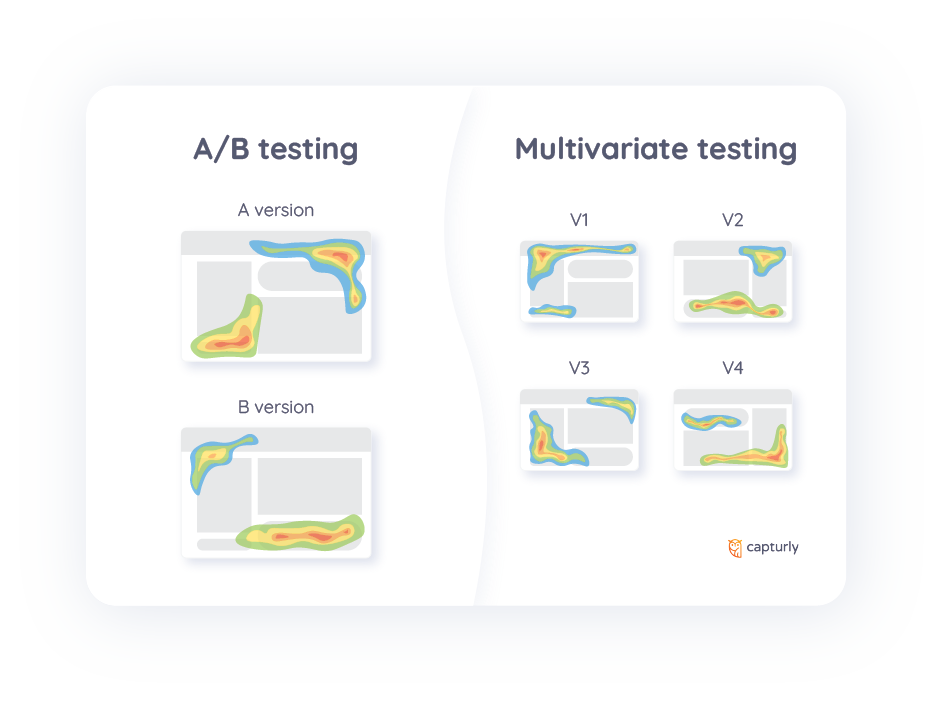
Common elements I test include:
- Different types of interactive navigation systems
- Various poll question formats and timing
- Alternative data visualization approaches
- Different levels of animation complexity
- Various interactive storytelling structures
Continuous Evolution
Using the insights gathered from analytics, feedback, and testing, I continuously evolve my presentation approach. This iterative improvement process ensures that my presentations become increasingly effective over time.
PageOn.ai's agentic capabilities have been particularly valuable in this improvement process. The system can analyze engagement patterns and suggest specific improvements based on audience behavior data. This AI-powered guidance helps me identify optimization opportunities I might otherwise miss.
Transform Your Visual Expressions with PageOn.ai
Ready to create presentations that truly captivate your audience? PageOn.ai makes it simple to design interactive, visually stunning slides without design expertise or coding knowledge.
Final Thoughts
Throughout this guide, I've shared my approach to transforming ordinary presentations into interactive visual experiences that truly engage audiences. The key takeaway is that effective presentations are no longer about simply displaying information—they're about creating meaningful experiences that facilitate understanding and connection.
As presentation technology continues to evolve, the possibilities for interactive engagement will only expand. By embracing these tools while maintaining focus on audience needs and clear communication goals, you can create presentations that not only inform but inspire and motivate action.
I encourage you to start small—implement one or two interactive elements in your next presentation and observe the difference in audience engagement. As your confidence grows, continue experimenting with more advanced techniques. With tools like PageOn.ai that simplify the creation process, anyone can create professional, engaging presentations that leave lasting impressions.
You Might Also Like
Transform Any Content into Professional Slides: The Ultimate Conversion Guide
Learn expert techniques for converting documents, presentations, and visual content into professional slides with this comprehensive guide to content format transformation.
Breaking the Ice: Transform Your Opening Minute from Predictable to Powerful
Discover how to transform the first 60 seconds of your presentation from cliché to compelling with visual hooks, interactive strategies, and storytelling techniques using PageOn.ai.
Circle of Knowledge Method: Creating Credible Visual Presentations That Resonate
Learn how to implement the Circle of Knowledge Method to create credible, visually stunning presentations that build authority and connect with your audience.
From Slides to Stories: Transform Presentations into Purpose-Driven Visual Experiences
Discover how to move beyond traditional PowerPoint presentations to create purpose-driven visual experiences that engage audiences, drive action, and leave lasting impact.