The Great Reversal: Visualizing America's Shifting Safe Haven Status in Global Markets
A deep dive into how the United States is losing its position as the world's financial refuge and what it means for investors worldwide.
Understanding America's Traditional Safe Haven Status
When examining the history of global finance, I've always been fascinated by how the United States established itself as the world's premier financial refuge. This "safe haven" status wasn't achieved overnight but was built methodically over decades following World War II.
What Makes a Financial Safe Haven?
A financial safe haven traditionally represents assets that investors flock to during times of uncertainty. These assets typically maintain or increase their value when markets experience turbulence. The United States, through its currency, government bonds, and equity markets, has long embodied this concept for global investors seeking stability.
Key Pillars of America's Safe Haven Status
flowchart TD
    A[America's Safe Haven Status] --> B[Political Stability]
    A --> C[Military Dominance]
    A --> D[Economic Size & Resilience]
    A --> E[Dollar as Reserve Currency]
    A --> F[Deep Financial Markets]
    B --> G[Investor Confidence]
    C --> G
    D --> G
    E --> G
    F --> G
    G --> H[Capital Inflows]
    H --> I[Reinforced Safe Haven Status]
    I --> A
The rise of American financial markets as the world's safe haven was built on several key foundations. The Bretton Woods agreement in 1944 established the US dollar as the world's reserve currency, backed by gold. Even after the gold standard ended in 1971, the dollar maintained its primacy through America's economic might and political stability.
Historical Timeline of America's Safe Haven Status

America's evolution as the world's financial safe haven from post-WWII to the modern era
Throughout the latter half of the 20th century, I've observed how the United States cemented its position through several key developments. The dollar's role as the global reserve currency created a natural demand for US assets. Meanwhile, America's deep and liquid financial markets, transparent legal system, and political stability made it the destination of choice for global capital seeking safety.
When examining market behavior during crises, it's remarkable to see how historical patterns repeat themselves. The wall street financial crises pattern recognition shows that despite domestic market turbulence, international capital typically flowed into US assets during global uncertainty—at least until recently.
Visual Indicators of the Current Exodus
In recent quarters, I've noticed alarming signals that suggest America's safe haven status is eroding. The data reveals a significant shift in global investor behavior that warrants careful analysis.
Q1 Performance Gap: European vs US Equities
The chart above illustrates one of the most telling indicators of this shift: European equities outperformed the S&P 500 by over 10% in the first quarter. This performance gap represents a significant deviation from the pattern we've seen over the past decade, where US markets typically led global returns.
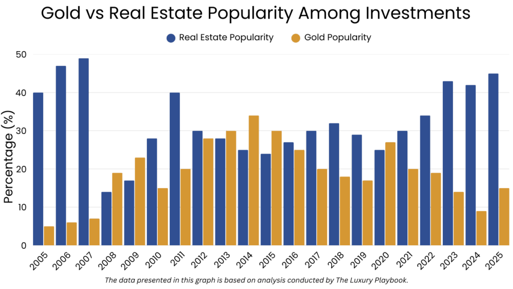
Gold's Rally: The Classic Safe Haven Alternative
Gold's dramatic 20% rally in the first quarter tells another compelling story. Historically, gold serves as an alternative safe haven during periods of dollar weakness or when confidence in US assets wanes. This surge suggests investors are actively seeking protection outside the traditional American financial ecosystem.
Capital Flow Patterns
flowchart LR
    A[Global Capital] --> B[Traditional Flow]
    A --> C[Emerging Flow]
    B --> D[US Treasury Bonds]
    B --> E[US Blue Chip Stocks]
    B --> F[US Dollar Cash]
    C --> G[European Equities]
    C --> H[Gold & Commodities]
    C --> I[Emerging Markets]
    subgraph "Historical Pattern"
    D
    E
    F
    end
    subgraph "New Pattern"
    G
    H
    I
    end
    classDef historical fill:#FF8000,stroke:#E67300,color:white
    classDef emerging fill:#42A5F5,stroke:#1E88E5,color:white
    class D,E,F historical
    class G,H,I emerging
The flow diagram above illustrates the dramatic shift in capital movement patterns. While US assets traditionally attracted significant inflows during periods of uncertainty, we're now seeing capital actively flowing toward alternative safe havens.
Examining us trade balance evolution provides additional context for this shift. America's persistent trade deficits have contributed to growing concerns about long-term economic sustainability, potentially undermining confidence in US assets.
Heat Map: Investor Sentiment Across Asset Classes

Heat map visualization of current investor sentiment across different asset classes
This heat map visualization reveals the dramatic shift in investor sentiment across various asset classes. The cooling sentiment toward traditional US safe haven assets contrasts sharply with warming attitudes toward alternatives like European equities, gold, and select emerging markets.
Underlying Forces Driving the Shift
To understand this dramatic reversal in safe haven preferences, I need to examine the fundamental forces eroding America's traditional position of financial primacy.
America's Growing Debt Burden
America's skyrocketing debt-to-GDP ratio has become increasingly concerning to global investors. When I examine historical trends, I can see that crossing the 100% threshold has historically been a warning sign for major economies. The current trajectory raises legitimate questions about long-term fiscal sustainability.
Understanding america's economic journey provides important context for how we arrived at this precarious debt position. Decades of fiscal decisions have compounded to create the current situation.
Political Polarization and Market Stability

Correlation between political polarization metrics and market stability indicators
Growing political polarization in the United States has emerged as a significant concern for global investors. The visualization above demonstrates the strong correlation between increasing polarization and market volatility metrics. This political uncertainty undermines one of America's historical advantages: its reputation for stable governance and predictable policy.
Germany's Infrastructure Plan: A Competing Safe Haven
flowchart TD
    A[Germany's $500B Infrastructure Plan] --> B[Enhanced Economic Growth]
    A --> C[Improved Fiscal Position]
    A --> D[Industrial Modernization]
    A --> E[Green Energy Transition]
    B --> F[European Financial Stability]
    C --> F
    D --> F
    E --> F
    F --> G[Enhanced Safe Haven Appeal]
    G --> H[Increased Capital Inflows]
    H --> I[Strengthened Euro Assets]
Germany's ambitious $500 billion infrastructure plan represents a significant development in the global safe haven landscape. This massive investment program not only strengthens Europe's largest economy but also enhances the appeal of European assets as a credible alternative to US markets.
Weakening Euro: Boosting European Competitiveness
The weakening euro has paradoxically strengthened Europe's appeal to investors. A lower euro boosts export competitiveness for European companies, enhancing corporate profitability and making European equities more attractive. This currency dynamic has contributed significantly to the outperformance of European markets.
Fiscal Policy Divergence
Comparative analysis of fiscal policy approaches across major economies
The divergence in fiscal approaches between major economies has become increasingly apparent. While the US has pursued expansionary fiscal policies that have increased debt levels, other nations have maintained more conservative approaches. This divergence has influenced investor perceptions of relative stability and risk.
The role of the federal reserve system in this context cannot be overstated. Monetary policy decisions have significant implications for US asset attractiveness and global capital flows.
Emerging Safe Haven Alternatives
As America's safe haven status erodes, I'm identifying several emerging alternatives that are attracting global capital. These new safe havens represent a fundamental reshaping of the global financial landscape.
Commodities: The Chaos Hedge
Commodities have emerged as a primary beneficiary of the shift away from US assets. Gold's 20% rally in Q1 is particularly telling, reflecting its traditional role as an alternative to fiat currencies during periods of uncertainty. Oil, agricultural commodities, and industrial metals have also seen strong inflows as investors seek tangible assets with intrinsic value.
China's Stabilizing Growth
flowchart LR
    A[China's Economic Stabilization] --> B[GDP Growth: 5%+]
    A --> C[Manufacturing PMI > 50]
    A --> D[Retail Sales Growth]
    A --> E[Infrastructure Investment]
    B --> F[Regional Economic Stability]
    C --> F
    D --> F
    E --> F
    F --> G[Emerging Market Confidence]
    G --> H[Capital Inflows to EM Assets]
    H --> I[Alternative Safe Haven Status]
China's economic stabilization has created ripple effects throughout global markets. With GDP growth exceeding 5% and manufacturing indices returning to expansion territory, China is providing a growth anchor for the broader Asian region. This stability has enhanced the appeal of emerging market assets as viable alternatives to traditional US investments.
Risk Assessment: Traditional vs. Emerging Safe Havens
Comparative risk assessment dashboard for traditional vs. emerging safe haven assets
This risk assessment dashboard provides a comprehensive comparison between traditional US-based safe havens and emerging alternatives. What's particularly notable is the convergence of risk metrics—while US assets historically offered significantly lower risk profiles, this gap has narrowed considerably in recent quarters.
Geographic Diversification Performance
The data clearly demonstrates that geographically diversified portfolios have delivered superior risk-adjusted returns compared to US-only allocations. This performance gap underscores the shifting dynamics of global financial markets and the benefits of looking beyond traditional safe havens.
Geopolitical Risk and Asset Performance
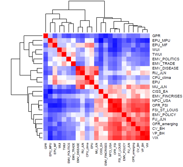
Correlation between geopolitical risk indices and asset class performance
This correlation matrix reveals a fascinating shift in how assets respond to geopolitical risk. Historically, US Treasuries and the dollar showed strong negative correlations with geopolitical risk indices (meaning they performed well when risk increased). Today, that relationship has weakened significantly, while gold and select European assets now demonstrate stronger safe haven characteristics during geopolitical crises.
Looking ahead to the global economy 2025, these shifting safe haven dynamics will likely play a critical role in shaping investment flows and market performance.
Portfolio Adaptation for the New Reality
Given the fundamental shifts in the global safe haven landscape, I believe strategic portfolio adaptation is essential. The following visualizations and frameworks can guide this process.
Geographic Diversification Decision Tree
flowchart TD
    A[Portfolio Adaptation Strategy] --> B{US Safe Haven Status?}
    B -->|Deteriorating| C{Risk Tolerance?}
    B -->|Stabilizing| D[Maintain Higher US Allocation]
    C -->|Conservative| E[Increase Gold/Commodities]
    C -->|Moderate| F[Add European Exposure]
    C -->|Aggressive| G[Explore Emerging Markets]
    E --> H{Inflation Concerns?}
    F --> I{Currency Exposure?}
    G --> J{Geopolitical Stability?}
    H -->|High| K[TIPS + Gold]
    H -->|Low| L[Sovereign Bonds + Gold]
    I -->|Hedge| M[Currency-Hedged ETFs]
    I -->|Embrace| N[Unhedged for Currency Alpha]
    J -->|Stable Regions| O[Asia-Pacific Focus]
    J -->|Unstable| P[Highly Selective EM]
This decision tree provides a systematic framework for geographic diversification based on your assessment of America's safe haven trajectory and your personal risk tolerance. By working through this logical structure, you can develop a tailored approach to portfolio adaptation.
Optimal Asset Allocation Models
The polar area chart above contrasts traditional safe haven portfolio allocations with an adapted approach that acknowledges the shifting global landscape. Note the reduced concentration in US assets and the increased geographic diversification in the adapted model.
Tangible Assets and Inflation Protection
Historical performance of tangible assets during inflationary periods
This visualization maps the relationship between tangible assets and inflation protection. In the current environment of fiscal expansion and monetary accommodation, inflation protection has become increasingly important. Tangible assets like gold, commodities, and real estate have historically provided effective hedges against inflationary pressures.
Portfolio Stress Tests
These stress test results demonstrate how an adapted portfolio structure significantly reduces vulnerability to scenarios that specifically impact US safe haven status. By diversifying across geographies and asset classes, the adapted portfolio shows notably smaller expected drawdowns across various crisis scenarios.
Rebalancing Strategy Timeline
Phased implementation timeline for portfolio rebalancing
Rather than making dramatic overnight changes, this timeline illustrates a measured approach to portfolio adaptation. By implementing changes gradually over several quarters, you can mitigate timing risk and allow for tactical adjustments based on evolving market conditions.
Transform Your Market Visualization Strategy with PageOn.ai
Struggling to make sense of complex market shifts? PageOn.ai's advanced visualization tools help you transform financial data into clear, actionable insights that guide better investment decisions.
Future Outlook: Charting Potential Recovery or Continued Decline
The future of America's safe haven status remains uncertain. By monitoring key indicators and understanding potential scenarios, we can prepare for various outcomes.
Key Indicators for US Safe Haven Recovery
flowchart TD
    A[US Safe Haven Recovery Indicators] --> B[Fiscal Discipline]
    A --> C[Political Stability]
    A --> D[Productivity Growth]
    A --> E[Trade Balance Improvement]
    A --> F[Dollar Stability]
    B --> G{Recovery Likelihood}
    C --> G
    D --> G
    E --> G
    F --> G
    G -->|High| H[Safe Haven Status Restoration]
    G -->|Medium| I[Partial Recovery]
    G -->|Low| J[Continued Erosion]
This flowchart identifies the key indicators that could potentially restore America's safe haven status. Fiscal discipline and political stability stand out as particularly critical factors that would signal a potential reversal of the current trend. Monitoring these indicators can provide early warning of a changing trajectory.
Capital Flight Trigger Points
Risk dashboard identifying potential trigger points for accelerated capital flight
This risk dashboard identifies potential trigger points that could accelerate capital flight from US assets. By monitoring these specific thresholds, investors can prepare for rapid shifts in market sentiment and positioning. The debt ceiling, political polarization metrics, and inflation indicators emerge as particularly sensitive trigger points.
Federal Reserve Policy Scenarios
The Federal Reserve's policy path will significantly influence America's safe haven trajectory. This chart models three distinct scenarios for monetary policy and their potential implications. The "Dovish Pivot" scenario could potentially support US asset values in the near term but might further erode long-term confidence if perceived as falling behind on inflation control.
Geopolitical Impact Analysis
Analysis of how geopolitical developments could impact safe haven dynamics
Geopolitical developments will play a crucial role in shaping safe haven preferences. This framework illustrates how various scenarios could either accelerate or reverse current trends. Particular attention should be paid to US-China relations, European political cohesion, and developments in key commodity-producing regions.
Evolving Safe Haven Framework
This radar chart provides a comprehensive framework for monitoring the evolution of safe haven preferences. By tracking these key dimensions, investors can identify shifts in the relative attractiveness of different markets and assets. The visualization clearly illustrates how America's position has weakened across multiple dimensions, while alternatives have strengthened their relative positioning.
As we look toward the future, the concept of a single dominant safe haven may be giving way to a more nuanced, multi-polar financial system. In this new reality, geographic diversification and adaptive portfolio strategies will be more important than ever.
You Might Also Like
The Science Behind Success: How AI-Powered Content Creation Delivers 25% Higher Success Rates
Discover why AI users report 25% higher content success rates. Learn proven strategies, productivity gains, and competitive advantages of AI-powered content creation.
Strategic AI Marketing Investment Roadmap: Maximizing ROI from the $360 Billion Surge | 2025 Marketing Tech Budget Guide
Navigate the $360 billion AI investment surge with strategic marketing technology budget allocation. Discover proven frameworks for maximizing ROI from AI marketing tools in 2025.
Prompt Chaining Techniques That Scale Your Business Intelligence | Advanced AI Strategies
Master prompt chaining techniques to transform complex business intelligence workflows into scalable, automated insights. Learn strategic AI methodologies for data analysis.
Building Trust in AI-Generated Marketing Content: Transparency, Security & Credibility Strategies
Discover proven strategies for establishing authentic trust in AI-generated marketing content through transparency, behavioral intelligence, and secure data practices.