Revolutionizing Data Analytics: Automating Visualization Workflows in Power BI
The Evolution of Power BI Automation
I've watched Power BI transform from a simple visualization tool into a robust automated analytics platform. In this guide, I'll share how automation is revolutionizing data visualization and how you can leverage these capabilities to transform your business intelligence processes.
The Evolution of Power BI Automation
I've been working with Power BI since its early days, and the transformation has been remarkable. What began as a primarily manual visualization tool has evolved into a sophisticated platform with extensive automation capabilities. This evolution has fundamentally changed how organizations approach business intelligence.
The journey from static reports to dynamic, self-updating visualizations represents a paradigm shift in how we interact with data. Early versions of Power BI required manual refreshes and updates, creating bottlenecks in the analytics process. Today's automation features have eliminated these constraints, allowing for real-time PowerPoint data storytelling and seamless data integration.

Power BI Automation Evolution Timeline
The following timeline illustrates key automation milestones in Power BI's development:
                    timeline
                        title Power BI Automation Evolution
                        2015 : Basic scheduled refresh
                        2016 : Power Query automation
                        2017 : Gateway data source management
                        2018 : Dataflows introduction
                        2019 : AI capabilities integration
                        2020 : Power Automate integration
                        2021 : Power Automate visual
                        2022 : Enhanced API capabilities
                        2023 : AI-driven visualization recommendations
In 2023, Power BI's automation capabilities have reached new heights, with AI-driven recommendations, predictive analytics, and seamless integration with other Microsoft tools. These advancements have positioned Power BI as a leader in automated data visualization for business intelligence, enabling organizations to make faster, more informed decisions.
Core Automation Technologies Powering Modern Visualization
The heart of Power BI's automation capabilities lies in its integration with Power Automate and its robust API framework. These technologies enable a seamless connection between data sources, transformation processes, and visualization outputs.
Power Automate Visual Integration
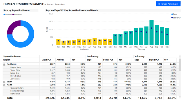
The Power Automate visual represents a significant leap forward in Power BI's automation capabilities. As Microsoft announced in their Power BI blog, this feature allows end-users to run automated flows directly within a Power BI report. What makes this particularly powerful is that these flows can be data contextual, meaning they dynamically respond to filters and selections made by users.
Power BI Automation Framework
The core components that enable automation in Power BI:
                    flowchart TD
                        A[Data Sources] -->|Automated Connection| B[Power Query]
                        B -->|Transformation Rules| C[Data Model]
                        C -->|Scheduled Refresh| D[Visualization Layer]
                        D -->|Power Automate| E[Actions & Alerts]
                        B -.->|API Integration| F[External Systems]
                        F -.->|Data Exchange| B
                        D -->|User Interaction| G[Contextual Flows]
                        G -->|Automated Response| H[Business Processes]
                        style A fill:#FF8000,stroke:#333,stroke-width:1px
                        style E fill:#FF8000,stroke:#333,stroke-width:1px
                        style H fill:#FF8000,stroke:#333,stroke-width:1px
Automation Capabilities Comparison
How Power BI's automation framework compares to other visualization platforms:
Data refresh automation stands as one of the most valuable features in Power BI. By configuring scheduled refreshes and conditional triggers, organizations can ensure their visualizations always reflect the most current data without manual intervention. This capability is particularly important for businesses that need to make decisions based on rapidly changing information.
The API integration capabilities extend Power BI's automation potential beyond its native features. By connecting to external systems and services, organizations can create comprehensive automation workflows that span their entire data ecosystem, enabling interactive visualizations for data exploration that update automatically as new data becomes available.
Building End-to-End Automated Visualization Pipelines
Creating effective automated visualization pipelines requires careful planning and implementation. I've found that the most successful approaches focus on designing flexible, resilient systems that can adapt to changing data conditions while maintaining visual integrity.
End-to-End Visualization Pipeline
A comprehensive view of an automated visualization workflow:
                    flowchart LR
                        subgraph "Data Sources"
                            DB[(Databases)]
                            API[API Services]
                            Files[File Systems]
                        end
                        subgraph "Extraction & Processing"
                            Gateway[Data Gateway]
                            Transform[Transformation Rules]
                            Quality[Data Quality Checks]
                        end
                        subgraph "Visualization Layer"
                            Model[Data Model]
                            Reports[Reports & Dashboards]
                            Alerts[Automated Alerts]
                        end
                        subgraph "Distribution & Action"
                            Share[Automated Sharing]
                            Export[Scheduled Exports]
                            Actions[Triggered Actions]
                        end
                        DB --> Gateway
                        API --> Gateway
                        Files --> Gateway
                        Gateway --> Transform
                        Transform --> Quality
                        Quality --> Model
                        Model --> Reports
                        Reports --> Alerts
                        Reports --> Share
                        Reports --> Export
                        Alerts --> Actions
Technical Implementation Steps
1. Connecting to Source Systems
Setting up automated gateways requires careful configuration of credentials, refresh schedules, and security parameters. The on-premises data gateway acts as a bridge between your data sources and Power BI, enabling secure, automated data transfers.
2. Configuring Refresh Parameters
Optimizing refresh schedules involves balancing data freshness requirements with system performance considerations. I recommend staggering refresh times for different datasets to prevent resource contention and ensure consistent performance.
3. Building Adaptive Transformation Rules
Creating transformation logic that adapts to changing inputs requires thoughtful use of Power Query's M language. Implement error handling and conditional processing to ensure your transformations remain robust even when source data changes unexpectedly.
4. Setting Up Responsive Formatting
Conditional formatting that responds to data variations can dramatically enhance the communicative power of your visualizations. Use DAX measures to drive formatting rules that highlight exceptions, trends, and threshold violations automatically.
Data Pipeline Performance Metrics
Comparing manual vs. automated processes in a typical enterprise scenario:
When implementing automated visualization pipelines, I've found that establishing governance protocols is essential. These protocols should define data refresh frequencies, error handling procedures, notification workflows, and access controls. With proper governance, automated pipelines can operate reliably with minimal oversight while maintaining data integrity and security.
For organizations already familiar with data visualization in Excel, the transition to automated Power BI pipelines requires some adjustment but offers significant advantages in terms of scalability and refresh capabilities.
From Insight to Action: Interactive Automation Features
The true power of Power BI automation emerges when we connect insights directly to actions. Modern Power BI implementations enable users to trigger workflows and processes directly from their visualization interfaces, creating a seamless path from data discovery to business action.
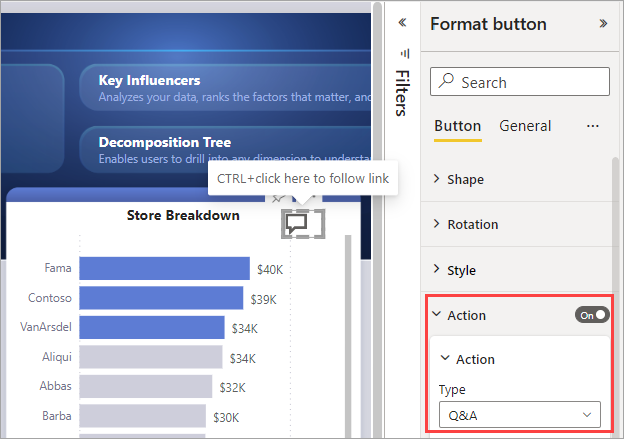
Contextual Actions with Power Automate Visual
The Power Automate visual transforms static reports into interactive action centers. Users can trigger workflows directly from their dashboards, with actions that are contextually aware of the data being displayed. For example, a sales manager viewing regional performance can automatically send personalized emails to underperforming store managers with specific guidance—all without leaving their Power BI dashboard.
User Interaction to Automated Action Flow
How user interactions in Power BI trigger automated workflows:
                    sequenceDiagram
                        participant User
                        participant Dashboard
                        participant Filter as Filter Context
                        participant Flow as Power Automate Flow
                        participant Action as Business System
                        User->>Dashboard: Views visualization
                        User->>Filter: Applies filters
                        Filter->>Dashboard: Updates visualization
                        User->>Dashboard: Clicks action button
                        Dashboard->>Flow: Triggers flow with context
                        Flow->>Flow: Processes data context
                        Flow->>Action: Executes business action
                        Action-->>User: Confirmation notification
Filter-responsive automated actions represent one of the most powerful aspects of modern Power BI implementations. When a user filters a report to focus on specific data points, the available actions and their parameters automatically adjust to remain relevant to the filtered context. This creates a highly personalized experience where the system anticipates the user's needs based on their data exploration path.
User Engagement with Interactive Features
Adoption rates of various interactive automation features:
Dynamic dashboards that adapt to user behavior patterns represent the next evolution in interactive data visualization tools. By analyzing how users interact with reports, these systems can automatically adjust layouts, highlight relevant information, and suggest potential actions based on established usage patterns.
Cross-report interactions and data synchronization enable a cohesive analytics experience across multiple dashboards and reports. When a user makes a selection in one report, related reports automatically update to maintain context, creating a seamless exploration experience that preserves the user's analytical thread across the entire reporting ecosystem.
Business Impact of Visualization Automation
The business value of automation in Power BI extends far beyond simple time savings. Organizations implementing comprehensive visualization automation strategies are experiencing transformative impacts across multiple dimensions of their operations.
ROI of Automated Visualization
Average return on investment by organization size:
Case Studies: Transformation Through Automation
Retail Chain: Real-time Inventory Optimization
A national retail chain implemented automated Power BI pipelines to monitor inventory levels across 500+ locations. The system automatically triggers restocking workflows when inventory falls below optimal levels, resulting in a 23% reduction in stockouts and a 17% decrease in excess inventory carrying costs.
Healthcare Network: Patient Flow Optimization
A regional healthcare network uses automated Power BI dashboards to monitor patient wait times and department capacity. When bottlenecks are detected, the system automatically alerts staff and suggests resource reallocation. This implementation has reduced average wait times by 31% and improved patient satisfaction scores by 22%.
Manufacturing: Quality Control Automation
A precision manufacturing company integrated sensor data with Power BI to automatically visualize production quality metrics. When anomalies are detected, the system triggers targeted quality control inspections. This approach has reduced defect rates by 42% and warranty claims by 35%.
Financial Services: Fraud Detection
A financial institution implemented automated Power BI visualizations to detect unusual transaction patterns. The system automatically escalates suspicious activities to fraud investigators. This implementation has improved fraud detection rates by 27% while reducing false positives by 18%.
Productivity Improvements
Time savings across different reporting activities:
The competitive advantages gained through visualization automation strategies are substantial. Organizations that successfully implement these approaches typically see accelerated decision-making cycles, improved operational agility, and enhanced ability to respond to market changes. In rapidly evolving industries, this agility can be the difference between market leadership and obsolescence.
Measuring productivity improvements requires a comprehensive approach that looks beyond simple time savings. The most successful organizations track metrics such as decision cycle time, insight generation rate, data utilization breadth, and action implementation speed. These metrics provide a more holistic view of how automation impacts the organization's ability to derive value from its data assets.
Advanced Visualization Automation Techniques
As Power BI's capabilities continue to evolve, advanced automation techniques are emerging that push the boundaries of what's possible in data visualization. These approaches leverage artificial intelligence, machine learning, and natural language processing to create increasingly sophisticated automated visualization experiences.
AI-Driven Visualization Recommendations
Power BI's AI features can now analyze your dataset and automatically suggest the most appropriate visualizations based on data characteristics. This capability dramatically accelerates the dashboard creation process and often reveals insights that might be missed with manual approaches. The system evaluates data types, distributions, and relationships to recommend visualization types that best communicate the underlying patterns.

Natural Language Processing Workflow
How NLP enables automated chart generation:
                    flowchart LR
                        A[User Query] -->|Natural Language| B[NLP Engine]
                        B -->|Query Analysis| C{Intent Recognition}
                        C -->|Data Request| D[Data Model]
                        D -->|Dataset| E[Visualization Selection]
                        E -->|Chart Parameters| F[Automated Generation]
                        F -->|Visual Output| G[Interactive Dashboard]
                        G -->|User Refinement| H[Feedback Loop]
                        H -->|Learning| B
                        style A fill:#FF8000,stroke:#333,stroke-width:1px
                        style G fill:#FF8000,stroke:#333,stroke-width:1px
Predictive Visualization Accuracy
Accuracy of automated forecasts by data type:
Automated Cross-Platform Distribution
Modern Power BI implementations can automatically distribute visualizations across multiple platforms based on content relevance and user preferences. This capability ensures that insights reach stakeholders through their preferred channels, whether that's email, Teams, SharePoint, or mobile notifications.
Template Auto-Population
Create visualization templates that automatically populate with relevant data based on user context, role, or business unit. This approach ensures consistency while maintaining personalization.
Anomaly-Driven Visualization
Implement systems that automatically generate and distribute visualizations when anomalies are detected, focusing attention on areas requiring immediate action.
Contextual Formatting
Develop visualizations that automatically adjust their formatting based on the data being displayed, emphasizing important patterns and relationships.
Predictive visualization represents one of the most valuable advanced automation techniques. By automatically generating forecasts and trend analyses, Power BI can help organizations anticipate future conditions and take proactive action. These capabilities are particularly valuable in areas such as demand forecasting, resource planning, and risk management.
Overcoming Challenges in Visualization Automation
While the benefits of visualization automation are substantial, implementing these systems successfully requires addressing several significant challenges. Understanding these challenges and developing strategies to overcome them is essential for realizing the full potential of Power BI automation.
Common Automation Failure Points
Critical areas requiring attention in automated visualization systems:
                    flowchart TD
                        A[Data Quality Issues] -->|Impacts| B[Visualization Accuracy]
                        C[Security Vulnerabilities] -->|Compromises| D[Data Protection]
                        E[Over-Automation] -->|Reduces| F[Customization Flexibility]
                        G[Gateway Failures] -->|Prevents| H[Data Refreshes]
                        I[Performance Bottlenecks] -->|Degrades| J[User Experience]
                        B -->|Leads to| K[Incorrect Decisions]
                        D -->|Results in| L[Compliance Violations]
                        F -->|Causes| M[User Resistance]
                        H -->|Creates| N[Stale Reports]
                        J -->|Triggers| O[Abandoned Dashboards]
                        style A fill:#ff8000,stroke:#333,stroke-width:1px
                        style C fill:#ff8000,stroke:#333,stroke-width:1px
                        style E fill:#ff8000,stroke:#333,stroke-width:1px
                        style G fill:#ff8000,stroke:#333,stroke-width:1px
                        style I fill:#ff8000,stroke:#333,stroke-width:1px
Addressing Key Challenges
| Challenge | Impact | Solution Approach |
|---|---|---|
| Data Quality Issues | Misleading visualizations, incorrect insights | Implement automated data quality checks, validation rules, and anomaly detection before visualization generation |
| Security & Compliance | Data breaches, regulatory violations | Establish row-level security, implement proper authentication, and maintain audit trails for all automated processes |
| Balancing Automation vs. Customization | Rigid systems that don't meet specific needs | Design modular automation with configuration options and override capabilities for special cases |
| Gateway & Connection Failures | Data refresh failures, stale reports | Implement monitoring systems, redundant gateways, and automated failure notifications with recovery procedures |
| Training & Adoption | Underutilization of automated capabilities | Develop comprehensive training programs, create internal champions, and measure adoption metrics |

Training Teams for Automation Success
Effective training is critical for successful visualization automation. Teams need to understand not just how to use automated systems but also how to troubleshoot issues, interpret results correctly, and recognize when manual intervention is necessary. I recommend a tiered training approach that addresses the needs of different user types, from casual dashboard consumers to power users who will extend and customize the automation.
Balancing automation with customization needs represents one of the most nuanced challenges in Power BI implementation. While automation drives efficiency, it can sometimes create rigid systems that don't accommodate unique business requirements. The most successful implementations maintain flexibility by providing configuration options, override capabilities, and clear documentation of customization pathways.
Troubleshooting automated visualization systems requires a systematic approach. When issues arise, teams should have clear protocols for diagnosing whether the problem lies in the data source, the connection, the transformation logic, the visualization configuration, or the distribution mechanism. Proper logging and monitoring are essential for quickly identifying and resolving issues before they impact business operations.
Future Horizons: Next-Generation Visualization Automation
The future of visualization automation in Power BI is being shaped by rapid advancements in artificial intelligence, machine learning, and natural language processing. These technologies promise to make data visualization even more accessible, intuitive, and powerful.
Emerging AI Capabilities
Next-generation AI systems will be capable of autonomously creating entire visualization suites based on business objectives rather than explicit instructions. These systems will analyze available data, understand business context, and generate comprehensive dashboards tailored to specific decision-making needs—all with minimal human intervention.

Conversational Visualization Creation
How natural language interfaces will transform visualization workflows:
                    sequenceDiagram
                        participant User
                        participant NLI as Natural Language Interface
                        participant AI as AI Processing Engine
                        participant Data as Data Sources
                        participant Vis as Visualization Engine
                        User->>NLI: "Show me sales trends by region for Q2"
                        NLI->>AI: Converts to structured query
                        AI->>Data: Requests relevant datasets
                        Data->>AI: Returns filtered data
                        AI->>AI: Analyzes patterns and context
                        AI->>Vis: Sends visualization parameters
                        Vis->>User: Displays optimized visualization
                        User->>NLI: "Compare to previous quarter"
                        NLI->>AI: Updates query context
                        AI->>Vis: Modifies visualization
                        Vis->>User: Shows comparative analysis
Adoption Timeline for Next-Gen Features
Projected implementation of advanced automation capabilities:
PageOn.ai's Conversational Approach
PageOn.ai's conversational approach to data visualization represents an exciting direction for the future of Power BI automation. By enabling users to describe their visualization needs in natural language and then automatically generating appropriate visualizations, PageOn.ai could dramatically lower the technical barriers to effective data visualization.
This approach could be particularly transformative for Power BI implementations by:
- Enabling non-technical users to create sophisticated visualizations through simple conversations
- Automatically suggesting optimal visualization types based on data characteristics and user intent
- Providing natural language explanations of data patterns and anomalies
- Allowing iterative refinement of visualizations through conversational feedback
- Facilitating knowledge transfer by documenting the reasoning behind visualization choices
Cross-platform automation integration possibilities are expanding rapidly as standards emerge for sharing data and visualizations across different tools. Future Power BI implementations will likely feature seamless integration with a wide range of business systems, enabling visualization automation to extend beyond traditional reporting boundaries and become embedded in operational processes throughout the organization.
The role of machine learning in predictive visual analytics will continue to grow, with systems not only visualizing what has happened but automatically identifying what's likely to happen and what actions might influence those outcomes. These capabilities will transform Power BI from a reporting tool into a decision support system that proactively guides users toward optimal choices.
Implementation Roadmap for Organizations
Successfully implementing visualization automation in Power BI requires a structured approach that addresses technical, organizational, and cultural factors. Based on my experience working with numerous organizations, I've developed a phased implementation roadmap that maximizes the chances of success.
Phased Implementation Approach
A structured path to visualization automation maturity:
                    flowchart LR
                        subgraph "Phase 1: Foundation"
                            A1[Assessment]
                            A2[Infrastructure Setup]
                            A3[Basic Automation]
                            A4[Initial Training]
                        end
                        subgraph "Phase 2: Expansion"
                            B1[Advanced Workflows]
                            B2[Cross-department Integration]
                            B3[Custom Templates]
                            B4[Power User Development]
                        end
                        subgraph "Phase 3: Optimization"
                            C1[AI Integration]
                            C2[Predictive Analytics]
                            C3[Self-service Enablement]
                            C4[Continuous Improvement]
                        end
                        A1 --> A2 --> A3 --> A4
                        A4 --> B1 --> B2 --> B3 --> B4
                        B4 --> C1 --> C2 --> C3 --> C4
Assessment Framework for Automation Readiness
| Dimension | Basic Readiness | Advanced Readiness |
|---|---|---|
| Data Quality | Consistent data formats, minimal manual cleaning required | Automated validation rules, data quality monitoring |
| Technical Infrastructure | Power BI Premium/Pro licenses, reliable network connectivity | On-premises gateway, dedicated resources, monitoring tools |
| Team Skills | Basic Power BI knowledge, understanding of data sources | DAX expertise, Power Query proficiency, API familiarity |
| Business Processes | Defined reporting requirements, clear refresh schedules | Documented decision workflows, action triggers |
| Governance | Basic security roles, content organization structure | Comprehensive governance policy, certification process |
Resource Requirements by Implementation Phase
Typical resource allocation across implementation stages:
Measuring Success: KPIs for Visualization Automation
Efficiency Metrics
- Report generation time reduction (%)
- Manual data processing hours saved
- Time to insight (hours/days)
- Report refresh reliability rate (%)
- Automation coverage (% of total reports)
Business Impact Metrics
- Decision cycle time reduction (%)
- Data-driven decision rate increase (%)
- Operational cost reduction ($)
- Revenue impact from faster insights ($)
- User satisfaction scores
Adoption Metrics
- Active users of automated reports (%)
- Self-service visualization creation rate
- Feature utilization breadth
- Training completion rates
- Internal knowledge sharing activities
Technical Performance Metrics
- Visualization load time (seconds)
- Refresh completion rate (%)
- Data model optimization score
- API reliability rate (%)
- System uptime (%)
Long-term maintenance strategies are critical for sustaining the benefits of visualization automation. Organizations should establish clear ownership for automated systems, implement regular review cycles, and develop processes for handling changes to underlying data structures or business requirements. Documentation is particularly important, as it ensures that knowledge is preserved even as team members change over time.
Skill development requirements should not be underestimated. While automation reduces the need for manual report creation, it increases the need for expertise in areas such as DAX formula writing, Power Query M language, API integration, and workflow design. Organizations should invest in developing these skills internally while also considering partnerships with external experts for specialized knowledge.
Transform Your Visual Expressions with PageOn.ai
Ready to take your data visualization automation to the next level? PageOn.ai's intuitive platform makes it easy to create stunning, interactive visualizations that communicate your data stories effectively—no complex coding required.
Looking Ahead: The Future of Automated Visualization
As we look to the future of data visualization in Power BI, it's clear that automation will continue to play an increasingly central role. The organizations that thrive will be those that successfully balance automated efficiency with human creativity and insight.
I've found that the most successful implementations are those that view automation not as a replacement for human expertise but as an amplifier of it. By automating routine tasks and data processing, we free up human analysts to focus on the higher-value activities of interpretation, strategy development, and creative problem-solving.
As tools like PageOn.ai continue to evolve, they'll further democratize data visualization by making powerful capabilities accessible through natural, conversational interfaces. This evolution will expand the universe of people who can effectively create and use data visualizations, driving better decisions throughout organizations.
The journey toward fully automated visualization is ongoing, with each advancement opening new possibilities. By staying informed about emerging capabilities and maintaining a thoughtful approach to implementation, organizations can harness these powerful tools to transform how they understand and act on their data.
You Might Also Like
Essential Elements Every Successful Startup Pitch Deck Must Include | PageOn.ai Guide
Discover the 9 essential elements every winning startup pitch deck needs, from compelling opening hooks to financial projections that captivate investors and secure funding.
Transforming Industries with Language Models: From Summarization to Question Answering
Explore practical applications of language models from text summarization to question answering systems. Learn how LLMs are transforming healthcare, finance, e-commerce and more with PageOn.ai.
Creating Interactive and Animated Infographics for Enhanced User Engagement
Discover how to transform data into captivating interactive stories through animated infographics. Learn best practices, technical approaches, and tools for creating engaging visual experiences.
Platform-Specific Infographic Formatting: Optimize for Social Media Success
Master platform-specific infographic formatting for Instagram, Pinterest, LinkedIn, Twitter & Facebook. Learn optimal dimensions, aspect ratios & design strategies for social media success.