Revolutionizing Organizational Visualization: How AI Transforms Excel Data into Dynamic Org Charts
The Evolution of Organizational Charting: From Static Diagrams to Intelligent Visualizations
I've spent years watching organizations struggle with outdated org charts that never seem to reflect current reality. The good news? We're now at a turning point where AI is transforming how we visualize organizational structures. In this guide, I'll walk you through how modern AI tools can turn your basic Excel data into dynamic, insightful organizational charts that actually deliver strategic value.
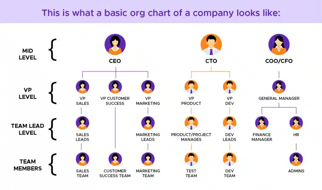
The Evolution of Organizational Charting
When I look back at how we used to create organizational charts, I'm amazed at how far we've come. For decades, creating org charts meant tedious manual work in tools like Visio or PowerPoint, resulting in static diagrams that were outdated almost as soon as they were published.
Traditional Challenges
- Time-consuming manual creation and maintenance
- Difficulty representing complex reporting relationships
- Static outputs that quickly become outdated
- Limited integration with other business systems
- Accessibility and distribution challenges
The AI Advantage
- Automated generation from existing data sources
- Real-time updates when underlying data changes
- Intelligent hierarchy detection and relationship mapping
- Dynamic filtering and visualization options
- Integration with HR and enterprise systems
The limitations of traditional Excel-based approaches have become increasingly apparent as organizations grow more complex and dynamic. Static org charts simply can't keep pace with modern business realities like matrix reporting structures, frequent reorganizations, and distributed teams.
Today, I'm seeing a fundamental shift from organizational charts as occasional deliverables to organizational visualization as an ongoing, data-driven capability. With AI-powered organizational chart tools, what was once a tedious administrative task is now becoming a strategic advantage, providing real-time insights into organizational structure and relationships.
Understanding the Excel-to-Org Chart Pipeline
Before diving into AI-powered solutions, I want to explore the foundation of any good org chart: properly structured data. Most organizations already store employee and organizational data in Excel spreadsheets, but not all data structures are equally suitable for visualization.
Essential Data Elements
| Data Element | Purpose | Format Recommendation |
|---|---|---|
| Employee ID | Unique identifier | Consistent alphanumeric format |
| Employee Name | Display on chart | First Name, Last Name in separate columns |
| Manager ID | Establish reporting relationship | Must match an existing Employee ID |
| Department | Organizational grouping | Consistent naming convention |
| Job Title | Role identification | Standardized across organization |
Data Preparation Best Practices
flowchart TD
    A[Raw Excel Data] --> B[Data Cleaning]
    B --> C[Structure Validation]
    C --> D[Hierarchy Verification]
    D --> E[Metadata Enhancement]
    E --> F[AI-Ready Dataset]
    subgraph "Common Issues"
    G[Missing Manager IDs]
    H[Inconsistent Naming]
    I[Duplicate Entries]
    J[Outdated Information]
    end
    G -.-> B
    H -.-> B
    I -.-> B
    J -.-> B
I've found that the most common data quality issues that impact visualization include:
- Circular references - Employees incorrectly listed as reporting to their subordinates
- Orphaned records - Employees without a valid manager ID
- Inconsistent formatting - Especially in department names and job titles
- Missing critical data - Such as department information or reporting lines
- Duplicate entries - Multiple records for the same employee
By addressing these issues before feeding your data into AI chart generators, you'll significantly improve the quality and accuracy of your resulting org charts. In my experience, investing time in data preparation pays enormous dividends in the visualization phase.
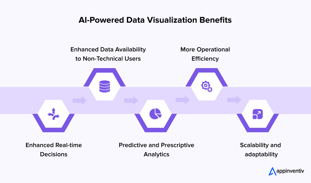
AI-Powered Org Chart Generation Fundamentals
Modern AI-powered org chart tools represent a fundamental leap beyond traditional visualization software. I'm continually impressed by how these systems can interpret complex organizational data and automatically generate meaningful visualizations.
Technology Comparison: Traditional vs. AI-Powered
Key AI Technologies at Work
Automatic Hierarchy Detection
AI algorithms analyze reporting relationships to automatically construct organizational hierarchies, even when data is incomplete. The system can infer missing relationships based on surrounding context and organizational patterns.
Natural Language Processing
Modern tools can extract organizational insights from unstructured data like job descriptions, emails, and project documentation. This allows for richer context in visualizations beyond what's explicitly defined in structured data.
Pattern Recognition
AI systems identify common organizational patterns and can suggest optimizations or highlight anomalies. For example, flagging unusually large spans of control or detecting potential matrix reporting relationships.
Adaptive Layout Algorithms
Rather than forcing rigid layouts, AI visualization tools can adapt to the specific characteristics of your organization, optimizing for clarity while accurately representing complex relationships.

What I find most impressive is how these systems can handle ambiguity. Traditional org chart tools require perfectly structured data, but AI tools for excel charts can make intelligent inferences about organizational relationships even when the data is incomplete or inconsistent.
The technology behind automatic hierarchy detection involves sophisticated graph theory algorithms that map relationships between employees, departments, and roles. These algorithms can identify not just direct reporting relationships but also functional relationships, project teams, and matrix structures that might not be explicitly defined in your Excel data.
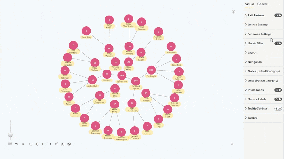
Advanced Features of AI Org Chart Tools
The most powerful AI-powered org chart solutions go far beyond simply displaying boxes and lines. They offer dynamic, interactive features that transform static organizational data into living, actionable insights.
flowchart LR
    Excel[(Excel Data)] --> Sync[Real-time Sync Engine]
    Sync --> Viz[Visualization Engine]
    Viz --> Views[Dynamic Views]
    Sync --> Rules[Conditional Rules Engine]
    Rules --> Viz
    HR[(HR Systems)] -.-> Sync
    Views --> F1[Department View]
    Views --> F2[Location View]
    Views --> F3[Custom Views]
    Viz --> AI[AI Blocks Module]
    AI --> M1[Skill Mapping]
    AI --> M2[Resource Allocation]
Standout Features
Real-time Synchronization
Modern AI tools maintain live connections to your Excel data sources, automatically updating visualizations whenever the underlying data changes. This ensures your org charts are never outdated and eliminates manual refresh processes.
Dynamic Filtering and Views
I've found this to be one of the most valuable features - the ability to instantly switch between different organizational perspectives. View by department, location, function, or create custom filters based on any data attribute to gain new insights into your organizational structure.
Conditional Formatting and Rules
Set up intelligent visualization rules that automatically apply different styles based on data attributes. For example, color-coding departments, highlighting positions with specific skills, or visually indicating tenure through icon size.
Enterprise System Integration
Advanced tools offer bidirectional integration with HR systems, project management tools, and other enterprise applications. This creates a unified organizational view that incorporates data from multiple sources.
PageOn.ai's AI Blocks feature is particularly powerful for organizational visualization. It enables modular building of complex organizational structures, allowing you to create custom visualization components that can be reused and reconfigured as your organization evolves.
With AI Blocks, I can quickly create specialized visualization modules for different aspects of the organization - from standard reporting hierarchies to project teams, skill clusters, and resource allocation views. These blocks can then be combined and reconfigured to answer specific organizational questions without rebuilding visualizations from scratch.
Implementing AI-Driven Org Charts: Step-by-Step Process
I've guided numerous organizations through the implementation of AI-powered org chart solutions, and I've developed a systematic approach that maximizes success while minimizing disruption.
Implementation Timeline
Detailed Implementation Steps
1. Excel Data Structure Setup
Start by organizing your Excel data with these essential columns:
- Employee ID (unique identifier)
- Employee Name (first and last in separate columns)
- Manager ID (must match an existing Employee ID)
- Department/Division
- Job Title/Role
- Location (if applicable)
- Additional attributes for filtering (skills, tenure, etc.)
2. Visualization Parameter Configuration
Configure how your organization will be visualized:
- Hierarchy depth display settings (how many levels to show)
- Node information display (what information appears in each box)
- Department grouping and color schemes
- Layout orientation (vertical, horizontal, radial)
- Relationship line styles (direct reports, matrix relationships)
3. Enhanced Information Integration
PageOn.ai's Deep Search feature can automatically enrich your org charts:
- Automatically locate and integrate employee photos from company directories
- Pull relevant biographical information from HR systems
- Integrate performance metrics and KPIs from business intelligence tools
- Connect project assignments from project management systems
4. Custom Views and Access Configuration
Create tailored views for different stakeholder groups:
- Executive view (high-level structure with key metrics)
- HR view (complete details with sensitive information)
- Manager view (focused on their department with team details)
- Employee view (public information only)
- Configure access permissions for each view
5. Visual Narrative Development
Use PageOn.ai's Vibe Creation to transform basic org data into compelling visual narratives:
- Apply consistent visual themes that reflect company branding
- Create interactive storytelling elements that highlight key organizational insights
- Develop visual indicators for strategic initiatives and transformation efforts
- Build custom visualization templates for different organizational scenarios
Through this implementation process, I've seen organizations transform their Excel-based org charts from static reference documents into dynamic strategic tools. The key is approaching implementation as an iterative process - start with core functionality, get feedback from key stakeholders, and continuously refine your visualization approach.
Beyond Basic Structure: Enhanced Visualization Capabilities
Modern AI-powered org chart tools offer visualization capabilities that go far beyond traditional boxes and lines. I've helped organizations leverage these advanced features to extract deeper insights from their organizational data.
Visualization Enhancement Impact
Metrics and KPI Integration
Modern visualization tools allow you to incorporate performance metrics and KPIs directly into org charts, creating a more complete picture of organizational health.
- Team performance indicators
- Headcount and budget allocation
- Project completion rates
- Customer satisfaction scores
- Visual indicators for under/over-staffing
Department-Based Visual Taxonomies
Color coding and visual taxonomies help make organizational patterns immediately apparent:
- Consistent color schemes for departments
- Icon systems for job functions
- Size variations to indicate team size or budget
- Border styles to indicate tenure or status
- Visual patterns to identify specialized teams
Geographic Distribution Mapping
For distributed and remote teams, geographic visualization adds crucial context:
- Interactive maps showing employee locations
- Time zone indicators for distributed teams
- Regional reporting structures
- Office and facility visualization
- Remote vs. in-office status indicators
Timeline and Evolution Features
Visualize organizational change over time:
- Historical organization snapshots
- Planned reorganization previews
- Growth and contraction patterns
- Merger and acquisition integration visualization
- Succession planning scenarios
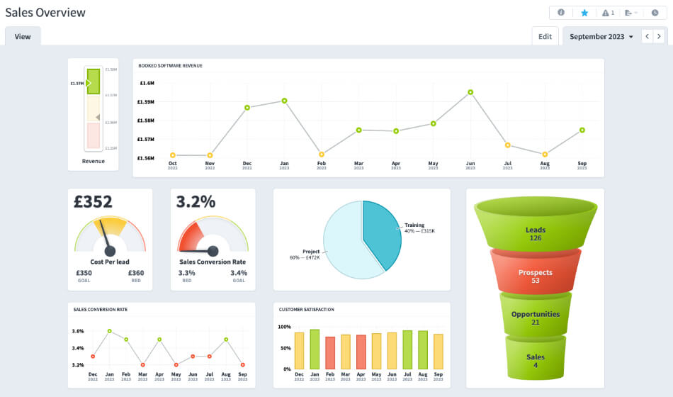
Using ai-powered bar chart generators alongside your org charts allows you to create supplementary visualizations that enhance understanding of organizational metrics. For example, you might generate bar charts showing departmental headcount, budget allocation, or performance metrics that complement your main organizational structure.
I've found that these enhanced visualization capabilities are particularly valuable during organizational transformation initiatives. They allow leaders to not just see the current state of the organization, but to model different scenarios, track progress over time, and communicate complex organizational concepts clearly to stakeholders.
Case Studies: Transformational Org Chart Implementation
I've had the privilege of working with organizations across various sectors to implement AI-powered org chart solutions. These case studies highlight the tangible benefits and transformative impact of modern organizational visualization.
Enterprise Reorganization: Global Technology Company
Challenge: Following a major acquisition, this company needed to merge two complex organizational structures while minimizing disruption and identifying redundancies.
Solution: Using AI-powered org chart tools, they created dynamic visualizations that allowed them to model different integration scenarios, identify overlapping roles, and plan a phased reorganization.
Results:
- Reduced reorganization planning time by 65%
- Identified 120+ redundant positions, saving $14M annually
- Created clear communication materials for all stakeholders
- Maintained 92% employee satisfaction during the transition
Small Business Growth: Digital Marketing Agency
Challenge: This fast-growing agency was adding 3-5 new team members monthly and struggling to maintain clear reporting structures and team assignments without dedicated HR resources.
Solution: Implemented an AI-powered org chart solution that automatically generated updated visualizations from their simple Excel roster, with minimal manual intervention.
Results:
- Reduced org chart maintenance from 8 hours monthly to 30 minutes
- Improved new hire onboarding with clear team visualizations
- Created client-facing team structures for project proposals
- Supported informed growth planning and resource allocation
Government Agency Transparency: Regional Healthcare Authority
Challenge: This public agency needed to improve transparency and communication about its organizational structure, both internally and to the public it serves.
Solution: Deployed an AI-powered visualization solution that created both detailed internal views and simplified public-facing organizational charts from the same data source.
Results:
- Created public-facing org charts with appropriate detail levels
- Reduced FOIA (Freedom of Information Act) requests by 40%
- Improved internal communication and cross-department collaboration
- Simplified reporting for oversight committees and governing bodies
These case studies demonstrate that the value of AI-powered org chart solutions extends far beyond administrative efficiency. When implemented thoughtfully, these tools become strategic assets that support better decision-making, improve communication, and enhance organizational agility.
Overcoming Common Challenges and Limitations
While AI-powered org chart tools offer tremendous benefits, I've encountered several common challenges when implementing these solutions. Here's how to address them effectively.
flowchart TD
    A[Common Challenges] --> B[Complex Reporting]
    A --> C[Data Privacy]
    A --> D[Data Accuracy]
    A --> E[Technical Limits]
    A --> F[User Adoption]
    B --> B1[Solution: Custom Relationship Types]
    C --> C1[Solution: Role-Based Access Controls]
    D --> D1[Solution: Automated Validation]
    E --> E1[Solution: Modular Visualization]
    F --> F1[Solution: Phased Implementation]
Challenge Solutions
Complex Reporting Relationships
Challenge: Matrix organizations, dotted-line reporting, and project-based teams don't fit neatly into traditional hierarchical structures.
Solution: Use visualization tools that support multiple relationship types and custom relationship definitions. PageOn.ai's AI Blocks feature is particularly effective for visualizing these complex structures by creating modular components that can be combined in different ways.
Sensitive Information Management
Challenge: Org charts often contain sensitive information that shouldn't be universally accessible.
Solution: Implement role-based access controls that show different levels of detail to different users. Create specific views for executives, managers, employees, and external stakeholders with appropriate information for each audience.
Data Accuracy and Timeliness
Challenge: Organizational data changes frequently, making it difficult to maintain accuracy.
Solution: Implement automated data validation rules and scheduled synchronization between source systems and visualization tools. Use AI to flag potential inconsistencies and anomalies for human review.
Technical Limitations
Challenge: Very large organizations can create performance issues with traditional visualization approaches.
Solution: Use visualization tools that support progressive loading, on-demand rendering, and efficient data handling. Implement modular visualization approaches that allow users to focus on relevant sections of the organization.
User Adoption
Challenge: New visualization tools require changes to established workflows and processes.
Solution: Implement a phased approach to adoption, starting with key stakeholders and gradually expanding. Provide targeted training that focuses on specific use cases relevant to each user group. Create quick reference guides and video tutorials to support self-service learning.
In my experience, addressing these challenges proactively as part of your implementation plan is crucial for success. By anticipating common obstacles and having solutions ready, you can ensure a smooth transition to AI-powered organizational visualization.
Future Trends in AI-Powered Organizational Visualization
The field of organizational visualization is evolving rapidly, with several exciting trends emerging that will further transform how we understand and interact with organizational structures.
Technology Adoption Timeline
Predictive Analytics for Organizational Planning
Future AI tools will move beyond showing what the organization looks like today to predicting how it might evolve. These predictive capabilities will help leaders model different organizational scenarios, identify potential bottlenecks, and optimize structures before implementing changes.
Performance Data and Talent Management Integration
The next generation of visualization tools will seamlessly integrate performance metrics, skills data, and talent management insights. This will enable leaders to not just see organizational structure, but to understand capability distribution, identify skill gaps, and make more informed talent decisions.
Advanced Natural Language Capabilities
The ability to create charts from text instructions will become increasingly sophisticated. Users will be able to request complex visualizations using natural language queries like "Show me all marketing teams with more than 10 members across our European offices" and instantly receive the appropriate visualization.
Organizational Digital Twins
Organizations will create comprehensive digital twins that represent not just reporting structures, but workflow patterns, communication networks, collaboration relationships, and resource flows. These digital twins will serve as living models of the organization that can be analyzed and optimized.
PageOn.ai's Agentic Capabilities
Perhaps most exciting is the evolution from descriptive to prescriptive organizational visualization. PageOn.ai's emerging Agentic capabilities will allow the system to not just visualize the organization, but to actively suggest optimizations, identify potential risks, and recommend structural improvements based on organizational goals and industry best practices.

These advancements will transform organizational visualization from a static representation tool to a dynamic strategic partner in organizational design and management. The organizations that embrace these capabilities early will gain significant competitive advantages in organizational agility and effectiveness.
Getting Started: Implementation Roadmap
Ready to transform your Excel-based org charts into dynamic, AI-powered visualizations? Here's a practical roadmap to get you started on your journey.
Assessing Your Current State
Data Readiness Assessment Checklist
Solution Selection Criteria
flowchart LR
    A[Selection Criteria] --> B[Data Integration]
    A --> C[Visualization Features]
    A --> D[Scalability]
    A --> E[User Experience]
    A --> F[Security & Privacy]
    B --> B1[Excel Import]
    B --> B2[API Access]
    B --> B3[Real-time Sync]
    C --> C1[Hierarchy Types]
    C --> C2[Custom Views]
    C --> C3[Filtering Options]
    D --> D1[Organization Size]
    D --> D2[Performance]
    E --> E1[Ease of Use]
    E --> E2[Mobile Access]
    F --> F1[Access Controls]
    F --> F2[Data Protection]
Pilot Project Planning
1. Start with a Defined Scope
Begin with a single department or business unit rather than the entire organization. This allows you to refine your approach with lower risk and demonstrate value quickly.
2. Identify Key Stakeholders
Engage representatives from HR, IT, leadership, and end users. Their diverse perspectives will ensure your implementation addresses varied needs and use cases.
3. Define Success Metrics
Establish clear KPIs to measure the impact of your new visualization approach, such as time saved in chart creation, user adoption rates, or stakeholder satisfaction scores.
4. Create an Implementation Timeline
Develop a realistic schedule that includes data preparation, tool configuration, testing, stakeholder reviews, and rollout phases.
5. Plan for Feedback and Iteration
Build in formal feedback mechanisms and scheduled review points to continuously improve your implementation based on user experience.
The key to successful implementation is taking an iterative approach. Start small, learn from early experiences, and gradually expand your use of AI-powered visualization tools as you build confidence and demonstrate value.
PageOn.ai is uniquely positioned to help you transform your fuzzy organizational concepts into clear, actionable visualizations. With its intuitive interface, powerful AI capabilities, and flexible visualization options, it provides an ideal platform for organizations looking to move beyond static Excel-based org charts to dynamic, insightful organizational visualization.
Transform Your Visual Expressions with PageOn.ai
Ready to revolutionize how you visualize your organization? PageOn.ai's powerful AI tools can transform your Excel data into dynamic, insightful org charts that drive strategic decision-making.
Start Creating with PageOn.ai TodayYou Might Also Like
The Creative Edge: Harnessing Templates and Icons for Impactful Visual Design
Discover how to leverage the power of templates and icons in design to boost creativity, not restrict it. Learn best practices for iconic communication and template customization.
Advanced Shape Effects for Professional Slide Design | Transform Your Presentations
Discover professional slide design techniques using advanced shape effects. Learn strategic implementation, customization, and optimization to create stunning presentations that engage audiences.
Revolutionizing Slides: The Power of AI Presentation Tools | PageOn.ai
Discover how AI presentation tools are transforming slide creation, saving hours of work while enhancing design quality. Learn how PageOn.ai can help visualize your ideas instantly.
The Strategic GIF Guide: Creating Memorable Moments in Professional Presentations
Discover how to effectively use GIFs in professional presentations to create visual impact, enhance audience engagement, and communicate complex concepts more memorably.