Transform CSV Data into Professional Charts: From Raw Numbers to Visual Insights
Unlock the hidden potential of your spreadsheet data with AI-powered visualization
I've spent years working with data visualization tools, and I'm excited to share how you can transform ordinary CSV files into extraordinary visual insights using simple prompts. In this guide, we'll explore everything from preparing your data to crafting effective prompts and creating professional charts that tell compelling stories.
Understanding the Power of CSV-to-Chart Transformation
I've always believed that the true value of data lies not in the numbers themselves, but in the insights they reveal when properly visualized. CSV files are everywhere in our professional lives—they're the backbone of data storage across industries—yet so many of us struggle to extract meaningful stories from these rows and columns.
When I first started working with data, I spent countless hours manually creating charts in spreadsheet software. The process was tedious, error-prone, and often resulted in visualizations that failed to communicate the key insights hidden within my data.
The challenges for non-technical users are particularly significant:
- Overwhelm when facing large datasets
- Uncertainty about which chart type best represents specific data relationships
- Limited design skills to create professional-looking visualizations
- Time constraints that make manual chart creation impractical
Today, we're witnessing a revolution in how we approach data visualization. AI chart generators have fundamentally changed this landscape. Instead of requiring technical expertise in programming or design, these tools allow us to simply describe what we want to see in natural language.
The power shift: We've moved from "How do I program this visualization?" to "Show me a comparison of quarterly sales by region as a stacked bar chart with our brand colors."
This shift from complex charting software to prompt-based visualization democratizes data insights, making them accessible to everyone from marketing specialists to financial analysts to educators—regardless of their technical background.
Getting Started: Preparing Your CSV Data for Visualization
In my experience, the quality of your visualization is directly tied to how well your data is prepared. Before we can create stunning charts, we need to ensure our CSV files are properly structured.
Essential Formatting Practices
// Good CSV Structure Example
Date,Region,Sales,Units
2023-01-01,North,12500,125
2023-01-01,South,9800,98
2023-01-01,East,15200,152
2023-01-01,West,11300,113
- Clear headers: Use descriptive column names without spaces (use CamelCase or underscores)
- Consistent formatting: Ensure dates, numbers, and text follow consistent patterns
- Remove unnecessary columns: Only include data relevant to your visualization
- Handle missing values: Either remove rows with missing data or fill with appropriate placeholders
- Check for outliers: Identify and decide how to handle extreme values that might skew visualizations
Common CSV Issues That Affect Chart Quality
When I'm identifying which data points will create the most impactful visualizations, I ask myself these questions:
- What's the primary insight I want viewers to take away?
- Which variables show the most interesting relationships?
- Is there a time component that would benefit from a trend visualization?
- Are there comparative elements that would be clearer in visual form?
- What contextual information is needed for proper interpretation?
By investing time in proper data preparation, you'll significantly improve the quality of your visualizations and reduce the need for revisions later in the process. Remember, AI tools for excel charts can help streamline this process, but they still benefit from well-structured input data.
Crafting Effective Prompts for Chart Generation
I've found that the art of writing effective prompts is what separates basic charts from truly insightful visualizations. When working with AI create charts from text systems, your instructions are the blueprint for success.

Key Elements of a Successful Chart Generation Prompt
flowchart TD
    A[Effective Prompt] --> B[Data Source]
    A --> C[Chart Type]
    A --> D[Visual Elements]
    A --> E[Insight Focus]
    B --> B1[CSV file path/name]
    B --> B2[Specific columns to use]
    C --> C1[Bar, Line, Pie, etc.]
    C --> C2[Orientation/style variants]
    D --> D1[Color scheme]
    D --> D2[Title and labels]
    D --> D3[Legend position]
    E --> E1[Trend highlighting]
    E --> E2[Comparison emphasis]
    E --> E3[Threshold indicators]
Prompt Pattern Examples
Basic Chart Request:
"Create a bar chart from sales_data.csv showing monthly revenue for 2023."
Intermediate Chart Request:
"Generate a horizontal bar chart from sales_data.csv comparing Q1 sales across regions. Use the company color palette (blue: #1A5276, green: #117A65, orange: #D35400)."
Advanced Chart Request:
"Create a stacked area chart from customer_data.csv showing customer acquisition by channel over time. Highlight the period between March-June when we ran the special promotion. Include annotations for key marketing events and use a soft color gradient that emphasizes our highest performing channel."
When specifying chart types and styling through natural language, I've learned to be as specific as possible about visual preferences while leaving room for the AI to optimize based on the data characteristics.
For example, instead of just requesting "a chart showing sales data," I might say:
"Create a line chart from quarterly_results.csv showing the trend in customer acquisition costs against revenue growth from 2020-2023. Use a dual y-axis with CAC on the left and revenue on the right. Highlight quarters where CAC decreased while revenue increased with green data points."
This level of specificity helps the AI understand exactly what insights you want to highlight in your visualization, resulting in charts that are not just visually appealing but also analytically valuable.
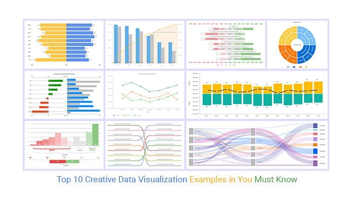
Chart Types and Their Ideal Use Cases
Selecting the right chart type is crucial for effectively communicating your data story. I've spent years experimenting with different data visualization charts, and I've found that matching the chart to your specific insight goal is key.
Chart Type Selection Guide
Bar Charts
Best for comparing values across categories.
- Use vertical bars when category names are short
- Use horizontal bars for longer category names
- Stacked bars show composition within categories
- Grouped bars excel at multi-variable comparisons
Line Charts
Ideal for showing trends over time and continuous data.
- Single lines for clear trend visibility
- Multiple lines to compare different variables over time
- Area charts emphasize volume and cumulative values
- Stepped lines for data with distinct changes
Pie & Donut Charts
Effective for showing composition and part-to-whole relationships.
- Limit to 6-7 slices for readability
- Order slices from largest to smallest
- Use donut charts when you need space for a central metric
- Consider alternatives when differences are subtle
Advanced Visualizations
For multi-dimensional data and complex relationships.
- Scatter plots for correlation analysis
- Bubble charts to add a third dimension
- Radar/spider charts for multivariate comparison
- Heatmaps for density and distribution patterns
One of the most powerful features I've discovered is the ability to combine multiple chart types into cohesive dashboards. Using PageOn.ai's AI Blocks, I can create visual narratives that guide viewers through complex data stories.
For example, I might use a line chart to show the overall trend, bar charts to break down key components, and a pie chart to show composition—all working together to provide a complete picture of the data landscape.
Enhancing Charts with Professional Design Elements
In my experience, the difference between an average chart and a professional visualization often comes down to thoughtful design elements that provide context and visual appeal.
Essential Context Elements
- Descriptive titles: Go beyond labeling what the chart is—explain what it shows. For example, instead of "Sales by Region," use "Western Region Leads Q3 Sales with 34% Growth."
- Subtitles: Add context about time periods, data sources, or methodology.
- Annotations: Highlight key data points, anomalies, or important thresholds directly on the chart.
- Axis labels: Ensure axes are clearly labeled with units where appropriate.
- Data source: Include a small attribution to maintain credibility.
Color Psychology in Data Visualization
When incorporating branding elements into charts, I follow these principles to ensure data clarity remains the priority:
- Use brand colors for primary data series, but adjust saturation/brightness for readability
- Apply brand typography only if it's highly readable (consider sans-serif for data-heavy charts)
- Include subtle brand elements like small logos in the corner or branded color bands for targets
- Maintain white space—avoid cluttering the visualization with excessive branding
- Create a consistent visual language across all company charts for recognition
PageOn.ai's Deep Search feature has been invaluable for finding complementary visual elements that enhance my data stories. Whether I need icons that represent industry-specific concepts or background patterns that subtly reinforce the data theme, having an AI-powered design assistant helps maintain professional quality across all my visualizations.
From Static to Interactive: Adding Engagement to Your Charts
I've found that interactive charts dramatically increase engagement and understanding. When viewers can explore data on their own terms, insights become more meaningful and memorable.

Techniques for Layering Information
flowchart TD
    A[Interactive Chart] --> B[Base Layer]
    A --> C[Interactive Layer]
    A --> D[Detail Layer]
    B --> B1[Core visualization]
    B --> B2[Essential labels]
    B --> B3[Primary metrics]
    C --> C1[Hover effects]
    C --> C2[Click actions]
    C --> C3[Filters/controls]
    D --> D1[Tooltips]
    D --> D2[Drilldown views]
    D --> D3[Contextual info]
When designing interactive elements, I follow a progressive disclosure approach:
Layer 1: At-a-glance
What viewers see immediately without any interaction. This should communicate the main insight clearly.
Layer 2: Exploration
Information revealed through simple interactions like hovering or clicking, providing additional context.
Layer 3: Deep Dive
Detailed analysis available through deliberate actions like filtering, selecting comparison views, or accessing related data.
Creating drill-down capabilities allows viewers to move from summary information to granular details without overwhelming them with everything at once. For example, a regional sales chart might:
- Start with total sales by region (Layer 1)
- Reveal product category breakdowns on hover (Layer 2)
- Allow clicking to see detailed product performance with time trends (Layer 3)
What I appreciate most about PageOn.ai's conversational interface is how it enables rapid iteration of interactive features. I can simply describe the interaction I want to add, and the system helps me implement it without requiring technical expertise in JavaScript or other programming languages. This democratizes the creation of sophisticated interactive visualizations that were once the domain of specialized developers.
Real-World Applications and Success Stories
I've seen CSV-to-chart transformations revolutionize workflows across various industries. Let me share some real-world examples that demonstrate the power of this approach.
Marketing Team Transformation
A digital marketing team I worked with was drowning in campaign data spread across multiple CSV exports from different platforms. Their monthly reporting process took nearly three days to complete and resulted in basic charts that failed to communicate the strategic insights hidden in their data.
By implementing an AI-powered CSV-to-chart workflow, they transformed their process:
- Consolidated campaign data from multiple sources into standardized CSV formats
- Created template prompts for their most common visualization needs
- Built interactive dashboards that automatically updated with fresh data
- Added annotation layers highlighting key performance indicators
The result? Reporting time dropped from three days to three hours, and the quality of insights dramatically improved. Campaign performance became immediately visible, allowing for faster optimization decisions.
Financial Reporting Revolution
A finance department at a mid-sized manufacturing company struggled with creating executive-ready visualizations from their complex financial data. Their spreadsheets were comprehensive but difficult for non-financial stakeholders to interpret.
Using ai-powered bar chart generators and other visualization tools, they created:
- Executive dashboards showing key financial metrics with appropriate context
- Variance analysis visualizations that highlighted deviations from forecasts
- Cash flow projections with interactive scenarios
- Department-specific performance charts that non-financial managers could understand
This transformation improved decision-making speed by 40% and increased engagement in financial reviews across all departments.
Educational Context: Making Data Accessible
An educational researcher I collaborated with was studying learning patterns across different teaching methodologies. The raw data was comprehensive but difficult to interpret without visualization.
By transforming their CSV data into interactive visualizations, they were able to:
- Show learning progress rates across different methodologies
- Identify which approaches worked best for different subject areas
- Create visual materials that helped teachers understand the research findings
- Develop interactive tools that allowed educators to explore the data themselves
The visualized data not only enhanced the research paper but also led to practical applications in classrooms, demonstrating how effective data visualization can bridge the gap between research and practice.
Best Practices for Sharing and Presenting Your Charts
Creating beautiful charts is only half the battle—I've learned that how you share and present them significantly impacts their effectiveness and influence.

Export Options for Different Contexts
| Format | Best For | Advantages | Limitations |
|---|---|---|---|
| PNG | Presentations, reports, social media | High quality, preserves transparency | Static, not interactive |
| SVG | Web content, scalable needs | Scales without quality loss, small file size | Less support in some applications |
| Print materials, formal documents | Professional, preserves exact formatting | No interactivity, larger file size | |
| Interactive HTML | Dashboards, websites, in-depth analysis | Full interactivity, real-time updates possible | Requires web environment, more complex to share |
When embedding charts in different media, I consider these best practices:
Documents
- Include explanatory text near the chart
- Consider page breaks and readability when sizing
- Use high-resolution exports (300dpi+)
- Place charts immediately after their first reference
Presentations
- One key insight per slide
- Simplify charts for presentation context
- Use builds/animations to guide focus
- Include presenter notes with talking points
Web Pages
- Ensure mobile responsiveness
- Consider loading performance
- Add accessibility features (alt text, ARIA)
- Include interactive elements where valuable
Creating chart narratives has been one of the most valuable skills I've developed. Rather than presenting isolated visualizations, I structure them to tell a coherent story:
- Set the context - Establish what question the chart answers and why it matters
- Guide the eye - Use visual cues to direct attention to key insights
- Reveal insights progressively - Move from overview to specific details
- Connect to action - Link the visual insights to decisions or next steps
PageOn.ai has been particularly helpful for generating presentation-ready assets that maintain visual consistency while adapting to different contexts. I can create a chart once and then export it in multiple formats optimized for various presentation scenarios, saving significant time while ensuring professional quality.
Advanced Techniques for Data Storytelling
Throughout my career, I've discovered that the most influential data visualizations aren't just technically accurate—they tell compelling stories that drive understanding and action.

Moving beyond single charts to create cohesive data narratives requires thoughtful planning. I structure my approach around these core principles:
Data Narrative Framework
flowchart LR
    A[Establish Context] --> B[Present Current State]
    B --> C[Reveal Insight/Problem]
    C --> D[Explore Implications]
    D --> E[Propose Action]
    style A fill:#FFE5CC,stroke:#FF8000
    style B fill:#FFD699,stroke:#FF8000
    style C fill:#FFC266,stroke:#FF8000
    style D fill:#FFAD33,stroke:#FF8000
    style E fill:#FF9900,stroke:#FF8000
When highlighting key insights, I've found these techniques particularly effective:
Visual Emphasis Techniques
- Use color strategically to highlight key data points while muting less relevant information
- Apply annotation layers that explain significance directly on the visualization
- Incorporate visual reference lines for benchmarks, goals, or thresholds
- Use size contrast to emphasize important elements (make key data points larger)
- Create "small multiples" to show patterns across different segments
Narrative Techniques
- Frame visualizations with compelling questions that pique curiosity
- Use sequential revelation to build understanding step by step
- Incorporate relevant context that helps interpret the data properly
- Create contrast between expectation and reality to highlight surprising findings
- Connect data points to human impact or business outcomes
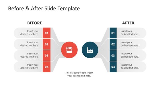
Before/After Visualization Impact
Creating before/after comparisons has been one of my most effective storytelling techniques. These visualizations:
- Make change tangible and immediately apparent
- Create emotional impact by showing progress (or regression)
- Help establish causality when paired with intervention timelines
- Provide natural entry points for discussing contributing factors
PageOn.ai's Vibe Creation feature has transformed how I approach data storytelling. By defining the emotional and intellectual response I want to evoke, I can generate visualizations that are not just accurate but resonant. Whether I need to create urgency around declining metrics or celebrate improvement trends, the ability to align the visual tone with the narrative purpose ensures my data tells a compelling, accurate story.
Future of Prompt-Based Data Visualization
As someone who's witnessed the evolution of data visualization tools over the years, I'm fascinated by the emerging trends in AI-assisted chart creation and what they mean for the future of our field.
Emerging Trends
- Multimodal inputs: Beyond text prompts, we're seeing systems that can generate visualizations from spoken instructions, sketches, or even by analyzing existing documents.
- Contextual awareness: AI systems are becoming better at understanding the broader context of data, suggesting visualizations that account for industry standards, audience expertise, and communication goals.
- Automated insights: Rather than just visualizing what you ask for, systems now proactively identify patterns and anomalies worth highlighting.
- Personalized visualization: Adapting charts based on viewer preferences, accessibility needs, and consumption context.
- Collaborative creation: Enabling multiple stakeholders to co-create and refine visualizations through natural language conversations.

Natural language processing is fundamentally changing the data visualization landscape in several key ways:
Democratization of Data
The ability to request visualizations in natural language removes technical barriers, allowing anyone to create professional charts without specialized skills.
This shift is particularly impactful for subject matter experts who understand their data deeply but lack technical visualization skills.
Iterative Refinement
Conversational interfaces enable rapid exploration of different visualization options through simple requests like "show this as a line chart instead" or "highlight the top three performers."
This iterative process leads to better final visualizations as users can quickly test different approaches.
Predicted Growth in Prompt-Based Visualization
Looking ahead, I expect CSV-to-chart workflows to evolve in these directions:
- Integration with real-time data streams for continuously updating visualizations
- Enhanced predictive capabilities that suggest not just how to visualize current data, but what future trends might look like
- Cross-platform experiences that maintain consistency whether viewed on mobile, desktop, or mixed reality environments
- Deeper customization through more nuanced natural language understanding
- Collaborative features that allow teams to build on each other's visualization work through conversation
PageOn.ai continues to innovate in making data visualization more accessible through features like automated data cleaning, intelligent chart recommendations, and natural language querying of visual data. As these capabilities advance, I believe we'll see a fundamental shift in who creates visualizations and how they're used across organizations—moving from specialized roles to universal data literacy expressed through natural conversation with AI systems.
Transform Your Visual Expressions with PageOn.ai
Ready to turn your CSV data into stunning, professional charts that tell compelling stories? PageOn.ai's intuitive prompt-based visualization tools make it easy to create beautiful, insightful visualizations without technical expertise.
Conclusion: Your Data Visualization Journey
Throughout this guide, we've explored how to transform raw CSV data into professional charts that tell compelling stories. From preparing your data and crafting effective prompts to selecting the right chart types and adding interactive elements, I've shared the techniques that have helped me create impactful visualizations.
The power of prompt-based visualization lies in its accessibility. You don't need to be a data scientist or designer to create professional charts—you just need to know how to ask for what you want. As AI tools continue to evolve, the gap between your vision and the final visualization will continue to narrow.
I encourage you to experiment with these approaches in your own work. Start with simple visualizations, refine your prompts based on the results, and gradually build more complex data stories. Remember that effective data visualization is an iterative process—each chart you create helps you better understand both your data and how to communicate its insights effectively.
You Might Also Like
The Creative Edge: Harnessing Templates and Icons for Impactful Visual Design
Discover how to leverage the power of templates and icons in design to boost creativity, not restrict it. Learn best practices for iconic communication and template customization.
Advanced Shape Effects for Professional Slide Design | Transform Your Presentations
Discover professional slide design techniques using advanced shape effects. Learn strategic implementation, customization, and optimization to create stunning presentations that engage audiences.
Building New Slides from Prompts in Seconds | AI-Powered Presentation Creation
Discover how to create professional presentations instantly using AI prompts. Learn techniques for crafting perfect prompts that generate stunning slides without design skills.
The Art of Data Storytelling: Creating Infographics That Captivate and Inform
Discover how to transform complex data into visually compelling narratives through effective infographic design. Learn essential techniques for enhancing data storytelling with visual appeal.