Transforming Data Into Actionable Insights: The Power of Automated Dashboard Generation
The Evolution of Data Visualization in Professional Reporting
I've witnessed firsthand how the landscape of data reporting has transformed dramatically over the years. Today, I'm excited to explore how automated dashboard generation is revolutionizing the way we visualize and interpret complex data, turning information overload into clear, actionable insights that drive smarter business decisions.
The Evolution of Data Visualization in Professional Reporting
I remember when business reporting meant static spreadsheets and basic charts printed on paper. Today, we've witnessed a remarkable transformation from these rigid formats to dynamic, automated dashboards that provide real-time insights. This evolution represents one of the most significant shifts in how businesses understand and leverage their data.
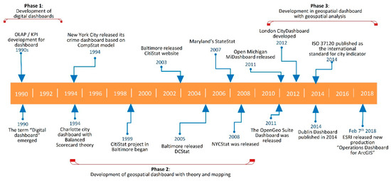
The transformation of business reporting over the decades
The journey from spreadsheets to sophisticated visual analytics hasn't been linear. Each advancement has addressed specific limitations of previous approaches. Modern automated dashboards solve what I consider the most persistent challenge in business intelligence: translating complex data into narratives that drive action.
Today's business leaders face unprecedented volumes of data. Without effective visualization tools, valuable insights remain buried in spreadsheets and databases. This is where AI-powered solutions are democratizing data visualization, making powerful analytical capabilities accessible to team members regardless of their technical expertise.
The Impact of Automated Dashboards Across Industries
I've observed how automated dashboard generation is fundamentally changing decision-making processes. Organizations that embrace these technologies gain competitive advantages through faster insights, reduced reporting overhead, and more agile responses to market changes. The democratization of these tools means that insights are no longer confined to data science teams but are accessible throughout organizations.
Core Components of Effective Automated Dashboards
In my experience designing dashboards for various stakeholders, I've found that effective automated dashboards share certain fundamental elements. These components work together to transform raw data into meaningful narratives that drive action.
Essential Dashboard Components
                    flowchart TD
                        A[Raw Data Sources] --> B[Data Processing Layer]
                        B --> C[Visualization Engine]
                        C --> D[Interactive Interface]
                        D --> E[User Experience]
                        subgraph "Core Visual Elements"
                            F[KPI Cards]
                            G[Time Series Charts]
                            H[Comparative Visualizations]
                            I[Geospatial Maps]
                            J[Relationship Diagrams]
                        end
                        C --> F
                        C --> G
                        C --> H
                        C --> I
                        C --> J
                        K[User Customization] --> C
                        L[AI-Powered Suggestions] --> C
                        M[Accessibility Features] --> D
The most effective dashboards I've developed strike a careful balance between automation and customization. While automation streamlines the generation process, customization ensures the dashboard meets specific stakeholder needs. Different audiences—executives, managers, analysts—require different levels of detail and interaction capabilities.
Key Performance Indicators (KPIs) Selection
I always emphasize that KPI selection is perhaps the most critical aspect of dashboard design. The right metrics create focus on what truly matters, while poor choices can mislead or distract. An effective dashboard establishes a clear visual hierarchy that guides users from high-level insights to detailed analysis.
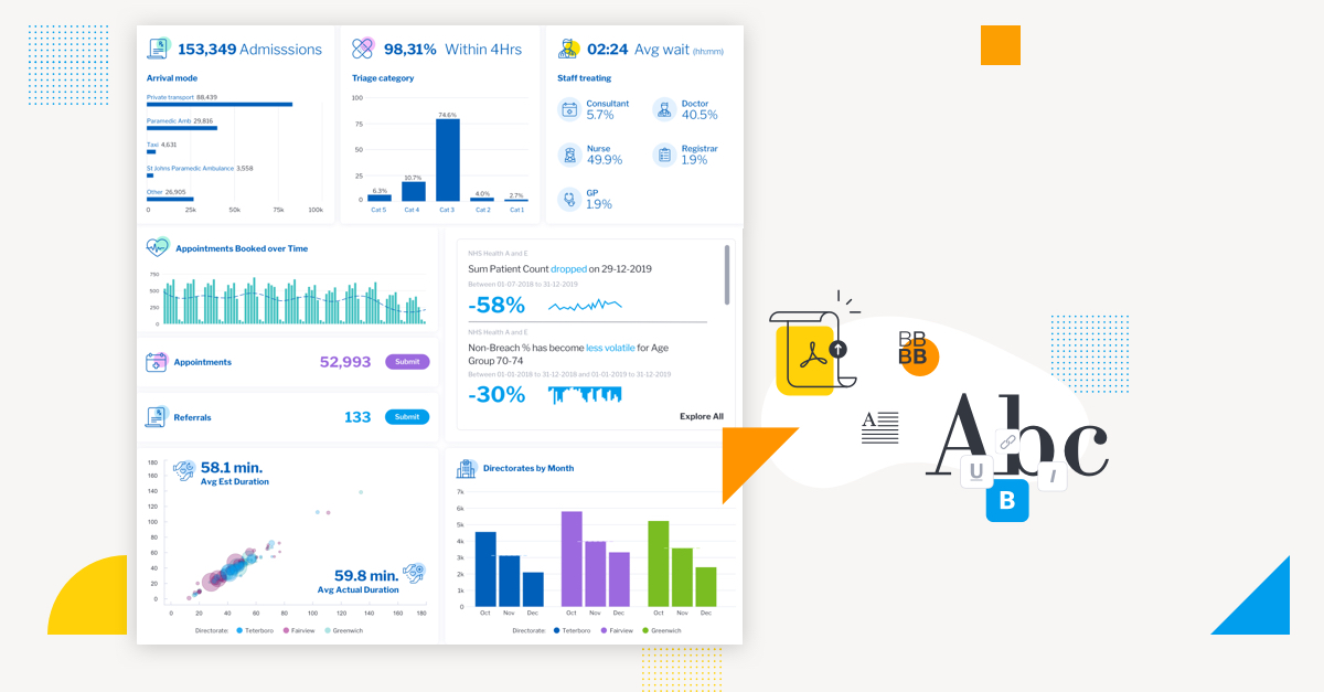
Visual hierarchy of KPIs in effective dashboard design
Interactive Elements for Data Exploration
What transforms a static report into a powerful analytical tool are the interactive visualizations for data exploration. These elements—filters, drill-downs, hover states—allow users to engage with data dynamically, following their analytical curiosity to discover insights that might otherwise remain hidden.
Integration Capabilities
Modern automated dashboards must connect seamlessly with diverse data sources—from traditional databases to cloud applications, IoT devices, and unstructured data repositories. This integration capability determines how comprehensive and current the dashboard insights will be.
Accessibility Considerations
I've learned that truly effective dashboards consider accessibility from the start. This means color schemes that work for colorblind users, keyboard navigation options, screen reader compatibility, and clear information hierarchy. Universal design principles ensure insights are available to all stakeholders, regardless of ability.
Dashboard Component Importance by User Role
Technical Architecture Behind Automated Dashboard Systems
Understanding the technical foundation of automated dashboard systems has been crucial in my work developing effective visualization solutions. The architecture supporting these systems is sophisticated yet increasingly accessible thanks to modern tools.
Data Pipeline for Automated Dashboard Generation
                    flowchart TB
                        DS1[(Database)] --> ETL[ETL Processes]
                        DS2[(API Sources)] --> ETL
                        DS3[(Unstructured Data)] --> ETL
                        ETL --> DW[(Data Warehouse)]
                        DW --> DP[Data Processing]
                        DP --> ML[Machine Learning Layer]
                        DP --> VE[Visualization Engine]
                        ML --> VE
                        VE --> UI[User Interface]
                        UI --> END[End User]
                        subgraph "Real-time Updates"
                            RT[Real-time Data] --> Stream[Stream Processing]
                            Stream --> VE
                        end
The data pipeline forms the backbone of any automated dashboard system. Modern pipelines must handle both batch processing for historical analysis and stream processing for real-time updates. This hybrid approach ensures dashboards remain current while maintaining historical context.
Behind the scenes, several backend systems work in concert to power automated visualization:
- Data extraction and transformation services that clean and prepare raw data
- Storage solutions optimized for analytical queries
- Caching mechanisms that improve dashboard performance
- Rendering engines that generate visualizations based on data characteristics
- Security layers that manage access controls and data governance
AI Algorithms for Visualization
What truly excites me about modern dashboard systems is how AI algorithms are transforming unstructured data into structured visual narratives. These algorithms can:
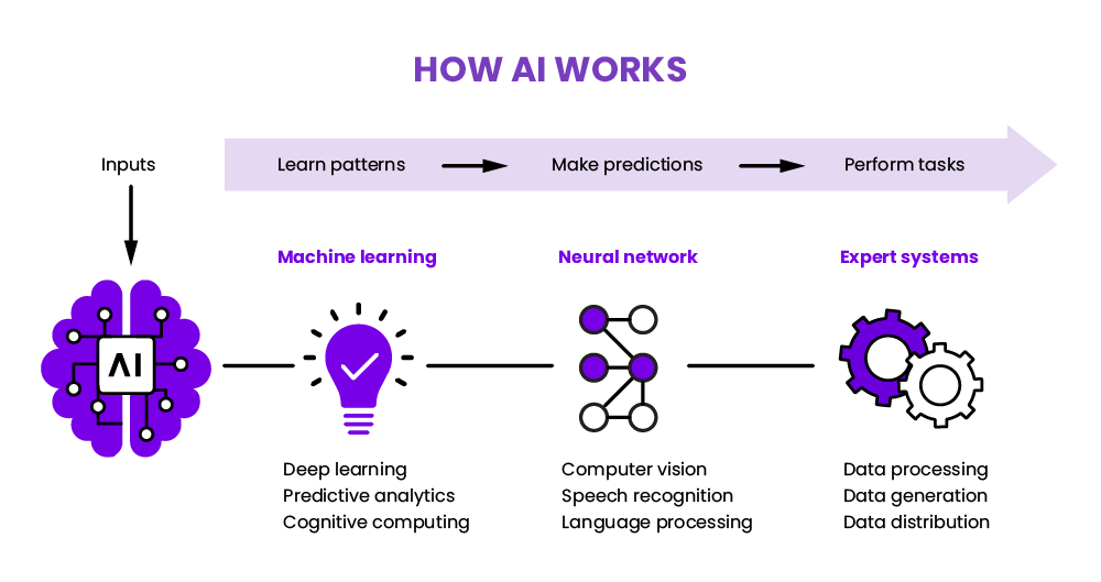
How AI transforms raw data into visual recommendations
- Identify patterns and correlations that might escape human analysts
- Suggest optimal visualization types based on data characteristics
- Automatically highlight anomalies and outliers
- Generate natural language summaries of visual insights
- Learn from user interactions to improve future recommendations
Natural Language Processing
One of the most powerful developments I've witnessed is the application of natural language processing (NLP) to dashboard creation. Modern systems can interpret plain language requests like "Show me sales trends by region for the past quarter" and automatically generate appropriate visualizations.
No-Code Dashboard Creation
The democratization of dashboard creation through drag-and-drop interfaces and AI Blocks has been revolutionary. These tools enable business users to create sophisticated visualizations without writing code, dramatically accelerating the insight-to-action cycle.
Integration with Existing BI Infrastructure
For many organizations I've worked with, the ability to integrate new dashboard solutions with existing business intelligence investments is crucial. Modern automated dashboard systems offer robust APIs and connectors that enable seamless integration with legacy systems, data lakes, and specialized analytical tools.
Technical Components Performance Impact
From Data to Decision: Implementing Effective Dashboard Strategies
Throughout my career implementing dashboard solutions, I've found that successful strategies begin not with technology selection but with clearly identifying the business questions that require visual answers. This question-first approach ensures dashboards deliver meaningful insights rather than just attractive visuals.
Mapping Data Storytelling to Business Objectives
Every effective dashboard tells a story that connects directly to specific organizational objectives. I work with stakeholders to map visualization techniques to their strategic goals, whether that's improving operational efficiency, identifying market opportunities, or optimizing resource allocation.
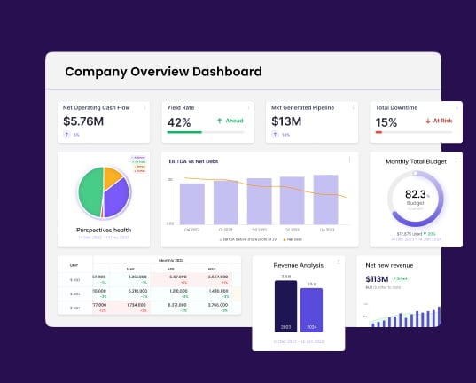
Strategic dashboard framework aligned with business objectives
Creating Dashboard Hierarchies
One strategy I've found particularly effective is developing dashboard hierarchies tailored to different organizational levels:
| Dashboard Level | Primary Audience | Key Characteristics | Update Frequency |
|---|---|---|---|
| Strategic | C-Suite, Board | High-level KPIs, trends, forecasts | Monthly/Quarterly |
| Tactical | Department Heads | Department metrics, resource allocation | Weekly |
| Operational | Team Managers | Detailed performance, bottlenecks | Daily |
| Analytical | Analysts, Specialists | Deep-dive capabilities, raw data access | Real-time/On-demand |
Implementation Roadmap
Based on my implementation experience, I recommend a phased approach to dashboard automation:
Dashboard Implementation Roadmap
                    flowchart LR
                        A[Assessment] --> B[Pilot Project]
                        B --> C[Infrastructure Setup]
                        C --> D[Data Integration]
                        D --> E[Dashboard Design]
                        E --> F[User Testing]
                        F --> G[Deployment]
                        G --> H[Training]
                        H --> I[Expansion]
                        I --> J[Continuous Improvement]
                        style A fill:#FF8000,color:white
                        style B fill:#FF9933,color:white
                        style C fill:#FFB366,color:black
                        style D fill:#FFCC99,color:black
                        style E fill:#FFE5CC,color:black
                        style F fill:#FFE5CC,color:black
                        style G fill:#FFCC99,color:black
                        style H fill:#FFB366,color:black
                        style I fill:#FF9933,color:white
                        style J fill:#FF8000,color:white
Change Management Considerations
I've learned that technical implementation is only half the battle. Successful dashboard adoption requires thoughtful change management that addresses cultural resistance, provides adequate training, and demonstrates clear value to all stakeholders. Executive sponsorship and identifying internal champions are particularly crucial success factors.
Measuring Dashboard Effectiveness
To ensure continuous improvement, I establish clear metrics for dashboard effectiveness:
- Usage statistics (active users, session duration, feature utilization)
- Time savings compared to previous reporting methods
- Decision velocity (time from data availability to action)
- User satisfaction scores
- Measurable business outcomes tied to dashboard insights
Dashboard Adoption Success Factors
Interactive Visualization Techniques That Drive Engagement
In my experience, the difference between dashboards that gather dust and those that become indispensable tools lies in their interactivity. When users can actively explore data rather than passively consume it, engagement and insight discovery increase dramatically.
Advanced Filtering and Drill-Down
I've found that sophisticated filtering options transform static dashboards into dynamic analytical tools. Cross-filtering, where selecting data in one visualization automatically filters related visualizations, creates an intuitive exploration experience. Similarly, drill-down capabilities allow users to move seamlessly from summary views to granular details.
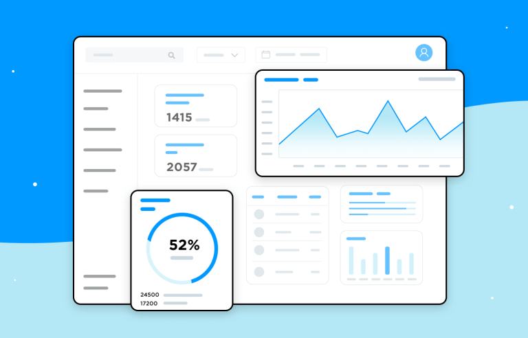
Interactive filtering and drill-down capabilities in modern dashboards
Interactive Exploration Techniques
The most engaging dashboards I've created incorporate interactive visualizations for data exploration that transform passive viewing into active analysis. These techniques include:
- Brushing and linking across multiple charts
- Lasso selection for identifying data clusters
- Dynamic parameter adjustment with immediate visual feedback
- Interactive legends that toggle data series visibility
- Zoom and pan controls for exploring dense data sets
Dynamic Chart Transformations
One of the most powerful interactive features I implement is dynamic chart transformation. This allows users to switch visualization types on the fly—perhaps viewing data as a bar chart initially, then switching to a line chart or scatterplot for different analytical perspectives. These transformations can be triggered manually or suggested automatically based on user behavior and data characteristics.
Collaborative Features
Modern dashboards extend interactivity beyond individual exploration to collaborative analysis. Features I've found particularly valuable include:
- Annotation tools for highlighting insights and adding context
- Comment threads attached to specific visualizations
- Shareable filtered views that preserve specific analytical states
- Collaborative bookmarking of important findings
- Version tracking for dashboard evolution
AI-Powered Suggestions
The integration of AI-powered suggestions represents the cutting edge of interactive data visualization tools. These systems observe user behavior, recognize patterns in their exploration, and proactively suggest new visualization approaches or data relationships to investigate. This guidance can lead users to unexpected discoveries they might otherwise miss.
Balancing Visual Appeal with Information Density
In designing interactive dashboards, I always navigate the tension between visual appeal and information density. Too much data creates cognitive overload; too little limits analytical value. The best solutions use interactivity itself to manage this balance—presenting clean, focused views initially while providing intuitive mechanisms to access additional detail on demand.
User Engagement by Interaction Type
Selecting the Right Chart Types for Different Data Stories
In my dashboard design practice, I've found that chart selection is both an art and a science. The right visualization can illuminate insights instantly, while the wrong choice can obscure important patterns or even mislead viewers.
Decision Framework for Chart Selection
When choosing among data visualization charts, I apply a systematic framework based on:
Chart Selection Decision Tree
                    flowchart TD
                        A[What story does your data tell?] --> B{Comparison?}
                        B -->|Yes| C{How many variables?}
                        B -->|No| D{Relationship?}
                        C -->|Few categories| E[Bar Chart]
                        C -->|Many categories| F[Heatmap]
                        C -->|Over time| G[Line Chart]
                        D -->|Yes| H{How many variables?}
                        D -->|No| I{Distribution?}
                        H -->|Two| J[Scatter Plot]
                        H -->|Multiple| K[Bubble Chart/Matrix]
                        I -->|Yes| L[Histogram/Box Plot]
                        I -->|No| M{Composition?}
                        M -->|Yes| N{Static or changing?}
                        M -->|No| O{Geospatial?}
                        N -->|Static| P[Pie/Donut Chart]
                        N -->|Changing| Q[Stacked Area Chart]
                        O -->|Yes| R[Map Visualization]
                        O -->|No| S[KPI Cards/Tables]
The data type fundamentally constrains visualization options. Categorical data, continuous values, time series, hierarchical structures, and geospatial information each have visualization formats that most effectively reveal their patterns.
Avoiding Common Visualization Pitfalls
Through years of dashboard implementation, I've identified several common pitfalls that lead to misinterpretation:
- Truncated axes that exaggerate differences
- 3D charts that distort proportions
- Pie charts with too many segments
- Inappropriate color scales that imply meaning where none exists
- Chart junk that distracts from the data
- Mixing incompatible scales in combined visualizations
Common visualization pitfalls and their corrections
Advanced Visualization Techniques
For complex data relationships, standard charts often prove insufficient. In these cases, I turn to specialized visualization techniques:
- Sankey diagrams for flow analysis
- Network graphs for relationship mapping
- Treemaps for hierarchical data
- Parallel coordinates for multivariate analysis
- Radar charts for multivariate comparison
- Sunburst charts for hierarchical proportions
Specialized vs. Familiar Formats
I've learned that the decision between specialized and familiar chart types involves careful consideration of audience expertise. While novel visualizations may offer analytical advantages, they require learning curves that can impede adoption. I generally recommend familiar formats for executive audiences and specialized visualizations for analytical teams.
Creating Visual Hierarchies
Effective dashboards rarely rely on a single chart type but instead combine multiple visualizations into coherent narratives. I create visual hierarchies that guide viewers from high-level summaries to detailed explorations, using consistent color schemes, clear labeling, and thoughtful layout to establish relationships between different data views.
Chart Type Effectiveness by Data Story
Designing Dashboard Templates for Different Business Functions
Throughout my career designing dashboard solutions, I've observed that different business functions have unique visualization needs. While the fundamental principles of effective data presentation remain consistent, the metrics, timeframes, and analytical focus vary significantly across departments.
Finance-Specific Dashboard Considerations
Financial dashboards require precision, historical context, and clear variance indicators. When designing these dashboards, I focus on:
- Year-over-year and period-over-period comparisons
- Variance analysis with threshold indicators
- Cash flow visualizations and forecasting
- Budget vs. actual spending comparisons
- Risk exposure indicators and trend analysis
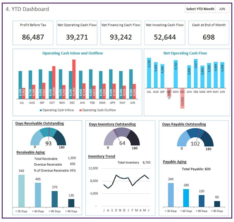
Example financial dashboard with key fiscal reporting elements
Marketing Performance Dashboards
Marketing teams benefit from business intelligence dashboard templates that track campaign effectiveness across multiple channels. Key elements I include are:
- Campaign performance metrics with ROI calculations
- Channel attribution analysis
- Customer acquisition cost and lifetime value comparisons
- Conversion funnel visualizations
- Social media engagement and sentiment analysis
- Market segmentation and targeting effectiveness
Operations-Focused Visualizations
For operations teams, I design dashboards that emphasize efficiency monitoring and process optimization:
- Production throughput and capacity utilization
- Supply chain visibility and bottleneck identification
- Quality control metrics and defect analysis
- Equipment effectiveness and maintenance scheduling
- Inventory levels and turnover rates
- Logistics performance and delivery timeliness
Executive Dashboards
Executive dashboards require careful curation to provide high-level strategic insights without overwhelming detail. I design these with:
- Balanced scorecard approach covering financial, customer, process, and growth perspectives
- Strategic initiative tracking with milestone visualization
- Market position and competitive analysis
- Risk assessment matrices and mitigation status
- Forward-looking indicators and predictive insights
Dashboard Metric Focus by Department
Sales Performance Dashboards
Sales dashboards require a blend of historical performance tracking and forward-looking forecasting. Key elements include:
- Pipeline visualization with stage progression
- Opportunity win/loss analysis
- Territory performance comparisons
- Sales rep productivity metrics
- Product mix and pricing analysis
- Customer retention and upsell tracking
HR Analytics Dashboards
Human resources dashboards focus on workforce insights and talent management:
- Headcount analysis and organizational structure visualization
- Recruitment funnel and time-to-hire metrics
- Employee engagement and satisfaction tracking
- Performance distribution and talent mapping
- Compensation analysis and benchmarking
- Diversity and inclusion metrics with trend analysis
Beyond Static Reports: The Future of Automated Visualization
As I look toward the horizon of data visualization, I see several emerging trends that will reshape how organizations interact with their data. These innovations promise to make insights more accessible, actionable, and integrated into decision-making processes.
Predictive Analytics Integration
The most forward-looking dashboards I'm developing now integrate predictive analytics directly into visualization interfaces. Rather than simply showing what has happened, these systems project what will likely happen under various scenarios. This predictive capability transforms dashboards from reporting tools into strategic planning platforms.

Predictive analytics integration in modern dashboard systems
Voice-Activated Dashboard Interactions
Voice interfaces are revolutionizing how users interact with dashboards. I'm particularly excited about natural language querying capabilities that allow users to ask questions like "Show me sales trends in the Northeast region for Q2" and receive instant visual responses. This conversational approach democratizes data access by removing technical barriers.
AI-Powered Anomaly Detection
One of the most valuable applications of AI in dashboard systems is automated anomaly detection. These systems continuously monitor data streams, identifying patterns that deviate from expected norms and proactively alerting users to potential issues or opportunities. This capability shifts dashboards from passive information displays to active business monitoring systems.
AI-Powered Anomaly Detection Process
                    flowchart LR
                        A[Data Streams] --> B[Pattern Recognition]
                        B --> C{Anomaly Detected?}
                        C -->|No| D[Continue Monitoring]
                        D --> B
                        C -->|Yes| E[Alert Generation]
                        E --> F[Root Cause Analysis]
                        F --> G[Recommendation Engine]
                        G --> H[User Notification]
                        H --> I[Feedback Loop]
                        I --> B
Immersive Data Experiences
Augmented and virtual reality technologies are opening new frontiers in data visualization. I'm exploring how these immersive technologies can transform complex multidimensional datasets into navigable virtual spaces. For example, a supply chain dashboard might become a virtual environment where users can "walk through" the flow of materials, identifying bottlenecks from within the data itself.
Evolution of Interactive Tools
The most sophisticated interactive data visualization tools are evolving to anticipate user needs through adaptive interfaces. These systems observe interaction patterns, learn from them, and dynamically reconfigure to present the most relevant visualizations and controls based on the user's analytical path.
Convergence with Decision Support
Perhaps the most significant trend I'm witnessing is the convergence of automated reporting with real-time decision support systems. These integrated platforms not only visualize what's happening but provide contextual recommendations on how to respond. By combining visualization with prescriptive analytics, these systems close the loop between insight and action.
Adoption Timeline for Advanced Visualization Technologies
Case Studies: Transformation Through Automated Dashboard Implementation
Throughout my career, I've witnessed remarkable transformations when organizations implement effective automated dashboard solutions. These real-world examples demonstrate the tangible impact that thoughtfully designed visualization systems can deliver.
Healthcare Organization: 40% Faster Decision-Making
I worked with a regional healthcare network that struggled with fragmented reporting across its facilities. By implementing automated clinical dashboards that integrated patient outcomes, resource utilization, and quality metrics, the organization achieved:
- 40% reduction in time required for operational decisions
- 25% improvement in resource allocation efficiency
- Identification of best practices that, when standardized, reduced complications by 15%
- Enhanced compliance reporting that previously required weeks of manual compilation

Healthcare dashboard implementation showing clinical metrics integration
Retail Company: 25% Operational Efficiency Increase
A multi-channel retailer I consulted with implemented AI-generated visual analytics across their supply chain and store operations. The results were transformative:
- 25% improvement in inventory turnover through better stocking decisions
- 30% reduction in out-of-stock incidents by predicting demand patterns
- 15% increase in sales through optimized product placement based on visual analytics
- Markdown optimization that improved margin by 8% on promotional items
Financial Services: From Days to Minutes
A financial services firm I worked with transformed their client reporting process through automated visualization:
- Reduced portfolio performance reporting time from 3 days to 15 minutes
- Enabled real-time risk assessment that previously required overnight processing
- Increased client satisfaction scores by 35% through interactive dashboards
- Freed analyst time for value-added activities, increasing revenue per analyst by 20%
Manufacturing: 30% Quality Improvement
I helped a manufacturing enterprise implement real-time visual monitoring across their production facilities:
- 30% reduction in quality issues through early detection of process variations
- 22% improvement in equipment effectiveness through predictive maintenance
- 18% energy consumption reduction by identifying inefficient operations
- 45% faster new product ramp-up through better process visibility
Creating Impactful Data Visualizations
Across these case studies, I've observed how organizations are creating impactful data visualizations that drive decision-making. The common thread is a focus on translating complex data into clear visual stories that connect directly to business outcomes.
Impact of Automated Dashboards by Industry
Lessons Learned
From these implementations, I've distilled several best practices:
- Start with clear business objectives rather than technical capabilities
- Involve end-users throughout the design process to ensure relevance
- Build iteratively, with regular feedback cycles and continuous improvement
- Invest in data quality and governance as foundations for trusted dashboards
- Provide adequate training and support during the transition period
- Measure and communicate dashboard impact in business terms, not technical metrics
Getting Started with Automated Dashboard Generation
Based on my experience implementing automated dashboard solutions across various organizations, I've developed a systematic approach to getting started. This framework helps ensure successful adoption and meaningful business impact.
Assessing Organizational Readiness
Before diving into implementation, I recommend conducting a thorough readiness assessment covering:
- Data maturity: quality, accessibility, and integration capabilities
- Technical infrastructure: existing systems and integration points
- Analytical culture: how decisions are currently made and supported
- Stakeholder alignment: executive sponsorship and departmental buy-in
- Skills availability: internal capabilities for implementation and maintenance
Organizational Readiness Assessment Framework
                    flowchart TD
                        A[Organizational Readiness] --> B[Data Readiness]
                        A --> C[Technical Readiness]
                        A --> D[Cultural Readiness]
                        A --> E[Skills Readiness]
                        B --> B1[Data Quality]
                        B --> B2[Data Accessibility]
                        B --> B3[Data Integration]
                        C --> C1[Existing Systems]
                        C --> C2[Infrastructure]
                        C --> C3[Security Framework]
                        D --> D1[Decision Processes]
                        D --> D2[Executive Support]
                        D --> D3[Change Appetite]
                        E --> E1[Technical Skills]
                        E --> E2[Analytical Skills]
                        E --> E3[Data Literacy]
Building the Business Case
A compelling business case is essential for securing investment in dashboard automation. I focus on quantifying benefits in these key areas:
- Time savings: reduced reporting effort and faster decision cycles
- Error reduction: minimized manual data handling and inconsistent reporting
- Improved decisions: better insights leading to measurable business outcomes
- Opportunity costs: what the organization can achieve by redirecting analytical effort
- Competitive advantage: how visualization capabilities position the organization in its market
First Steps: Pilot Project Selection
I recommend starting with a focused pilot project that offers:
- High visibility within the organization
- Manageable scope that can be delivered within 2-3 months
- Clear success metrics tied to business outcomes
- Engaged stakeholders willing to provide frequent feedback
- Potential for expansion if successful

Pilot project selection matrix for automated dashboard initiatives
Evaluating Technology Options
When assessing dashboard automation technologies, I consider these factors:
- Data connectivity: ability to integrate with existing data sources
- Visualization capabilities: range and flexibility of visual formats
- Automation features: scheduling, refreshing, and distribution options
- Customization potential: adaptability to specific business needs
- User experience: intuitive interface for both creators and consumers
- Scalability: capacity to grow with increasing data volumes and user base
- Total cost of ownership: licensing, implementation, and maintenance costs
Training and Adoption Strategies
Successful dashboard implementations require thoughtful approaches to training and adoption:
- Role-based training tailored to different user types
- Champions program to build internal expertise and enthusiasm
- Regular showcase sessions to highlight successful use cases
- Office hours or help desk support for users with questions
- Recognition program for innovative dashboard applications
- Continuous feedback loops to refine dashboards based on user experience
Future-Proofing Your Dashboard Strategy
Finally, I advise organizations to future-proof their dashboard strategy by:
- Building modular systems that can evolve with changing requirements
- Establishing governance frameworks for sustainable growth
- Creating centers of excellence to maintain best practices
- Regularly evaluating emerging visualization technologies
- Developing data literacy programs to maximize dashboard utilization
- Planning for scaling both in terms of data volume and user base
Key Success Factors for Dashboard Initiatives
Transform Your Visual Expressions with PageOn.ai
Ready to revolutionize how your organization visualizes data? PageOn.ai's powerful automated dashboard generation tools make it simple to create stunning, interactive data stories that drive better decisions.
Start Creating with PageOn.ai TodayConclusion: The Transformative Power of Automated Dashboards
Throughout this exploration of automated dashboard generation, I've shared how these powerful tools are revolutionizing the way organizations understand and leverage their data. The shift from static reports to dynamic, interactive visualizations represents more than a technological evolution—it's a fundamental transformation in how we approach decision-making.
As we've seen across various industries and business functions, well-designed automated dashboards deliver tangible benefits: faster decisions, improved operational efficiency, deeper insights, and more agile responses to changing conditions. The democratization of these capabilities means that data-driven decision-making is no longer confined to specialized analysts but available throughout organizations.
Looking ahead, the convergence of AI, predictive analytics, natural language processing, and immersive technologies promises even more powerful visualization experiences. Organizations that embrace these innovations will gain significant competitive advantages through enhanced data understanding and more effective decision processes.
I encourage you to assess your organization's visualization maturity, identify high-impact opportunities for dashboard automation, and begin your journey toward more insightful, efficient, and impactful data visualization. The tools and strategies we've explored provide a roadmap for transforming raw data into the actionable insights that drive business success.

The future of automated dashboard generation: intelligent, predictive, and seamlessly integrated
With PageOn.ai, you can accelerate this transformation, leveraging cutting-edge visualization capabilities to create dashboards that not only inform but inspire action. Whether you're taking your first steps into automated reporting or looking to enhance existing visualization systems, PageOn.ai provides the tools, templates, and guidance to turn your data into compelling visual stories.
You Might Also Like
The Art of Text Contrast: Transform Audience Engagement With Visual Hierarchy
Discover how strategic text contrast can guide audience attention, enhance information retention, and create more engaging content across presentations, videos, and marketing materials.
Transforming Presentations: Strategic Use of Color and Imagery for Maximum Visual Impact
Discover how to leverage colors and images in your slides to create visually stunning presentations that engage audiences and enhance information retention.
Mastering Visual Flow: How Morph Transitions Transform Presentations | PageOn.ai
Discover how Morph transitions create dynamic, seamless visual connections between slides, enhancing audience engagement and transforming ordinary presentations into memorable experiences.
Bringing Google Slides to Life with Dynamic Animations | Complete Guide
Transform static presentations into engaging visual stories with our comprehensive guide to Google Slides animations. Learn essential techniques, advanced storytelling, and practical applications.
