Transforming Data Storytelling with Natural Language in Power BI
Unlock the power of conversation-based chart creation
In today's data-driven world, the ability to quickly transform raw information into meaningful visualizations is invaluable. I've found that one of the most revolutionary developments in this space is Power BI's Natural Language Query (NLQ) feature, which allows users to create charts and visualizations simply by typing questions or commands in plain English. This approach democratizes data analysis and makes it accessible to everyone, regardless of technical expertise.
Throughout this guide, I'll walk you through how to harness the power of natural language to create compelling visualizations in Power BI, from basic charts to complex data stories. Whether you're a data analyst looking to streamline your workflow or a business user wanting to extract insights without coding knowledge, this comprehensive exploration of AI create charts from text capabilities will transform how you interact with your data.
Understanding NLQ Capabilities
When I first encountered Power BI's Natural Language Query feature, I was amazed at how it bridges the gap between technical data analysis and intuitive human communication. At its core, NLQ allows users to interact with their data using plain English phrases rather than complex formulas or drag-and-drop interfaces.
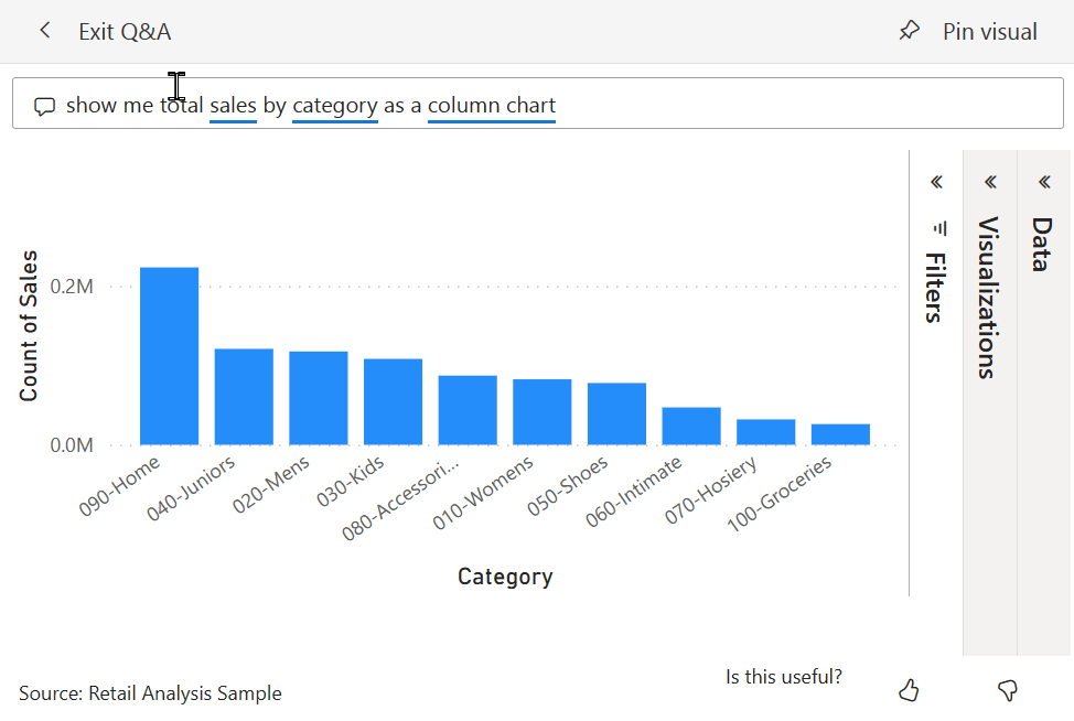
Unlike traditional visualization methods that require knowledge of data relationships and visualization types, NLQ enables a conversational approach. I can simply ask questions like "Show me total sales by region as a bar chart" or "What were our top-performing products last quarter?" and Power BI generates the appropriate visualization instantly.
How NLQ Works
flowchart TD
    A[Natural Language Input] -->|Parsing| B[Language Processing]
    B -->|Entity Recognition| C[Data Mapping]
    C -->|Query Generation| D[Data Query]
    D -->|Result Processing| E[Visualization Selection]
    E -->|Rendering| F[Chart Generation]
The underlying AI technology that powers NLQ in Power BI is sophisticated. It uses natural language processing (NLP) to understand the intent behind your queries, maps those intents to your data model, and then determines the most appropriate visualization to represent the answer. This technology continues to improve, making the data visualization charts creation process increasingly intuitive.
Key Benefits of NLQ in Power BI
Perhaps the most significant benefit I've observed is how NLQ removes technical barriers for non-technical team members. Marketing specialists, sales representatives, and executives can now directly interact with data without relying on data analysts as intermediaries. This democratization of data analysis leads to faster insights and more data-informed decision-making across organizations.
Getting Started with NLQ for Chart Creation
Getting started with Natural Language Queries in Power BI is straightforward, even for beginners. I'll walk you through the process step by step so you can begin creating visualizations through simple text commands.
Accessing the NLQ Feature
flowchart TD
    A[Open Power BI Service] --> B[Navigate to Dashboard]
    B --> C[Click 'Ask a question about your data']
    C --> D[Type natural language query]
    D --> E[Review generated visualization]
    E --> F{Satisfied with results?}
    F -->|Yes| G[Pin to dashboard]
    F -->|No| H[Refine query]
    H --> D
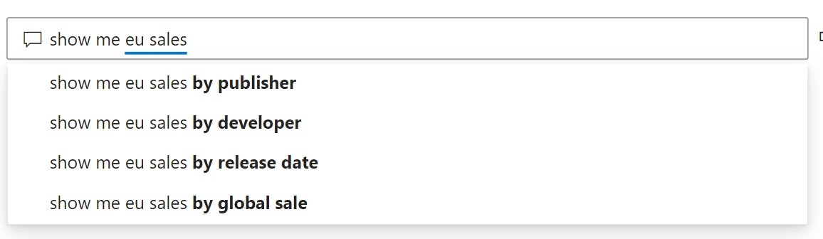
To access the NLQ feature in Power BI Service, I first open my existing dashboard and look for the "Ask a question about your data" option at the top of the screen. This opens the Q&A interface where I can type my queries. The feature is also available in Power BI Desktop, though with slightly different navigation.
Phrasing Effective Queries
Example NLQ Commands for Chart Creation:
- "Show me total sales by product category as a bar chart"
- "Create a line graph of monthly revenue for the past year"
- "Display customer acquisition by region in a pie chart"
- "Compare budget vs. actual expenses in a column chart"
- "Show me top 5 customers by sales amount"
I've found that the key to effective queries is being specific about what data you want to see and how you want to see it. Including the desired chart type in your query (e.g., "as a bar chart") helps Power BI understand your visualization preference. Starting with simple queries and gradually adding complexity as you become more comfortable with the system is a great approach for beginners.
Common Pitfalls and How to Avoid Them
| Common Pitfall | Better Approach |
|---|---|
| Using vague terms | Be specific about metrics and dimensions |
| Assuming field names | Use the actual column names from your dataset |
| Complex queries at once | Start simple and refine incrementally |
| Ignoring suggestions | Pay attention to autocomplete suggestions |
| Unclear time references | Specify exact time periods (e.g., "in 2023" vs "recent") |
When I first started using NLQ, I often made the mistake of using terms that weren't recognized by the system. I quickly learned that it's important to phrase queries using terminology that matches your dataset's structure. As you type, Power BI provides autocomplete suggestions that can guide you toward effective queries, which I've found extremely helpful for learning the system's capabilities and limitations.
Advanced Natural Language Techniques for Complex Visualizations
Once I mastered the basics of NLQ in Power BI, I discovered that the system is capable of creating sophisticated visualizations through more complex queries. These advanced techniques allow for multi-dimensional analysis and deeper data exploration.
Creating Multi-Dimensional Charts
I've learned that Power BI's NLQ can handle multi-dimensional analysis through conversational refinement. For example, I might start with "Show me sales by region," then refine with "break it down by product category and show as a stacked bar chart." This iterative approach allows me to build complex visualizations through a series of simple, intuitive commands.

Specifying Parameters Using Natural Language
I've become adept at specifying parameters in my natural language queries to get precisely the visualization I need. For example, I can specify chart types ("as a heat map"), add filters ("where region is North America"), set sorting ("sort by sales descending"), define aggregations ("average price by category"), and more. The key is to be explicit about what you want while maintaining natural language phrasing.
Temporal Analysis Techniques
One of my favorite advanced techniques is using temporal phrases to create time-based visualizations. Queries like "Show me monthly sales trends over the past 2 years as an area chart" or "Compare Q1 performance year over year" generate powerful time-series analyses. Power BI can even create animated time visualizations when you ask to "show changes over time."
These advanced capabilities align perfectly with modern AI chart generators that are transforming how we interact with data visualization tools. The ability to simply describe what you want to see and have the system generate it is revolutionizing data analysis workflows.
Pro Tip:
When creating complex visualizations, I've found it helpful to build my query incrementally. Start with the basic data you want to see, then add specifications for chart type, filters, and formatting. This approach gives you more control over the final visualization and helps the system understand your intent more clearly.
Real-World Applications and Use Cases
I've seen natural language query capabilities transform how different departments interact with their data. The ability to quickly generate visualizations through simple text commands has practical applications across the entire organization.
Department-Specific Applications
flowchart TD
    A[Natural Language Queries] --> B[Marketing]
    A --> C[Finance]
    A --> D[Sales]
    A --> E[Executive]
    B --> B1[Campaign Performance]
    B --> B2[Channel Attribution]
    B --> B3[Customer Segmentation]
    C --> C1[Budget Analysis]
    C --> C2[Expense Tracking]
    C --> C3[Forecast Visualization]
    D --> D1[Territory Performance]
    D --> D2[Pipeline Analysis]
    D --> D3[Customer Insights]
    E --> E1[KPI Dashboards]
    E --> E2[Strategic Planning]
    E --> E3[Performance Overview]
Marketing Team Applications
In my experience working with marketing teams, NLQ has been a game-changer. Marketers can now quickly ask questions like "Show me campaign conversion rates by channel as a bar chart" or "Compare email open rates across the last 5 campaigns." This immediate access to visual data helps them make timely adjustments to campaigns and better allocate resources.
Finance Department Applications
Finance teams I've worked with use NLQ for rapid budget and forecast charting. Queries like "Show me monthly expenses vs. budget year to date" or "Forecast Q4 revenue based on current trends" generate instant visualizations that help financial analysts identify variances and opportunities. This capability is particularly valuable during budget planning cycles and monthly financial reviews.
Sales Team Applications
Sales representatives benefit from on-the-fly customer segmentation visualizations. I've seen sales teams use queries like "Show me top 10 customers by revenue this quarter" or "Compare win rates by product line and territory" to quickly identify opportunities and optimize their sales strategies. The ability to create these visualizations during client calls or team meetings without technical assistance has significantly improved their responsiveness.

Executive Dashboard Applications
Perhaps the most impactful application I've observed is in executive dashboards. Leadership teams can now ask high-level questions like "What's our year-over-year growth by business unit?" or "Show me operational efficiency trends across regions" and immediately get visualizations that support strategic decision-making. This direct interaction with data eliminates the delay of waiting for reports to be prepared by analysts.
These real-world applications demonstrate how natural language queries are democratizing access to data insights across organizations. The technology behind ai-powered bar chart generators and other visualization tools continues to evolve, making it increasingly accessible to users of all technical backgrounds.
Beyond Basic Charts: Natural Language for Data Exploration
What truly excites me about Power BI's natural language capabilities is how they enable an interactive, exploratory approach to data analysis. Beyond simply creating static charts, NLQ facilitates a dynamic conversation with your data that can lead to unexpected insights.
The Interactive Q&A Experience
sequenceDiagram
    participant User
    participant NLQ as NLQ System
    participant Data as Dataset
    User->>NLQ: Show sales by region
    NLQ->>Data: Query sales data
    Data->>NLQ: Return regional sales
    NLQ->>User: Display bar chart
    User->>NLQ: Which region had highest growth?
    NLQ->>Data: Calculate YOY growth
    Data->>NLQ: Return growth metrics
    NLQ->>User: Highlight top region
    User->>NLQ: Break down by product category
    NLQ->>Data: Query category data
    Data->>NLQ: Return detailed breakdown
    NLQ->>User: Display stacked chart
    User->>NLQ: Focus on top category only
    NLQ->>Data: Filter for top category
    Data->>NLQ: Return filtered data
    NLQ->>User: Display focused visualization
I've found that the real power of natural language queries lies in the ability to ask follow-up questions. After generating an initial visualization, I can drill down with questions like "What's driving this spike?" or "Show me only the top performers." This conversational flow mimics the natural way humans explore information and can lead to discoveries that might be missed with pre-defined reports.
Techniques for Data Exploration
Effective Data Exploration Commands:
- "Drill down into [specific data point]"
- "Compare this to last year's performance"
- "Show me the outliers in this dataset"
- "What's contributing most to this trend?"
- "Zoom out to see the broader pattern"
- "Filter to only show [specific segment]"
I've developed techniques for zooming in and out of data through conversational commands. Starting with a high-level overview and then asking questions that progressively narrow the focus allows me to navigate complex datasets intuitively. Conversely, when I spot an interesting detail, I can ask questions that broaden the context to understand its significance.

Creating Narrative Flows
One of my favorite advanced applications is creating narrative flows through sequential natural language queries. By asking a series of related questions, I can build a story that guides viewers through the data from different angles. For example, I might start with overall sales performance, then explore regional variations, identify top products, and finally examine growth trends—all through simple conversational commands.
These narrative flows can then be integrated into comprehensive dashboards that preserve the logical progression of the analysis. This approach transforms data exploration from a technical exercise into a storytelling process, making insights more accessible and memorable for all stakeholders.
Enhancing Power BI's Natural Language Capabilities with PageOn.ai
While Power BI's natural language capabilities are impressive, I've discovered that combining them with PageOn.ai creates an even more powerful data storytelling ecosystem. PageOn.ai's complementary features enhance the visualization experience and help transform simple charts into comprehensive visual narratives.
Supplementing Visualization Capabilities
PageOn.ai supplements Power BI's visualization capabilities through more intuitive conversation. Where Power BI excels at generating specific charts from structured data, PageOn.ai shines in understanding broader context and creating visual frameworks that give those charts meaning. This synergy allows me to move seamlessly between generating detailed visualizations in Power BI and creating the narrative structure that makes those visualizations meaningful.
Using AI Blocks for Enhanced Structure
One of my favorite features is how PageOn.ai's AI Blocks can be used to combine Power BI charts with additional context and structure. For instance, I can export a visualization created through natural language in Power BI, then use PageOn.ai to place it within a larger framework that includes explanatory text, related metrics, and visual elements that highlight key insights.
Leveraging Deep Search for Data Integration
PageOn.ai's Deep Search capability has transformed how I find and integrate relevant data sources for Power BI analysis. While Power BI works with the data you've already connected, PageOn.ai can help identify additional data sources that might enhance your analysis. This complementary approach ensures that your visualizations are based on the most comprehensive data available.
I've found that ai tools for excel charts and other data visualization platforms work best when they're part of a broader ecosystem. The integration between Power BI's natural language query capabilities and PageOn.ai's contextual understanding creates a powerful combination for data storytelling.
Transforming Charts into Visual Stories
flowchart LR
    A[Power BI Chart] --> B[PageOn.ai]
    B --> C[Context Addition]
    B --> D[Narrative Structure]
    B --> E[Visual Enhancement]
    C --> F[Complete Visual Story]
    D --> F
    E --> F
What truly sets PageOn.ai apart is its agentic approach, which transforms simple chart requests into comprehensive visual stories. Rather than just generating a visualization based on a query, PageOn.ai considers the broader context—who will view the visualization, what decisions they need to make, and what supporting information they might need. This approach ensures that the charts created through natural language queries become part of a coherent, impactful narrative rather than isolated data points.
Best Practices and Optimization Strategies
Through my experience with natural language queries in Power BI, I've developed several best practices that maximize the effectiveness of this approach to data visualization. These strategies help ensure that your natural language interactions consistently produce valuable insights.
Structuring Datasets for Better Recognition
I've found that the way you structure your datasets significantly impacts how well Power BI understands your natural language queries. Clear, descriptive column names that reflect business terminology make it much easier for the system to map your questions to the right data. For example, using "AnnualRevenue" instead of "AR" or "Monthly_Customer_Acquisition" instead of "MCA" improves recognition.
Dataset Optimization Tips:
- Use clear, descriptive column names that match common business terminology
- Add synonyms for technical terms in your data model
- Properly categorize date fields to enable temporal queries
- Set appropriate data types for all columns
- Create hierarchies for commonly used drill-down paths
Training Team Members
Even with a user-friendly interface like natural language queries, I've found that training team members is essential. Simple workshops that teach effective query formulation and demonstrate common patterns can significantly improve adoption. I typically start by showing examples of successful queries and explaining why they work well, then progress to hands-on practice with the team's actual data.
Balancing NLQ and Manual Design
In my experience, the most effective approach is to balance between NLQ-generated charts and manually designed visualizations. I use natural language queries for rapid exploration and initial insights, then refine the most important visualizations using Power BI's design tools. This hybrid approach combines the speed and accessibility of NLQ with the precision and customization of manual design.
Creating Multi-Tool Synergy
I've developed strategies for creating synergy between Power BI's NLQ and other data visualization tools. For example, I might use natural language queries in Power BI to quickly identify interesting patterns, export those visualizations, and then incorporate them into a broader narrative using PageOn.ai. This approach leverages the strengths of each platform while mitigating their limitations.
Measuring Productivity Improvements
To justify continued investment in natural language capabilities, I track productivity improvements after implementation. Key metrics I monitor include time saved in visualization creation, increased frequency of data-driven decisions, broader adoption of analytics tools across departments, and user satisfaction scores. These metrics consistently show significant returns on investment, with time savings of 40-60% for common visualization tasks being typical.
Future Trends in Natural Language Data Visualization
As I look to the future of data visualization, I'm excited by the emerging trends in natural language interfaces. The technology is evolving rapidly, with several key developments on the horizon that will further transform how we interact with our data.
Evolution of Conversational Interfaces
I believe we're moving toward increasingly sophisticated conversational interfaces for data analysis. Future systems will maintain context across longer conversations, understand more complex queries, and even anticipate follow-up questions based on typical analysis patterns. The experience will feel less like querying a database and more like discussing insights with a knowledgeable colleague.
Multimodal AI Enhancement
I'm particularly excited about how multimodal AI will enhance natural language chart creation. Future systems will combine text, voice, and even gesture inputs to create a more intuitive experience. Imagine being able to say "Show me sales trends," then point to a specific region on a map, and finally use hand gestures to adjust the time period—all seamlessly integrated into the visualization process.
Power BI's Roadmap
Based on Microsoft's development patterns, I anticipate several improvements in Power BI's natural language capabilities. These will likely include better handling of complex analytical concepts, improved integration with domain-specific terminology, and more sophisticated visualization recommendations based on the nature of the data and query. The goal is to make the system smarter about matching the right visualization to the user's intent.

Voice Commands in Visualization Workflows
Voice commands represent the next frontier in natural language data visualization. I expect to see more robust voice interfaces that allow analysts to create and modify visualizations hands-free. This capability will be particularly valuable in collaborative settings like meetings, where stopping to type queries disrupts the flow of discussion.
Democratizing Data Analysis
Perhaps the most significant trend I see is how natural language is democratizing data analysis across organizations. As these tools become more intuitive and powerful, the traditional barriers to data literacy are falling. More employees at all levels can engage directly with data, ask questions, and generate insights without specialized training. This shift is fundamentally changing organizational cultures, making data-driven decision-making accessible to everyone.
Transform Your Visual Expressions with PageOn.ai
Take your data storytelling beyond basic charts. PageOn.ai's intuitive platform helps you create comprehensive visual narratives that communicate complex ideas with clarity and impact.
Start Creating with PageOn.ai TodayConclusion
Throughout this exploration of natural language queries in Power BI, I've shared how this technology is transforming the way we create and interact with data visualizations. From simple chart creation to complex data exploration, NLQ capabilities make data analysis more accessible, efficient, and intuitive.
While Power BI's natural language features provide an excellent foundation, I've found that complementing them with PageOn.ai's capabilities creates an even more powerful ecosystem for data storytelling. The combination allows for both rapid visualization creation and thoughtful narrative construction, ensuring that data insights are not just generated but effectively communicated.
As natural language interfaces continue to evolve, they will further break down barriers to data literacy and empower more people to engage meaningfully with data. This democratization of data analysis represents a significant shift in how organizations operate, moving from siloed expertise to collaborative insight generation.
I encourage you to explore the natural language capabilities in your data visualization tools and consider how they might transform your own data storytelling process. The future of data analysis is conversational, intuitive, and accessible—and it's already here.
You Might Also Like
Mapping the Architecture of Legal Reasoning: Visualizing Precedent, Analogy, and Case Law Application
Explore how precedent, analogy, and case law application form the foundation of judicial practice, with visual frameworks that transform abstract legal concepts into clear decision pathways.
Platform-Specific Infographic Formatting: Optimize for Social Media Success
Master platform-specific infographic formatting for Instagram, Pinterest, LinkedIn, Twitter & Facebook. Learn optimal dimensions, aspect ratios & design strategies for social media success.
PDR Security Framework: Visualizing Protection, Detection & Response Systems
Explore the PDR Security Framework with visual guides to Protection, Detection, and Response systems. Learn implementation strategies with interactive diagrams and actionable insights.
Beyond The Pitch: Visualizing Startup Traction Metrics That Win VC Funding
Discover the essential startup traction metrics that venture capitalists truly value. Learn how to visualize growth, efficiency, and revenue metrics to secure funding for your startup.