Transforming Data into Visual Stories
How QuickChart API Creates Interactive Graphs from Raw Data
In today's data-driven world, transforming complex information into accessible visual narratives isn't just helpful—it's essential. QuickChart API offers a powerful solution for creating dynamic, interactive graphs with just a few lines of code.
The Power of Visual Data Representation
In our increasingly data-saturated world, the ability to transform raw numbers into compelling visual narratives has become a critical skill. Whether you're preparing a business presentation, creating educational content, or developing an application, effective data visualization can mean the difference between confusion and clarity.
Data visualization transforms raw numbers into meaningful insights
QuickChart API offers an elegant solution to this challenge by providing a simple, URL-based approach to creating dynamic, interactive graphs from raw data. By leveraging the power of the popular Chart.js library, QuickChart allows you to generate high-quality chart images that can be embedded in emails, reports, dashboards, and more—all without the need for complex client-side rendering.
In this comprehensive guide, we'll explore how QuickChart API can streamline your data visualization workflow, from basic implementation to advanced customization techniques. Whether you're a developer looking to integrate charts into your application or a data analyst seeking to enhance your reports, you'll discover how QuickChart can help you transform numbers into compelling visual stories with minimal effort.
Understanding QuickChart's Core Capabilities
At its core, QuickChart is a web service that generates chart images on-the-fly using configurations based on Chart.js, one of the most popular open-source charting libraries available today. This foundation provides QuickChart with exceptional flexibility and a wide range of visualization options.
Key Features and Benefits
URL-Based Generation
Create charts by simply constructing a URL with your configuration parameters—no need for server-side rendering or client-side JavaScript.
Static Image Output
Generate PNG, SVG, or PDF outputs that can be embedded anywhere, including platforms that don't support JavaScript.
Chart.js Compatibility
Leverage the extensive customization options of Chart.js while avoiding the complexity of implementing it directly.
Multiple Chart Types
Support for bar, line, pie, radar, scatter, bubble charts and more, including mixed types for complex data visualization.
flowchart TD
    A[Raw Data] --> B[QuickChart API]
    B --> C[Chart Configuration]
    C --> D[Chart.js Processing]
    D --> E[Image Generation]
    E --> F[PNG/SVG/PDF Output]
    F --> G[Email Integration]
    F --> H[Report Embedding]
    F --> I[Web Display]
    F --> J[SMS/Messaging]
QuickChart API workflow from data to visualization
What sets QuickChart apart is its simplicity. By encapsulating chart configurations in URL parameters, it eliminates the need for complex client-side JavaScript or server-side rendering. This approach makes it particularly valuable for platforms where JavaScript execution isn't possible, such as email clients or certain messaging applications.
With data visualization charts becoming increasingly important for effective communication, QuickChart provides a lightweight, accessible solution that bridges the gap between raw data and compelling visual representation.
Getting Started with QuickChart API
Getting started with QuickChart is remarkably straightforward. The basic approach involves constructing a URL that includes your chart configuration as a parameter. Let's break down the process into simple steps.
Basic URL Structure
https://quickchart.io/chart?c={chart-configuration}
The c parameter contains your Chart.js configuration object, which defines the type of chart, data, labels, and styling options. This object can be written in either JSON or JavaScript format.
Creating Your First Chart
Let's create a simple bar chart to visualize monthly sales data:
{
  type: 'bar',
  data: {
    labels: ['Jan', 'Feb', 'Mar', 'Apr', 'May'],
    datasets: [{
      label: 'Monthly Sales',
      data: [65, 59, 80, 81, 56],
      backgroundColor: 'rgba(255, 128, 0, 0.6)'
    }]
  }
}
When this configuration is URL-encoded and appended to the QuickChart endpoint, it generates a chart image like this:
Essential Parameters
Beyond the chart configuration itself, QuickChart supports several parameters to control the output:
| Parameter | Description | Example |
|---|---|---|
width or w |
Width of the image in pixels | width=500 |
height or h |
Height of the image in pixels | height=300 |
backgroundColor or bkg |
Background color of the chart | backgroundColor=white |
format or f |
Output format (png, svg, pdf) | format=svg |
devicePixelRatio |
Resolution multiplier | devicePixelRatio=2 |
Combining these parameters with your chart configuration gives you complete control over the output. For example:
https://quickchart.io/chart?width=500&height=300&backgroundColor=white&c={type:'bar',data:{labels:['Jan','Feb','Mar','Apr','May'],datasets:[{label:'Monthly Sales',data:[65,59,80,81,56],backgroundColor:'rgba(255,128,0,0.6)'}]}}
Tools like AI create charts from text capabilities from PageOn.ai can help you visualize and structure your chart configuration before implementation, making it easier to experiment with different options and see the results in real-time.
Advanced Customization Techniques
One of QuickChart's greatest strengths is its extensive customization capabilities, inherited from the Chart.js library. Let's explore some advanced techniques to create more sophisticated and visually appealing charts.
Styling and Theming
You can control virtually every visual aspect of your charts, from colors and fonts to grid lines and legends:
Custom styled chart with gradient background and formatted axes
The example above demonstrates custom styling with gradient fills, curved lines, formatted axis labels, and custom title and legend positioning.
Chart Annotations
QuickChart supports the Chart.js annotation plugin, allowing you to add lines, boxes, and points to highlight specific data or thresholds:
Line chart with threshold annotation and region highlighting
Mixed Chart Types
QuickChart allows you to combine different chart types in a single visualization, which is particularly useful for comparing related but different data series:
Mixed chart with bar and line elements to compare actual vs target metrics
These advanced customization options allow you to create charts that not only present data accurately but do so in a visually compelling way that enhances understanding and engagement. AI chart generators like PageOn.ai can help you experiment with different configurations and find the optimal visual representation for your data.
By leveraging PageOn.ai's AI Blocks feature, you can prototype different chart configurations before implementing them with QuickChart, ensuring that your final visualization effectively communicates your data story.
Beyond Basic Charts: Specialized Visualization Options
While standard chart types like bars and lines are valuable for many scenarios, QuickChart also supports specialized visualization types that can address specific data presentation needs. Let's explore some of these options.
Radial Gauges and Meter Charts
Radial gauges are excellent for displaying progress toward goals or showing values within a defined range:

{
  type: 'radialGauge',
  data: {
    datasets: [{
      data: [75],
      backgroundColor: 'rgba(255, 128, 0, 0.9)',
      borderWidth: 0
    }]
  },
  options: {
    // Gauge specific options
    domain: [0, 100],
    valueLabel: {
      fontSize: 24,
      formatter: function(value) {
        return value + '%';
      }
    },
    // Add other customization options...
  }
}
Sparklines for Compact Trend Visualization
Sparklines are minimalist, word-sized charts that are perfect for displaying trends in a compact space, such as within a table or alongside text:

Positive trend

Fluctuating

Negative trend
{
  type: 'sparkline',
  data: {
    datasets: [{
      data: [12, 19, 27, 23, 32, 38, 43],
      borderColor: 'rgba(255, 128, 0, 1)',
      backgroundColor: 'rgba(255, 128, 0, 0.2)',
      fill: true
    }]
  },
  options: {
    // Remove all axes, legends, and other elements
    plugins: {
      legend: {
        display: false
      }
    },
    scales: {
      x: {
        display: false
      },
      y: {
        display: false
      }
    }
  }
}
QR Code Generation
Beyond charts, QuickChart also offers QR code generation capabilities with extensive customization options:

Standard QR
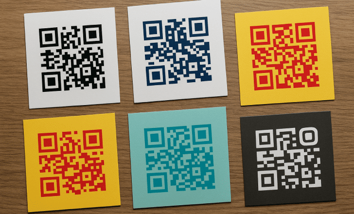
Colored QR
The QR code endpoint follows a similar pattern to chart generation:
https://quickchart.io/qr?text=https://www.pageon.ai&dark=FF8000&light=FFFFFF&ecLevel=H
Parameters include:
text: The content to encode (URL, text, etc.)dark: Color of the QR code modules (hex)light: Background color (hex)ecLevel: Error correction level (L, M, Q, H)margin: White space around the code (in modules)size: Size of the output image in pixels
These specialized visualization options extend QuickChart's capabilities beyond traditional charts, making it a versatile tool for various data presentation needs. Tools like PageOn.ai's Deep Search can help you identify which visualization type would be most effective for your specific data and communication goals.
Implementing QuickChart in Different Environments
One of QuickChart's greatest strengths is its versatility across different platforms and communication channels. Let's explore how to implement QuickChart in various environments.
Email Integration
Charts in emails can significantly enhance the impact of newsletters, reports, and other communications. Since most email clients block JavaScript, QuickChart's static image approach is ideal:
<div style="text-align: center; margin: 20px 0;">
  <h2>Monthly Performance Summary</h2>
  <img src="https://quickchart.io/chart?width=600&height=300&c={type:'bar',data:{labels:['Jan','Feb','Mar','Apr'],datasets:[{label:'Revenue',data:[42000,58000,69000,73500],backgroundColor:'rgba(255,128,0,0.7)'}]}}" alt="Monthly Revenue Chart" style="max-width: 100%;">
</div>
SMS and Messaging Platforms
For SMS and messaging platforms, where space is limited and embedding options are restricted, QuickChart's short URL feature is particularly valuable:
sequenceDiagram
    participant App as Your Application
    participant QC as QuickChart API
    participant SMS as SMS/Messaging Platform
    participant User as End User
    App->>QC: POST /chart/create with chart config
    QC-->>App: Returns short URL
    App->>SMS: Send message with short URL
    SMS-->>User: Delivers message with URL
    User->>QC: Opens short URL
    QC-->>User: Displays chart image
Workflow for using QuickChart with messaging platforms
The short URL creation process involves sending a POST request to the QuickChart API:
// Example POST request
fetch('https://quickchart.io/chart/create', {
  method: 'POST',
  headers: {
    'Content-Type': 'application/json',
  },
  body: JSON.stringify({
    chart: {
      type: 'pie',
      data: {
        labels: ['Red', 'Blue', 'Yellow'],
        datasets: [{
          data: [300, 50, 100],
          backgroundColor: ['#FF6384', '#36A2EB', '#FFCE56']
        }]
      }
    }
  })
})
.then(response => response.json())
.then(data => {
  // data.url contains the short URL
  console.log('Short URL:', data.url);
});
Reports and Dashboards
For PDF reports and dashboards, QuickChart offers several integration options:
Direct PDF Output
Generate charts directly in PDF format using the format=pdf parameter, ideal for report generation systems.
SVG for Print Quality
Use format=svg for high-quality vector graphics that scale perfectly in printed reports.
PageOn.ai can streamline these implementation workflows by helping you generate the appropriate chart configurations based on your data and intended platform. Its AI-powered tools can suggest optimal chart types, dimensions, and styling for different environments, ensuring that your visualizations are effective regardless of where they're displayed.
For example, when creating charts for email, PageOn.ai might recommend higher contrast colors and simplified designs to ensure clarity across different email clients, while for dashboards, it might suggest more detailed visualizations with interactive elements.
Optimizing API Usage for Performance
As you integrate QuickChart into your applications or workflows, optimizing your API usage becomes important for performance, reliability, and efficiency. Let's explore some strategies for making the most of the QuickChart API.
GET vs POST Approaches
QuickChart supports both GET and POST requests, each with its own advantages:
| Method | Advantages | Best For |
|---|---|---|
| GET |
|
|
| POST |
|
|
For POST requests, the endpoint structure is simpler:
// Example POST request
fetch('https://quickchart.io/chart', {
  method: 'POST',
  headers: {
    'Content-Type': 'application/json',
  },
  body: JSON.stringify({
    width: 500,
    height: 300,
    format: 'png',
    backgroundColor: 'white',
    chart: {
      // Your Chart.js configuration
    }
  })
})
.then(response => response.blob())
.then(blob => {
  // Process the image blob
});
Short URL Creation for Sharing
For charts that need to be shared or embedded in platforms with character limitations, QuickChart's short URL feature is invaluable:
Short URL creation workflow
Short URLs are particularly useful for:
- SMS messages where character count is limited
- Social media posts
- QR code generation (shorter URLs create simpler QR codes)
- Verbal communication of chart links
Encoding Options for Special Characters
When working with GET requests, proper encoding of your chart configuration is crucial to avoid issues with special characters:
URL Encoding
Use JavaScript's encodeURIComponent() function or similar tools to properly encode your chart configuration string.
Base64 Encoding
For complex configurations, use base64 encoding with the encoding=base64 parameter to avoid URL encoding issues entirely.
// Example of base64 encoding
const chartConfig = {
  type: 'bar',
  data: {
    labels: ['January', 'February', 'March'],
    datasets: [{
      label: 'Sales',
      data: [50, 60, 70],
      backgroundColor: '#FF8000'
    }]
  }
};
const base64Config = btoa(JSON.stringify(chartConfig));
const chartUrl = `https://quickchart.io/chart?encoding=base64&c=${base64Config}`;
PageOn.ai's Agentic capabilities can help optimize your chart configuration code by automatically handling encoding issues, suggesting the most efficient approach (GET vs POST) based on your chart complexity, and generating optimized code snippets for your specific implementation environment.
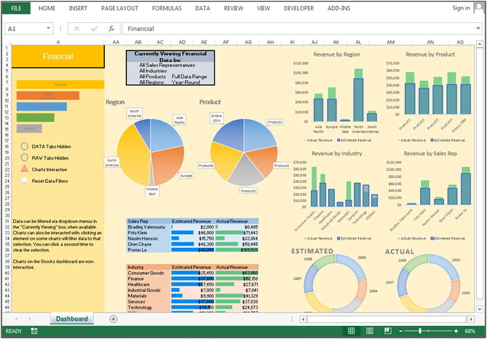
Real-World Applications and Use Cases
QuickChart's versatility makes it suitable for a wide range of applications across various industries. Let's explore some real-world use cases that demonstrate the power and flexibility of this API.
Business Reporting and Analytics
In business environments, QuickChart can transform raw data into actionable insights through visual reports:
Quarterly business performance dashboard with multiple metrics
Applications include:
- Automated daily/weekly sales reports
- Executive dashboards with key performance indicators
- Financial statements with visual data representation
- Investor relations materials and presentations
Educational Content and E-Learning
In educational settings, QuickChart can make complex concepts more accessible through visual representation:
Educational applications include:
- Interactive learning materials with dynamic charts
- Student progress visualization for teachers and parents
- Scientific data representation in research papers
- Conceptual illustrations for mathematical principles
Marketing and Communication
Marketing teams can leverage QuickChart to create compelling visual content for campaigns and communications:
Marketing campaign performance visualization
Marketing applications include:
- Email newsletter performance metrics
- Social media campaign results
- Customer demographics visualization
- Comparative product performance charts
In each of these scenarios, PageOn.ai can enhance the workflow by helping users turn vague data visualization needs into concrete chart configurations. For example, a marketing manager might simply describe the campaign metrics they want to visualize, and PageOn.ai could suggest the optimal chart type, color scheme, and layout to effectively communicate those metrics.
By combining ai-powered bar chart generators like PageOn.ai with QuickChart's rendering capabilities, users can create sophisticated data visualizations without needing deep technical knowledge of chart configuration or API integration.
Overcoming Common Challenges with QuickChart
While QuickChart offers a powerful and flexible solution for data visualization, users may encounter certain challenges during implementation. Let's address some common issues and their solutions.
URL Encoding Issues
One of the most common challenges when using QuickChart's GET endpoint is properly encoding the chart configuration to avoid URL syntax errors:
| Issue | Solution |
|---|---|
| Special characters breaking the URL |
Use const url = `https://quickchart.io/chart?c=${encodeURIComponent(JSON.stringify(chartConfig))}`;
|
| URL length limitations |
Switch to the POST endpoint for complex charts or use base64 encoding: const url = `https://quickchart.io/chart?encoding=base64&c=${btoa(JSON.stringify(chartConfig))}`;
|
Handling Large Datasets
When working with large datasets, you may encounter performance issues or URL length limitations:
flowchart TD
    A[Large Dataset] --> B{Dataset Size?}
    B -->|Small/Medium| C[Direct API Call]
    B -->|Large| D[Data Processing]
    D --> E[Aggregation]
    D --> F[Sampling]
    D --> G[Segmentation]
    E --> H[POST Request]
    F --> H
    G --> H
    H --> I[Chart Image]
    C --> I
Strategies for handling large datasets with QuickChart
Strategies for handling large datasets include:
- Data aggregation: Summarize data points (e.g., daily values into weekly averages)
- Data sampling: Select representative subsets of your data
- Multiple charts: Split large datasets into multiple related charts
- Always use POST requests: For large datasets to avoid URL length limitations
Browser Compatibility Considerations
When embedding QuickChart images in various environments, you may need to consider browser and platform compatibility:
Image Format Selection
Use PNG for general compatibility, SVG for high-quality printing, and WebP for optimized file size where supported.
Responsive Design
Use CSS to ensure chart images scale appropriately on different screen sizes.
<img
  src="https://quickchart.io/chart?c={...}"
  alt="Sales Performance Chart"
  style="max-width: 100%; height: auto;"
  width="600"
  height="300"
>
PageOn.ai can help troubleshoot and refine chart configurations by analyzing your data structure, identifying potential issues before they occur, and suggesting optimizations. For example, it can detect when a dataset might be too large for a GET request and automatically generate code for a POST request instead, or it can recommend appropriate data aggregation strategies based on your specific visualization goals.
Future-Proofing Your Data Visualization Strategy
As data visualization needs continue to evolve, it's important to adopt solutions that will remain viable and effective in the long term. Let's explore how QuickChart fits into a future-proof visualization strategy.
QuickChart vs Alternatives
When evaluating QuickChart against alternatives like the now-deprecated Google Image Charts, several factors highlight its long-term viability:
Comparison of chart solution attributes
Key advantages of QuickChart include:
- Open-source foundation: The entire codebase is publicly available on GitHub
- Self-hosting option: You can run your own instance if needed, eliminating dependency risks
- Active development: Regular updates and improvements to the codebase
- Community support: Growing ecosystem of users and contributors
- Modern architecture: Built on contemporary web technologies
The Advantages of Open-Source Solutions
Choosing an open-source solution like QuickChart provides several long-term benefits:
Transparency
Full visibility into how the software works, with no hidden functionality or unexpected changes.
Continuity
Even if official support ends, the community can maintain and extend the software.
Flexibility
Ability to modify the code to meet specific requirements or integrate with custom systems.
Upcoming Features and Enhancements
As QuickChart continues to evolve, users can look forward to new features and improvements:
gantt
    title QuickChart Development Roadmap
    dateFormat  YYYY-MM-DD
    section Core Features
    Enhanced Chart.js 4 Support      :done, 2023-01-01, 2023-06-30
    Advanced Annotations             :active, 2023-07-01, 2023-12-31
    Interactive SVG Outputs          :2024-01-01, 2024-06-30
    section Integrations
    API Client Libraries             :done, 2023-01-01, 2023-09-30
    Data Source Connectors           :active, 2023-10-01, 2024-03-31
    AI-Powered Chart Generation      :2024-04-01, 2024-12-31
Potential development roadmap for QuickChart (conceptual)
Anticipated enhancements include:
- Expanded support for the latest Chart.js versions
- More advanced annotation and interaction capabilities
- Additional output formats and rendering options
- Improved integration with data sources and analytics platforms
- Performance optimizations for handling larger datasets
As these capabilities evolve, tools like ai pie chart generators from PageOn.ai will continue to enhance the data visualization workflow by providing intelligent assistance in chart creation and configuration. PageOn.ai's evolving capabilities can help bridge the gap between raw data and effective visual communication, making it easier to leverage QuickChart's full potential.
By combining QuickChart's powerful rendering engine with PageOn.ai's intelligent configuration assistance, users can create sophisticated data visualizations that effectively communicate insights while remaining adaptable to future technological developments.
Transform Your Data Visualization with PageOn.ai
Ready to take your data visualizations to the next level? PageOn.ai helps you create stunning, interactive graphs from your raw data with intelligent assistance and powerful configuration tools.
Start Creating Beautiful Charts TodayConclusion: Harnessing the Power of QuickChart
Throughout this guide, we've explored how QuickChart API provides a powerful, flexible solution for transforming raw data into compelling visual stories. From simple bar charts to complex multi-dataset visualizations, QuickChart offers the tools needed to create professional-quality graphs for any platform or medium.
Key takeaways from our exploration include:
- QuickChart's URL-based approach makes it exceptionally easy to generate and embed charts in various environments
- The extensive customization options inherited from Chart.js allow for highly tailored visualizations
- Support for multiple chart types and specialized visualizations provides flexibility for different data scenarios
- The open-source foundation ensures long-term viability and adaptability
- Integration with tools like PageOn.ai can streamline the chart creation process
As data continues to grow in importance across all sectors, the ability to transform that data into clear, compelling visualizations becomes increasingly valuable. QuickChart provides an accessible, powerful tool for this transformation, while PageOn.ai enhances the process by helping users determine the most effective visualization approach for their specific data and communication goals.
Whether you're creating reports, enhancing presentations, or building applications, the combination of QuickChart's rendering capabilities and PageOn.ai's intelligent assistance offers a comprehensive solution for all your data visualization needs.
You Might Also Like
Mastering ChatGPT to PowerPoint: Complete Workflow Guide | PageOn.ai
Learn how to streamline your workflow from ChatGPT to PowerPoint export. Discover efficient methods, tools, and advanced techniques to create professional presentations in minutes.
Transforming Raw Data into Compelling Business Stories | Data Storytelling Guide
Learn how to transform raw data into powerful business narratives through effective data storytelling techniques. Discover visualization methods and narrative structures that drive decision-making.
Typography Evolution: From Cave Paintings to Digital Fonts | Visual Journey
Explore typography's rich evolution from ancient cave paintings to modern digital fonts. Discover how visual communication has transformed across centuries and shaped design.
The Ultimate Design Tools & Workflow Ecosystem for Creative Professionals
Discover essential design tools and optimized workflows for creative professionals. Learn how to build a cohesive ecosystem of visual tools that streamline ideation, feedback, and asset management.