Transforming Raw Data into Business Narratives: The Art and Science of Data Storytelling
Bridging the gap between information overload and actionable insights
The Power of Data Narratives in Modern Business
I've seen firsthand how businesses today are drowning in data. It's no surprise that 65% of decision-makers report feeling overwhelmed by raw data. In my experience working with executives, this data overload often leads to analysis paralysis rather than actionable insights.
Raw numbers, no matter how accurate, rarely inspire action on their own. What's missing is the crucial bridge between information and meaning—the narrative that transforms disconnected data points into a coherent story that drives decisions.
I like to think of storytelling with data as a form of modern alchemy. Just as ancient alchemists sought to turn lead into gold, we're transforming the "lead" of raw information into the "gold" of business decisions that create real value.
The Data-to-Decision Journey
When we transform raw data into compelling narratives, we create a pathway that leads directly to informed action:
                    flowchart LR
                        A[Raw Data] -->|Collection| B[Analysis]
                        B -->|Interpretation| C[Insights]
                        C -->|Storytelling| D[Narrative]
                        D -->|Engagement| E[Decision]
                        E -->|Implementation| F[Action]
                        style A fill:#FF8000,stroke:#333,stroke-width:1px,color:white
                        style F fill:#FF8000,stroke:#333,stroke-width:1px,color:white
In my work with various organizations, I've found that the conversational approach offered by tools like PageOn.ai helps business professionals articulate these data stories without technical barriers. By removing the friction between having data and communicating its significance, we can democratize the power of data storytelling across teams with varying technical expertise.
Core Elements of Effective Data Storytelling
In my years of experience crafting data narratives, I've discovered that the most compelling stories balance three essential pillars: robust data, engaging narrative, and intuitive visuals. When these elements work in harmony, even the most complex insights become accessible and actionable.
The Three Pillars of Data Storytelling
Each component contributes uniquely to the effectiveness of your data story:
Contextualizing Numbers: The Human Element
Raw numbers rarely resonate on their own. I've learned that contextualizing data within human frameworks dramatically increases its impact. For instance, instead of simply stating "conversion rates increased by 15%," I might say "our redesigned customer journey helped 1,500 more people find solutions to their problems each month—that's enough to fill a small concert venue."
This approach leverages what neuroscience tells us about how our brains process information. Our neural pathways are literally wired for stories, not statistics. When I present data within a narrative framework, I'm working with—not against—how our minds naturally organize and remember information.
Tailoring to Your Audience
One critical lesson I've learned is that effective data storytelling must be calibrated to your audience's technical understanding. When I present to our engineering team, I can include more technical depth. For executive stakeholders, I focus on business implications and ROI.
Using PageOn.ai's AI Blocks, I can seamlessly combine narrative elements with visual components, adjusting the complexity based on who I'm addressing. This flexibility ensures my data stories resonate regardless of the audience's technical background.
The Psychology of Data Storytelling
Our brains are 22 times more likely to remember facts when they're presented within a narrative structure rather than as isolated statistics. This is why I always frame my data insights within a cohesive story that connects to my audience's experiences and priorities.
From Raw Data to Meaningful Insights
In my practice, I've developed a systematic workflow for transforming raw numbers into compelling narratives. This process ensures I don't just report what happened but communicate why it matters and what actions should follow.
Data Storytelling Workflow
My process follows these key stages to ensure no valuable insights are missed:
                    flowchart TD
                        A[Data Collection] -->|Define Objectives| B[Data Analysis]
                        B -->|Pattern Recognition| C[Insight Extraction]
                        C -->|Prioritization| D[Narrative Construction]
                        D -->|Visualization| E[Story Delivery]
                        B -->|Outliers & Anomalies| F[Unexpected Discoveries]
                        F --> C
                        C -->|Context Building| G[Why It Matters]
                        G --> D
                        C -->|Action Planning| H[What To Do Next]
                        H --> D
                        style A fill:#FF8000,stroke:#333,stroke-width:1px,color:white
                        style E fill:#FF8000,stroke:#333,stroke-width:1px,color:white
Identifying Narrative-Worthy Patterns
Not all patterns in data deserve equal attention in your story. In my experience, I focus on identifying:
- Significant deviations from expected trends
- Correlations that suggest causation worth investigating
- Emerging patterns that may indicate future opportunities or threats
- Counterintuitive findings that challenge existing assumptions
Moving Beyond "What Happened"
The most common mistake I see in data presentations is stopping at "what happened." True data storytelling must progress through three levels of insight:
- What happened - The observable data patterns
- Why it matters - The business implications of these patterns
- What to do next - The recommended actions based on these implications
I've found that PageOn.ai's Deep Search capability helps me automatically surface relevant contextual information and supporting visuals that strengthen each of these levels, particularly when connecting insights to potential actions.
Case Study: Retail Holiday Sales Data
I recently worked with a retail client who was struggling to make sense of their holiday sales data. Using our data storytelling workflow, we transformed raw sales figures into a strategic action plan:
- Data Collection: Historical sales data from previous holiday seasons
- Analysis: Identified unexpected growth in mobile purchases during non-peak hours
- Insight: Night shift workers were shopping during breaks but experiencing higher cart abandonment
- Narrative: "The Forgotten Night Shoppers" story revealed an underserved customer segment
- Action: Implemented targeted late-night promotions and streamlined mobile checkout
- Result: 23% increase in after-hours conversion rate
Through this systematic approach, I've consistently been able to transform what might appear as mundane data into compelling narratives that drive strategic action. The key is always moving from "here's what the numbers say" to "here's why this matters to our business goals."
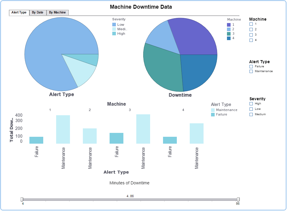
Visualization Techniques That Amplify Your Data Story
In my experience crafting data narratives, I've found that the right visualization can transform a complex dataset into an intuitive, memorable insight. However, choosing the wrong chart type can obscure your message or, worse, mislead your audience.
Matching Visualization Types to Insight Types
Different visualization formats serve specific storytelling purposes:
Creating Visual Hierarchies
When I design data visualizations, I carefully construct visual hierarchies that guide my audience through the narrative. This means:
- Using size and color to emphasize the most important data points
- Creating a clear focal point that draws attention to the key insight
- Using consistent visual language throughout related charts
- Removing unnecessary visual elements that don't contribute to the story
I've found that these principles of visual hierarchy are particularly important when creating PowerPoint data storytelling presentations, where audience attention must be carefully directed.
Design Principles for Clear Data Visualizations
Clarity First
I always prioritize clarity over complexity. This means using familiar chart types, clear labels, and thoughtful color choices that support accessibility.
Contextual Integration
I ensure every visualization includes sufficient context—titles, annotations, and legends—so the audience can understand the insight without additional explanation.
Consistent Formatting
I maintain consistent formatting across related visualizations, using the same color schemes, fonts, and scales to reinforce connections.
Intentional Color Usage
I use color strategically—to highlight key points, show categories, or represent values—never merely for decoration.

Interactive vs. Static Visualizations
I've learned that choosing between interactive and static visualizations depends on your storytelling goals:
| Interactive | Static |
|---|---|
| Best for exploration and discovery | Best for directed narratives |
| Allows audience to find personal insights | Ensures audience focuses on key message |
| Great for technical audiences | Effective for time-constrained presentations |
| Supports multiple story angles | Controls narrative progression |
Using PageOn.ai, I can transform complex datasets into intuitive visual representations without design expertise, choosing the right balance of interactivity based on my audience and goals.
Structuring Your Data Narrative for Maximum Impact
Through years of crafting data stories, I've found that even the most insightful data analysis falls flat without a compelling narrative structure. The way we sequence and frame our insights dramatically affects how they're received and whether they inspire action.
The Anatomy of a Compelling Data Story
Every effective data narrative follows this fundamental structure:
                    flowchart LR
                        A[Setup: Context & Question] --> B[Rising Insight: Data Exploration]
                        B --> C[Climax: Key Discovery]
                        C --> D[Resolution: Recommendations]
                        A -->|Business Context| A1[Why should we care?]
                        A -->|Clear Question| A2[What are we investigating?]
                        B -->|Building Evidence| B1[Supporting data points]
                        B -->|Creating Tension| B2[Challenges & obstacles]
                        C -->|Aha Moment| C1[The unexpected insight]
                        C -->|Validation| C2[Proof points]
                        D -->|Clear Actions| D1[What to do next]
                        D -->|Expected Impact| D2[Projected outcomes]
                        style A fill:#FF8000,stroke:#333,stroke-width:1px,color:white
                        style C fill:#FF8000,stroke:#333,stroke-width:1px,color:white
Maintaining Narrative Flow with Complex Information
When presenting complex data, I use several techniques to maintain a clear narrative thread:
- Signposting: I regularly remind the audience where we are in the story and where we're going next
- Progressive disclosure: I reveal information gradually, building complexity only after establishing foundational understanding
- Recurring motifs: I use consistent visual or verbal themes that tie different parts of the analysis together
- Strategic repetition: I reinforce key points at multiple junctures to ensure they're remembered
Incorporating Emotional Hooks
Data alone rarely inspires action—emotion does. I deliberately incorporate emotional elements into my data stories through:
- Human impact stories that illustrate how the data affects real people
- Relatable analogies that connect abstract concepts to familiar experiences
- Surprising contrasts that challenge assumptions and create memorable moments
- Stakes and consequences that highlight the importance of acting on the insights
I've found that PageOn.ai's conversational interface helps me structure my thoughts into coherent visual narratives that incorporate these emotional elements naturally, making complex data more relatable and actionable.
Balancing Detail with Clarity
One of my greatest challenges is determining which data to highlight versus which to minimize or exclude entirely. I follow this principle: every data point included must directly contribute to the central narrative. If it's merely interesting but doesn't advance the story or support decision-making, I save it for an appendix or follow-up.
The Impact of Narrative Structure on Memory Retention
My experience confirms what research shows—structured narratives dramatically improve how well information is remembered:
By thoughtfully structuring my data narratives, I ensure that insights aren't just understood in the moment but remembered and acted upon long after the presentation ends. This is the true measure of effective data storytelling—not just comprehension, but inspiration that leads to meaningful change.
Data Storytelling Across Different Business Contexts
Throughout my career, I've adapted data storytelling techniques to serve various business functions, each with unique needs and challenges. The fundamental principles remain consistent, but the emphasis and approach shift based on the specific context.
Data Storytelling Priorities by Department
Different business functions prioritize distinct aspects of data storytelling:
Marketing
When I work with marketing teams, I focus on turning customer behavior data into actionable campaign strategies. This typically involves:
- Segmenting audience data to reveal distinct behavioral patterns
- Mapping customer journeys to identify friction points and opportunities
- Measuring campaign performance against historical benchmarks
- Connecting engagement metrics to business outcomes like conversions
For marketing leaders, I emphasize visually compelling narratives that connect customer insights to brand storytelling opportunities, often leveraging techniques from startup storytelling to make the data more engaging.
Finance
With finance teams, my data storytelling focuses on communicating complex financial insights to non-financial stakeholders. Key approaches include:
- Translating technical metrics into business impact terminology
- Creating clear visualizations of risk-return relationships
- Using scenario analysis to illustrate potential outcomes
- Connecting financial performance to operational decisions
Finance professionals particularly appreciate how I use annotation layers to highlight regulatory considerations and risk factors within their data stories.
Operations
For operations teams, I craft data narratives that drive process improvements and efficiency gains:
- Visualizing process flows to identify bottlenecks
- Comparing actual vs. expected performance with clear variance analysis
- Quantifying the impact of operational changes over time
- Creating executive summaries that highlight optimization opportunities
Operations leaders particularly value how I use progressive disclosure techniques to allow them to drill down from high-level metrics to root causes.
Leadership
When supporting executive leadership, I focus on data narratives that facilitate strategic decision-making:
- Creating integrated views across departmental silos
- Highlighting long-term trends and their strategic implications
- Connecting operational metrics to strategic objectives
- Providing clear decision frameworks supported by data
For leadership audiences, I emphasize concise, impactful visualizations with clear recommendations—recognizing their limited time and need for actionable insights.
Adapting to Different Business Contexts
The versatility of PageOn.ai's agentic capabilities has been invaluable in adapting my data storytelling approach across these diverse business contexts. Its ability to understand the specific needs of different departments allows me to:
- Quickly shift between technical and non-technical language
- Suggest appropriate visualization types for different insight categories
- Integrate relevant industry benchmarks and contextual information
- Generate department-specific recommendations based on the data

By adapting my data storytelling approach to each business context while maintaining core principles of clarity and relevance, I ensure that insights resonate with diverse stakeholders and drive appropriate action across the organization.
Common Pitfalls in Data Storytelling and How to Avoid Them
Throughout my career creating data narratives, I've witnessed—and occasionally made—numerous mistakes that undermine the effectiveness of data storytelling. Recognizing these pitfalls is the first step toward avoiding them.
Data Storytelling Pitfalls and Solutions
Here are the most common mistakes I've encountered and how I address them:
                    flowchart TD
                        A[Common Pitfalls] --> B[Cherry-Picking Data]
                        A --> C[Overwhelming Detail]
                        A --> D[Missing "So What"]
                        A --> E[Neglecting Audience]
                        B --> B1[Solution: Start with questions,\n not desired conclusions]
                        C --> C1[Solution: Create layers of\n progressive disclosure]
                        D --> D1[Solution: Connect every insight\n to specific actions]
                        E --> E1[Solution: Research audience\n needs before designing]
                        style A fill:#FF8000,stroke:#333,stroke-width:1px,color:white
Cherry-Picking Data to Support Predetermined Conclusions
One of the most dangerous pitfalls I've observed is selecting only the data that supports a narrative we've already decided to tell. This confirmation bias not only undermines the integrity of our analysis but can lead to poor business decisions.
My Approach to Maintaining Objectivity:
- Start with clear questions, not answers I'm hoping to find
- Actively look for evidence that contradicts my initial hypotheses
- Include confidence intervals and limitations in my presentations
- Have peers review my methodology before finalizing conclusions
- Use PageOn.ai to maintain objectivity by exploring multiple interpretations of the same dataset
Overwhelming Audiences with Excessive Detail
I've learned the hard way that including every data point and analysis doesn't make a presentation more thorough—it makes it less effective. Information overload paralyzes decision-making rather than enabling it.
My Strategy for Managing Detail:
- Create a hierarchy of insights: primary, secondary, and supporting
- Design the main presentation around only primary insights
- Use appendices for those who want to explore deeper
- Create interactive elements that reveal details on demand
- Follow the "rule of three" for main points in any presentation
Neglecting the "So What" Factor
Too often, I see data presentations that end at the insight without connecting to actions. Without this critical bridge, even brilliant analysis fails to drive change.
My Framework for Ensuring Relevance:
- For every key finding, explicitly answer "So what does this mean for our business?"
- Include specific, actionable recommendations
- Quantify potential impact of recommended actions when possible
- Address potential obstacles to implementation
- Use PageOn.ai to help connect insights to practical next steps
Testing Whether Your Data Story Resonates
I've developed a systematic approach to testing whether my data stories will resonate with intended audiences before high-stakes presentations:
For each dimension, I ask specific questions to assess effectiveness:
- Comprehension: Can the audience accurately summarize the main points?
- Engagement: Do they ask relevant follow-up questions?
- Memorability: Can they recall key insights a day later?
- Actionability: Can they articulate what actions should follow?
- Emotional Impact: Does the story evoke an appropriate emotional response?
Using Technology to Avoid Pitfalls
I've found that PageOn.ai helps me avoid common data storytelling pitfalls in several ways:
- Its exploration capabilities encourage considering multiple perspectives before settling on a narrative
- The layered information architecture naturally supports progressive disclosure of details
- Its action-oriented prompts ensure I always connect insights to recommended next steps
- The ability to quickly generate alternative visualizations helps me test which approaches resonate best
- Its collaborative features make it easy to get feedback from diverse stakeholders before finalizing
Building a Data Storytelling Culture in Your Organization
Throughout my career leading data-driven initiatives, I've learned that creating isolated data stories, no matter how brilliant, isn't enough. To truly transform an organization, we need to build a culture where data storytelling becomes the default approach to communicating insights and driving decisions.
Training Teams to Think Narratively
When I first began promoting data storytelling in organizations, I focused solely on visualization techniques. I quickly realized this was insufficient. Effective data storytelling requires a fundamental shift in how teams think about and approach data analysis.
Now, I focus on training teams to:
- Begin analysis with clear questions tied to business objectives
- Look for patterns and anomalies that suggest narrative threads
- Consider multiple interpretations before settling on a story
- Frame insights within relevant business and human contexts
- Anticipate and address stakeholder questions and concerns

The Data Storytelling Maturity Model
I use this framework to assess where organizations are in their data maturity journey:
                    flowchart TD
                        A[Data Storytelling\nMaturity Levels] --> B[Level 1:\nData Reporting]
                        A --> C[Level 2:\nBasic Visualization]
                        A --> D[Level 3:\nInsight Narration]
                        A --> E[Level 4:\nStrategic Storytelling]
                        A --> F[Level 5:\nEmbedded Culture]
                        B --> B1[Raw data in tables\nand basic charts]
                        C --> C1[Better visuals but\nlimited context]
                        D --> D1[Insights with narrative\ncontext and meaning]
                        E --> E1[Stories aligned with\nstrategic objectives]
                        F --> F1[Data storytelling in\neveryday decisions]
                        style A fill:#FF8000,stroke:#333,stroke-width:1px,color:white
                        style F fill:#FF8000,stroke:#333,stroke-width:1px,color:white
Creating Frameworks for Consistent Data Storytelling
To scale data storytelling beyond a few talented individuals, I've found it essential to create frameworks that provide structure while allowing for creativity. These frameworks typically include:
Story Templates
Adaptable narrative structures for different insight types (trend analysis, comparison, anomaly investigation, etc.) with prompts for key elements to include.
Visual Standards
Guidelines for chart selection, color usage, annotation practices, and branding elements to ensure consistency across storytellers.
Review Checklists
Structured evaluation criteria for assessing data stories before presentation, focusing on accuracy, clarity, relevance, and actionability.
Audience Personas
Detailed profiles of key stakeholder groups, including their priorities, technical literacy, preferred communication styles, and common objections.

Tools and Technologies for Collaborative Data Storytelling
Building a data storytelling culture requires supporting technology that makes the practice accessible to everyone, not just data specialists. In my work with organizations, I recommend a technology stack that includes:
- Accessible data visualization platforms with templates and guardrails
- Collaborative workspaces where teams can build stories together
- Version control systems for tracking narrative evolution
- Feedback mechanisms to capture audience reactions
- Knowledge repositories to share successful story structures
PageOn.ai has been particularly valuable in democratizing data storytelling across technical and non-technical team members by providing an intuitive interface that guides users through the storytelling process while maintaining analytical rigor.
Measuring the Impact of Data Storytelling
To justify investment in building a data storytelling culture, I track these key metrics:
Building a data storytelling culture isn't a one-time initiative but an ongoing transformation. In my experience, it requires consistent leadership attention, clear success metrics, and technology that makes the practice accessible to everyone. When done right, it fundamentally changes how organizations make decisions, shifting from opinion-based debates to collaborative exploration of what the data is telling us.
The Future of Data Storytelling
As someone who's been deeply immersed in the evolution of data communication, I'm fascinated by the emerging trends that are reshaping how we transform raw data into compelling narratives. The future of data storytelling promises to be more automated, interactive, and ethically nuanced.
AI and Automation in Generating Preliminary Data Narratives
I'm already seeing how AI is transforming the initial stages of data storytelling. Systems can now identify patterns, anomalies, and correlations that might take humans hours or days to discover. But the most exciting developments go beyond pattern recognition.
Advanced AI systems are beginning to:
- Generate natural language explanations of what the data shows
- Suggest appropriate visualization formats based on data characteristics
- Identify potential causal relationships worthy of further investigation
- Recommend narrative structures that effectively communicate the insights
However, I believe the future isn't about AI replacing human storytellers but augmenting them—handling the time-consuming initial analysis so humans can focus on adding context, nuance, and strategic direction.

The Evolution of Data Storytelling Approaches
We're seeing a clear progression in how organizations approach data storytelling:
Interactive and Immersive Data Storytelling Experiences
The future of data storytelling will be increasingly interactive and immersive. I'm particularly excited about developments in:
Spatial Data Visualization
Using augmented and virtual reality to create three-dimensional data experiences that allow users to physically move through data landscapes, gaining intuitive understanding of complex relationships.
Personalized Data Narratives
AI-driven systems that adapt the same underlying data story to different audiences, adjusting technical depth, examples, and visualization complexity based on the viewer's role, expertise, and preferences.
Collaborative Story Building
Platforms that allow multiple stakeholders to simultaneously explore data and collectively build narratives, combining diverse perspectives into richer, more nuanced stories.
Sensory Data Experiences
Moving beyond visual-only data representation to incorporate sound, touch, and other senses for more intuitive understanding of patterns and anomalies in complex datasets.

The Next Evolution in Data Communication
PageOn.ai's agentic capabilities represent what I see as the next frontier in data storytelling—systems that don't just visualize data or suggest insights but actively collaborate with humans in the storytelling process.
These agentic systems can:
- Anticipate questions the audience might ask and prepare supporting evidence
- Suggest counterarguments to consider and address
- Adapt the narrative in real-time based on audience engagement
- Connect seemingly unrelated datasets to reveal deeper insights
- Maintain narrative consistency while exploring different analytical paths
Ethical Considerations in Data Storytelling
As data storytelling becomes more powerful and automated, I believe we must pay increasing attention to the ethical dimensions of how we frame and present data. This includes:
- Transparency about data sources, limitations, and potential biases
- Careful consideration of how visualization choices can subtly influence interpretation
- Inclusion of alternative interpretations when data allows multiple readings
- Awareness of whose stories might be missing from the data
- Accountability for the actions and decisions that result from our data stories
Preparing for the Future of Data Storytelling
To thrive in this evolving landscape, I recommend organizations and individuals focus on developing these key capabilities:
                        flowchart TD
                            A[Future-Ready\nData Storytelling Skills] --> B[Data Literacy]
                            A --> C[Narrative Design]
                            A --> D[Visual Communication]
                            A --> E[Ethical Reasoning]
                            A --> F[Human-AI Collaboration]
                            style A fill:#FF8000,stroke:#333,stroke-width:1px,color:white
As we move into this future, I believe the most successful organizations will be those that balance technological capabilities with human creativity and ethical judgment. The tools will continue to evolve, but the fundamental goal remains the same: transforming raw data into stories that illuminate, inspire, and drive meaningful action.
Transform Your Visual Expressions with PageOn.ai
Ready to revolutionize how you transform raw data into compelling business narratives? PageOn.ai provides the intuitive tools you need to create stunning data stories without technical barriers.
Start Creating with PageOn.ai TodayMastering the Art of Data Storytelling
Throughout this guide, I've shared my approach to transforming raw data into compelling business narratives that drive action. From establishing a solid workflow to choosing the right visualizations, structuring narratives for impact, and building a data storytelling culture, we've covered the essential elements that make data stories resonate.
As we look to the future, I'm excited by how tools like PageOn.ai are democratizing data storytelling, making it accessible to everyone regardless of technical background. The ability to quickly transform complex datasets into clear visual expressions means more teams can harness the power of their data to make better decisions.
Remember that effective data storytelling isn't just about beautiful charts or clever narratives—it's about creating meaningful connections between information and action. By thoughtfully applying the principles we've discussed, you can ensure your data doesn't just inform but inspires and motivates.
I encourage you to start small, experiment often, and continuously refine your approach to data storytelling. The journey from raw data to compelling business narrative is ongoing, but with practice and the right tools, you'll transform not just your data but how your entire organization makes decisions.
You Might Also Like
Mastering Workplace Communication with International Phonetic Alphabet (IPA) - Visual Guide
Discover how the International Phonetic Alphabet transforms workplace communication. Learn visual approaches to implement IPA for clearer global business interactions.
Mastering Visual Harmony: Typography and Color Selection for Impactful Presentations
Learn how to create professional presentations through strategic typography and color harmony. Discover font pairing, color theory, and design principles for slides that captivate audiences.
Building Competitive Advantage Through Effective Speaking | Business Communication Strategy
Discover how effective speaking creates measurable competitive advantage in business. Learn strategic communication frameworks, crisis response techniques, and visualization tools for organizational success.
Multi-Format Conversion Tools: Transforming Modern Workflows for Digital Productivity
Discover how multi-format conversion tools are revolutionizing digital productivity across industries. Learn about essential features, integration strategies, and future trends in format conversion technology.