Visualizing AI Concepts: Finding & Creating Effective Diagrams
Transform complex intelligence systems into comprehensible visual components
In my experience working with artificial intelligence systems, I've found that diagrams serve as foundational tools for understanding the complex structures and processes that power AI. As we explore the world of AI visualization, I'll share how these visual representations bridge the gap between technical complexity and practical understanding, breaking down AI operations into comprehensible components that provide deeper insights into learning models and decision processes.
Whether you're a researcher, developer, educator, or business professional, I'll guide you through finding, evaluating, and creating effective AI concept diagrams that serve audiences across both technical and non-technical backgrounds.
The Power of AI Concept Visualization
When I first began working with artificial intelligence systems, I quickly realized that diagrams are not just helpful—they're essential for truly understanding how AI works. These visual tools transform abstract intelligence frameworks into comprehensible components that anyone can grasp, regardless of their technical background.

Visual representation serves as a critical bridge between technical complexity and practical understanding. When I need to explain how a machine learning model makes decisions, I find that a well-designed diagram communicates in seconds what might take paragraphs of technical text to describe.
Breaking down AI operations visually enables deeper insights into learning models and decision processes. These visualizations help me trace data flows, understand model architectures, and identify potential bottlenecks or optimization opportunities.
What I find most valuable about AI diagrams is their ability to serve diverse audiences simultaneously. The same visualization can provide a high-level overview for executives while offering specific technical details for engineers—making them invaluable communication tools in cross-functional teams.
The Value Bridge of AI Visualization
I've found that AI concept visualization creates value across different stakeholder groups:
                    flowchart TD
                        AI[AI Concept Visualization] --> Tech[Technical Teams]
                        AI --> Exec[Executive Leadership]
                        AI --> Client[Clients & Stakeholders]
                        AI --> Edu[Educational Settings]
                        Tech --> TechVal[Detailed Implementation Insights]
                        Exec --> ExecVal[Strategic Decision Support]
                        Client --> ClientVal[Builds Trust & Understanding]
                        Edu --> EduVal[Accelerates Learning Curve]
                        classDef orange fill:#FF8000,stroke:#FF6000,color:white
                        classDef blue fill:#42A5F5,stroke:#1976D2,color:white
                        class AI orange
                        class TechVal,ExecVal,ClientVal,EduVal blue
Finding Existing AI Concept Diagrams
When I need to explain AI concepts quickly, I often start by looking for existing diagrams rather than creating them from scratch. Over the years, I've discovered several reliable resources for high-quality AI visualizations.
Specialized AI Visualization Resources
My search typically begins with industry-specific diagram collections. For healthcare applications, I've found specialized repositories that visualize how AI assists in diagnostic processes. Similarly, finance and data science domains have their own visualization libraries tailored to their unique AI implementations.
Academic repositories are another goldmine I frequently explore. Universities and research institutions often publish peer-reviewed AI concept visualizations that maintain high standards of accuracy. These diagrams tend to be more technically rigorous and reflect cutting-edge developments in the field.

Evaluation Criteria for Selecting Quality Diagrams
Not all AI diagrams are created equal. When evaluating visualizations, I focus on three key criteria:
- Technical accuracy and currency: I verify that diagrams reflect the latest AI developments and aren't presenting outdated concepts or architectures.
- Visual clarity: Effective diagrams follow information design principles with clear visual hierarchy, appropriate use of color, and minimal clutter.
- Appropriate complexity: I match the diagram's complexity to my audience's technical knowledge. What works for AI researchers might overwhelm business stakeholders.
Tools Offering Ready-Made AI Templates
When I need to customize existing diagrams, I turn to platforms that offer ready-made AI concept templates. These save me considerable time while ensuring professional results. Types of diagrams available range from simple flowcharts to complex neural network visualizations.
Several platforms specialize specifically in AI visualization resources. These tools not only provide templates but also offer specialized components for representing common AI architectures, making them invaluable for both quick explanations and detailed technical documentation.
Diagram Source Reliability Comparison
Based on my experience, here's how different sources of AI diagrams compare on key attributes:
Types of AI Concept Diagrams
In my work with AI systems, I've found that different visualization types serve specific purposes. Understanding the strengths of each diagram type helps me choose the right visual approach for any given concept.
Architectural Diagrams
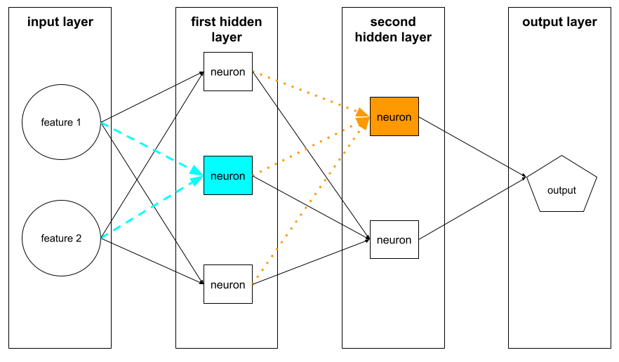
When I need to explain how an AI system is structured, architectural diagrams are my go-to choice. These visualizations excel at showing the components and relationships within neural networks, deep learning systems, and edge AI deployments.
Simple Neural Network Architecture
A basic architectural diagram I often use to introduce neural network concepts:
                    flowchart LR
                        subgraph Input
                            I1[Input 1]
                            I2[Input 2]
                            I3[Input 3]
                        end
                        subgraph Hidden
                            H1[Neuron 1]
                            H2[Neuron 2]
                            H3[Neuron 3]
                            H4[Neuron 4]
                        end
                        subgraph Output
                            O1[Output 1]
                            O2[Output 2]
                        end
                        I1 --> H1
                        I1 --> H2
                        I1 --> H3
                        I1 --> H4
                        I2 --> H1
                        I2 --> H2
                        I2 --> H3
                        I2 --> H4
                        I3 --> H1
                        I3 --> H2
                        I3 --> H3
                        I3 --> H4
                        H1 --> O1
                        H1 --> O2
                        H2 --> O1
                        H2 --> O2
                        H3 --> O1
                        H3 --> O2
                        H4 --> O1
                        H4 --> O2
                        classDef orange fill:#FF8000,stroke:#FF6000,color:white
                        classDef blue fill:#42A5F5,stroke:#1976D2,color:white
                        classDef green fill:#66BB6A,stroke:#388E3C,color:white
                        class I1,I2,I3 orange
                        class H1,H2,H3,H4 blue
                        class O1,O2 green
I've found that architectural diagrams are particularly effective when showing how different components interact within a system. For edge AI deployments, these visualizations help clarify how models are optimized for resource-constrained environments.
Process Flow Diagrams
When explaining how data moves through an AI system, I rely on process flow diagrams. These visualizations show the sequence of operations in machine learning pipelines, data processing workflows, and training cycles.

I find process flow diagrams particularly valuable when explaining the difference between training and inference workflows. They help stakeholders understand where bottlenecks might occur and how data transformations affect model performance.
Conceptual Models
For explaining theoretical foundations and relationships between AI concepts, I create conceptual model diagrams. These help illustrate abstract ideas, algorithm comparisons, and connections between AI subdisciplines.
AI compute visual guides are excellent examples of conceptual models that help demystify complex requirements and costs associated with artificial intelligence systems.
Performance Visualizations
When evaluating or comparing AI systems, I use performance visualizations to communicate model accuracy, resource utilization, and business impact metrics. These data-driven diagrams help stakeholders make informed decisions about AI implementations.
AI Model Performance Comparison
A typical visualization I create to compare different models across key metrics:
These visualizations help me communicate the tradeoffs between different models. For example, a model with higher accuracy might require more computational resources, which is critical information for deployment planning.
Creating Custom AI Concept Diagrams with PageOn.ai
While finding existing diagrams is useful, I often need to create custom visualizations tailored to specific AI concepts or projects. This is where I've found tools like PageOn.ai to be incredibly valuable in my workflow.
Transforming Complex AI Ideas into Visual Content
One of the most challenging aspects of AI visualization is the initial translation from complex technical concepts to visual structures. Using natural language commands to generate initial AI concept structures has dramatically simplified this process for me.
I've been particularly impressed with how PageOn.ai allows me to convert technical AI documentation into visual representations through conversation. Instead of manually designing each element, I can describe what I need, and the system generates a starting point that I can refine.
This approach has been particularly valuable when I'm working with team members who aren't designers. AI block diagram whiteboards allow everyone to contribute to the visualization process, regardless of their design skills.
Building Modular AI Concept Visualizations
For complex AI systems, I've found that modular diagram construction is essential. PageOn.ai's approach of combining standardized AI component blocks to create comprehensive system views has saved me countless hours of design work.
Modular AI System Construction
How I build complex AI visualizations using modular components:
                    flowchart TD
                        subgraph "Data Processing"
                            A1[Raw Data Input] --> A2[Data Cleaning]
                            A2 --> A3[Feature Extraction]
                            A3 --> A4[Normalization]
                        end
                        subgraph "Model Training"
                            B1[Initialize Model] --> B2[Forward Pass]
                            B2 --> B3[Loss Calculation]
                            B3 --> B4[Backpropagation]
                            B4 --> B5[Update Weights]
                            B5 --> B2
                        end
                        subgraph "Inference Pipeline"
                            C1[Input Processing] --> C2[Model Prediction]
                            C2 --> C3[Post-processing]
                            C3 --> C4[Output Generation]
                        end
                        A4 --> B1
                        B5 -.-> C1
                        classDef orange fill:#FF8000,stroke:#FF6000,color:white
                        classDef blue fill:#42A5F5,stroke:#1976D2,color:white
                        classDef green fill:#66BB6A,stroke:#388E3C,color:white
                        class A1,A2,A3,A4 orange
                        class B1,B2,B3,B4,B5 blue
                        class C1,C2,C3,C4 green
The drag-and-drop assembly of neural network layers and connections has been particularly useful when I'm iterating on different architectural designs. I can quickly experiment with different configurations without starting from scratch each time.
As my AI projects grow in complexity, I need diagrams that can scale accordingly. PageOn.ai's approach creates scalable visualizations that grow with project complexity, allowing me to start simple and add detail as needed.
Integrating Relevant AI Resources Automatically
Finding appropriate visual assets for specific AI concepts used to be a time-consuming process. Now, I rely on tools that can source these assets automatically, ensuring consistency and accuracy across my visualizations.
Incorporating up-to-date AI statistics and metrics into diagrams helps keep my visualizations current and relevant. AI visual tools can automatically integrate these data points, saving me research time.
I've also found tremendous value in systems that help me find and implement standardized AI iconography and visual language. This ensures my diagrams adhere to industry conventions, making them immediately recognizable to those familiar with the field.
Best Practices for Effective AI Concept Visualization
Through years of creating AI visualizations, I've developed a set of best practices that consistently produce clear, informative, and engaging diagrams. These principles guide my approach regardless of the specific visualization type.
Balancing Technical Accuracy with Visual Clarity
One of the greatest challenges I face is maintaining technical accuracy while keeping visualizations accessible. I've learned to identify the essential elements that must be preserved for accuracy, then simplify everything else to improve clarity.
This balance is particularly important when creating diagrams for mixed audiences. I've found that layered approaches work well—providing a clear high-level view with the option to explore technical details for those who need them.
Employing Consistent Visual Language
Consistency is crucial for effective communication. I develop and maintain a visual language across related concepts, using the same shapes, colors, and symbols to represent similar elements across different diagrams.
Visual Language Consistency Impact
My observations on how consistent visual language affects diagram effectiveness:
Using Color Coding and Visual Hierarchy
Strategic use of color helps me emphasize key AI relationships and guide viewers through complex diagrams. I limit my color palette to avoid overwhelming the viewer, using color primarily to highlight functional relationships and important components.
Visual hierarchy—created through size, position, color, and contrast—directs attention to the most important elements first. This is especially important for AI diagrams where certain components may have outsized importance despite small visual footprints.
Incorporating Interactive Elements
For complex, multi-layered AI systems, I've found interactive elements to be invaluable. These allow users to explore different levels of detail, toggle between views, and focus on specific components of interest.
AI implementation diagrams particularly benefit from interactivity, as they often need to show both high-level strategy and detailed execution steps.
Designing with Audience Knowledge in Mind
I always consider my audience's technical knowledge when creating AI visualizations. For technical teams, I include more detailed components and specific terminology. For business stakeholders, I focus on outcomes, relationships, and business impact.
This audience-centric approach sometimes means creating multiple versions of the same diagram, each tailored to a different audience's needs and knowledge level.
Case Studies: Successful AI Concept Visualization
Looking at real-world examples has helped me refine my own visualization approach. Here, I'll share some notable case studies that demonstrate effective AI concept visualization in different contexts.
Research Labs Visualizing Breakthrough Concepts
Leading AI research labs have developed sophisticated approaches to visualizing breakthrough concepts. I've been particularly impressed by how they use visual metaphors to make novel ideas accessible while maintaining technical rigor.
These visualizations often become canonical representations that influence how the entire field understands and discusses new concepts. The attention mechanism visualizations from transformer models are a perfect example—they've become the standard way to explain this breakthrough approach.
Enterprise Implementation for Stakeholder Alignment
In enterprise settings, I've observed how effective visualizations facilitate stakeholder alignment around AI initiatives. These diagrams focus on business outcomes, integration points with existing systems, and clear implementation roadmaps.
Enterprise AI Implementation Roadmap
A typical enterprise implementation visualization I've used with stakeholders:
                    flowchart LR
                        subgraph Phase1[Phase 1: Foundation]
                            A1[Data Infrastructure]
                            A2[Use Case Definition]
                            A3[Team Formation]
                        end
                        subgraph Phase2[Phase 2: Development]
                            B1[Model Selection]
                            B2[Initial Training]
                            B3[Evaluation Framework]
                        end
                        subgraph Phase3[Phase 3: Deployment]
                            C1[Integration]
                            C2[Monitoring Setup]
                            C3[User Training]
                        end
                        subgraph Phase4[Phase 4: Scale]
                            D1[Performance Analysis]
                            D2[Model Refinement]
                            D3[Expand Use Cases]
                        end
                        Phase1 --> Phase2
                        Phase2 --> Phase3
                        Phase3 --> Phase4
                        classDef phase1 fill:#FF8000,stroke:#FF6000,color:white
                        classDef phase2 fill:#42A5F5,stroke:#1976D2,color:white
                        classDef phase3 fill:#66BB6A,stroke:#388E3C,color:white
                        classDef phase4 fill:#AB47BC,stroke:#7B1FA2,color:white
                        class Phase1,A1,A2,A3 phase1
                        class Phase2,B1,B2,B3 phase2
                        class Phase3,C1,C2,C3 phase3
                        class Phase4,D1,D2,D3 phase4
These enterprise visualizations are particularly effective when they clearly show how AI components integrate with existing business processes and systems. This helps stakeholders understand the scope of change and necessary resources.
Educational Institutions Teaching Advanced AI
Educational institutions have developed particularly effective approaches to visualizing AI concepts for teaching purposes. These diagrams often use progressive disclosure—starting with simplified models that establish core concepts before introducing complexity.
I've found that educational visualizations excel at making abstract mathematical concepts tangible through visual metaphors. For example, representing high-dimensional spaces through carefully designed 2D projections helps students grasp concepts that are otherwise difficult to visualize.
Startup Success with Visual AI Explanations
I've witnessed startups effectively use visual AI explanations to secure investor funding. These visualizations focus on differentiation, market opportunity, and technical innovation—all communicated through clear, compelling diagrams.
The most successful startup visualizations I've seen balance technical credibility with business potential. They demonstrate deep technical understanding while making the value proposition immediately apparent to non-technical investors.
The Future of AI Concept Visualization
As AI continues to evolve, so too will the ways we visualize it. I'm particularly excited about several emerging trends that promise to transform how we create and interact with AI concept diagrams.
Emerging Trends in Dynamic and Interactive Diagrams
Static diagrams are giving way to dynamic, interactive visualizations that respond to user input and real-time data. These allow for deeper exploration and understanding of complex AI systems as they operate.
I'm seeing increased adoption of interactive elements that allow users to manipulate parameters and immediately see their effects on AI systems. This hands-on approach dramatically improves understanding of cause-and-effect relationships within models.
AI-Generated Visualizations
Perhaps the most fascinating development is AI systems that can visualize their own functioning. These self-explaining AI systems generate diagrams that highlight their internal processes, decision boundaries, and attention mechanisms.
This capability not only improves transparency but also helps developers identify and address issues within models. I expect this approach to become increasingly important as AI systems are deployed in high-stakes domains.
Immersive and 3D Representations
As virtual and augmented reality technologies mature, I anticipate a shift toward immersive, three-dimensional representations of complex AI architectures. These will allow users to "walk through" neural networks and other AI structures, gaining intuitive understanding through spatial exploration.
These immersive visualizations will be particularly valuable for understanding highly complex systems like large language models, where traditional 2D diagrams struggle to capture the full scope and interconnectedness of components.
Market Growth Projections
The market for AI visualization tools is projected to grow significantly, with a compound annual growth rate (CAGR) of 38.1% through 2027. This growth reflects the increasing importance of visualization in AI development, deployment, and education.
AI Visualization Market Growth Projection
Based on industry reports, here's how the market is expected to grow:
Evolution of Visualization Techniques
As AI systems grow more complex, visualization techniques must evolve to keep pace. I expect to see new visual languages and conventions emerge that are specifically designed to represent the unique characteristics of advanced AI architectures.
These evolving techniques will likely draw inspiration from fields like information design, cognitive psychology, and data visualization, creating hybrid approaches that maximize comprehension while minimizing cognitive load.
Transform Your AI Concepts into Powerful Visualizations
Ready to create stunning AI concept diagrams that communicate complex ideas clearly? PageOn.ai provides intuitive tools that make it easy to visualize even the most complex AI systems—no design experience required.
Start Creating with PageOn.ai TodayYou Might Also Like
Optimizing AI Model Costs: Balancing Performance with Resource Requirements
Discover practical strategies for AI model cost optimization while maintaining high performance. Visual frameworks for balancing computational efficiency with powerful AI capabilities.
From Complexity to Clarity: Why Creators Are Trading Notion for Apple Notes
Discover why creators are simplifying their productivity systems by moving from Notion to Apple Notes, and how this digital minimalism enhances creative output and mental clarity.
Transforming Industries with Language Models: From Summarization to Question Answering
Explore practical applications of language models from text summarization to question answering systems. Learn how LLMs are transforming healthcare, finance, e-commerce and more with PageOn.ai.
Essential Open Source Tools for Local AI Development and Deployment | PageOn.ai
Discover the best open source tools for local AI development, from foundation models like Llama to deployment platforms like Ollama. Build your complete local AI stack with this visual guide.