Visualizing America's $1.8 Trillion Deficit
Numbers, Impact, and Future Implications
I've spent years analyzing fiscal policy, and today I'm breaking down one of the most significant economic challenges facing our nation: the $1.8 trillion annual deficit. Through interactive visualizations and clear analysis, we'll explore what this massive number actually means for America's economy, its future, and your financial wellbeing.
Understanding the Scale: Breaking Down the $1.8 Trillion Deficit
When I first encountered the $1.8 trillion deficit figure, I struggled to truly comprehend its magnitude. To put this enormous number in perspective, I've created visualizations that break it down into more relatable terms.

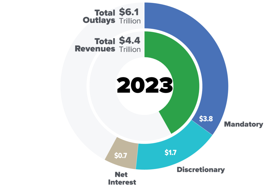
The fiscal year 2024 deficit of $1.8 trillion represents a $138 billion increase from FY2023. This growth is particularly concerning when we consider that revenue also increased significantly during this period. As a percentage of GDP, the deficit rose from 6.2% in 2023 to 6.4% in 2024, indicating that our fiscal challenges are outpacing economic growth.
FY2024 Deficit as Percentage of GDP
Perhaps the most striking way to visualize the deficit is to compare it directly with revenue. In FY2024, the federal government collected $4.9 trillion in revenue but spent $6.7 trillion, creating the $1.8 trillion gap. This means that for every dollar the government collected, it spent approximately $1.37.
Revenue vs. Spending Gap (FY2024)
                    flowchart LR
                        Revenue["Revenue\n$4.9T"] --> Gap["Deficit\n$1.8T"]
                        Gap --> Total["Total Spending\n$6.7T"]
                        classDef revenue fill:#66BB6A,stroke:#43A047,color:white
                        classDef deficit fill:#FF5252,stroke:#D32F2F,color:white
                        classDef total fill:#42A5F5,stroke:#1E88E5,color:white
                        class Revenue revenue
                        class Gap deficit
                        class Total total
When looking at these numbers, I'm reminded of how critical it is to understand the federal reserve system and its relationship to government spending and deficits. The interplay between fiscal and monetary policy becomes increasingly important as deficits grow.
Revenue vs. Expenditure: The Fiscal Imbalance
Despite the growing deficit, I was surprised to discover that FY2024 actually saw an impressive 11% increase in tax revenue, bringing the total to $4.9 trillion. This growth came primarily from two sources: a $249 billion (11%) increase in individual income taxes and a substantial $109 billion (26%) jump in corporate income taxes.
Tax Revenue Growth by Category (FY2024)
As a percentage of GDP, revenue collections increased from 16.2% in FY2023 to 17.1% in FY2024. This growth is significant and reflects both economic expansion and improved tax collection efficiency. However, it's important to note that some of this increase was due to timing factors, including IRS extensions of tax payment deadlines for areas affected by natural disasters.
Despite the revenue growth, spending continued to outpace income. Key categories driving expenditures include:
- Social Security and Medicare/Medicaid entitlements
- Defense spending
- Interest payments on existing debt
- Discretionary domestic programs
The relationship between revenue and expenditure has significant implications for us trade balance evolution, as deficit spending can affect international capital flows and currency valuations.
Historical Context and Trends
To truly understand the significance of today's $1.8 trillion deficit, I find it essential to place it within historical context. Looking at deficit trends over time reveals patterns that can inform our expectations for the future.
U.S. Federal Deficit Trend (2014-2024)
Historical Turning Points
Throughout america's economic journey, there have been several notable periods of deficit reduction that offer valuable lessons:
| Period | Key Actions | Result |
|---|---|---|
| 1990s | Bipartisan budget deals, tax increases, spending restraint | Budget surplus by end of decade |
| 1980s | Tax reform, deficit reduction acts | Slowed deficit growth temporarily |
| Post-WWII | Economic growth, reduced military spending | Significant deficit reduction relative to GDP |
Several factors have historically helped balance budgets:
- Strong economic growth periods
- Bipartisan fiscal discipline
- Structural reforms to major spending programs
- Temporary revenue measures
Historical Deficit Reduction Factors
                    flowchart TD
                        A[Deficit Reduction] --> B[Economic Growth]
                        A --> C[Fiscal Discipline]
                        A --> D[Program Reform]
                        A --> E[Revenue Measures]
                        B --> F[Increased Tax Base]
                        B --> G[Lower Safety Net Costs]
                        C --> H[Spending Caps]
                        C --> I[Budget Enforcement]
                        D --> J[Entitlement Reform]
                        D --> K[Efficiency Improvements]
                        E --> L[Tax Code Changes]
                        E --> M[Fee Structures]
                        classDef default fill:#f9f9f9,stroke:#333,stroke-width:1px
                        classDef main fill:#FF8000,stroke:#CC6600,color:white
                        class A main
Understanding these historical patterns helps provide context for our current fiscal situation and potential paths forward. The historical relationship between deficits and wall street financial crises pattern recognition also offers valuable insights into potential economic vulnerabilities.
Economic Ripple Effects
The $1.8 trillion deficit doesn't exist in isolation—it creates ripple effects throughout the economy that impact everything from interest rates to the strength of the dollar. I've found that visualizing these interconnections helps clarify how deficits affect our everyday economic reality.

One of the most direct impacts of large deficits is on interest rates. As the government borrows more to finance the deficit, it can put upward pressure on rates, increasing borrowing costs for everyone—from homebuyers to businesses seeking capital for expansion.
Interest Rates and Deficit Relationship
The deficit also influences the strength of the U.S. dollar and our international trade position. Large deficits can potentially weaken the dollar over time, which has complex effects: making exports more competitive but imports more expensive, and potentially reducing the purchasing power of American consumers.
Inflation concerns are also closely tied to deficit spending. When the government spends significantly more than it collects, especially during periods of economic growth, it can create inflationary pressures as more money chases the same amount of goods and services.
Deficit's Impact on Economic Factors
                    flowchart TD
                        A[Federal Deficit] --> B[Government Borrowing]
                        B --> C[Interest Rates]
                        C --> D[Borrowing Costs]
                        D --> E[Business Investment]
                        D --> F[Consumer Spending]
                        A --> G[Money Supply]
                        G --> H[Inflation Pressure]
                        H --> I[Purchasing Power]
                        A --> J[Investor Confidence]
                        J --> K[Dollar Strength]
                        K --> L[Trade Balance]
                        L --> M[Economic Growth]
                        M -.-> A
                        classDef default fill:#f9f9f9,stroke:#333,stroke-width:1px
                        classDef deficit fill:#FF8000,stroke:#CC6600,color:white
                        classDef negative fill:#FF6B6B,stroke:#CC5555,color:white
                        class A deficit
                        class H,D negative
Looking ahead to global economy 2025 projections, the deficit's impact on long-term economic growth and stability will be a critical factor to monitor. The interplay between fiscal policy, monetary policy, and economic outcomes becomes increasingly complex as deficit levels remain elevated.
Future Projections and Critical Thresholds
Interestingly, the actual FY2024 deficit of $1.8 trillion came in $82 billion lower than the Congressional Budget Office (CBO) had projected in their June 2024 Budget and Economic Outlook. While this is a small positive deviation, the overall trajectory remains concerning.

A critical question I often consider is: At what point does the deficit become economically dangerous? While there's no single answer, economists generally look at several key metrics:
Fiscal Sustainability Metrics
Looking at international comparisons, the U.S. deficit position is concerning but not yet at crisis levels seen in some other economies:
Global Deficit Comparison (% of GDP)
Several critical fiscal challenges and trigger points are on the horizon:
Timeline of Upcoming Fiscal Challenges
                    timeline
                        title U.S. Fiscal Challenge Timeline
                        2025 : Social Security Disability Fund Pressure
                        2026 : Major Tax Provisions Expire
                        2028 : Medicare Hospital Insurance Trust Fund Projected Insolvency
                        2030 : Debt-to-GDP Ratio Projected to Exceed 130%
                        2034 : Social Security Old-Age Trust Fund Projected Depletion
These projections highlight the importance of developing sustainable fiscal strategies now, before critical thresholds are crossed.
Visualization Strategies for Complex Fiscal Data
Throughout my analysis of the federal deficit, I've found that effective visualization is key to making these complex numbers understandable. Here are some strategies I've developed for creating intuitive visual representations of fiscal data.

Creating intuitive flow diagrams helps illustrate the movement of government revenue and spending. These Sankey diagrams are particularly effective at showing how money moves through the federal budget:
Federal Budget Flow Visualization
                    flowchart LR
                        A[Revenue\n$4.9T] --> B[Individual\nIncome Tax]
                        A --> C[Corporate\nTax]
                        A --> D[Payroll\nTax]
                        A --> E[Other\nRevenue]
                        B --> F[Federal\nBudget]
                        C --> F
                        D --> F
                        E --> F
                        F --> G[Social\nSecurity]
                        F --> H[Medicare &\nMedicaid]
                        F --> I[Defense]
                        F --> J[Interest on\nDebt]
                        F --> K[Other\nSpending]
                        G --> L[Total\nSpending\n$6.7T]
                        H --> L
                        I --> L
                        J --> L
                        K --> L
                        M[Deficit\n$1.8T] -.-> L
                        classDef revenue fill:#66BB6A,stroke:#43A047,color:white
                        classDef spending fill:#42A5F5,stroke:#1E88E5,color:white
                        classDef deficit fill:#FF5252,stroke:#D32F2F,color:white
                        class A,B,C,D,E revenue
                        class F,G,H,I,J,K,L spending
                        class M deficit
PageOn.ai's AI Blocks feature is particularly valuable for building interactive debt-to-GDP ratio visualizations. This tool allows me to create modular components that can be easily updated as new data becomes available, ensuring that visualizations remain current and accurate.
Comparative timelines are another effective strategy for showing deficit growth against economic indicators. By placing deficit numbers alongside metrics like GDP growth, unemployment rates, and interest rates, we can better understand the broader economic context.
Deficit vs. Economic Indicators (2019-2024)
When crafting visual narratives for fiscal data, I focus on making budget numbers accessible to non-economists. This means:
- Using relatable comparisons (e.g., comparing the deficit to household budgets)
- Breaking down large numbers into per-capita figures
- Using visual metaphors that convey scale and proportion
- Creating progressive disclosure of information to avoid overwhelming viewers
PageOn.ai's Deep Search feature is invaluable for integrating real-time fiscal data into presentations. This allows me to create visualizations that are always current, pulling the latest economic indicators and budget figures directly into my visual expressions.
Policy Considerations and Tradeoffs
Addressing the $1.8 trillion deficit requires difficult policy choices with significant tradeoffs. I've found that visualizing these tradeoffs helps clarify the implications of different approaches.
The fundamental policy choice is between revenue enhancement and spending reduction approaches. Each has different sectoral impacts:
Sectoral Impact of Deficit Reduction Strategies
Generational equity considerations are particularly important when evaluating deficit reduction strategies. Current deficits represent potential burdens on future generations, who will have to pay for today's spending.
Generational Impact of Deficit Policies
                    flowchart TD
                        A[Current Deficit] --> B[Current Generation]
                        A --> C[Future Generations]
                        B --> D[Current Benefits]
                        B --> E[Current Tax Burden]
                        C --> F[Future Debt Service]
                        C --> G[Reduced Fiscal Flexibility]
                        C --> H[Potential Growth Constraints]
                        I[Policy Choices] --> J[Short-term Fixes]
                        I --> K[Structural Reforms]
                        J -.-> B
                        K -.-> C
                        classDef current fill:#FF8000,stroke:#CC6600,color:white
                        classDef future fill:#42A5F5,stroke:#1E88E5,color:white
                        classDef policy fill:#66BB6A,stroke:#43A047,color:white
                        class A,B,D,E current
                        class C,F,G,H future
                        class I,J,K policy
The tradeoff between long-term structural reforms and short-term fixes is another critical consideration. While short-term measures may provide immediate deficit reduction, they often fail to address the underlying structural issues driving fiscal imbalances.
Building consensus on deficit reduction requires clear visual representation of fiscal challenges. By using PageOn.ai's visualization tools, policymakers can better communicate the scale of the problem and the implications of different solutions, facilitating more productive dialogue across political divides.
Transform Your Fiscal Data Visualizations with PageOn.ai
Ready to create compelling, insightful visualizations of complex economic data? PageOn.ai provides powerful tools to transform abstract numbers into clear, engaging visual stories that drive understanding and decision-making.
Start Creating with PageOn.ai TodayConclusion: Making Sense of America's Fiscal Challenge
The $1.8 trillion deficit represents one of America's most significant fiscal challenges. Through this analysis, I've aimed to break down this enormous figure into understandable components and visualize its implications for our economy and future.
Understanding the scale, context, and impact of the deficit is essential for informed civic participation and policy discussion. By leveraging powerful visualization tools like those offered by PageOn.ai, we can transform complex fiscal data into clear visual expressions that facilitate better understanding and more productive dialogue.
As we look ahead to the future of America's fiscal position, visualization will play an increasingly important role in helping policymakers and citizens alike navigate these complex challenges. The ability to clearly communicate fiscal data through effective visual storytelling will be crucial for building the consensus needed to address our long-term fiscal sustainability.
Whether you're a policymaker, educator, journalist, or concerned citizen, PageOn.ai offers the tools you need to create compelling visual narratives around fiscal policy and economic data—transforming abstract numbers into meaningful insights that can drive better decisions and outcomes.
You Might Also Like
Transforming Marketing Teams: From AI Hesitation to Strategic Implementation Success
Discover proven strategies to overcome the four critical barriers blocking marketing AI adoption. Transform your team from hesitant observers to strategic AI implementers with actionable roadmaps and success metrics.
Creating Visual AI Ethics Frameworks: A Leadership Guide for Modern Business | PageOn.ai
Discover how to develop comprehensive visual AI ethics frameworks for your organization. This guide helps business leaders translate complex ethical principles into clear visual guidelines.
Google's 9-Hour Prompt Engineering Path to AI Mastery | Complete Visual Guide
Master AI communication through Google's comprehensive 9-hour prompt engineering framework. Learn visual strategies for effective AI interaction and professional success.
The AI Superpower Timeline: Visualizing US-China AI Race & Tech Developments
Explore the narrowing US-China AI performance gap, historical milestones, technical battlegrounds, and future projections in the global artificial intelligence race through interactive visualizations.