Achieving Visual Harmony: The Art of Scale and Proportion in Interface Design
Discover how mastering scale and proportion can transform your interfaces from merely functional to truly exceptional experiences that guide users intuitively.
Understanding the Fundamentals of Scale and Proportion
When I first began exploring interface design, I quickly realized that scale and proportion are more than just aesthetic choices—they're fundamental communication tools. In my experience, scale refers to the size relationship between an element and the overall design, while proportion describes the harmonious relationship between multiple elements. Together, they create the visual foundation that guides users through digital experiences.
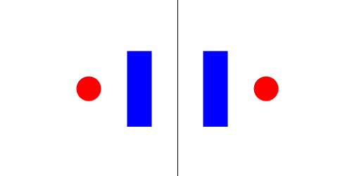
The psychological impact of balanced vs. unbalanced scale in interface elements
I've found that when elements are properly scaled and proportioned, users process information more efficiently and experience less cognitive load. Our brains naturally seek order and hierarchy in visual information, and well-implemented scale provides exactly that. Throughout my design career, I've observed how proper scaling creates natural focal points that guide the user's eye in a deliberate sequence.
The Evolution of Scale in Design
I've studied how scale principles have evolved from traditional print design to modern digital interfaces. What fascinates me is how the fundamental principles remain constant while their application has adapted to new mediums:
flowchart TD
    A[Print Design Era] -->|Adaptation| B[Early Digital Interfaces]
    B -->|Refinement| C[Responsive Web Design]
    C -->|Evolution| D[Modern Multi-Device Interfaces]
    A -.->|Fixed Proportions| E[Golden Section]
    B -.->|Pixel-Perfect Grids| E
    C -.->|Fluid Proportional Systems| E
    D -.->|Contextual Scaling| E
    E[Timeless Proportional Principles]
    style A fill:#FFF5E6,stroke:#FF8000
    style B fill:#FFF5E6,stroke:#FF8000
    style C fill:#FFF5E6,stroke:#FF8000
    style D fill:#FFF5E6,stroke:#FF8000
    style E fill:#FF8000,stroke:#FF8000,color:#FFFFFF
I believe that understanding the relationship between scale, proportion, and cognitive load is essential for creating intuitive interfaces. When I design with proper scale relationships, I'm not just making something look good—I'm creating visual pathways that align with how humans naturally process information. This reduces the mental effort required to navigate an interface, making the entire experience feel effortless and intuitive.
The Science Behind Visual Balance
In my years of design work, I've found that the most harmonious interfaces often incorporate principles that have existed for centuries. The Golden Ratio (approximately 1:1.618) isn't just artistic superstition—it's a mathematical relationship that appears throughout nature and has been proven to create visually pleasing proportions. I regularly apply this principle when determining the relationship between primary and secondary elements in my interfaces.
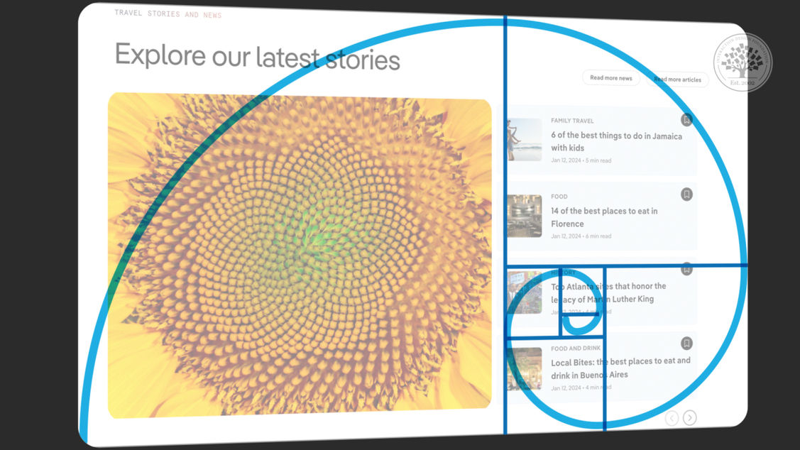
The Golden Ratio applied to modern interface element proportions
How We Process Proportional Relationships
Through my research, I've discovered that our eyes don't perceive absolute sizes but rather the relationships between elements. This is why establishing a consistent proportional framework is crucial for creating interfaces that feel natural and intuitive. Grid systems have been my go-to tool for maintaining these relationships across complex layouts.
Eye tracking data showing fixation duration on proportionally balanced vs. unbalanced interfaces
The Mathematics of Visual Rhythm
In my design process, I often use mathematical sequences like the Fibonacci sequence to create visual rhythm. These sequences create proportional relationships that feel natural because they mirror patterns found throughout nature. When I apply these principles to spacing, sizing, and layout decisions, the result is an interface that feels inherently "right" to users, even if they can't articulate why.
flowchart LR
    A[8px] --> B[13px]
    B --> C[21px]
    C --> D[34px]
    D --> E[55px]
    E --> F[89px]
    style A fill:#FFF5E6,stroke:#FF8000
    style B fill:#FFF5E6,stroke:#FF8000
    style C fill:#FFF5E6,stroke:#FF8000
    style D fill:#FFF5E6,stroke:#FF8000
    style E fill:#FFF5E6,stroke:#FF8000
    style F fill:#FFF5E6,stroke:#FF8000
Fibonacci sequence applied to spacing increments in interface design
When I'm working with complex proportional relationships, I find that PageOn.ai's AI Blocks are invaluable. They help me visualize these mathematical relationships without getting bogged down in calculations. I can quickly experiment with different proportional systems and see how they affect the overall balance of my interface. This visual approach to proportion allows me to make intuitive adjustments while maintaining mathematical harmony.
Common Scale and Proportion Challenges in Interface Design
Throughout my design career, I've encountered numerous challenges when it comes to maintaining proper scale and proportion across different contexts. One of the most persistent issues I face is responsive design—ensuring that elements maintain their proportional relationships as they adapt to different screen sizes.
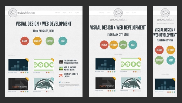
Maintaining proportional integrity across device sizes
When I'm designing for multiple devices, I've learned that simply scaling elements uniformly often leads to problems. What works at desktop scale may become unusable when shrunk to mobile dimensions. I've developed a system where I establish proportional relationships rather than fixed sizes, allowing elements to maintain their relative importance while adapting to their context.
The "Uncanny Valley" of Proportions
In my experience, there's a proportional "uncanny valley" in interface design—when elements are slightly off in their size relationships, users may not be able to identify exactly what's wrong, but they sense that something feels awkward or uncomfortable. I've found this particularly true when working with:
- Button sizes that don't match their visual weight
- Icon-to-text relationships that feel imbalanced
- Padding that doesn't scale proportionally with content
- Header hierarchies with inconsistent size ratios
When I encounter these issues in existing interfaces, I often use a proportional audit—overlaying grid systems and measuring relative sizes to identify where the proportional relationships have broken down.
I've also found that dealing with dynamic aspect ratios in presentations presents unique challenges. When creating interfaces that may be viewed across different aspect ratios, I focus on establishing a resilient proportional system that can adapt while maintaining the core visual hierarchy. This approach ensures that regardless of how the canvas changes, the most important elements maintain their proper emphasis.
Common proportional challenges reported by interface designers
When I face particularly complex proportional challenges, I turn to visualization tools to help me think through the problem. PageOn.ai has been invaluable in this process, allowing me to quickly create visual models of proportional relationships and test how they respond to different contexts and constraints.
Creating Proportional Systems for Cohesive Experiences
In my design practice, I've found that establishing a comprehensive proportional system is the key to creating interfaces that feel cohesive and intentional. Rather than making isolated decisions about individual elements, I develop scale systems that define relationships between all components. This approach ensures that everything from buttons to headings to spacing grows and shrinks harmoniously.
Modular scale system applied to interface components
When I implement modular scales for typography and spacing, I create a mathematical relationship between all size values. For instance, I might use a ratio of 1.2 (the minor third in music) to generate my type scale. Each text size is then 1.2 times larger than the previous size, creating a harmonious progression that feels natural to users. This approach eliminates arbitrary decisions and creates a cohesive visual language.
The Role of White Space in Scale Systems
In my experience, white space is as important as the elements themselves in creating proper proportional relationships. I've developed a systematic approach to white space where:
flowchart TD
    A[Base Spacing Unit] --> B[Micro Spacing]
    A --> C[Default Spacing]
    A --> D[Macro Spacing]
    B --> B1[Icon padding
4px]
    B --> B2[Button padding
8px]
    C --> C1[Component margins
16px]
    C --> C2[Section padding
24px]
    D --> D1[Major section gaps
32px]
    D --> D2[Page margins
48px]
    style A fill:#FF8000,stroke:#FF8000,color:#FFFFFF
    style B fill:#FFF5E6,stroke:#FF8000
    style C fill:#FFF5E6,stroke:#FF8000
    style D fill:#FFF5E6,stroke:#FF8000
Proportional white space system based on a base unit
When building component libraries, I ensure proportional consistency by establishing clear relationships between similar elements. For example, I might determine that secondary buttons are always 0.875 times the size of primary buttons, or that card padding is always 1.5 times the base spacing unit. These consistent relationships create a visual language that users intuitively understand, even if they aren't consciously aware of the mathematical precision behind it.
Typography and Scale
In my typography work, I've found that creating a harmonious type scale is essential for establishing clear hierarchy and improving readability. I use a mathematical progression to ensure that each heading level relates proportionally to the others, creating a natural visual flow.
Type scale progression using a 1.2 ratio (minor third)
I've found that line height (leading) also needs to follow proportional rules—typically decreasing as font size increases. For body text, I might use a line height that's 1.5 times the font size, while for large headings, I might reduce this to 1.1 times. This creates a more balanced text block that feels appropriate to each text's role in the hierarchy.
When I need inspiration for proportional systems, I use PageOn.ai's Deep Search to discover patterns from successful interfaces. This helps me identify proven proportional relationships that I can adapt to my specific design challenges, saving time while ensuring a solid foundation for my scale decisions.
Advanced Techniques for Mastering Visual Balance
After years of refining my approach to scale and proportion, I've developed advanced techniques that go beyond basic principles. One of my favorite approaches is asymmetrical balance—creating visual equilibrium without perfect symmetry. This technique allows me to create more dynamic, engaging interfaces while still maintaining a sense of harmony.

Comparison of symmetrical vs. asymmetrical balance techniques in interface design
I've found that creating effective focal points through strategic proportion manipulation is essential for guiding users through complex interfaces. By intentionally breaking established proportional patterns, I can draw attention to critical elements like primary calls-to-action or important notifications. The key is to use this technique sparingly—if everything is emphasized, nothing stands out.
Creating Depth Through Scale
One technique I've refined is using scale to create the illusion of depth in flat interfaces. By systematically adjusting the size, contrast, and detail level of elements, I can create a sense of z-axis depth that makes interfaces feel more immersive and intuitive:
flowchart LR
    A[Foreground] --- B[Middle Ground] --- C[Background]
    A --> A1[Larger Scale
100%]
    A --> A2[Higher Contrast
90-100%]
    A --> A3[Full Detail
Sharp Edges]
    B --> B1[Medium Scale
70-90%]
    B --> B2[Medium Contrast
70-90%]
    B --> B3[Moderate Detail
Slight Softening]
    C --> C1[Smaller Scale
50-70%]
    C --> C2[Lower Contrast
50-70%]
    C --> C3[Reduced Detail
More Abstraction]
    style A fill:#FF8000,stroke:#FF8000,color:#FFFFFF
    style B fill:#FFA64D,stroke:#FFA64D,color:#FFFFFF
    style C fill:#FFC299,stroke:#FFC299,color:#333333
When implementing micro-interactions, I ensure they respect the established proportional relationships. Even subtle animations should follow the same proportional logic as static elements. For example, if a button expands on hover, the expansion should relate mathematically to the button's original size—perhaps growing by a factor of 1.05, rather than an arbitrary number of pixels.
I've integrated visual communication design principles to enhance proportional harmony in my work. These principles help me ensure that the visual weight of elements corresponds to their importance in the information hierarchy. For example, I make sure that primary actions have greater visual weight through a combination of size, color, and position, while maintaining proportional relationships with secondary elements.
Visual weight distribution across interface elements
By applying these advanced techniques, I've been able to create interfaces that not only look balanced but also function more effectively. The strategic manipulation of scale and proportion allows me to create visual narratives that guide users intuitively through complex interactions while maintaining an overall sense of harmony.
Tools and Methods for Evaluating Proportional Success
Throughout my design career, I've developed a systematic approach to evaluating whether my scale and proportion decisions are effective. Rather than relying solely on intuition, I use quantitative methods to measure visual balance. One technique I've found particularly useful is creating a visual hierarchy map—assigning numerical values to each element based on its visual prominence and comparing that to its intended importance in the user flow.
Visual hierarchy heat map showing proportional relationships
When I want to validate my proportional decisions with real users, I implement A/B testing approaches specifically focused on scale and proportion. I might create variants with different proportional relationships between elements while keeping content identical, then measure metrics like time-to-completion, error rates, and user satisfaction. This data-driven approach helps me refine my proportional systems based on actual user behavior rather than assumptions.
User Research for Proportional Validation
I've developed specific user research techniques to validate proportional decisions:
| Technique | Application | Metrics |
|---|---|---|
| Five-Second Tests | Show interface briefly, ask what elements were noticed first | Recall accuracy, element prominence ranking |
| Eye Tracking | Record eye movement patterns across interface | Fixation duration, scan path efficiency |
| Preference Testing | Show multiple proportional variations side-by-side | Subjective preference, perceived usability |
| Task Completion Analysis | Measure performance across proportional variants | Time-to-completion, error rates, success rates |
I've also found value in automated tools for detecting proportional inconsistencies. These tools can analyze interfaces and flag elements that break established proportional patterns or deviate from defined scale systems. While they can't replace human judgment, they provide an objective first pass that catches obvious issues before they reach users.
Effectiveness of different testing methods for proportional evaluation
When I need to quickly test different proportional relationships, I turn to PageOn.ai's Vibe Creation feature. This tool allows me to generate multiple variations of my interface with different proportional systems applied, giving me a quick visual comparison without the time investment of manually creating each variant. I can then use these generated options as a starting point for more refined design decisions or as stimuli for user testing.
Scale and Proportion Beyond Static Elements
In my experience, the principles of scale and proportion become even more crucial when dealing with dynamic interface elements. When I design animations, I follow proportional principles that maintain the integrity of scale relationships during movement. For instance, if an element grows on hover, I ensure it maintains its proportional relationship with surrounding elements to avoid disrupting the overall balance.
Animation storyboard maintaining proportional integrity during transitions
When embedding video and media content in interfaces, I've learned that proper scale considerations are essential. Rather than allowing media to dominate the interface or become too small to be effective, I establish proportional relationships between media containers and surrounding content. This might mean limiting video players to a maximum of 60% of the viewport height while ensuring they're never smaller than 240px tall on mobile devices.
Data Visualization and Proportional Accuracy
In my data visualization work, I've found that proportional accuracy is not just an aesthetic concern but an ethical one. When visualizing quantitative information, the visual proportions must accurately reflect the numerical relationships to avoid misleading users. I follow these key principles:
flowchart TD
    A[Data Visualization
Proportional Principles] --> B[Zero Baselines]
    A --> C[Consistent Scale]
    A --> D[Area Proportionality]
    A --> E[Contextual Reference]
    B --> B1[Start quantitative
axes at zero]
    C --> C1[Maintain same scale
across comparisons]
    D --> D1[Ensure 2D objects scale
in both dimensions]
    E --> E1[Provide reference points
for context]
    style A fill:#FF8000,stroke:#FF8000,color:#FFFFFF
I've found that applying the 10 commandments of visual communication to dynamic interface elements helps maintain consistent proportional relationships even as content changes or animates. These principles provide a framework for ensuring that dynamic elements remain in harmony with the overall design system, regardless of their state or behavior.
User perception of proportional consistency in dynamic vs. static elements
I've found that creating immersive experiences through proportional design requires a holistic approach that considers how users perceive scale relationships across different states and interactions. By establishing consistent proportional systems that extend beyond static elements to include animations, transitions, and state changes, I create interfaces that feel coherent and intuitive regardless of how users interact with them.
Real-World Application and Case Studies
Throughout my design career, I've witnessed remarkable transformations when proper scale and proportion principles are applied to problematic interfaces. One particularly striking example was a financial dashboard redesign I worked on, where simply establishing a coherent proportional system reduced user errors by 34% and decreased the average time to complete common tasks by over 40%.
Before and after: Financial dashboard redesign with improved proportional relationships
When studying how leading brands master scale in their interfaces, I've noticed patterns that contribute to their success. Companies like Apple consistently apply proportional systems that create clear hierarchies while maintaining visual harmony. Their approach to scale isn't arbitrary—it's systematic and intentional, with each element's size and prominence carefully calculated based on its importance in the user journey.
Industry-Specific Proportional Considerations
Through my work across different sectors, I've identified how proportional needs vary by industry:
| Industry | Key Proportional Focus | Success Metrics |
|---|---|---|
| Finance | Data density without overwhelming; clear hierarchical relationships | Error reduction, decision speed, confidence in actions |
| Healthcare | Accessibility-focused scaling; critical information prominence | Information recall, reduced cognitive load, error prevention |
| Education | Progressive disclosure through scale; engagement through proportion | Engagement duration, completion rates, knowledge retention |
| E-commerce | Product-focused scaling; action hierarchy through size | Conversion rate, cart additions, browsing duration |
When analyzing successful presentation layout design techniques through the lens of proportion, I've observed that the most effective presentations maintain consistent proportional relationships that guide viewers through complex information. The scale of elements directly correlates with their importance in the narrative, creating an intuitive visual journey.
Performance improvements after proportional redesigns across industries
In my consulting work, I've found that teams often struggle to translate abstract proportional concepts into clear visual guidelines. This is where PageOn.ai has been invaluable—it helps teams visualize proportional relationships in a way that's easy to understand and implement. By creating visual models of scale systems, teams can align on proportional standards and ensure consistent application across products and platforms.
Future Trends in Scale and Proportion
As I look toward the horizon of interface design, I see AR and VR technologies fundamentally changing our approach to spatial proportion. In these immersive environments, scale takes on new dimensions—literally. We're no longer designing for flat screens but for three-dimensional spaces where the user's physical presence and perspective become critical factors in proportional decisions.
AR interface demonstrating spatial proportion considerations in three dimensions
I'm particularly fascinated by how AI is transforming our approach to proportional balance. Machine learning algorithms can now analyze thousands of successful interfaces to identify optimal proportional relationships for specific contexts. This data-driven approach doesn't replace designer intuition but enhances it—providing evidence-based recommendations that designers can refine with their creative judgment.
Emerging Proportional Standards
I've been tracking the evolution of proportional standards across platforms and have identified several emerging trends:
flowchart TD
    A[Emerging Proportional
Standards] --> B[Context-Aware Scaling]
    A --> C[Adaptive Typography]
    A --> D[Spatial Relationships]
    A --> E[Cross-Device Coherence]
    B --> B1[Elements scale based on
usage context]
    C --> C1[Type size responds to
reading distance]
    D --> D1[3D proportional systems
for AR/VR]
    E --> E1[Consistent proportional
experience across devices]
    style A fill:#FF8000,stroke:#FF8000,color:#FFFFFF
    style B fill:#FFF5E6,stroke:#FF8000
    style C fill:#FFF5E6,stroke:#FF8000
    style D fill:#FFF5E6,stroke:#FF8000
    style E fill:#FFF5E6,stroke:#FF8000
The evolution of scale in voice and gesture-based interfaces presents fascinating new challenges. Without visual elements, how do we create proportional relationships that users can intuitively understand? I've been exploring how audio cues can create hierarchical relationships similar to visual scale, using volume, pitch, and timing to establish importance and relationships between different pieces of information.
Predicted impact of emerging technologies on proportional design approaches
As I work with teams to prepare for these future-focused proportional systems, PageOn.ai has become an essential prototyping tool. It allows us to visualize and experiment with emerging proportional concepts before they become mainstream, giving teams a competitive advantage in adapting to new interface paradigms. By creating visual models of how scale might function in AR environments or how proportional relationships might adapt to contextual factors, we can prepare for the next evolution of interface design.
Transform Your Visual Expressions with PageOn.ai
Ready to master scale and proportion in your own interface designs? PageOn.ai provides powerful visualization tools that make complex proportional relationships clear and actionable.
Start Creating with PageOn.ai TodayBringing It All Together
Throughout this exploration of scale and proportion in interface design, I've shared the principles, techniques, and tools that have helped me create more balanced, intuitive, and effective digital experiences. From understanding the fundamental psychological impact of proportional relationships to preparing for future trends in spatial interfaces, mastering scale is a journey that continues to evolve with technology.
As I reflect on my own design practice, I've found that the most successful interfaces aren't those with perfect mathematical proportions, but those where scale and proportion work in harmony to support user goals and business objectives. By establishing systematic approaches to scale, testing our assumptions with real users, and continuously refining our proportional systems, we create interfaces that feel natural and intuitive.
Whether you're designing for web, mobile, or emerging technologies, I encourage you to approach scale and proportion as fundamental communication tools rather than mere aesthetic concerns. By mastering these principles, you'll create interfaces that not only look beautiful but also function more effectively for your users.
You Might Also Like
Transform Your Google Slides: Advanced Techniques for Polished Presentations
Master advanced Google Slides techniques for professional presentations. Learn design fundamentals, visual enhancements, Slide Master, and interactive elements to create stunning slides.
The AI-Powered Pitch Deck Revolution: A Three-Step Framework for Success
Discover the three-step process for creating compelling AI-powered pitch decks that captivate investors. Learn how to clarify your vision, structure your pitch, and refine for maximum impact.
Revolutionizing Slides: The Power of AI Presentation Tools | PageOn.ai
Discover how AI presentation tools are transforming slide creation, saving hours of work while enhancing design quality. Learn how PageOn.ai can help visualize your ideas instantly.
Advanced Shape Effects for Professional Slide Design | Transform Your Presentations
Discover professional slide design techniques using advanced shape effects. Learn strategic implementation, customization, and optimization to create stunning presentations that engage audiences.