Creating Immersive Worlds: The Art of Color and Atmosphere in Visual Storytelling
Transform your creative vision with the magic of color psychology and atmospheric design
I've spent years exploring how color and atmosphere work together to create unforgettable worlds across various media. In this guide, I'll share my insights on building immersive environments that captivate your audience through strategic use of visual elements, and how PageOn.ai can help streamline this creative process.
The Foundation of World-Building Through Color
When I create a new world, I always start with color. Color isn't just decoration—it's the fundamental language that establishes the emotional tone of any imagined universe. There's a profound difference between simply selecting colors and truly storytelling through color choices. While selection is about aesthetics, storytelling with color creates an immersive experience that resonates on a deeper psychological level.
PageOn.ai's Vibe Creation feature has revolutionized how I approach this process. Instead of struggling with technical color terminology, I can simply have a conversation about the feeling I want to evoke—whether it's "mysterious forest at twilight" or "retro-futuristic cityscape"—and watch as the AI helps translate these concepts into cohesive color palettes.
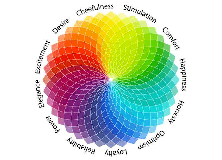
The psychological impact of color choices cannot be overstated. When building worlds, I'm constantly aware that every hue carries emotional weight and cultural significance that will shape how audiences perceive and connect with my creation.
Emotional Impact of Color in World-Building
I've studied how iconic fantasy worlds use signature color palettes to establish immediate recognition. Think about how the emerald greens of Oz, the golden warmth of Middle-earth, or the neon-drenched cyberpunk futures instantly transport you to those worlds. These aren't random choices—they're deliberate color strategies that create a visual shorthand for complex world-building.
Color Psychology Fundamentals for World-Builders
Understanding color psychology in design is essential when creating immersive worlds. These principles translate directly to world-building contexts, helping creators establish consistent emotional landscapes. I've developed what I call an "emotional spectrum" approach—mapping specific colors to particular moods and story elements to create coherence throughout my worlds.
flowchart TD
    A[World Concept] --> B[Emotional Core]
    B --> C[Color Palette Selection]
    C --> D1[Primary Colors]
    C --> D2[Secondary Colors]
    C --> D3[Accent Colors]
    D1 --> E[World Identity]
    D2 --> E
    D3 --> E
    E --> F[Visual Consistency]
    F --> G[Audience Immersion]
    classDef primary fill:#FF8000,stroke:#333,stroke-width:1px,color:white;
    classDef secondary fill:#42A5F5,stroke:#333,stroke-width:1px;
    classDef accent fill:#66BB6A,stroke:#333,stroke-width:1px;
    class A,B primary;
    class C,E,G secondary;
    class D1,D2,D3,F accent;
Cultural considerations are equally important when building worlds with color. I'm always mindful that colors carry different associations across cultures—white signifies purity in some contexts but death in others. This awareness helps avoid unintended associations that might break immersion for diverse audiences.
PageOn.ai's AI Blocks feature has been invaluable for my world-building process. It allows me to experiment with different color combinations without needing technical design skills. I can quickly visualize how various palettes might influence the perception of my world, making the creative process both more efficient and more experimental.
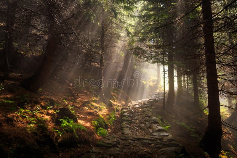
Crafting Atmosphere Through Visual Elements
Creating a truly immersive world requires mastering the delicate interplay between color, lighting, texture, and space. I've found that these elements working in harmony create what we perceive as "atmosphere"—that ineffable quality that makes a world feel real and lived-in.
Atmosphere does more than just set a mood—it communicates essential world-building information. Through visual cues alone, I can convey a world's time period, level of technological advancement, and even the rules of its magical systems. When done well, these atmospheric elements reduce the need for exposition, allowing the visuals to do the storytelling work.
PageOn.ai's Deep Search functionality has transformed how I find reference imagery. Rather than scrolling through endless generic search results, I can describe the specific atmospheric quality I'm seeking—"mist-shrouded ancient ruins with bioluminescent vegetation"—and find precisely the visual inspiration I need.
Maintaining atmospheric consistency across different scenes and contexts presents a significant challenge. I've developed techniques for ensuring that a world feels cohesive even as characters move through varied environments. The key lies in establishing a consistent visual language—recurring motifs, lighting techniques, and textural elements that tie diverse locations together.
Atmospheric Elements and Their Impact
Contrast plays a crucial role in establishing dramatic tension within a world. I deliberately juxtapose different atmospheric elements—light against shadow, warm against cool, smooth against rough—to create visual interest and highlight important narrative elements. These contrasts guide the viewer's eye and emphasize what matters most in each scene.
Environmental Storytelling Through Visual Cues
I've learned that subtle atmospheric elements can replace pages of exposition in world-building. A crumbling statue overgrown with luminescent moss tells us about a civilization's past glory and current state of decay. Mist curling around floating islands immediately establishes a world where the laws of physics operate differently.
Creating visual shorthand for different regions or realms within your world helps audiences navigate complex geographies. I use distinctive color signatures for different kingdoms, realms, or planets—allowing viewers to instantly recognize where scenes are taking place without explicit explanation.
flowchart TD
    A[Environmental Storytelling] --> B[Visual Cues]
    B --> C1[Architecture]
    B --> C2[Natural Elements]
    B --> C3[Lighting]
    B --> C4[Color Schemes]
    C1 --> D1[History & Culture]
    C2 --> D2[World Rules & Magic]
    C3 --> D3[Time & Mood]
    C4 --> D4[Faction & Territory]
    D1 --> E[Reduced Exposition]
    D2 --> E
    D3 --> E
    D4 --> E
    E --> F[Deeper Immersion]
PageOn.ai has been instrumental in helping me generate consistent atmospheric elements across multiple scenes. Its ability to understand and maintain visual continuity means I can create variations on a theme without losing the core atmospheric identity that makes my world distinctive.
The most compelling worlds strike a delicate balance between realism and fantasy through strategic color and atmosphere choices. I aim for what I call the "familiar strange"—grounding fantastical elements in recognizable atmospheric conditions while using subtle shifts in color and light to signal departure from our reality. This approach creates worlds that feel both believable and magical.
Technical Approaches to Color World-Building
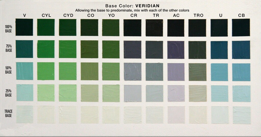
Moving beyond intuition, I've found that understanding formal color theory provides a powerful framework for world-building. Color harmonies—monochromatic, analogous, complementary, triadic—each create distinctly different world aesthetics and emotional responses.
Color Harmony Effects in World-Building
Monochromatic
Creates unity and cohesion. Perfect for establishing singular-themed worlds or realms with strong identity.
Analogous
Harmonious and pleasing. Ideal for natural environments or worlds with subtle magical elements.
Complementary
High contrast and vibrant. Excellent for worlds with strong opposing forces or dramatic conflicts.
Triadic
Dynamic and balanced. Perfect for complex worlds with multiple factions or realms.
Establishing a core color palette as the foundation of your world's visual identity is essential. I typically start with 3-5 primary colors that define the world's essence, then expand with secondary and accent colors for specific areas or story elements. This approach creates a cohesive visual language while allowing for diversity within the world.
Surprisingly, principles from color palettes for data visualization have significantly informed my world-building strategies. Just as data visualization requires clear color distinction without visual fatigue, fantasy worlds need colors that differentiate regions and factions while maintaining overall harmony.

PageOn.ai has transformed my approach to color experimentation. Instead of starting from scratch with each iteration, I can use the platform to experiment with different color schemes while maintaining the core elements of my world. This dramatically accelerates the creative process and encourages bold experimentation.
Color consistency is paramount in maintaining world believability. Even the most fantastical settings need internal color logic—the way light behaves, how colors interact, and how atmosphere affects perception should follow consistent rules. When these rules are broken without purpose, audience immersion suffers.
Digital Tools and Techniques
Modern creators have unprecedented access to digital tools that facilitate world-building. I've found AI image generators for coloring pages particularly useful for experimenting with world aesthetics before committing to more detailed renderings.
PageOn.ai's AI Blocks feature has been revolutionary for visualizing color concepts. I can quickly mock up color relationships and see how they function in different contexts, allowing for rapid iteration and refinement of my world's visual language.
Color Consistency Across World Elements
Creating mood boards and visual references has been essential to my world-building process. I collect images, color swatches, and texture samples that capture the essence of my world, creating a visual language guide that ensures consistency across all elements.
Color grading techniques borrowed from cinema have dramatically enhanced my world's atmospheric elements. By applying consistent color treatments across different scenes, I can unify diverse environments while emphasizing their unique qualities. This creates a world that feels both varied and cohesive—a difficult balance that separates amateur world-building from professional work.
Emotional Storytelling Through Color Evolution
The most sophisticated world-building uses color as a dynamic storytelling element that evolves throughout the narrative. I've found that color transitions can powerfully mirror character development and plot progression without a single word of exposition.

Atmosphere shifts serve as powerful signals for important story moments or world changes. A gradual warming of colors might indicate a character's growing confidence, while a sudden shift to desaturated tones could mark a catastrophic world event. These visual cues prepare audiences emotionally for narrative developments.
Creating visual metaphors through strategic color application adds layers of meaning to world-building. A character associated with blue tones moving through increasingly red environments might symbolize their journey from calm rationality to passionate action—all without explicit explanation.
flowchart LR
    A[Story Beginning] -->|Color Evolution| B[Rising Action]
    B -->|Color Evolution| C[Climax]
    C -->|Color Evolution| D[Resolution]
    subgraph ColorPalette1[Cool Blues & Purples]
    A
    end
    subgraph ColorPalette2[Transitional Greens & Teals]
    B
    end
    subgraph ColorPalette3[Intense Reds & Oranges]
    C
    end
    subgraph ColorPalette4[Golden Yellows & Warm Neutrals]
    D
    end
PageOn.ai's Agentic capabilities have revolutionized how I plan color arcs throughout a narrative. The platform helps me visualize how colors will evolve across different scenes and story beats, ensuring that the emotional journey feels cohesive and purposeful rather than random or jarring.
I've developed techniques for using color to foreshadow events or reveal character truths. Subtle color cues can plant seeds in the audience's mind that bloom into understanding later in the story. A character surrounded by shadow with a hint of red might subtly suggest their future villainous turn, creating satisfying narrative cohesion when that transformation occurs.
Narrative Color Evolution
The most masterful world-building uses color not just to create beautiful images but to tell emotional stories that resonate on a subconscious level. When color evolution aligns with narrative development, audiences experience a satisfying sense of cohesion even if they can't articulate exactly why the story feels so complete.
Practical Applications Across Different Media
The principles of color and atmosphere in world-building must be adapted for different media formats. Film, games, illustrations, and other visual media each have unique considerations and technical constraints that influence how color strategies are implemented.
Color Strategy Adaptation Across Media
I've found that techniques from color and imagery in presentations translate surprisingly well to immersive world-building. Both contexts require strategic color choices that guide attention, establish hierarchy, and create emotional resonance.

PageOn.ai has been invaluable for maintaining visual consistency when transitioning between media types. When adapting a world from one medium to another—perhaps from illustrations to animated sequences—the platform helps preserve the core color identity while making necessary technical adjustments for the new format.
Accessibility considerations are essential while maintaining atmospheric integrity. I strive to ensure that color-based storytelling remains effective for viewers with color vision deficiencies by incorporating additional visual cues like texture, shape, and composition that reinforce the narrative.
The principles of color psychology for presentations have proven remarkably useful for creating compelling world-building pitches. When presenting world concepts to collaborators, producers, or audiences, strategic color choices can make the difference between a world that feels conceptually complete and one that seems like a collection of disconnected ideas.
flowchart TD
    A[Core World Concept] --> B1[Film Adaptation]
    A --> B2[Game Adaptation]
    A --> B3[Illustration Adaptation]
    A --> B4[Presentation Adaptation]
    B1 --> C1[Dynamic Lighting]
    B1 --> C2[Temporal Color Arcs]
    B1 --> C3[Atmospheric VFX]
    B2 --> D1[Interactive Lighting]
    B2 --> D2[User-Responsive Color]
    B2 --> D3[Procedural Atmospherics]
    B3 --> E1[Fixed Lighting]
    B3 --> E2[Concentrated Color Impact]
    B3 --> E3[Suggested Atmosphere]
    B4 --> F1[Simplified Color Schemes]
    B4 --> F2[High Contrast]
    B4 --> F3[Minimalist Atmosphere]
Each medium offers unique opportunities and challenges for world-building through color. Film provides unparalleled control over temporal color evolution but limits audience interaction. Games allow for dynamic, responsive color experiences but introduce technical constraints. Illustrations offer complete color control in a single frame but must suggest motion and change through static elements. Understanding these differences has helped me adapt worlds across media while maintaining their essential identity.
From Concept to Execution: Building Your World
Translating abstract world concepts into concrete visual elements requires a structured approach. I always start by developing a color and atmosphere style guide for my world—a comprehensive document that establishes the visual rules and relationships that will govern all creative decisions.
PageOn.ai has transformed how I approach this process. The platform allows me to transform abstract world concepts into concrete visual elements through intuitive tools that don't require advanced design expertise. I can quickly generate visual representations of atmospheric concepts, experiment with color relationships, and document successful approaches for consistent implementation.
Practical exercises are essential for testing and refining your world's color identity. I regularly create "color studies"—simple scenes rendered in different palettes to compare their emotional impact and narrative implications. These exercises reveal which color approaches best serve the world's story and themes.
World-Building Workflow Stages
Gathering and incorporating feedback on your world's visual elements is crucial but challenging. I've developed techniques for soliciting specific, actionable feedback rather than vague impressions. Questions like "What emotion does this color palette evoke for you?" and "Which elements feel most distinctive or memorable?" yield more useful insights than simply asking if someone likes the design.
Creating a workflow that allows for creative exploration while maintaining consistency has been one of my biggest challenges. I've found that establishing clear "color landmarks"—fixed points in the color identity that must remain consistent—while allowing flexibility in transitional or secondary elements strikes the right balance between creative freedom and cohesive world-building.
flowchart LR
    A[World Concept] --> B[Core Color Palette]
    B --> C[Atmosphere Definition]
    C --> D[Test Scenes]
    D --> E{Feedback}
    E -->|Revise| C
    E -->|Approve| F[Style Guide]
    F --> G1[Location 1]
    F --> G2[Location 2]
    F --> G3[Location 3]
    G1 --> H[Cohesive World]
    G2 --> H
    G3 --> H
The journey from concept to execution is iterative and often non-linear. I've learned to embrace this reality, using each iteration as an opportunity to refine and strengthen my world's visual identity. The most compelling worlds often emerge from this process of continuous discovery and refinement rather than from perfectly executing an initial concept.
Case Studies: Masterful World-Building Through Color
Studying successful color-driven worlds across various media provides invaluable insights for creators. I've analyzed numerous examples to understand how color choices contribute to world-building success.
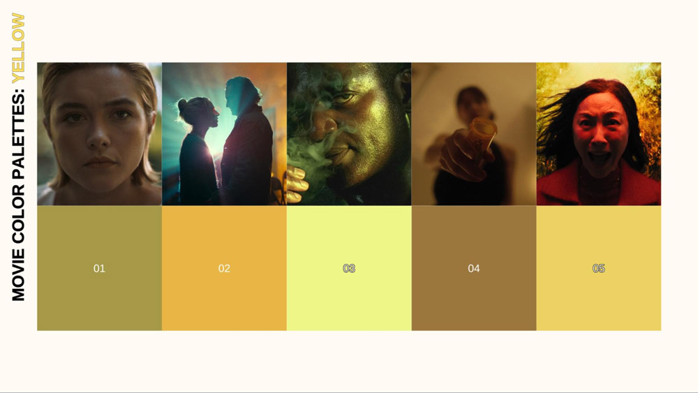
Cinema offers particularly rich examples of distinctive color-crafted universes. The acid greens and sterile whites of The Matrix immediately signal its digital unreality. The amber-drenched nostalgic glow of Amélie creates a Paris that feels like a beautiful memory rather than a real city. The desaturated blue-gray of The Road establishes a post-apocalyptic world stripped of life and hope.
These worlds succeed because their color choices aren't merely aesthetic—they're storytelling tools that reinforce the narrative's themes and emotional core. The consistency of these color approaches creates worlds that feel complete and internally coherent, even when they depart dramatically from our reality.
I've been particularly inspired by how indie creators have used limited resources to create memorable worlds through color. These examples demonstrate that compelling world-building doesn't necessarily require massive budgets—strategic color choices can create immersive worlds even with technical constraints.
Iconic Worlds and Their Color Signatures
Avatar's Pandora
Bioluminescent blues and purples create an alien world that feels both magical and biologically plausible. The color palette establishes a world with its own natural laws.
Mad Max: Fury Road
Orange-tinted desert wasteland contrasted with night scenes of cool blue creates a world of harsh extremes where survival is constantly threatened.
Blade Runner 2049
Stark contrast between warm orange interiors and harsh blue exteriors establishes a world where humanity clings to warmth amid technological coldness.
Into the Spider-Verse
Vibrant, comic-inspired color palette with distinctive color schemes for different dimensions creates a multiverse where each reality has its own visual identity.
PageOn.ai has been invaluable for deconstructing and learning from existing worlds' color strategies. The platform's analysis tools help me identify patterns and techniques in successful world-building examples, which I can then adapt and apply to my own projects.
The most important lesson from these case studies is that successful world-building through color requires intentionality and consistency. Whether creating a lush fantasy realm or a stark dystopian future, the colors must serve the world's story and themes rather than simply looking attractive in isolation. When every color choice reinforces the world's identity, audiences experience a level of immersion that transcends the technical aspects of the visuals.
Transform Your Visual Expressions with PageOn.ai
Create stunning, immersive worlds with intuitive tools that bring your color and atmospheric concepts to life—no technical expertise required.
Start Creating with PageOn.ai TodayBringing Your Magical Worlds to Life
Throughout this guide, I've shared my approach to building magical worlds through color and atmosphere. The journey from concept to fully realized world is complex but deeply rewarding. By understanding the psychological foundations of color, mastering atmospheric techniques, and developing consistent visual systems, you can create worlds that captivate and immerse your audience.
PageOn.ai has transformed my creative process by making sophisticated visual techniques accessible without requiring technical expertise. From experimenting with color palettes to generating consistent atmospheric elements, the platform provides tools that accelerate the world-building process while encouraging creative exploration.
As you embark on your own world-building journey, remember that the most compelling worlds are those where every visual element serves the story and themes you want to convey. Color isn't just decoration—it's a powerful storytelling tool that can transport your audience to places that have never existed except in imagination. With intention, consistency, and the right tools, you can create worlds that linger in the memory long after the experience ends.
You Might Also Like
Bringing Google Slides to Life with Dynamic Animations | Complete Guide
Transform static presentations into engaging visual stories with our comprehensive guide to Google Slides animations. Learn essential techniques, advanced storytelling, and practical applications.
Advanced Shape Effects for Professional Slide Design | Transform Your Presentations
Discover professional slide design techniques using advanced shape effects. Learn strategic implementation, customization, and optimization to create stunning presentations that engage audiences.
Transform Your Google Slides: Advanced Techniques for Polished Presentations
Master advanced Google Slides techniques for professional presentations. Learn design fundamentals, visual enhancements, Slide Master, and interactive elements to create stunning slides.
Mastering Visual Harmony: The Art and Science of Cohesive Slide Layouts
Discover how to create visually harmonious slide layouts through color theory, typography, and spatial design. Learn professional techniques to elevate your presentations with PageOn.ai.