Mastering the Art of Effective Infographics
Transform Your Presentations from Ordinary to Extraordinary
In the world of presentations, the difference between merely informing and truly engaging your audience often comes down to how effectively you visualize your information. I've discovered that well-crafted infographics serve as powerful tools that can elevate any presentation from forgettable to extraordinary. Let me guide you through the art and science of creating infographics that captivate, clarify, and convince.
The Psychology Behind Successful Presentation Infographics
I've always been fascinated by how our brains process visual information. When I create infographics for presentations, I'm not just designing something pretty—I'm leveraging fundamental principles of cognitive science to maximize impact and retention.
Visual information processing in the brain is significantly faster than text processing
The science is clear: our brains process visual information using visual aids in presentation contexts is exponentially more efficient than text alone. In fact, studies show we process images 60,000 times faster than text, making infographics particularly powerful for conveying complex information quickly.
Key Psychological Principles at Work
- Pattern recognition: Our brains are wired to identify patterns, making well-designed infographics instantly comprehensible
- Dual coding theory: We process and store information more effectively when it's presented in both visual and verbal formats
- Picture superiority effect: Images are remembered better than words, especially over longer periods
- Emotional connection: Visual elements trigger emotional responses that strengthen memory formation
The Color Psychology Factor
I've learned that color isn't just decorative—it's a powerful communication tool that influences how audiences perceive and respond to information. Each color evokes specific emotional and psychological responses:
The most effective infographics strike a delicate balance between aesthetic appeal and functional clarity. When designing for presentations, I prioritize information comprehension while still creating visuals that capture and maintain attention.
flowchart TD
    A[Visual Information] --> B[Brain Processing]
    B --> C{Balanced Design?}
    C -->|Too Complex| D[Cognitive Overload]
    C -->|Too Simple| E[Insufficient Engagement]
    C -->|Just Right| F[Optimal Learning]
    D --> G[Information Loss]
    E --> H[Interest Loss]
    F --> I[Knowledge Retention]
    style F fill:#FF8000,stroke:#333,stroke-width:2px
Understanding these psychological principles has transformed how I approach infographic design. By aligning my visuals with how the brain naturally processes information, I can create presentations that not only inform but truly resonate with my audience.
Essential Elements of High-Impact Presentation Infographics
Through years of refining my approach to infographic design, I've identified several critical elements that consistently elevate presentation visuals from merely decorative to genuinely effective. These principles form the foundation of any successful infographic.
Visual Hierarchy: Guiding the Eye

Example of effective visual hierarchy in an infographic
Visual hierarchy isn't just about making certain elements bigger—it's about creating a deliberate pathway for the viewer's attention. I use a combination of size, color, contrast, and positioning to ensure the most important information stands out immediately, while supporting details remain accessible but don't compete for attention.
Strategic White Space
I've found that what you leave out is just as important as what you include. White space (or negative space) gives the eye room to rest and helps prevent cognitive overload. It frames important elements and improves overall readability.
Typography Considerations
Font choices dramatically impact how information is perceived. I select typefaces that balance readability with personality, usually limiting myself to 2-3 complementary fonts per infographic to maintain visual cohesion.
Color Schemes That Enhance Meaning
Color isn't just decorative—it's functional. When I develop color schemes for presentation infographics, I focus on:
- Creating meaningful associations (e.g., green for growth, red for warnings)
- Ensuring sufficient contrast for readability, especially in large presentation rooms
- Maintaining brand consistency while still optimizing for information clarity
- Using color to group related concepts and create visual patterns
Data-to-Ink Ratio: The Art of Elimination
One of the most valuable principles I've adopted comes from Edward Tufte's concept of the "data-to-ink ratio." This means eliminating any visual element that doesn't actively contribute to understanding. When creating infographics for presentations, I ruthlessly question every graphic element: Does this enhance comprehension or merely decorate? If it's just decoration, it's usually better to remove it.
Elements to Consider Eliminating:
- Redundant legends when direct labeling is possible
- Decorative 3D effects that distort data perception
- Excessive grid lines in charts that create visual noise
- Background patterns that compete with foreground information
- Unnecessary icons that don't add meaningful context
From Complex Data to Compelling Visuals
The true art of infographic design for presentations lies in transforming complex, abstract data into visuals that immediately communicate meaning. I've developed a systematic approach to this transformation process that ensures my infographics don't just present data—they tell stories.

Before and after: Raw data transformed into visual insight
Techniques for Transforming Abstract Concepts
When faced with abstract concepts or complex relationships, I rely on several proven techniques to create create stunning infographics that clarify rather than complicate:
| Technique | Best Used For | Example Application |
|---|---|---|
| Visual Metaphors | Abstract concepts, theoretical frameworks | Using an iceberg to show visible vs. hidden aspects of a process |
| Process Flows | Sequential information, procedures | Step-by-step visualization of a customer journey |
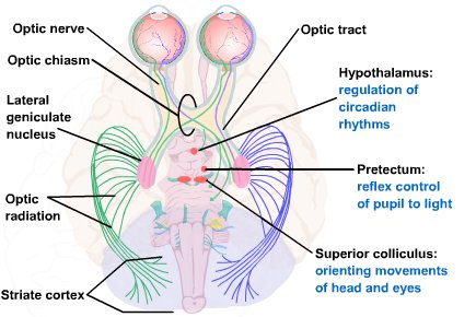
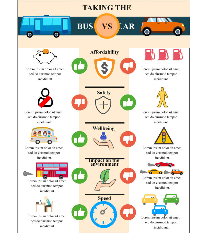
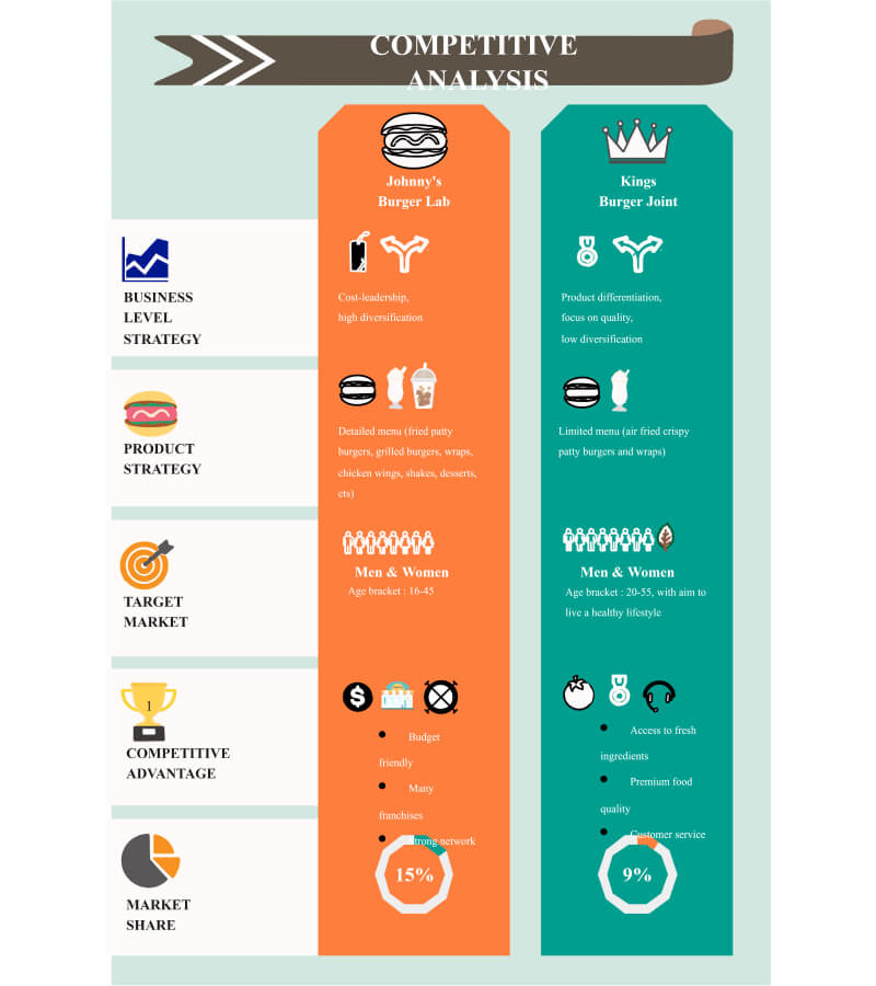
| Comparison Charts | Highlighting differences, options analysis | Side-by-side visualization of competing strategies |
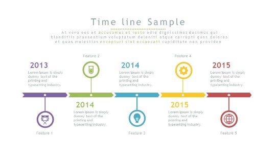
| Hierarchical Structures | Organizational relationships, taxonomies | Tree diagram showing product category breakdowns |
| Spatial Arrangements | Geographic data, physical relationships | Heat map overlaid on floor plan showing traffic patterns |
Methods for Simplifying Multi-Layered Data
When working with complex datasets for presentations, I follow these principles to maintain clarity without sacrificing depth:
flowchart TD
    A[Complex Dataset] --> B[Identify Core Message]
    B --> C[Determine Essential Variables]
    C --> D[Choose Appropriate Chart Type]
    D --> E[Apply Visual Hierarchy]
    E --> F[Progressive Disclosure]
    F --> G[Test Comprehension]
    G --> H[Refine Based on Feedback]
    style B fill:#FF8000,stroke:#333,stroke-width:1px
    style E fill:#FF8000,stroke:#333,stroke-width:1px
    style F fill:#FF8000,stroke:#333,stroke-width:1px
Case Study: Financial Data Transformation
I recently worked with a client who needed to present quarterly financial results to stakeholders. The raw data included dozens of metrics across multiple business units. Here's how I transformed it:
- Identified the core story: Growth in new market segments despite overall industry contraction
- Selected only the 5 most relevant metrics that supported this narrative
- Created a two-part visualization: a simplified trend line showing overall performance, with a detailed breakout of the successful segments
- Used color to highlight the growth areas, keeping other elements in muted tones
- Added contextual annotations directly on the chart to explain key inflection points
The result: Executives could grasp the essential story in seconds, while still having access to supporting details.
Storytelling Through Data
The most powerful presentation infographics don't just display data—they tell a compelling story. I structure my visual narratives with:
- A clear beginning (context), middle (insight), and end (implication or call to action)
- Visual cues that guide viewers through the intended sequence
- Emotional elements that connect data to human impact
- Consistent visual language that builds throughout the presentation
By approaching infographic design as storytelling rather than mere data visualization, I create presentations that resonate on both intellectual and emotional levels.
Tailoring Infographics to Presentation Environments
One aspect of infographic design that's often overlooked is how the presentation environment affects visual perception. I've learned through experience that an infographic that works beautifully on a desktop screen might fail completely when projected in a large conference room. Creating truly effective presentation visuals requires careful consideration of the viewing context.
The same infographic optimized for different viewing environments
Adapting Designs for Different Viewing Contexts
Large Screens
- Increase contrast ratios significantly
- Simplify detailed elements
- Use bolder fonts with increased spacing
- Test visibility from the back of the room
Digital Handouts
- Optimize for screen viewing
- Enable interactive elements when possible
- Include more detailed annotations
- Consider dark/light mode versions
Printed Materials
- Adjust colors for CMYK printing
- Increase text size for readability
- Ensure sufficient margins
- Test print before mass production
Animation and Progressive Disclosure
When presenting complex infographics, I often use animation and progressive disclosure techniques to prevent overwhelming the audience. This approach allows me to:
- Guide attention precisely to each element as I discuss it
- Build complexity gradually, allowing for better comprehension
- Create moments of revelation that increase engagement
- Adjust the pace based on audience reactions
Accessibility Considerations
Creating visually appealing presentations doesn't mean sacrificing accessibility. I ensure my infographics can be interpreted by all audience members by:
- Using color combinations that work for colorblind viewers (avoiding red/green contrasts)
- Providing text alternatives for key visual information
- Testing readability under various lighting conditions
- Creating simplified versions for audience members who may need them
Technical Specifications for Optimal Display
Technical Checklist for Presentation Infographics
- Resolution: Minimum 1920×1080 for digital presentations
- File format: Vector-based (SVG) whenever possible for scaling
- Text size: Minimum 24pt for projected content
- Color space: RGB for digital, CMYK for print
- Contrast ratio: Minimum 4.5:1 for text elements
- File optimization: Compressed appropriately for quick loading
Audience-Centered Design Principles
The most beautiful infographic in the world is a failure if it doesn't resonate with its specific audience. I've learned that effective presentation visuals begin with a deep understanding of who will be viewing them. Different audiences have different visual literacy levels, domain knowledge, and expectations.

Audience analysis matrix for infographic design planning
Analyzing Your Specific Audience
Before designing any presentation infographic, I assess my audience across several dimensions:
flowchart TD
    A[Audience Analysis] --> B[Visual Literacy Level]
    A --> C[Subject Familiarity]
    A --> D[Cultural Background]
    A --> E[Decision-Making Role]
    A --> F[Viewing Environment]
    B --> G[Design Decisions]
    C --> G
    D --> G
    E --> G
    F --> G
    G --> H[Visual Complexity]
    G --> I[Terminology Level]
    G --> J[Color & Symbol Choices]
    G --> K[Detail vs. Overview]
    G --> L[Technical Specifications]
This analysis informs every aspect of my design process, from the initial concept to the final execution. For example, when presenting to a mixed audience of technical and non-technical stakeholders, I often create layered visuals that offer both high-level insights and detailed data for those who want to dig deeper.
Cultural Considerations in Visual Communication
Cross-Cultural Visual Design Principles
- Be aware of color associations that vary across cultures (e.g., white signifies mourning in some Asian cultures)
- Use universal icons and symbols when possible
- Consider reading direction (left-to-right vs. right-to-left) in layout design
- Avoid culturally specific metaphors that may not translate globally
- Test infographics with representatives from target cultural groups when possible
Balancing Expert and Novice-Friendly Elements
One of my greatest challenges is creating infographics that simultaneously satisfy experts and newcomers to a topic. I've developed several strategies to bridge this gap:
My preferred approach is to create infographics with multiple layers of information:
- A clear, high-level message that's immediately accessible to everyone
- Visual cues that guide novices through the basic narrative
- Deeper data layers that experts can explore for additional insight
- Optional technical annotations that don't interfere with the main visual
Testing Comprehension
I never assume my infographics are effective without testing them first. My testing process typically includes:
- The 5-second test: Can viewers grasp the main message in just a few seconds?
- Comprehension questions: Can they accurately answer questions about the content?
- Recall testing: What information do they remember after a delay?
- Feedback collection: What questions or confusion points arise?
This testing process often reveals unexpected issues that I can address before the actual presentation, significantly improving the effectiveness of my infographics.
Integration Strategies for Maximum Impact
Even the most brilliant infographic will fall flat if it's not properly integrated into your overall presentation. I've found that thoughtful integration strategies can dramatically enhance the impact of visual elements and ensure they support—rather than distract from—your core message.
Seamless integration of infographics into presentation flow
Seamless Incorporation into Presentation Flow
When incorporating infographics into presentations, I follow these principles to maintain narrative coherence:
- Foreshadow the visual before revealing it, creating anticipation
- Provide a brief orientation to help viewers understand how to read the graphic
- Allow sufficient time for processing before moving to detailed explanation
- Reference back to the infographic at relevant points later in the presentation
Verbal Support Techniques
Effective Verbal Guidance for Infographics
How you talk about your infographic is just as important as the visual itself. I use these verbal techniques to maximize comprehension:
- Use precise pointing language: "As you can see in the upper right corner..." rather than vague references
- Explain the significance before the details: "This chart shows our dramatic growth in Q3, particularly in these three markets..."
- Acknowledge complexity when appropriate: "This might look complex at first, but I'll guide you through the key points..."
- Provide thinking time: "Take a moment to look at this visualization..." followed by silence
- Connect to previous points: "Remember our discussion about market challenges? This visual shows how we've addressed them..."
Creating Visual Continuity
Visual continuity helps audiences follow your presentation's narrative thread. When I design presentation infographics, I create visual connections through:
flowchart LR
    A[Consistent Color Coding] --> F[Visual Continuity]
    B[Recurring Visual Elements] --> F
    C[Unified Style & Typography] --> F
    D[Transition Visuals] --> F
    E[Progressive Building] --> F
    F --> G[Audience Comprehension]
    F --> H[Message Retention]
    F --> I[Narrative Cohesion]
    style F fill:#FF8000,stroke:#333,stroke-width:2px
This visual continuity doesn't just make presentations more aesthetically pleasing—it significantly enhances comprehension by reducing the cognitive load required to process each new visual element.
Using Infographics as Discussion Anchors
One of my favorite techniques is to use well-designed infographics as anchors for complex discussions or Q&A sessions. A comprehensive visual can serve as:
- A reference point that keeps discussions on track
- A shared mental model that aligns understanding among diverse stakeholders
- A tool for addressing unexpected questions by pointing to relevant visual elements
- A memory aid that helps participants recall key points after the presentation
Leveraging Infographics in Follow-up Materials
The impact of your presentation shouldn't end when you finish speaking. I extend the value of my infographics by:
- Creating standalone versions optimized for email and document sharing
- Developing expanded versions with additional details for interested stakeholders
- Designing social media-friendly variants to extend reach
- Creating interactive versions when appropriate for digital distribution
- Providing printer-friendly versions for physical reference materials
Tools and Technologies for Creating Presentation-Ready Infographics
The landscape of infographic creation tools has evolved dramatically in recent years. I've experimented with dozens of platforms to find the most efficient and effective options for different presentation contexts and user skill levels.

Comparison of popular infographic creation platforms
Specialized Platforms vs. General Design Tools
| Tool Type | Advantages | Limitations | Best For |
|---|---|---|---|
| Specialized Infographic Platforms (Piktochart, Visme, Infogram) |
|
|
Quick turnaround projects Data-heavy presentations Non-designers |
| General Design Software (Adobe Illustrator, Figma) |
|
|
Brand-critical presentations Unique visual concepts Design professionals |
| Presentation Software (PowerPoint, Keynote) |
|
|
Last-minute updates Animated reveals Presentation integration |
| AI-Powered Tools (PageOn.ai, Canva AI) |
|
|
Quick ideation Multiple iterations Data-driven visuals |
Time-Saving Templates and Frameworks
For many presentation scenarios, starting from scratch isn't necessary or efficient. I maintain a library of flexible templates and frameworks that can be quickly adapted while still maintaining professional quality:
Template Categories I Recommend
- Data comparison frameworks (bar/column charts, scatter plots)
- Process flow visualizations (linear, circular, branching)
- Hierarchical structures (org charts, taxonomies)
- Timeline templates (vertical, horizontal, milestone-based)
- Concept relationship maps (mind maps, network diagrams)
Template Customization Tips
- Replace default colors with brand palette
- Adjust typography to match presentation style
- Modify icons to align with industry/topic
- Add distinctive visual elements for uniqueness
- Simplify or expand based on content complexity
Collaborative Creation Approaches
Modern presentation infographics often require input from multiple team members with varied expertise. I've developed effective collaborative workflows that leverage each person's strengths:
flowchart TD
    A[Initial Planning] --> B[Content Expert: Data & Message]
    A --> C[Designer: Visual Concepts]
    A --> D[Presenter: Delivery Requirements]
    B --> E[Draft Infographic]
    C --> E
    E --> F[Feedback Loop]
    D --> F
    F --> G{Approved?}
    G -->|No| E
    G -->|Yes| H[Final Production]
    H --> I[Integration with Presentation]
    D --> I
PageOn.ai: AI-Powered Infographic Creation
One of the most exciting developments I've encountered is how AI tools like PageOn.ai are democratizing the creation of professional infographics. Even team members without design experience can now produce compelling visuals.
How PageOn.ai Transforms Infographic Creation
PageOn.ai's AI Blocks feature has revolutionized how I approach infographic creation for presentations. It allows me to:
- Rapidly generate visual concepts based on my data and desired message
- Experiment with multiple design approaches in minutes rather than hours
- Create modular visual components that can be combined and rearranged
- Maintain visual consistency across complex presentations
- Generate variations optimized for different presentation contexts
The Deep Search feature is particularly valuable when I need to incorporate relevant data visualizations. Instead of starting from scratch, I can discover existing visualization approaches that have proven effective for similar content, then adapt them to my specific needs.

PageOn.ai's AI Blocks feature in action, creating modular infographic components
The combination of AI-powered generation and human creativity offers the best of both worlds: the efficiency and range of AI with the strategic thinking and contextual understanding that only humans can provide.
Measuring Infographic Effectiveness
Creating beautiful infographics is only half the battle—understanding their actual impact on your audience is equally important. I've developed a systematic approach to evaluating and improving the effectiveness of presentation visuals.
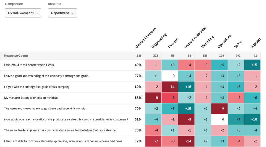
Dashboard for analyzing infographic effectiveness metrics
Key Metrics for Evaluation
To truly understand if my infographics are working, I focus on these measurable indicators:
Measurement Techniques
- Comprehension Testing: Can audience members accurately summarize the key message?
- Retention Surveys: What information do they recall 24 hours or 1 week later?
- Eye-Tracking Analysis: Where do viewers focus? Do they follow the intended visual path?
- Decision Impact: Did the infographic influence subsequent actions or decisions?
- Engagement Metrics: Questions asked, discussions generated, sharing behavior
Audience Feedback Techniques
Collecting meaningful feedback requires more than just asking "Did you like it?" I use structured approaches to gather actionable insights:
- Guided questioning: "What was the main message you took from this visual?"
- Comparative evaluation: "Which of these two approaches makes the data clearer to you?"
- Confusion spotting: "Was there any part of this infographic that was unclear or confusing?"
- Information hierarchy testing: "What stood out to you first in this visual?"
- Action orientation: "Based on this infographic, what would be your next step?"
A/B Testing for Critical Presentations
For high-stakes presentations, I often develop multiple versions of key infographics and test them with representative audience members. This approach has saved me from using visuals that seemed perfect in theory but failed to connect in practice.
A/B testing results for two alternative infographic approaches
Common Pitfalls and How to Avoid Them
Pitfalls to Avoid
- Data overload: Trying to include too much information
- Mixed metaphors: Conflicting visual representations
- Decoration over function: Prioritizing aesthetics over clarity
- Ignoring context: Not adapting to presentation environment
- Assuming comprehension: Not testing with actual audience members
Solution Strategies
- Focus on one core message per visual
- Maintain consistent visual language throughout
- Test functionality first, then enhance aesthetics
- Create adaptable versions for different contexts
- Incorporate feedback loops into design process
Iterative Improvement Strategies
The best infographics evolve through continuous refinement. My process for iterative improvement includes:
flowchart LR
    A[Create Initial Version] --> B[Test with Sample Audience]
    B --> C[Collect Specific Feedback]
    C --> D[Identify Improvement Areas]
    D --> E[Implement Targeted Changes]
    E --> F[Re-test with New Audience]
    F --> G{Meets Objectives?}
    G -->|No| D
    G -->|Yes| H[Finalize & Document Insights]
    H --> I[Add to Design Library]
    style G fill:#FF8000,stroke:#333,stroke-width:2px
By treating infographic design as an ongoing learning process rather than a one-time deliverable, I continuously improve not just individual visuals but my entire approach to visual aids in presentations.
Transform Your Visual Expressions with PageOn.ai
Ready to create presentation infographics that captivate, clarify, and convince? PageOn.ai's powerful AI-driven tools make it easy to transform complex information into stunning visuals that drive your message home.
Bringing It All Together
Throughout this guide, I've shared my approach to creating infographics that truly elevate presentations from ordinary to extraordinary. The most effective infographics aren't just visually appealing—they're strategically designed to support your message, engage your specific audience, and drive meaningful action.
Remember that effective infographics balance art and science. They require both creative vision and analytical rigor. By applying the principles we've explored—from understanding the psychology behind visual processing to measuring effectiveness through data-driven approaches—you can create infographics that don't just decorate your presentations but transform how your audience receives and retains information.
As presentation environments and audience expectations continue to evolve, so too must our approach to visual communication. Tools like PageOn.ai are making it easier than ever to create professional-quality infographics without extensive design experience, allowing you to focus more on strategy and content while still delivering visually stunning results.
Whether you're presenting complex data to experts, explaining new concepts to beginners, or trying to persuade decision-makers, the right infographic approach can make all the difference. Start applying these principles in your next presentation, and watch as your audience engagement, comprehension, and response dramatically improve.
You Might Also Like
Mastering Live Product Demonstrations in Investor Meetings | Captivating Presentation Guide
Learn how to create powerful live product demonstrations that captivate investors, showcase your product's value, and help secure funding through strategic visual storytelling techniques.
Transforming Legal Reasoning: Visual Approaches to Modern Jurisprudence | PageOn.ai
Discover how visual approaches are revolutionizing legal reasoning in modern jurisprudence. Learn practical tools, methodologies, and technological innovations for enhanced legal analysis.
AI-Powered Coding Assistants: Integrating Language Models into Development Workflows
Discover how AI coding assistants transform development workflows by integrating language models to create visual clarity in complex programming environments.
PDR Security Framework: Visualizing Protection, Detection & Response Systems
Explore the PDR Security Framework with visual guides to Protection, Detection, and Response systems. Learn implementation strategies with interactive diagrams and actionable insights.