Transforming Data Insights: How PowerBI Q&A Revolutionizes Chart Creation Through Natural Language
Unlock the power of conversational data visualization
In today's data-driven business landscape, the ability to quickly transform raw data into meaningful visualizations is more valuable than ever. As I've navigated the world of business intelligence tools, I've found that one of the most revolutionary features to emerge in recent years is PowerBI's Q&A capability. This natural language processing tool has fundamentally changed how we interact with our data, making insights accessible to everyone regardless of their technical expertise.
Throughout my experience with data visualization platforms, I've seen how PowerBI's Q&A feature stands out by eliminating the traditional barriers between business users and their data. In this comprehensive guide, I'll walk you through everything you need to know about this powerful feature - from basic concepts to advanced techniques that can transform your data analysis workflow.
Understanding PowerBI's Q&A Feature Fundamentals
PowerBI has established itself as Microsoft's flagship business intelligence and data visualization platform. What makes it particularly powerful is how it democratizes data analysis through features like Q&A, which leverages natural language processing to transform simple questions into powerful visualizations.
The evolution of natural language processing in data analytics tools represents a significant shift in how we interact with business intelligence platforms. Rather than requiring users to learn complex query languages or visualization techniques, PowerBI Q&A allows anyone to simply ask questions about their data in plain English.
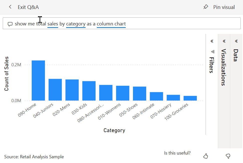
At its core, Q&A works by translating plain English queries into visual data representations. When I type a question like "What were our top 5 products by sales in 2022?", PowerBI intelligently interprets this request, identifies the relevant data fields, determines the appropriate visualization type, and generates the chart instantly.
Key Benefits of PowerBI Q&A
- Accessibility for non-technical users: Anyone can generate visualizations without coding or query knowledge
- Speed of insight generation: Obtain visual answers in seconds rather than minutes or hours
- Reduced learning curve: Natural language is intuitive, eliminating the need to learn complex interfaces
- Democratization of data: All team members can explore data regardless of technical background
You can find the Q&A feature in multiple places within the PowerBI ecosystem. It's available in PowerBI service dashboards, where it appears as a prominent "Ask a question about your data" box. It can also be added to reports in both the PowerBI service and PowerBI Desktop as a dedicated Q&A visual. This flexibility ensures that natural language querying is available throughout your data exploration journey.
The Technical Architecture Behind Natural Language Chart Creation
To truly appreciate the power of PowerBI's Q&A feature, it helps to understand what's happening behind the scenes when you type a natural language query. The process involves several sophisticated components working together seamlessly.
PowerBI Q&A Processing Pipeline
The journey from natural language query to visualization involves multiple processing stages:
flowchart TD
    A[User Query Input] --> B[Query Parsing]
    B --> C[Term Recognition]
    C --> D[Semantic Model Mapping]
    D --> E[Query Translation]
    E --> F[Visualization Selection]
    F --> G[Chart Rendering]
    classDef orange fill:#FF8000,stroke:#333,stroke-width:1px,color:white;
    classDef blue fill:#0078D4,stroke:#333,stroke-width:1px,color:white;
    class A,G orange;
    class B,C,D,E,F blue;
The semantic model integration is the foundation that powers query understanding. When I build a PowerBI report, the semantic model (formerly called the data model) contains not just the raw data, but also the relationships between tables, calculated measures, and metadata about each field. Q&A leverages this rich semantic layer to interpret natural language queries in the context of the available data.
The term recognition system is particularly fascinating. When I type a query like "show me monthly sales by region as a bar chart," PowerBI identifies key terms like "monthly" (suggesting a time dimension), "sales" (a measure), "region" (a dimension), and "bar chart" (visualization preference). It maps these terms to actual fields in the semantic model, even accounting for synonyms and variations in terminology.
Visualization Selection Logic
PowerBI automatically selects the optimal chart type based on data characteristics:
Perhaps most impressively, PowerBI employs machine learning that improves query interpretation over time. As users interact with Q&A, the system learns from these interactions, gradually becoming better at understanding intent and delivering more accurate visualizations. This adaptive capability means that Q&A becomes increasingly valuable the more it's used within an organization.
The automatic visualization selection is particularly clever. Based on the data types involved in the query and the nature of the question, PowerBI chooses the optimal chart type. For instance, time-based queries often result in line charts, comparisons between categories typically yield bar charts, and part-to-whole relationships are displayed as pie or donut charts. This intelligent selection removes the burden of chart choice from users while ensuring that the resulting visualization effectively communicates the data story.
Practical Implementation of PowerBI Q&A
Now that we understand the fundamentals and technical architecture, let's explore how to actually implement and use PowerBI Q&A in practical scenarios. I've found that getting started with Q&A is straightforward, but mastering it requires understanding a few key techniques.
Step-by-Step Guide to Accessing Q&A
-
In PowerBI Service Dashboards:
- Navigate to your dashboard
- Look for the "Ask a question about your data" box at the top
- Click and begin typing your query
-
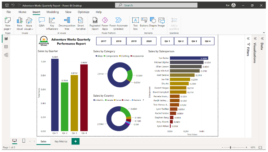
In PowerBI Desktop:
- Go to the Insert tab in the ribbon
- Click on "Q&A" in the visualizations section
- Draw a box on your report canvas where you want the Q&A visual to appear
- The Q&A question box will appear in your report
-
In PowerBI Mobile:
- Open a dashboard
- Tap the Q&A icon (usually at the bottom of the screen)
- Type or speak your question

Crafting effective natural language queries is an art that improves with practice. I've learned that the most successful queries tend to be specific and use terminology that matches your dataset's field names. For example, instead of asking "How are we doing in the West?", a more effective query might be "What were total sales in the Western region in 2022 compared to 2021?"
One of the most helpful features of Q&A is its suggestion system. As you type, you'll notice that certain terms are underlined in blue. These are terms that PowerBI recognizes from your semantic model. Clicking on these underlined terms reveals suggestions that can help refine your query. Similarly, PowerBI may offer complete question suggestions based on what you've typed so far. These suggestions are invaluable for learning how to phrase effective queries.
Pro Tip: Saving Q&A Visualizations
When you've created a particularly useful visualization with Q&A, you can pin it to your dashboard for permanent reference. In the PowerBI service, simply click the pin icon that appears near your Q&A result. In PowerBI Desktop, right-click on the visualization and select "Pin visual." This allows you to build a collection of valuable insights generated through natural language queries.
When troubleshooting common Q&A interpretation challenges, I've found it helpful to start with simpler queries and gradually add complexity. If PowerBI misinterprets your question, try rephrasing it using different terms or being more explicit about what you're looking for. Pay attention to how fields are named in your dataset and try to use those exact names in your queries when possible. For instance, if your dataset uses "Revenue" rather than "Sales," using "Revenue" in your queries will typically yield better results.
Advanced Q&A Techniques for Data Professionals
Once you've mastered the basics of PowerBI Q&A, you can leverage more sophisticated techniques to create complex visualizations through natural language. As I've deepened my expertise with this feature, I've discovered several advanced approaches that significantly expand its capabilities.
Using complex linguistic patterns can unlock more sophisticated visualizations. For example, I can create conditional analyses by using phrases like "show me products where sales exceeded $10,000 last quarter as a treemap." The key is understanding that Q&A can process conditional statements, comparisons, and specific visualization requests all within a single query.
Advanced Query Pattern Examples
flowchart TD
    A[Advanced Query Patterns] --> B[Time-Based Analysis]
    A --> C[Multi-Dimension Analysis]
    A --> D[Comparative Analysis]
    A --> E[Filtered Visualization]
    B --> B1["'Show monthly sales for 2021 and 2022 as line chart'"]
    C --> C1["'Matrix of product category by region showing profit margin'"]
    D --> D1["'Compare Q1 vs Q2 revenue by product category'"]
    E --> E1["'Top 10 customers by revenue where region is Northeast'"]
    classDef orange fill:#FF8000,stroke:#333,stroke-width:1px,color:white;
    classDef blue fill:#0078D4,stroke:#333,stroke-width:1px,color:white;
    class A orange;
    class B,C,D,E blue;
    class B1,C1,D1,E1 white;
Combining multiple data dimensions in a single query is particularly powerful. Instead of creating separate visualizations for different aspects of your data, you can ask questions like "show sales by product category and customer segment as a stacked column chart, sorted by total sales." This approach allows for multidimensional analysis through a single natural language request.
Visualization Types by Query Complexity
Different visualization types become available as query complexity increases:
Time-based analysis through conversational queries is another area where Q&A truly shines. I can ask questions like "show me the trend of monthly sales for the past 18 months" or "what's the year-over-year growth in customer acquisition by quarter?" PowerBI intelligently interprets these temporal references and creates appropriate time-series visualizations.
For comparative analysis, I've found that using specific phrasing helps Q&A understand the intent. Queries like "compare sales performance between regions in 2022" or "show me the difference between actual and budgeted expenses by department" yield insightful comparative visualizations. The key is to be explicit about what elements you want to compare.
Phrasing for Specific Visualization Types
| Visualization Type | Example Query Phrasing |
|---|---|
| Bar Chart | "Show me sales by product category as a bar chart" |
| Line Chart | "Show the trend of monthly revenue over the past year" |
| Pie Chart | "What is the breakdown of expenses by department as a pie chart?" |
| Scatter Plot | "Plot customer satisfaction against purchase frequency" |
| Map | "Show sales by state on a map" |
| Table | "List top 10 customers by revenue with their contact details" |
For truly comprehensive data visualizations, I've found that AI chart generators like PageOn.ai's Deep Search can enhance PowerBI visualizations by incorporating relevant external data. This powerful feature allows me to enrich my PowerBI insights with contextual information from outside sources, creating more complete and informative visualizations that tell a fuller story.
Real-World Applications & Case Studies
The true value of PowerBI's Q&A feature becomes apparent when we examine how organizations are using it to transform their data analysis workflows. I've observed several compelling real-world applications across different business functions.
Marketing teams have embraced Q&A for rapid campaign performance analysis. For instance, a digital marketing manager can quickly ask "show me conversion rates by channel for the summer campaign" or "compare cost per acquisition across all social media platforms for Q2." This immediate access to visual insights allows for agile campaign optimization without waiting for reports to be created by data analysts.
Sales organizations are leveraging natural language queries for territory insights. Sales managers can ask questions like "which regions are below quota this quarter?" or "show me the top 5 salespeople by new customer acquisition." These conversational queries provide immediate visibility into performance metrics, helping sales leaders make data-driven decisions about resource allocation and coaching priorities.
Q&A Usage by Department
Adoption rates of PowerBI Q&A across different business functions:
In financial reporting, I've seen how Q&A has transformed traditional processes. Finance teams can ask questions like "what's our current cash flow trend?" or "show me departments exceeding budget year-to-date." This conversational approach to financial data exploration helps identify areas of concern more quickly than navigating through static reports.
Perhaps most impressively, executive dashboards enhanced with Q&A integration are changing how leadership teams interact with company data. Instead of being limited to pre-built visualizations, executives can ask their own questions during meetings, getting immediate visual answers that drive better decision-making. This capability transforms passive data consumption into active data exploration.
Case Study: Retail Chain Implementation
A national retail chain implemented PowerBI Q&A across their organization and saw a 40% increase in data-driven decision making among store managers. By enabling these front-line leaders to ask natural language questions about store performance, inventory levels, and staffing efficiency, they were able to make more timely operational adjustments. The accessibility of Q&A meant that managers spent less time requesting reports and more time acting on insights.
While PowerBI Q&A excels at creating instant visualizations, I've found that comparison chart creation tools like PageOn.ai can transform these insights into comprehensive visual presentations. PageOn.ai allows me to take the visualizations generated through Q&A and incorporate them into broader narrative contexts, creating compelling data stories that communicate insights effectively to any audience. This integration of PowerBI's analytical power with PageOn.ai's presentation capabilities creates a seamless workflow from data exploration to communication.
Q&A Feature Limitations and Optimization Strategies
While PowerBI's Q&A feature is remarkably powerful, it's important to understand its limitations and how to optimize its performance. Through my experience with this tool, I've identified several common challenges and developed strategies to address them.
Common Misinterpretation Scenarios
| Challenge | Solution |
|---|---|
| Ambiguous field references | Use exact field names from your dataset in queries |
| Complex calculations not understood | Create calculated measures in the semantic model first, then reference them in Q&A |
| Incorrect visualization selection | Explicitly specify the visualization type in your query |
| Date/time confusion | Be specific about time periods (e.g., "fiscal year 2022" vs. "calendar year 2022") |
| Multiple similar measures | Use distinctive naming in your semantic model to avoid confusion |
Data preparation best practices play a crucial role in improving Q&A accuracy. I've learned that investing time in creating a clean, well-structured semantic model pays enormous dividends in Q&A performance. This includes using clear, descriptive field names, establishing proper relationships between tables, setting appropriate data types, and creating hierarchies for dimensions like dates and geography.
Q&A Optimization Process
flowchart LR
    A[Data Preparation] --> B[Semantic Model Optimization]
    B --> C[Synonyms Management]
    C --> D[Phrasing Guidance]
    D --> E[User Training]
    E --> F[Continuous Refinement]
    classDef orange fill:#FF8000,stroke:#333,stroke-width:1px,color:white;
    classDef blue fill:#0078D4,stroke:#333,stroke-width:1px,color:white;
    class A,F orange;
    class B,C,D,E blue;
Synonyms and terminology management is a powerful but often overlooked feature for improving Q&A results. PowerBI allows report creators to define synonyms for fields, measures, and values in the dataset. For example, if your dataset uses the field name "Revenue" but users frequently search for "Sales," you can define "Sales" as a synonym for "Revenue." This ensures that Q&A correctly interprets these queries despite the terminology difference.
Performance considerations become important with large datasets. I've found that Q&A can become slower to respond when working with extremely large data volumes or complex semantic models. To address this, consider implementing aggregation tables for common high-level queries, using incremental refresh to limit the data volume, or creating separate focused semantic models for different analytical purposes.
While PowerBI Q&A is excellent for quick data exploration, I've found that AI tools for excel charts like PageOn.ai's AI Blocks provide complementary visualization capabilities. When Q&A reaches its limits with highly specialized visualization needs, PageOn.ai can step in to create custom visual representations that go beyond PowerBI's standard offerings. This combination of tools ensures that no matter how complex the visualization requirement, there's always a path to creating the perfect visual expression of your data insights.
Future Directions: The Evolution of Natural Language in Data Visualization
The landscape of natural language in data visualization is evolving rapidly, with PowerBI's Q&A feature representing just the beginning of this transformation. As I look toward the future, several exciting developments are on the horizon.
Microsoft's roadmap for PowerBI Q&A enhancements suggests significant improvements coming to the platform. Based on public information and industry trends, we can expect more sophisticated natural language understanding, support for more complex queries, and better handling of ambiguous questions. The goal is clearly to make the gap between human language and data visualization as small as possible.
Projected Evolution of NLP in Data Visualization
The capabilities of natural language processing in visualization tools are expected to grow significantly:
Integration with broader AI capabilities and GPT models represents perhaps the most exciting frontier. We're likely to see PowerBI Q&A evolve from understanding relatively structured queries to interpreting much more conversational and nuanced questions. This could include the ability to ask follow-up questions, request explanations of visualizations, or even engage in a dialogue about what the data means and what actions it suggests.
Cross-platform natural language querying trends suggest that the ability to ask questions of our data will expand beyond PowerBI to become a standard feature across the data ecosystem. We may soon be able to use natural language to query data in Excel, SQL Server, and other Microsoft tools, with a consistent experience across platforms. This democratization of data access through natural language has profound implications for data literacy across organizations.
Emerging Capabilities on the Horizon
- Voice-to-visualization: Speak queries aloud and receive instant visual responses, making data analysis completely hands-free
- Multimodal interactions: Combine voice, text, and touch to refine visualizations intuitively
- Predictive query completion: AI anticipates the full query based on the first few words, similar to modern search engines
- Automatic insight narration: Natural language explanations of what the visualization means and key takeaways
- Cross-dataset querying: Ask questions that span multiple datasets without having to manually join them first
The future alignment between PowerBI's conversational querying and ai-powered bar chart generators like those offered by PageOn.ai is particularly promising. As these technologies evolve in parallel, we're likely to see even more seamless integration between instant chart creation through natural language and the ability to craft those visualizations into compelling narratives. PageOn.ai's conversational content creation approach already aligns well with this future direction, positioning it as an ideal companion to PowerBI as natural language continues to transform how we interact with data.
Comparative Analysis: PowerBI Q&A vs. Alternative Solutions
To fully appreciate the value of PowerBI's Q&A feature, it's helpful to compare it with alternative approaches to data visualization and natural language processing in business intelligence. Through my work with various tools, I've developed a comparative perspective on where Q&A excels and where other solutions might have advantages.
Feature Comparison: PowerBI Q&A vs. Alternatives
How PowerBI Q&A stacks up against other natural language solutions:
When comparing PowerBI Q&A with other natural language BI tools, several distinctions emerge. Tableau's "Ask Data" feature offers similar functionality but with different strengths and limitations. In my experience, PowerBI Q&A tends to have better integration with the Microsoft ecosystem and a slightly more intuitive interface for beginners. However, Tableau's visualization rendering can sometimes produce more aesthetically refined results for certain types of charts.
Relative to custom visualization development, Q&A offers tremendous speed advantages but with some flexibility trade-offs. Custom development allows for highly specialized visualizations tailored exactly to specific business requirements, but at the cost of development time and technical expertise. Q&A provides instant results without coding but within the constraints of PowerBI's visualization library.
Cost-Benefit Analysis
| Approach | Initial Cost | Ongoing Cost | Time to Insight | Customization |
|---|---|---|---|---|
| PowerBI Q&A | Low (included in PowerBI) | Low | Seconds | Medium |
| Traditional BI Reporting | Medium | Medium | Hours to Days | High |
| Custom Development | High | Medium to High | Days to Weeks | Very High |
| Self-Service BI (without NLP) | Medium | Low to Medium | Minutes to Hours | High |
The cost-benefit analysis of natural language solutions versus traditional reporting is compelling. While traditional reporting requires significant upfront investment in report development and ongoing maintenance, Q&A provides immediate results with minimal setup beyond the initial semantic model creation. For organizations with rapidly changing analytical needs, this agility can translate to significant cost savings and faster decision-making.

While PowerBI Q&A excels at quick chart creation, I've found that interactive quiz in powerpoint and other advanced presentation features from PageOn.ai can bridge gaps between PowerBI Q&A and complete presentation needs. PageOn.ai allows me to take the initial visualizations created through Q&A and incorporate them into interactive, engaging presentations that bring data stories to life for any audience.
Integration possibilities with other Microsoft and third-party tools expand the potential of PowerBI Q&A even further. The Microsoft Power Platform allows for connections between PowerBI, Power Apps, Power Automate, and Power Virtual Agents, creating scenarios where natural language queries can trigger automated workflows or feed into custom applications. Similarly, PageOn.ai's API capabilities enable seamless integration with PowerBI, allowing for automated creation of visual presentations based on Q&A-generated insights.
Transform Your Visual Expressions with PageOn.ai
Take your PowerBI Q&A visualizations to the next level with PageOn.ai's intelligent design tools. Create stunning presentations that tell your data story with clarity and impact.
Start Creating with PageOn.ai TodayConclusion: The Future of Natural Language in Data Visualization
PowerBI's Q&A feature represents a significant step forward in the democratization of data analysis. By allowing users to interact with data through natural language, Microsoft has removed a major barrier to data-driven decision making across organizations. The ability to simply ask questions of your data and receive immediate visual responses transforms how we approach business intelligence.
As we've explored throughout this guide, Q&A offers tremendous benefits in terms of accessibility, speed, and ease of use. While it does have limitations, particularly with very complex queries or highly specialized visualization needs, these are being addressed through ongoing improvements to the platform and can be complemented by tools like PageOn.ai.
Looking ahead, the integration of more advanced AI capabilities promises to make natural language an even more powerful interface for data visualization. As these technologies evolve, the gap between human thought and data insight will continue to narrow, making powerful analytical capabilities accessible to everyone in an organization regardless of technical background.
For those looking to maximize the value of their data visualization efforts, the combination of PowerBI's analytical power with PageOn.ai's presentation capabilities offers a compelling solution. This integrated approach ensures that insights generated through natural language queries can be effectively communicated and acted upon, completing the journey from data to decision.
You Might Also Like
From Complexity to Clarity: Why Creators Are Trading Notion for Apple Notes
Discover why creators are simplifying their productivity systems by moving from Notion to Apple Notes, and how this digital minimalism enhances creative output and mental clarity.
AI-Powered Coding Assistants: Integrating Language Models into Development Workflows
Discover how AI coding assistants transform development workflows by integrating language models to create visual clarity in complex programming environments.
Streamlined Visual Creation: The Essential Minimalist Creator's Toolkit That Actually Works
Discover how to build a truly minimalist creator's toolkit that delivers results. Learn to overcome creative bottlenecks and build sustainable workflows that boost productivity without sacrificing quality.
Strategic Infographic Planning: Transform Complex Ideas into Visual Narratives | PageOn.ai
Master strategic content planning for infographics that tell clear visual stories. Learn frameworks, data visualization strategies, and design elements that transform complex ideas into engaging narratives.