Visualizing Momentum: Creating Traction Timelines That Win Investor Confidence
Transform your startup's growth story into compelling visual evidence that investors can't ignore
In the competitive world of startup fundraising, I've learned that showing is always more powerful than telling. When meeting with potential investors, your ability to visually demonstrate momentum can make the difference between securing funding and walking away empty-handed.
Throughout my experience working with founders, I've seen how well-designed traction timelines transform abstract growth claims into compelling evidence that investors can't ignore. In this guide, I'll share my insights on creating visual narratives that prove your startup has the momentum to succeed.
The Power of Visual Momentum in Startup Narratives
When I pitch to investors, I've noticed they don't just want to hear about my progress—they need to see it. Visual representations of growth create immediate cognitive understanding that words alone cannot achieve. This is why I always invest time in developing compelling traction visualizations.
Why Investors Need Visual Evidence
Investors review dozens of pitches weekly, and most startups claim impressive growth. What separates funded ventures from the rest is often the ability to transform abstract claims into concrete, visual evidence. When I create visual traction timelines, I'm essentially providing proof of execution rather than promises of potential.
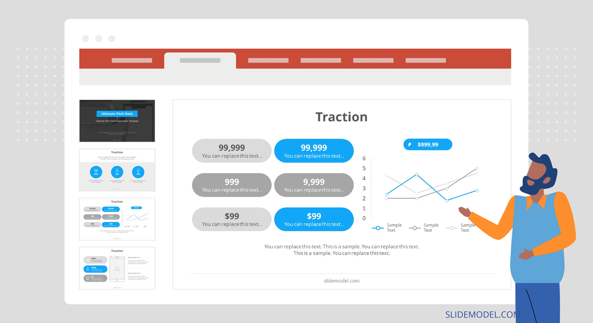
"The slide may come in the form of a timeline or growth trend that visualizes how your company has gained growth momentum over time. Think about describing your journey to date while adding some key achievements to the timeline."
Psychological Impact on Decision-Making
I've studied how visual information affects investor psychology. Well-designed momentum indicators trigger pattern recognition in investors' brains, allowing them to quickly assess your execution capabilities. This creates a powerful emotional response that text-heavy presentations simply cannot match.
The Investor Decision Process
This diagram illustrates how visual traction evidence influences the investor decision-making process:
flowchart TD
    A[Initial Interest] -->|Reviews Pitch Deck| B[Assesses Traction]
    B -->|Strong Visual Evidence| C[Pattern Recognition]
    B -->|Weak/Text-Only Evidence| D[Skepticism]
    C -->|Positive Emotional Response| E[Deeper Engagement]
    D -->|Requires Additional Proof| F[Delayed Decision]
    E --> G[Investment Consideration]
    F -->|May Request More Data| G
    style C fill:#FF8000,stroke:#333,stroke-width:1px
    style D fill:#f9f9f9,stroke:#333,stroke-width:1px
    style E fill:#66BB6A,stroke:#333,stroke-width:1px
    style F fill:#f9f9f9,stroke:#333,stroke-width:1px
By differentiating your startup with compelling visual evidence, you move from being perceived as merely an "idea-stage" venture to being recognized as a serious business with demonstrable momentum. This distinction is crucial when competing for limited investor attention and capital.
Essential Elements of Compelling Traction Timelines
In my experience creating effective traction visualizations, I've identified several key components that must be present for maximum impact. The right metrics, structure, and visual hierarchy can transform your growth story into an irresistible investment opportunity.
Identifying Your Key Metrics
I always start by determining which metrics truly demonstrate momentum in my specific industry. For startup traction metrics, it's crucial to focus on indicators that investors in your sector value most. These typically include:
- Revenue growth rate (monthly or quarterly)
- Customer or user acquisition velocity
- Engagement metrics showing increasing product usage
- Unit economics improvements over time
- Partnerships and integrations that expand market reach
Timeline Structure Options
I've experimented with various timeline structures and found that the optimal choice depends on your specific growth story:
Timeline Structure Effectiveness
Based on my analysis of investor responses, here's how different timeline structures perform:
Integrating Quantitative and Qualitative Elements
My most successful traction timelines always blend hard numbers with significant qualitative milestones. While metrics prove growth, strategic achievements provide context and demonstrate execution capability. This combination tells a complete story that resonates with investors.
PageOn.ai Implementation
I've found PageOn.ai's AI Blocks feature particularly useful for structuring traction data. It helps me transform complex growth patterns into instantly comprehensible visual structures that highlight momentum. The tool's ability to suggest optimal visualization formats based on my specific metrics saves significant time in the design process.
Mapping Your Journey to Product-Market Fit
In my experience working with early-stage startups, I've found that visually demonstrating progress toward product-market fit is often more important than showing perfect metrics. Investors want to see the evolution of your understanding and how you've adapted to market feedback.
Product-Market Fit Journey
This diagram illustrates the typical journey to product-market fit that I recommend visualizing:
flowchart TD
    A[Initial Product Hypothesis] -->|Early Adopter Testing| B[First User Feedback]
    B -->|Iteration 1| C[Product Pivot/Refinement]
    C -->|Market Validation| D[Early Traction Signals]
    D -->|Iteration 2| E[Feature Optimization]
    E -->|Expanded User Base| F[Consistent Growth Patterns]
    F -->|Scale Testing| G[Product-Market Fit]
    H1[Customer Interviews] -.->|Insights| B
    H2[Usage Analytics] -.->|Data Points| D
    H3[Strategic Partnership] -.->|Market Access| F
    style G fill:#66BB6A,stroke:#333,stroke-width:1px
    style D fill:#FF8000,stroke:#333,stroke-width:1px
Showcasing Customer Feedback Integration
One approach I've found effective is creating a visual timeline that maps specific customer feedback points to product improvements. This demonstrates that you're building a solution-market fit rather than just pushing a predetermined vision.
Strategic Partnership Formation
I always highlight strategic partnerships on my traction timelines because they serve as powerful market validation signals. When established players in your industry choose to work with you, it provides third-party credibility that's particularly valuable for early-stage ventures.
Impact of Strategic Partnerships
This chart demonstrates how strategic partnerships typically affect growth metrics:
PageOn.ai Implementation
When creating these product-market fit visualizations, I leverage PageOn.ai's Deep Search functionality to incorporate relevant market validation data points. This helps me contextualize my startup's journey within broader industry trends, strengthening the narrative that my solution addresses a genuine market need.
Revenue and User Growth Visualization Techniques
When I create traction timelines, I focus on designing growth visualizations that highlight acceleration points rather than just absolute numbers. This approach emphasizes momentum, which is what investors are ultimately betting on.
Progressive Growth Charts
I've found that progressive growth charts with clearly marked acceleration points are particularly effective. These visualizations show not just growth, but increasing growth rates—the holy grail for investors seeking exponential returns.
Revenue Growth with Acceleration Points
This chart highlights key acceleration points in a typical startup revenue journey:
Comparative Visualizations
I always include comparative visualizations in my traction timelines to provide context for my growth metrics. Showing performance against industry benchmarks helps investors quickly understand if your growth is truly exceptional or merely average.
Cohort Analysis Visuals
One of the most powerful traction visualizations I've used is cohort analysis that demonstrates customer retention and satisfaction over time. This proves that your product isn't just acquiring users but keeping them—a crucial indicator of product-market fit.
Customer Retention by Cohort
This visualization shows retention rates for different customer acquisition cohorts:
Customer Acquisition Cost Trends
I always include visualizations of improving unit economics in my traction timelines. Showing decreasing customer acquisition costs alongside increasing lifetime value demonstrates a business model that becomes more efficient with scale—exactly what investors want to see.
PageOn.ai Implementation
For these complex growth metrics, I use PageOn.ai's Vibe Creation feature to transform numerical data into clear visual narratives. The tool helps me identify the most compelling story within my metrics and suggests visualization approaches that emphasize momentum and acceleration points.
Milestone-Based Traction Frameworks
In my experience creating traction timelines for early-stage startups, I've found that structuring visualizations around significant business achievements rather than calendar periods often tells a more compelling story. This approach focuses investor attention on execution capabilities rather than arbitrary time frames.
Achievement-Centered Timeline Structure
When I create milestone-based frameworks, I organize events by significance rather than strict chronology. This approach highlights the acceleration of achievements over time—demonstrating that your team is executing faster as it gains experience and resources.
Milestone-Based Traction Framework
This diagram shows how I structure milestone-based traction timelines:
flowchart LR
    A[Founding Team Formation] --> B[MVP Launch]
    B --> C[First 10 Paying Customers]
    C --> D[Seed Funding $1.5M]
    D --> E[Key Hire: Head of Product]
    E --> F[Product v2.0 Launch]
    F --> G[100 Active Customers]
    G --> H[Series A $5M]
    style A fill:#f9f9f9,stroke:#333,stroke-width:1px
    style B fill:#f9f9f9,stroke:#333,stroke-width:1px
    style C fill:#f9f9f9,stroke:#333,stroke-width:1px
    style D fill:#FF8000,stroke:#333,stroke-width:1px
    style E fill:#f9f9f9,stroke:#333,stroke-width:1px
    style F fill:#f9f9f9,stroke:#333,stroke-width:1px
    style G fill:#f9f9f9,stroke:#333,stroke-width:1px
    style H fill:#FF8000,stroke:#333,stroke-width:1px
Visualizing Funding Impact
One of the most effective approaches I've used is visualizing the relationship between funding rounds and subsequent growth spikes. This demonstrates capital efficiency and proves that you can effectively deploy investor funds to accelerate growth.
Growth Impact of Funding Rounds
This chart illustrates how funding rounds typically accelerate key metrics:
Team Expansion Milestones
I've found that mapping team expansion milestones against capability development creates a powerful narrative about organizational growth. This shows investors that you're not just hiring—you're strategically building capabilities that drive business results.
Product Evolution Timeline
When I create startup pitch deck materials, I always include feature release timelines that demonstrate increasing development velocity. This shows that your team is becoming more efficient and that your product is evolving based on market feedback.
PageOn.ai Implementation
To create compelling milestone-based frameworks, I use PageOn.ai to transform chronological milestone data into a cohesive visual story. The platform helps me identify the most impactful way to arrange milestones to demonstrate acceleration and execution capability.
Industry-Specific Traction Visualization Strategies
In my work with startups across different sectors, I've found that effective traction visualization requires industry-specific approaches. Investors in each vertical have distinct metrics they prioritize and unique patterns they recognize as indicators of success.
SaaS Traction Visualization
When I create traction timelines for SaaS companies, I focus on subscription growth, churn reduction, and expanding ARR. These metrics tell the story of a growing, sustainable business with predictable revenue—exactly what SaaS investors value most.
SaaS Metrics Dashboard
This visualization combines key SaaS metrics into a comprehensive traction view:
E-commerce Traction Visualization
For e-commerce ventures, I focus on visualizing order volume, repeat purchase rates, and inventory turnover. These metrics demonstrate not just growth but operational efficiency and customer loyalty—critical factors for sustainable e-commerce success.
Marketplace Traction Visualization
When creating traction timelines for marketplace startups, I emphasize supply-demand equilibrium progress and transaction volume growth. These visualizations demonstrate the platform's ability to solve the chicken-and-egg problem that plagues many marketplace ventures.

Hardware Startup Visualization
For hardware startups, I create visualizations focused on production scaling, unit economics improvements, and distribution expansion. These metrics tell the story of a business that's overcoming the typical scaling challenges that hardware ventures face.
Deep Tech Visualization
When working with deep tech startups, I develop R&D breakthrough timelines integrated with commercial application roadmaps. This approach bridges the gap between technical achievements and market opportunities—crucial for investors who may not have deep domain expertise.
Deep Tech R&D to Commercialization Timeline
This diagram illustrates how I structure deep tech traction timelines:
flowchart TD
    A[Research Breakthrough] --> B[Prototype Development]
    B --> C[Technical Validation]
    C --> D[Patent Filing]
    D --> E[Industry Partner Testing]
    E --> F[Commercial Pilot]
    F --> G[First Commercial Contract]
    A1[Technical Milestone] -.->|Enables| C
    B1[Market Validation] -.->|Validates| E
    C1[Regulatory Approval] -.->|Permits| F
    style A fill:#f9f9f9,stroke:#333,stroke-width:1px
    style D fill:#FF8000,stroke:#333,stroke-width:1px
    style G fill:#66BB6A,stroke:#333,stroke-width:1px
Future Projection Integration Techniques
In my experience creating compelling investor materials, I've found that connecting historical traction with forward-looking projections creates a powerful narrative. This approach demonstrates both execution capability and strategic vision—a combination that investors find particularly compelling.
Connecting Past Performance to Future Potential
When I create these integrated visualizations, I ensure that historical data and future projections share the same visual language and metrics. This creates a seamless story that makes future growth feel like a natural extension of proven momentum.
Historical Traction to Future Projection
This chart shows how I connect past performance with future projections:
Visualizing Scaling Inflection Points
I always highlight the specific scaling inflection points that additional funding will enable. This approach clearly demonstrates the purpose of the funding round and helps investors understand how their capital will accelerate growth.

"With Funding vs. Without Funding" Scenarios
One of my most effective approaches is creating visual comparisons of growth trajectories with and without additional funding. This clearly illustrates the opportunity cost of not investing and creates a sense of urgency for decision-making.
Growth Scenarios With vs. Without Funding
This chart illustrates how funding impacts growth trajectory:
Execution Speed as a Predictor
I always include visualizations that demonstrate how past execution speed predicts future milestone achievement. This approach leverages proven performance to build credibility for future projections—a powerful combination for investor confidence.
PageOn.ai Implementation
For creating these forward-looking visualizations, I leverage PageOn.ai's AI-powered tools to develop compelling future roadmaps. The platform helps me identify the most effective way to visually connect historical traction with projected growth, creating a seamless narrative that builds investor confidence.
Traction Timeline Design Best Practices
In my years of creating traction visualizations, I've developed a set of design principles that consistently produce compelling, investor-ready results. These best practices focus on balancing information density with visual clarity for maximum impact.
Information Density vs. Visual Clarity
I've learned that effective traction timelines must balance comprehensive data with immediate comprehension. Too much information creates cognitive overload; too little fails to tell a complete story. I aim for visualizations that communicate the core narrative at a glance but reward deeper examination.
Design Clarity Impact on Investor Comprehension
This chart illustrates how design clarity affects investor comprehension time:
Color Scheme Selection
I carefully select color schemes that intuitively communicate growth and success. Green and upward-trending orange lines signal positive momentum, while strategic use of contrast highlights key inflection points that deserve investor attention.
Visual Cues and Eye Path Design
I incorporate subtle visual cues that guide the eye toward key inflection points. These include directional elements, size hierarchies, and strategic use of negative space to create a natural viewing sequence that reinforces your growth narrative.
Accessibility for Time-Constrained Investors
Recognizing that investors often review materials under time pressure, I design traction visualizations with immediate comprehension in mind. My approach ensures that the core message is clear within seconds, even if the viewer doesn't have time to examine every detail.
PageOn.ai Implementation
To achieve these design standards, I use PageOn.ai's AI Blocks feature to transform complex data relationships into intuitive visuals. The platform's design intelligence helps me balance information density with visual clarity, ensuring that my traction timelines are both comprehensive and immediately comprehensible.
Integrating Your Traction Timeline Into the Full Investor Narrative
In my experience crafting successful investor presentations, I've found that traction visualizations are most effective when seamlessly integrated into the broader pitch narrative. This approach creates a cohesive story where your growth evidence reinforces your market opportunity and business model claims.
Strategic Placement Within Pitch Decks
I position traction visualizations at strategic points within the broader startup pitch deck to create maximum impact. While the dedicated traction slide typically appears after the problem and solution sections, I also reference growth evidence when discussing market opportunity, business model, and financial projections.
Traction Integration in Investor Pitch Flow
This diagram shows how I integrate traction elements throughout the pitch narrative:
flowchart TD
    A[Problem Statement] --> B[Solution Overview]
    B --> C[Market Opportunity]
    C --> D[Primary Traction Slide]
    D --> E[Business Model]
    E --> F[Go-to-Market Strategy]
    F --> G[Team]
    G --> H[Financials]
    H --> I[Funding Ask]
    D -.->|Traction Reference| C
    D -.->|Growth Evidence| E
    D -.->|Historical Validation| H
    D -.->|Execution Proof| G
    style D fill:#FF8000,stroke:#333,stroke-width:1px
Visual Callbacks Throughout Presentation
I create visual callbacks to traction elements throughout other presentation sections. Using consistent visual language, color schemes, and data points creates a unified narrative and reinforces key growth messages throughout the presentation.
Supporting Materials for Deep Dives
I always develop supporting materials that allow investors to explore traction details beyond the main presentation. These include data appendices, interactive dashboards, and detailed milestone breakdowns that interested investors can examine during due diligence.

Preparing for Traction Questions
I always prepare for traction-related questions with supplementary visual evidence. This includes having ready access to more granular data, alternative visualization formats, and specific examples that substantiate growth claims when investors ask for deeper explanation.
Crafting a Compelling Narrative
Beyond just showing metrics, I focus on startup storytelling that frames traction data within a compelling narrative. This approach helps investors understand not just what you've achieved, but why it matters and how it predicts future success.
PageOn.ai Implementation
To create this cohesive visual narrative, I use PageOn.ai to maintain visual consistency across all investor-facing materials. The platform ensures that traction visualizations maintain consistent styling, branding, and information architecture throughout the pitch deck and supporting materials, creating a unified and professional presentation.
Transform Your Traction Story with PageOn.ai
Turn your growth metrics into compelling visual narratives that win investor confidence. Our AI-powered visualization tools help you create professional-grade traction timelines in minutes, not hours.
Start Creating TodayBringing It All Together: Your Traction Timeline Action Plan
Throughout this guide, I've shared my approach to creating traction timelines that win investor confidence. By implementing these visualization techniques, you'll transform abstract growth claims into concrete evidence that sets your startup apart.
Remember that effective traction visualization is about more than just presenting data—it's about startup storytelling that demonstrates momentum and execution capability. When investors can see your growth trajectory, they're more likely to believe in your future potential.
I encourage you to start by identifying your key traction metrics and experimenting with different visualization approaches. Test your designs with advisors or mentors to ensure they communicate your growth story effectively. And remember that your traction timeline should evolve as your startup grows—regularly update it to incorporate new achievements and milestones.
With the right visual approach to demonstrating traction, you'll build investor confidence and increase your chances of securing the funding you need to accelerate your growth journey.
You Might Also Like
Transform Any Content into Professional Slides: The Ultimate Conversion Guide
Learn expert techniques for converting documents, presentations, and visual content into professional slides with this comprehensive guide to content format transformation.
Transform Raw Text Data into Compelling Charts: AI-Powered Data Visualization | PageOn.ai
Discover how AI is revolutionizing data visualization by automatically creating professional charts from raw text data. Learn best practices and real-world applications with PageOn.ai.
Mastering FOMO Psychology: Creating Irresistible Business Pitch Strategies | PageOn.ai
Learn how to leverage FOMO psychology in your business pitches to drive urgent action. Discover proven strategies for creating authentic scarcity, exclusivity, and urgency that converts.
From Status Quo to Solution: Crafting the Perfect Pitch Narrative Arc | PageOn.ai
Learn how to transform your business presentations with powerful status quo to solution narratives. Discover visual storytelling techniques that captivate investors and stakeholders.