Crafting Impactful Infographics: A Complete Design Guide
Master the art and science of visual storytelling through strategic infographic design
I've spent years designing infographics for various purposes, and I've learned that creating a truly effective infographic is both an art and a science. In this comprehensive guide, I'll share my expertise on how to design high-quality infographics that not only look beautiful but also effectively communicate your message and engage your audience.
Whether you're a seasoned designer looking to refine your skills or a beginner taking your first steps into the world of visual communication, this guide will provide you with the knowledge, techniques, and inspiration you need to create compelling infographics that stand out.
Understanding Infographic Fundamentals
At their core, infographics are visual tools designed to communicate complex information quickly and clearly. I've found that the best infographics combine engaging visuals with concise text to tell a story that resonates with viewers and makes information more digestible and memorable.
The Psychology Behind Visual Information
Our brains process visual information 60,000 times faster than text. When I create infographics, I'm leveraging this cognitive advantage to help viewers absorb and retain information more effectively. Visual content increases comprehension, recollection, and engagement—all critical factors for successful communication.
The Three Pillars of Successful Infographics
flowchart TD
    A[Successful Infographics] --> B[Clarity]
    A --> C[Engagement]
    A --> D[Actionability]
    B --> B1[Simple language]
    B --> B2[Logical flow]
    B --> B3[Visual hierarchy]
    C --> C1[Compelling visuals]
    C --> C2[Relevant storytelling]
    C --> C3[Brand consistency]
    D --> D1[Clear takeaways]
    D --> D2[Memorable insights]
    D --> D3[Call to action]
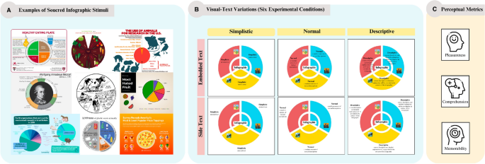
Types of Infographics
I've worked with various types of infographics, each suited to different content and objectives. Understanding these formats helps me choose the right approach for each project:
Choosing the right type of infographic depends on your message and goals. When I'm presenting trends over time, I opt for a timeline infographic. For comparing options or approaches, a infographic design that clearly shows comparisons works best.
Strategic Planning Before Design
In my experience, the most successful infographics begin with thorough planning. Before I even open a design tool, I make sure I have a clear strategy in place.
Setting Clear Objectives
Every infographic I create starts with defining specific goals. Am I trying to educate, persuade, or raise awareness? The objective shapes every design decision that follows.
Pro Tip: I always write down 1-3 key messages I want viewers to remember. This helps me stay focused throughout the design process.
Understanding Your Audience
Different audiences respond to different visual styles, complexity levels, and tones. I always research my target audience's preferences, knowledge level, and expectations before designing.
Data Verification and Organization
The credibility of my infographics depends on accurate data. I always verify information from multiple sources and organize it logically before visualizing it. This helps me create create stunning infographics that are both beautiful and trustworthy.
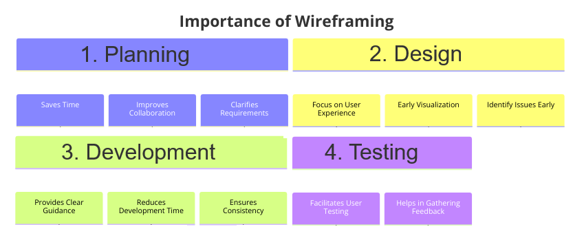
Creating a Wireframe
I've found that sketching a rough wireframe saves tremendous time in the design phase. PageOn.ai's AI Blocks feature makes this process intuitive, allowing me to quickly visualize the structure and flow of information before committing to a final design.
flowchart TD
    A[Start: Define Objective] --> B[Identify Target Audience]
    B --> C[Research & Verify Data]
    C --> D[Organize Information Hierarchy]
    D --> E[Create Wireframe with PageOn.ai]
    E --> F[Determine Format & Dimensions]
    F --> G[Begin Design Phase]
Format and Dimension Planning
Where will your infographic live? I always consider the distribution channels early in the process. An infographic designed for Instagram will have different dimensions and content density than one designed for a presentation or website.
Essential Design Principles for Infographic Excellence
The visual appeal of an infographic significantly impacts its effectiveness. I've learned that applying fundamental design principles consistently produces better results.
Typography That Works
In my designs, I limit myself to 2-3 complementary fonts to maintain visual harmony. I typically use a bold, distinctive font for headings and a highly readable font for body text. This infographic formatting approach ensures consistency throughout the design.

Color Psychology and Palette Development
Colors evoke emotions and associations. When I create infographics, I develop a cohesive color palette that aligns with the message and brand identity. I typically use 3-5 core colors with variations for emphasis and hierarchy.
The 70/30 Visual-Text Balance
One rule I always follow is the 70/30 ratio: 70% visuals and 30% text. This balance ensures the infographic remains visually engaging while providing enough context and explanation.
Visual Hierarchy Techniques
I use size, color, contrast, and positioning to guide the viewer's eye through the information in a logical sequence. This creates a clear path that helps viewers absorb information in the intended order.
Finding the Right Visual Elements
PageOn.ai's Deep Search feature has transformed how I find icons, illustrations, and visual elements for my infographics. I can quickly locate visually consistent elements that perfectly match my theme and style.
Strategic Use of White Space
I've learned that what I don't include is just as important as what I do. White space (or negative space) gives elements room to breathe and prevents visual overwhelm. I strategically incorporate white space to create balance and focus attention on key elements.
Data Visualization Best Practices
Effective infographic data visualizations transform raw numbers into meaningful insights. I've developed specific techniques to ensure my data visualizations are both accurate and impactful.
Choosing the Right Chart Type
Different data relationships require different visualization methods. I always match the chart type to the specific data relationship I'm trying to communicate:
flowchart TD
    A[Data Relationship] --> B{What are you showing?}
    B -->|Comparison| C[Bar/Column Charts]
    B -->|Composition| D[Pie/Donut Charts]
    B -->|Distribution| E[Histograms/Bell Curves]
    B -->|Trends over time| F[Line/Area Charts]
    B -->|Correlation| G[Scatter Plots]
    B -->|Hierarchical| H[Tree Maps]
    B -->|Geographic| I[Maps]
Simplifying Without Sacrificing Accuracy
One of my most important principles is to simplify data visualizations without distorting the underlying information. This means removing unnecessary decorations, using clear labels, and maintaining proper proportions.

Creating Custom Visualizations
Sometimes standard charts aren't enough. I use PageOn.ai's AI-powered tools to create custom data visualizations that perfectly match my specific needs. This allows me to present data in unique, memorable ways while maintaining clarity.
Consistent Scales and Proper Labeling
I ensure all my charts use consistent scales and include clear, concise labels. This prevents confusion and misinterpretation of the data.
Common Pitfall: Truncated axes can dramatically misrepresent data differences. I always consider whether to start axes at zero to provide proper context.
Meaningful Color Coding
I use color strategically to highlight key insights and group related data points. Consistent color coding helps viewers quickly understand relationships within the data.
By avoiding these common pitfalls, I ensure my data visualizations maintain their integrity while effectively communicating key insights.
Crafting Compelling Visual Narratives
The most memorable infographics tell a story. I approach each project as a narrative journey, with a clear beginning, middle, and end.
Narrative Structure
Just like a good story, my infographics have a clear narrative arc. I start with an engaging hook, develop the main concepts in the middle, and end with a memorable conclusion or call to action.
Emotional Engagement
I've found that infographics that evoke emotion are more memorable and shareable. I use storytelling techniques to create an emotional connection with viewers, whether through relatable scenarios, surprising statistics, or compelling visuals.
Setting the Right Tone
PageOn.ai's Vibe Creation feature has been invaluable for establishing the right tone and atmosphere in my infographics. Whether I need a professional, playful, or urgent tone, I can quickly generate visual elements that match that specific mood.
Visual Metaphors
I regularly use visual metaphors to simplify complex concepts. For example, representing a multi-step process as a journey or showing growth as a sprouting plant can make abstract ideas more concrete and relatable.
flowchart LR
    A[Abstract Concept] --> B{Visual Metaphor}
    B --> C[Concrete Understanding]
    B --> D[Emotional Connection]
    B --> E[Memorable Association]
    subgraph Examples
    F[Growth → Plant]
    G[Process → Journey]
    H[Relationship → Bridge]
    I[Structure → Building]
    end
Custom Illustrations
I often create custom illustrations that reinforce key messages. These unique visuals help my infographics stand out and communicate ideas that might be difficult to express with stock imagery or standard charts.
Directional Cues
I use visual elements like arrows, lines, and numbered steps to guide viewers through the information in a logical sequence. These directional cues create a clear path that helps viewers navigate complex information.

Tools and Technology for Infographic Creation
The right tools can dramatically improve both your workflow and the quality of your infographics. I've experimented with many platforms and have insights to share about their strengths and limitations.
Popular Infographic Platforms
There are several established platforms for creating infographics, each with its own strengths. Venngage offers a user-friendly interface and thousands of high-quality templates that can be customized to suit your needs. Infogram specializes in data visualization, making it ideal for statistics-heavy infographics.
| Tool | Strengths | Best For | Limitations |
|---|---|---|---|
| Venngage | User-friendly, many templates | Beginners, marketing materials | Limited free version |
| Infogram | Data visualization focus | Statistical infographics | Less aesthetic flexibility |
| Canva | Extensive template library | Social media graphics | Limited data visualization |
| Piktochart | Presentation integration | Business presentations | Steeper learning curve |
| PageOn.ai | AI-powered, intuitive interface | Complex visualizations, custom designs | New platform (rapidly evolving) |
PageOn.ai's Intuitive Interface
I've found PageOn.ai's interface particularly intuitive for infographic creation. The platform streamlines the design workflow, allowing me to focus on content rather than wrestling with complex tools.

AI-Assisted Data Transformation
One of my favorite features of PageOn.ai is its ability to transform complex data sets into visually appealing charts with AI assistance. I simply input my data, and the platform suggests optimal visualization formats based on the data structure.
Template Libraries as Starting Points
While I often create custom designs, I sometimes use templates as starting points. PageOn.ai's template library offers diverse options that I can quickly customize to match my specific needs and brand guidelines.
Responsive Design Principles
In today's multi-device world, I ensure my infographics display properly across different screen sizes. I implement responsive design principles to maintain readability and visual impact regardless of where the infographic is viewed.
Interactive and Animated Elements
For digital distribution, I often incorporate interactive infographics and animated elements to enhance engagement. These features can reveal additional information on hover or click, creating a more immersive experience.
Testing and Optimization Strategies
Creating an effective infographic is an iterative process. I always test and refine my designs before finalizing them.
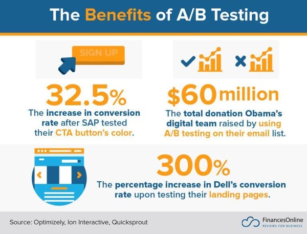
A/B Testing Design Variations
When creating high-stakes infographics, I often develop multiple variations to test with a small audience. This helps me identify which design elements are most effective at communicating the intended message.
Gathering Representative Feedback
I always seek feedback from individuals who represent my target audience. Their perspectives often reveal blind spots in my design or content that I might have missed.
Pro Tip: When gathering feedback, ask specific questions rather than general ones. Instead of "What do you think?", try "What information stood out to you first?" or "Was there anything confusing about this section?"
Analyzing Engagement Metrics
For digital infographics, I track metrics like time spent viewing, sharing rates, and click-through rates to identify areas for improvement. These data points help me refine my approach for future projects.
Accessibility Optimization
I believe information should be accessible to everyone. I optimize my infographics for accessibility by using sufficient color contrast, readable font sizes, and alternative text for screen readers when published digitally.
Performance Considerations
For digital infographics, I ensure proper loading times by optimizing image sizes and using appropriate file formats. This is especially important for infographics embedded on websites or shared via email.
Continuous Improvement
I view each infographic as a learning opportunity. By analyzing what worked well and what could be improved, I continuously refine my design approach for future projects.
Distribution and Promotion Tactics
Even the most brilliantly designed infographic won't achieve its goals if it doesn't reach its intended audience. I've developed strategies to ensure my infographics get maximum visibility.
Platform-Specific Optimization
Different platforms have different requirements and optimal dimensions. I always adapt my infographics for each platform where they'll be shared.
flowchart TD
    A[Original Infographic] --> B[Social Media Versions]
    A --> C[Website Version]
    A --> D[Presentation Version]
    A --> E[Print Version]
    B --> F[Instagram: 1080x1080]
    B --> G[Twitter: 1200x675]
    B --> H[LinkedIn: 1104x736]
    B --> I[Facebook: 1200x628]
    C --> J[Desktop: Full width]
    C --> K[Mobile: Stacked layout]
Adaptive Formatting
PageOn.ai's adaptive formatting feature has been a game-changer for my workflow. It allows me to quickly create platform-specific variations without starting from scratch each time.
Compelling Headlines and Descriptions
When sharing infographics online, I craft attention-grabbing headlines and descriptive text that entice viewers to engage with the content. These elements are crucial for standing out in crowded social feeds.

SEO for Infographics
For infographics published online, I implement SEO best practices to increase discoverability. This includes using descriptive file names, alt text, and embedding relevant keywords in surrounding content.
Website Integration
When embedding infographics on websites, I consider options like zoomable views, sectional reveals, or interactive elements that enhance the user experience.
Performance Tracking
I track how my infographics perform across different channels to identify which distribution methods are most effective for reaching my target audience.
Case Studies: Successful Infographic Implementations
Learning from real-world examples has been invaluable in my journey as an infographic designer. Let's examine some successful implementations and extract actionable insights.
Viral Success Factors
I've analyzed numerous viral infographics and identified common elements that contribute to their success: emotional resonance, surprising information, visual appeal, and timely relevance.

Industry-Specific Examples
Different industries have unique requirements and audience expectations. I've studied successful infographics across sectors like healthcare, finance, education, and technology to understand these nuances.
Before-and-After Transformations
Some of my most satisfying projects involve transforming complex, text-heavy content into clear, engaging infographics. Using PageOn.ai has significantly streamlined this transformation process, allowing me to focus on strategic design decisions rather than technical implementation.
Innovative Approaches
I'm always inspired by infographics that take creative approaches to information challenges. For example, I've seen complex statistical relationships made clear through innovative visualization techniques that go beyond standard charts and graphs.
ROI Calculations
For business clients, I help calculate the return on investment for infographic projects. This might include metrics like increased engagement, time saved in explanation, improved comprehension rates, or conversion improvements.
Case Study Result: A healthcare client saw a 43% increase in patient comprehension of treatment protocols after implementing an infographic-based explanation system, reducing follow-up questions by 27%.
Advanced Techniques for Infographic Mastery
Once you've mastered the fundamentals, there are advanced techniques that can take your infographics to the next level. I've explored many of these approaches in my own work.
Interactive Elements
For digital infographics, interactivity can significantly enhance user engagement. I incorporate elements like hover states, clickable sections, and progressive disclosure to create a more immersive experience.
Animation Possibilities
Strategic animation can draw attention to key information and make complex processes easier to understand. I use subtle animations to guide the viewer's focus and illustrate dynamic concepts.
Infographic Series
For complex topics or ongoing campaigns, I often create a series of connected infographics. This approach allows me to maintain audience engagement over time while exploring different aspects of a subject in appropriate depth.
flowchart LR
    A[Core Topic] --> B[Infographic 1: Overview]
    A --> C[Infographic 2: Deep Dive]
    A --> D[Infographic 3: Case Studies]
    A --> E[Infographic 4: Future Trends]
    B --> F[Social Media]
    C --> G[Blog/Website]
    D --> H[Email Campaign]
    E --> I[Presentation]
Custom Illustration Styles
Developing a unique illustration style can help your infographics stand out and strengthen brand recognition. I often create custom visual elements that reflect the brand's personality and values.
Multi-Channel Design
I design with repurposing in mind, creating infographics that can be easily adapted for different formats and platforms. This approach maximizes the return on investment for each design project.
AI-Enhanced Concept Visualization
PageOn.ai's agentic capabilities have revolutionized how I approach complex concept visualization. The platform can analyze intricate ideas and suggest visual representations that make them more accessible and engaging.
Transform Your Visual Expressions with PageOn.ai
Ready to create stunning infographics that captivate your audience and communicate your message with clarity? PageOn.ai's intuitive platform and AI-powered tools make it easy to design professional-quality infographics—no design experience required.
Start Creating with PageOn.ai TodayFinal Thoughts on Infographic Excellence
Creating high-quality infographics is both an art and a science. Throughout this guide, I've shared my approach to designing infographics that effectively communicate complex information while engaging and delighting viewers.
Remember that the most successful infographics are those that prioritize clarity, engagement, and actionability. By applying the principles and techniques we've explored—from strategic planning and design fundamentals to data visualization best practices and advanced techniques—you'll be well-equipped to create infographics that achieve your communication goals.
As you continue your infographic design journey, I encourage you to experiment with different approaches and continually refine your skills. With tools like PageOn.ai at your disposal, you have everything you need to transform complex ideas into visually stunning, highly effective infographics that stand out in today's information-rich world.
You Might Also Like
Legal Interpretation Theory: From Textual Analysis to Visual Meaning-Making | PageOn.ai
Explore the evolution of legal interpretation theory from strict textualism to constructive meaning-making, and discover how visual tools transform complex legal reasoning into accessible frameworks.
Transforming Legal Reasoning: Visual Approaches to Modern Jurisprudence | PageOn.ai
Discover how visual approaches are revolutionizing legal reasoning in modern jurisprudence. Learn practical tools, methodologies, and technological innovations for enhanced legal analysis.
Mastering Investor Communication: Angel to Series C Fundraising Visuals
Learn how to adapt your fundraising visual strategy from Angel to Series C. Discover stage-specific investor communication techniques and create compelling fundraising materials.
PDR Security Framework: Visualizing Protection, Detection & Response Systems
Explore the PDR Security Framework with visual guides to Protection, Detection, and Response systems. Learn implementation strategies with interactive diagrams and actionable insights.