Creating Powerful Infographics Online: Modern Tools and Techniques for Visual Storytelling
Transform complex data into compelling visual narratives
I've spent years creating infographics for various projects, and I've learned that the right tools and techniques can transform complex information into engaging visual stories. In this guide, I'll share everything I know about creating stunning infographics that captivate audiences and communicate your message effectively.
Understanding the Infographic Landscape
When I first started creating infographics, I quickly realized they're much more than just pretty pictures with text. Effective infographics combine design, data, and narrative to communicate complex information quickly and memorably.
The evolution of infographics: from static printed designs to dynamic interactive experiences
What Makes an Effective Infographic?
I've found that the most effective infographics share several key characteristics:
- Clear purpose and focused message
- Logical information flow and hierarchy
- Balanced combination of visuals and text
- Cohesive design style and color scheme
- Appropriate data visualization for the information type
The Evolution of Infographics
We've come a long way from simple static designs. Today's infographics range from basic static images to fully interactive infographics with animation, clickable elements, and real-time data updates. This evolution has expanded what's possible in visual storytelling.
Key Benefits of Infographics
Types of Infographics
In my experience, choosing the right type of infographic for your content is crucial for effectiveness:
Statistical Infographics
Best for: Presenting survey data, research findings, and numeric information
Process Infographics
Best for: Explaining steps, workflows, and how-to guides
Comparison Infographics
Best for: Contrasting options, before/after scenarios, or pros/cons
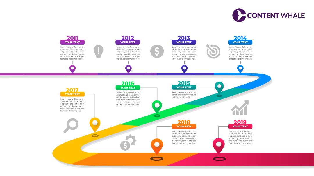
Timeline Infographics
Best for: Historical overviews, project schedules, and evolution stories
Top Tools for Creating Professional Infographics
After testing dozens of platforms, I've identified the best tools for creating professional infographics online. Each has distinct strengths depending on your needs and skill level.
All-in-one Design Platforms
Visme
I love Visme for its comprehensive functionality. It offers a perfect balance of ease-of-use and professional features, with standout animation capabilities and interactive data widgets. The learning curve is moderate, but the results can be stunning.
Canva
Canva has been my go-to recommendation for beginners. Its intuitive interface makes creating professional-looking infographics incredibly accessible. While it may lack some advanced data features, its extensive template library and quick learning curve make it perfect for quick projects.
Venngage
When I'm creating business-focused infographics, Venngage is often my choice. Its templates are specifically designed for professional contexts, and its data visualization features are robust. I particularly appreciate its icon library and chart options.
Data-Focused Infographic Tools
Infogram
For data-heavy infographics, I've found Infogram to be exceptional. It specializes in charts, maps, and infographic data visualizations that can be interactive. Its ability to connect to live data sources makes it perfect for dashboards and reports that need regular updating.
Piktochart
Piktochart has been my solution when working with CSV data that needs to be visualized quickly. Its strong data import capabilities make transforming spreadsheets into visual stories much more efficient. The templates are clean and professional, ideal for business presentations.
PageOn.ai
What's impressed me most about PageOn.ai is how it uses AI to enhance the visualization process. When I'm struggling to conceptualize how to present complex data, its AI-powered suggestions help break through creative blocks. The deep search capabilities for finding relevant visual assets save hours of hunting through stock libraries.
Specialized and Niche Options
Genial.ly
Perfect for creating interactive infographics with engaging animations and clickable elements.
Animaker
Excellent for creating video-infographic hybrids with animated characters and motion graphics.
VistaCreate
Specialized in social media-optimized infographic templates with proper dimensions for each platform.
Tool Selection Decision Process
When I'm choosing an infographic tool for a project, I follow this decision path:
flowchart TD
    A[Start Tool Selection] --> B{Data Complexity?}
    B -->|Simple Data| C{Design Priority?}
    B -->|Complex Data| D{Interactive Needs?}
    C -->|Ease of Use| E[Canva]
    C -->|Professional Look| F[Visme/Venngage]
    D -->|Static| G[Infogram/Piktochart]
    D -->|Interactive| H[PageOn.ai/Genial.ly]
Essential Elements of Effective Infographic Design
Through my years of creating infographics, I've learned that great infographic design follows specific principles that guide viewers through information in a logical, engaging way.
Visual Hierarchy

I always start by establishing a clear visual hierarchy that guides the viewer's eye through the information in the intended sequence. This involves:
- Using size contrast to distinguish between primary and secondary information
- Positioning key elements strategically (important information typically goes top-left in Western cultures)
- Creating visual pathways through alignment and directional cues
- Using color and contrast to highlight the most important data points
Color Psychology
I've found that color selection can dramatically impact how your infographic is perceived:
- Blue conveys trust and professionalism, making it ideal for business and finance infographics
- Green works well for environmental, health, and growth-related topics
- Red captures attention and creates urgency, but should be used sparingly
- I recommend limiting your palette to 3-5 colors for cohesiveness
- Always consider color accessibility for colorblind viewers
Typography Best Practices
Typography can make or break your infographic's readability:
DO
- Limit to 2-3 font families maximum
- Use sans-serif fonts for better screen readability
- Create clear contrast between headings and body text
- Maintain consistent alignment
DON'T
- Use decorative fonts for body text
- Create text blocks wider than 50-60 characters
- Mix too many different sizes and weights
- Use low contrast text-background combinations
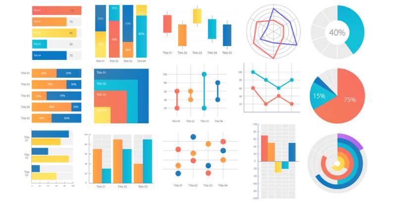
Data Visualization Techniques
Choosing the right chart type is crucial for accurate data representation:
flowchart TD
    A[Data Type] --> B{Comparison?}
    B -->|Yes| C{How Many Items?}
    B -->|No| D{Relationship?}
    C -->|Few| E[Bar Chart]
    C -->|Many| F[Line Chart]
    D -->|Yes| G[Scatter Plot]
    D -->|No| H{Distribution?}
    H -->|Yes| I[Histogram]
    H -->|No| J{Parts of Whole?}
    J -->|Yes| K[Pie Chart]
    J -->|No| L[Table]
My general rules for effective data visualization:
- Bar charts work best for comparing quantities across categories
- Line charts excel at showing trends over time
- Pie charts should only be used for parts of a whole (and limited to 5-7 segments)
- Always include clear labels and a legend when necessary
- Use consistent scales to avoid misleading comparisons
Balancing Text and Visual Elements
I've learned that the most effective infographics maintain a careful balance between text and visuals:
- Aim for approximately 30% text and 70% visuals
- Use text for context and explanation, not to carry the primary narrative
- Break text into digestible chunks rather than dense paragraphs
- Ensure every visual element serves a purpose and isn't just decorative
Using PageOn.ai's AI Blocks
One tool that's transformed my approach to structuring complex information is PageOn.ai's AI Blocks feature. It helps me:
- Break down complicated concepts into modular visual components
- Create logical connections between related information
- Maintain visual consistency across different sections
- Quickly experiment with different organizational structures
From Data to Story: The Infographic Creation Process
Creating an effective infographic isn't just about design skills—it's about transforming raw data into a compelling visual narrative. Here's the process I follow:
flowchart LR
    A[Define Goals] --> B[Research & Data Collection]
    B --> C[Storyboarding]
    C --> D[Design & Layout]
    D --> E[Review & Refine]
    E --> F[Publish & Share]
Planning Your Infographic
Before I even open a design tool, I establish:
- The primary goal of the infographic (inform, persuade, entertain)
- The target audience and their level of familiarity with the subject
- The key message I want viewers to remember
- Where and how the infographic will be shared (social media, website, presentation)
This planning phase prevents scope creep and keeps the infographic focused on its core purpose.
Collecting and Curating Data
Data is the foundation of any good infographic. My process includes:
- Gathering data from reliable sources and citing them
- Identifying the most compelling statistics and insights
- Looking for patterns, contrasts, and surprising findings
- Simplifying complex data without sacrificing accuracy
I've found that the most effective infographics don't try to include every data point—they highlight the most meaningful ones that support the core narrative.
Storyboarding Your Visual Narrative
Before diving into design, I create a simple storyboard that outlines:
- The logical flow of information from beginning to end
- Key sections and their approximate proportions
- Types of visualizations for different data points
- Rough placement of text, images, and graphic elements
This step saves countless hours of redesign work later and ensures a cohesive final product.
Transforming Concepts into Visual Metaphors
One of the most powerful techniques I use is finding visual metaphors that represent abstract concepts:
Abstract Concept
Growth over time
Visual Metaphor
Seedling growing into a tree with data points as branches
Abstract Concept
Market segmentation
Visual Metaphor
Puzzle pieces fitting together with segment data
These metaphors create instant understanding and make abstract information more relatable and memorable.
Using PageOn.ai's Conversation-Based Creation
When I'm struggling to articulate fuzzy concepts, I've found PageOn.ai's conversation-based creation to be invaluable. It allows me to:
- Describe what I'm trying to visualize in natural language
- Receive intelligent suggestions for visual approaches
- Refine concepts through iterative conversation
- Translate abstract ideas into concrete visual elements
Testing and Refining Your Infographic
Before finalizing any infographic, I always test it with these questions:
- Can someone understand the main message in under 5 seconds?
- Does the information flow logically from one section to the next?
- Are all data visualizations accurate and clearly labeled?
- Is the text concise and free of jargon?
- Does the design work at different sizes (especially when scaled down)?
Getting feedback from someone unfamiliar with the topic is especially valuable—if they can understand it, anyone can.
Platform-Specific Optimization Strategies
I've learned that a one-size-fits-all approach rarely works when sharing infographics across different platforms. Each has unique requirements and audience expectations.
Social Media Platform Adaptations
| Platform | Optimal Dimensions | Special Considerations |
|---|---|---|
| 1080×1080px (square) 1080×1350px (portrait) |
First section must capture attention quickly Consider carousel posts for longer content |
|
| 1200×675px | Keep text minimal and large Consider how it looks in timeline view |
|
| 1104×736px | Professional tone Data-focused content performs best |
|
| 1000×1500px (2:3 ratio) | Vertical format performs best Include clear text title at top |
I've found that infographic formatting tailored to each platform significantly improves engagement and sharing rates.
Mobile-Friendly Design Considerations
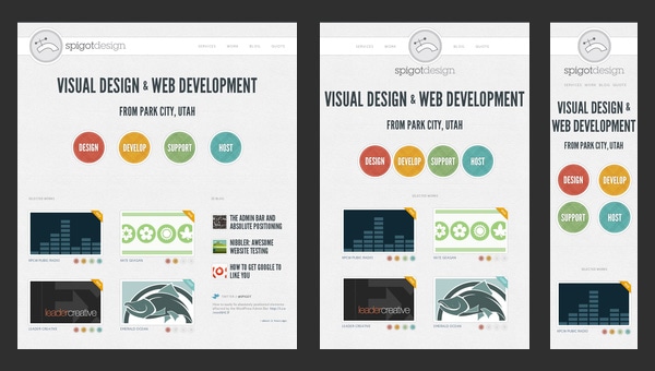
With over 50% of web traffic now coming from mobile devices, I always follow these principles for mobile-friendly infographics:
- Use a vertical layout that works with natural scrolling behavior
- Make text larger than you think necessary (minimum 16px for body text)
- Ensure high contrast for readability in variable lighting conditions
- Test how the infographic appears on actual mobile devices
- Consider creating simplified mobile versions of complex infographics
Interactive Elements for Website Engagement
When creating infographics for websites, I leverage these interactive elements to boost engagement:
- Hover effects that reveal additional information
- Clickable sections that expand to show more detail
- Toggle switches to compare different data sets
- Simple animations that guide the viewer through the narrative
- Embedded calculators or tools related to the infographic's topic
These interactive elements transform passive viewers into active participants, significantly increasing time spent with the content.
SEO Considerations for Infographic Discoverability
To ensure my infographics get found in search results, I always:
- Include descriptive alt text for the infographic image
- Surround the infographic with relevant text content
- Use a descriptive file name with keywords before uploading
- Create a text transcript of the infographic's content
- Include social sharing buttons with pre-written descriptions
Using PageOn.ai's Deep Search
One of my favorite features of PageOn.ai is its deep search capability for finding platform-specific visual assets. It helps me:
- Quickly locate icons, illustrations, and graphics that match each platform's aesthetic
- Find visual elements that align with current trends on specific platforms
- Discover inspiration from successful infographics in similar niches
- Access platform-specific templates that are already optimized
Advanced Techniques for Standout Infographics
Once you've mastered the basics, these advanced techniques can elevate your infographics from good to exceptional.
Animation and Motion Graphics Integration

I've found that subtle animation can dramatically increase engagement with infographics:
- Entrance animations that build the infographic as the user scrolls
- Animated charts that show data progression over time
- Subtle background animations that create visual interest
- Animated icons that demonstrate concepts or processes
Tools like Visme, Genial.ly, and create stunning infographics with built-in animation features that don't require advanced technical skills.
Interactive Elements That Transform Engagement
Taking interactivity a step further, I've seen these elements create exceptional user experiences:
- Quizzes that test knowledge related to the infographic content
- Personalized calculators that give custom results based on user input
- Sliders that allow users to compare scenarios or timeframes
- Clickable maps that reveal regional data
- Gamified elements that reward exploration of the infographic
Data-Driven Infographics That Update Automatically
For data that changes frequently, I've implemented these solutions:
- Connecting infographics to live data sources via APIs
- Creating template infographics that automatically populate with the latest data
- Using embedded dashboards that reflect real-time metrics
- Building infographics with conditional elements that appear based on current data
Tools like Infogram, Tableau Public, and Google Data Studio excel at creating these dynamic, data-driven visualizations.
Accessibility Considerations
I believe strongly that infographics should be accessible to everyone, so I always implement these practices:
- Providing alt text that thoroughly describes the infographic content
- Using colorblind-friendly palettes (avoiding red-green combinations)
- Including text transcripts of all information presented visually
- Maintaining sufficient color contrast for readability
- Avoiding conveying information through color alone
Leveraging PageOn.ai's Agentic Capabilities
For particularly complex data sets, I've found PageOn.ai's agentic capabilities to be game-changing:
flowchart TD
    A[Complex Data Set] --> B[PageOn.ai Analysis]
    B --> C{Pattern Recognition}
    C --> D[Narrative Extraction]
    C --> E[Visual Mapping]
    D --> F[Story Structure]
    E --> G[Visual Elements]
    F --> H[Final Infographic]
    G --> H
The system can:
- Identify patterns and correlations in complex data sets
- Suggest the most effective visualization methods for specific data types
- Generate narrative frameworks that highlight key insights
- Create visual hierarchies that guide viewers through complex information
Measuring Success and Refining Your Approach
Creating infographics is an iterative process. I've learned that measuring performance and continuously refining my approach leads to better results over time.
Key Metrics to Track
When evaluating infographic performance, I focus on these metrics:
- Views/Impressions: How many people saw the infographic
- Engagement Rate: Likes, comments, and interactions relative to views
- Time Spent: How long viewers engage with the infographic
- Social Shares: How often the infographic is shared across platforms
- Click-through Rate: For infographics with calls-to-action
- Conversion Rate: For infographics designed to drive specific actions
A/B Testing Strategies
I regularly use A/B testing to improve infographic performance by testing:
- Different headlines and introductory text
- Color schemes and visual styles
- Data visualization methods for the same information
- Layout variations (horizontal vs. vertical flow)
- Call-to-action placement and wording
The key is to test one element at a time so you can clearly identify what drives improvements in performance.
Gathering and Incorporating User Feedback

Beyond quantitative metrics, I collect qualitative feedback through:
- Comments and direct responses to the infographic
- Short surveys asking specific questions about clarity and usefulness
- Heat mapping tools that show where viewers focus their attention
- User testing sessions with think-aloud protocols
This feedback often reveals insights that metrics alone can't capture, like confusion about specific elements or unexpected interpretations of the data.
Adapting Infographics for Different Channels
When an infographic performs well, I often adapt it for different channels:
- Breaking complex infographics into series of simpler images for social media
- Converting static infographics into video format for YouTube or TikTok
- Creating interactive versions of popular static infographics
- Developing presentation slides based on successful infographics
This multi-channel approach maximizes the return on investment for the research and design work.
Case Studies: Before and After Examples
Before Refinement
- Text-heavy design with minimal visual hierarchy
- Generic stock imagery with little relevance
- Confusing data presentation without clear focus
- Single long-form infographic format
Result: 2.1% engagement rate
After Refinement
- Clear visual hierarchy with 70% visuals, 30% text
- Custom illustrations aligned with brand and message
- Focused data visualization highlighting key insights
- Multiple formats optimized for different platforms
Result: 8.7% engagement rate (314% increase)
Transform Your Visual Expressions with PageOn.ai
Ready to create infographics that captivate your audience and communicate complex ideas with clarity? PageOn.ai's AI-powered platform makes it simple to transform your data into stunning visual stories.
Start Creating with PageOn.ai TodayConclusion: The Future of Infographic Creation
Throughout this guide, I've shared everything I've learned about creating effective infographics online. From choosing the right tools to implementing advanced techniques, the goal is always the same: transforming complex information into clear, engaging visual stories.
As we look to the future, I'm particularly excited about how AI-powered tools like PageOn.ai are democratizing infographic creation. They're making it possible for anyone—regardless of design experience—to create professional-quality visualizations that communicate effectively.
The most successful infographics aren't just visually appealing; they're strategically crafted to meet specific goals, tailored to their target audience, and optimized for the platforms where they'll be shared. By following the principles and techniques outlined in this guide, you'll be well-equipped to create infographics that stand out in today's crowded digital landscape.
Remember that creating great infographics is an iterative process. Measure your results, gather feedback, and continuously refine your approach. Each infographic you create is an opportunity to improve your visual storytelling skills.
I'd love to see what you create using these techniques. Feel free to share your work and continue the conversation!
You Might Also Like
Strategic Infographic Planning: Transform Complex Ideas into Visual Narratives | PageOn.ai
Master strategic content planning for infographics that tell clear visual stories. Learn frameworks, data visualization strategies, and design elements that transform complex ideas into engaging narratives.
Strategic Icon Selection Guide: Achieving Visual Consistency in Design Systems
Learn how to create visual harmony through intentional icon systems. Our comprehensive guide covers selection criteria, styling guidelines, and implementation strategies for cohesive design.
Beyond The Pitch: Visualizing Startup Traction Metrics That Win VC Funding
Discover the essential startup traction metrics that venture capitalists truly value. Learn how to visualize growth, efficiency, and revenue metrics to secure funding for your startup.
Transforming Industries with Language Models: From Summarization to Question Answering
Explore practical applications of language models from text summarization to question answering systems. Learn how LLMs are transforming healthcare, finance, e-commerce and more with PageOn.ai.