Beyond Free Infographic Tools: Creating Customized Visual Stories with AI
Discover how to transform standard templates into unique visual narratives
In today's data-driven world, infographics have become essential tools for communicating complex information quickly and effectively. While many free resources exist, creating truly impactful and original infographics often requires moving beyond basic templates. I'll guide you through navigating the landscape of free infographic resources and show you how to create customized visual stories that truly stand out.
Understanding the Landscape of Free Infographic Resources
When I first started creating infographics, I was overwhelmed by the number of "free" options available. While platforms like Piktochart, Canva, and Visme offer impressive free versions, understanding their capabilities and limitations is essential before investing your time.
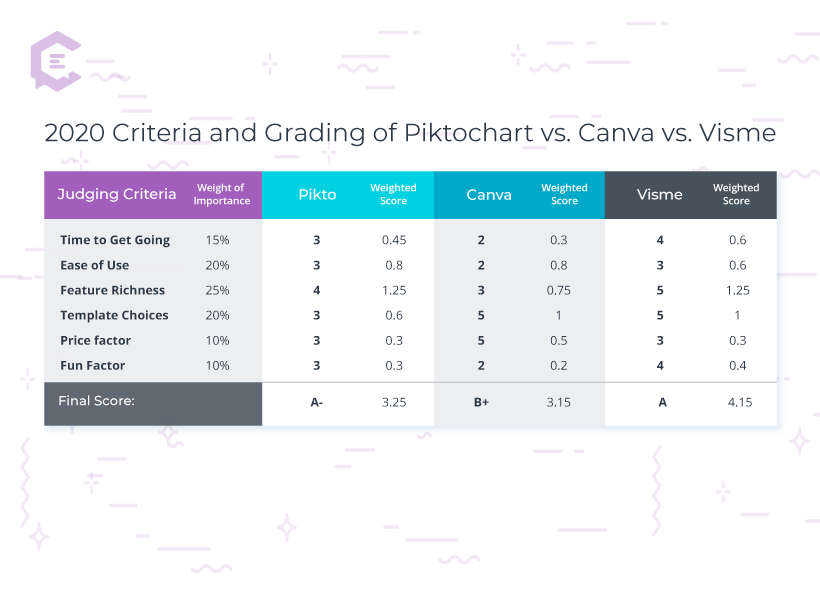
Each platform offers a unique approach to infographic creation:
| Platform | Free Features | Limitations |
|---|---|---|
| Canva | 250,000+ free templates, 1GB storage | Limited premium templates, Canva branding |
| Piktochart | Templates, basic icons, charts | Watermarked downloads, limited export options |
| Visme | Basic templates, limited assets | Visme branding, limited download formats |
While these platforms advertise themselves as "free," I've found there are several hidden costs to consider:
- Time investment: Learning each platform's interface can take hours
- Creative limitations: Free templates often look generic and are widely used
- Export restrictions: Limited resolution or format options for downloads
- Branding issues: Most free versions include the platform's watermark
- Upgrade prompts: Constant reminders to upgrade to paid versions
These limitations can be frustrating, especially when you're working on professional projects or trying to create something truly unique. As I'll explore throughout this guide, there are strategies to maximize free resources while overcoming these common challenges.
Evaluating Free Infographic Sources for Quality and Uniqueness
Not all free infographic tools are created equal. When evaluating which platform might best suit your project, I've found it's important to look beyond just the number of templates offered and consider the quality, customization options, and specific features that align with your goals.
Template Variety Across Free Platforms
When assessing if a free infographic tool meets your needs, I ask myself these key questions:
Essential Evaluation Criteria
- ✓ Export quality: Can I download in the resolution and format I need?
- ✓ Customization depth: How much can I change templates to make them unique?
- ✓ Asset library: Are there enough free icons, illustrations, and charts?
- ✓ Learning curve: How intuitive is the interface for my skill level?
- ✓ Watermarking: How prominent is the platform branding on free downloads?
I've found that maximizing free trial periods across different platforms can be an effective strategy. Most premium tools offer 7-30 day trials with full features. By planning your projects carefully, you can utilize these trials for specific high-priority infographics without committing to a subscription.
For example, I once needed to create a series of professional infographics for a client presentation. By timing my free trial of Piktochart to coincide exactly with my project timeline, I was able to create and export watermark-free designs without paying for a full subscription.
Remember that "free" often comes with the cost of your time. Sometimes investing in a premium tool that streamlines your workflow can actually save you money in the long run, especially for professional or recurring projects.
Transforming Raw Data into Compelling Visual Narratives
Creating an effective infographic isn't just about making data pretty—it's about transforming information into a visual story that guides viewers through a logical narrative. I've found that the most engaging infographics start with thoughtful data curation and clear storytelling goals.
When working with complex datasets, I follow these principles to identify which elements deserve visual emphasis:
- Focus on contrast: Highlight significant differences or comparisons
- Identify trends: Show patterns over time rather than individual data points
- Emphasize relationships: Visualize connections between different variables
- Simplify complexity: Break down multi-faceted concepts into digestible components
Moving beyond static charts requires thinking about how information flows. I structure my infographic elements to create a natural reading path that guides the viewer's eye through the information in a logical sequence.
flowchart TD
    A[Raw Data Collection] --> B[Data Analysis & Curation]
    B --> C[Story Structure Planning]
    C --> D[Visual Hierarchy Design]
    D --> E[Choose Appropriate Visualizations]
    E --> F[Create Visual Flow]
    F --> G[Review & Refine Narrative]
    style A fill:#FF8000,stroke:#333,stroke-width:1px
    style G fill:#FF8000,stroke:#333,stroke-width:1px
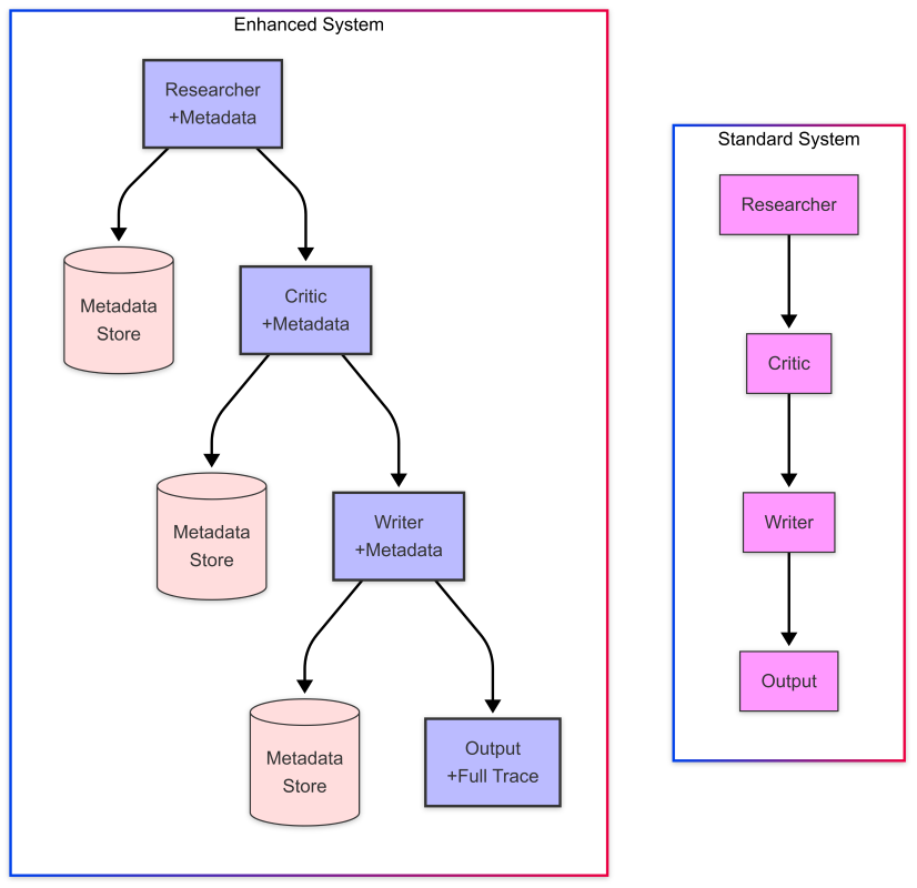
When working with complex datasets, PageOn.ai's AI Blocks feature has been a game-changer for me. It allows me to:
- Break down complex information into modular visual components
- Create logical connections between different data points
- Generate intuitive visual structures that guide the viewer's understanding
- Maintain visual consistency across different data representations
Effectiveness of Different Data Visualization Types
The key to creating compelling infographic data visualizations is maintaining visual consistency while telling your data story. This means using consistent color coding for related concepts, maintaining proportional representations of quantities, and ensuring your design elements support rather than distract from the information being conveyed.
Breaking Free from Template Constraints
One of the biggest challenges I've faced with free infographic tools is the "template problem" — that unmistakable look that screams "I used a free template!" When everyone uses the same templates, your content blends into the noise rather than standing out.
Here are some techniques I've developed to break free from template constraints:
Template Mixing
Combine elements from multiple templates to create something unique. Take the header from one template, the data visualization style from another, and the color scheme from a third.
Custom Illustrations
Replace generic icons with custom illustrations or modified versions. Even simple adjustments to colors and proportions can make stock elements feel custom-made.
Layout Inversion
Flip the expected layout. If most templates in your category flow top-to-bottom, try a horizontal flow or a radial design centered around a key concept.
Typography Focus
Make typography a central design element rather than an afterthought. Custom font pairings and creative text treatments can transform a basic template.
I've found that PageOn.ai's Vibe Creation feature offers a powerful solution to the template problem. Instead of starting with a pre-made template, it helps me generate unique infographic concepts based on my specific content and aesthetic preferences. This approach has several advantages:
- Generates truly original layout concepts tailored to your specific content
- Suggests unique visual metaphors relevant to your topic
- Creates custom color palettes that align with your brand while optimizing visual hierarchy
- Adapts to your content rather than forcing your content to fit a template
flowchart TD
    A[Standard Template] --> B{Creative Modifications}
    B -->|Layout Changes| C[Custom Layout]
    B -->|Color Adjustments| D[Unique Color Scheme]
    B -->|Typography Updates| E[Custom Typography]
    B -->|Icon Replacements| F[Personalized Icons]
    C --> G[Unique Infographic]
    D --> G
    E --> G
    F --> G
    style A fill:#f5f5f5,stroke:#333,stroke-width:1px
    style G fill:#FF8000,stroke:#333,stroke-width:1px
By combining elements from multiple templates and adding your own creative touches, you can create stunning infographics that don't have that "template look." The key is to view templates as starting points rather than final products, and to develop the confidence to break design rules when it serves your communication goals.
Integrating Advanced Visual Elements Without Design Skills
One of the biggest misconceptions about creating professional infographics is that you need advanced design skills. In my experience, what you actually need is access to quality visual assets and knowledge of basic principles that make information visually appealing and easy to understand.

Finding Free Visual Assets
There are numerous sources for free images, icons, and illustrations that can be legally used in your infographics:
| Resource Type | Recommended Sources | Usage Notes |
|---|---|---|
| Stock Photos | Unsplash, Pexels, Pixabay | Most offer CC0 licenses; no attribution required |
| Icons | Flaticon, Icons8, The Noun Project | Many require attribution for free use |
| Illustrations | unDraw, Storyset, Blush | Some allow color customization even in free versions |
| Data Visualization | Datawrapper, Flourish (limited free tier) | Export options may be limited in free versions |
Finding the perfect visual assets for specific topics can be challenging. This is where I've found PageOn.ai's Deep Search functionality particularly valuable. It helps me discover visual elements that precisely match my topic, saving hours of searching across multiple platforms.
Creating Custom Data Visualizations
You don't need to be a data scientist to create compelling data visualizations. Here's my approach to creating effective charts and graphs:
Chart Type Selection Guide
Visual Hierarchy Principles
Creating effective visual hierarchy is essential for guiding viewers through your infographic. I follow these principles:
Size & Scale
Larger elements naturally draw attention first. Use size deliberately to emphasize your most important information.
Color & Contrast
Vibrant colors and high contrast elements stand out. Use color strategically to highlight key data points or create visual groupings.
Positioning
Elements at the top and left typically receive more attention in cultures that read left-to-right and top-to-bottom.
White Space
Strategic use of empty space creates breathing room and helps important elements stand out.
By applying these principles, I've been able to create infographic design that effectively guides viewers through complex information, even without formal design training. The key is understanding how visual elements work together to create clarity and emphasis.
From Concept to Completion: Streamlining the Creation Process
Creating infographics can be time-consuming, but I've developed a streamlined workflow that helps me move efficiently from initial concept to finished product. The key is having a clear process that eliminates indecision and keeps the project moving forward.
Before diving into design, I always establish clear goals for my infographic by answering these questions:
Pre-Design Questionnaire
- 1. Who is my target audience and what is their existing knowledge level?
- 2. What is the single most important takeaway I want viewers to remember?
- 3. What action do I want viewers to take after seeing this infographic?
- 4. Where will this infographic be shared and what are the format requirements?
- 5. What are the key data points or concepts that must be included?
The structure of your infographic should be determined by the complexity of your information. Here's how I approach planning different types of infographic structures:
flowchart TD
    A[Assess Information Complexity] --> B{Type of Information}
    B -->|Sequential Process| C[Linear Flow]
    B -->|Multiple Categories| D[Sectioned Layout]
    B -->|Comparison Data| E[Side-by-Side Format]
    B -->|Hierarchical Info| F[Pyramid/Tree Structure]
    B -->|Geographic Data| G[Map-Based Layout]
    C --> H[Plan Visual Elements]
    D --> H
    E --> H
    F --> H
    G --> H
    H --> I[Create Draft]
    I --> J[Gather Feedback]
    J --> K[Refine & Finalize]
    style A fill:#FF8000,stroke:#333,stroke-width:1px
    style K fill:#FF8000,stroke:#333,stroke-width:1px
One of the most valuable aspects of PageOn.ai's agentic approach is how it transforms vague ideas into structured visual plans. When I have a general concept but struggle with specific organization, PageOn.ai helps me:
- Identify the most logical structure for my specific information
- Suggest the most effective visual formats for different types of data
- Create a cohesive visual language across different sections
- Generate a step-by-step creation plan tailored to my content
This approach has dramatically reduced the time I spend on infographic creation. What used to take me days now often takes just hours, with results that are more visually cohesive and effectively communicate my message.
Time Investment Comparison
By establishing clear goals, planning an appropriate structure, and leveraging AI assistance where it adds value, I've been able to create more effective infographics in less time. This structured approach ensures that the final product achieves my communication goals while maintaining visual appeal.
Sharing and Leveraging Your Infographics Effectively
Creating a great infographic is only half the battle—the other half is ensuring it reaches your intended audience and achieves your communication goals. I've found that strategic distribution and repurposing can multiply the impact of a single infographic.

Digital Distribution Strategies
Different platforms require different approaches to maximize engagement:
Social Media
- Format for each platform's dimensions
- Create teaser versions that link to full infographic
- Use platform-specific hashtags
- Schedule posts during peak engagement times
Email Marketing
- Use infographic sections as email content
- Create exclusive infographics for subscribers
- A/B test different infographic previews
- Include clear calls-to-action
Website/Blog
- Optimize file size for fast loading
- Include proper alt text for SEO
- Create accompanying text content
- Add Pinterest-optimized save buttons
Adapting Infographics for Multiple Purposes
One of my favorite strategies is creating modular infographics that can be broken down and repurposed across multiple channels. Here's how I approach this:
Content Repurposing Strategy
When creating interactive infographics, I focus on ensuring they provide value across different user experiences:
- Design for both interactive and static viewing experiences
- Create printer-friendly versions with QR codes linking to interactive versions
- Develop "bite-sized" versions for social sharing that link to the full experience
- Ensure accessibility across different devices and platforms
Measuring Infographic Effectiveness
To understand if your infographics are achieving their goals, track these key metrics:
| Metric | What It Measures | How to Track |
|---|---|---|
| Engagement Rate | How interesting your audience finds the content | Likes, shares, comments, saves |
| Time on Page | How long viewers spend with your infographic | Google Analytics, heatmap tools |
| Click-through Rate | Effectiveness of calls-to-action | UTM parameters, link tracking |
| Backlinks | How valuable others find your infographic | SEO tools like Ahrefs, SEMrush |
By strategically distributing your infographics and measuring their performance, you can continuously refine your approach to create increasingly effective visual content. Remember that the most successful infographics are those that provide genuine value to your audience while advancing your communication goals.
Transform Your Visual Expressions with PageOn.ai
Stop struggling with generic templates and limited free tools. Create truly unique, data-rich infographics that tell your story effectively with PageOn.ai's AI-powered design assistance.
Start Creating with PageOn.ai TodayMoving Beyond Free Tools to Create Professional Infographics
Throughout this guide, I've explored the landscape of free infographic resources and shared strategies for creating more professional, customized visual content. While free tools provide a starting point, truly exceptional infographics often require moving beyond their limitations.
The journey from basic templates to custom visual stories doesn't necessarily require advanced design skills or expensive software. Instead, it's about approaching the creation process strategically, leveraging the right resources, and focusing on clear communication goals.
PageOn.ai offers a unique solution that bridges the gap between free template tools and custom design services. Its AI-powered approach helps transform your ideas into structured visual expressions that communicate effectively while maintaining your unique perspective and brand identity.
Whether you're creating infographics for business presentations, educational content, or social media engagement, remember that the most effective visuals are those that make complex information accessible while telling a compelling story. By applying the principles and techniques we've discussed, you can create infographics that not only look professional but also achieve your communication goals.
I encourage you to experiment with different approaches, measure what works for your specific audience, and continue refining your visual storytelling skills. The ability to transform data and information into engaging visual narratives is an increasingly valuable skill in our information-rich world.
You Might Also Like
Essential Open Source Tools for Local AI Development and Deployment | PageOn.ai
Discover the best open source tools for local AI development, from foundation models like Llama to deployment platforms like Ollama. Build your complete local AI stack with this visual guide.
Mastering Investor Communication: Angel to Series C Fundraising Visuals
Learn how to adapt your fundraising visual strategy from Angel to Series C. Discover stage-specific investor communication techniques and create compelling fundraising materials.
Essential Elements Every Successful Startup Pitch Deck Must Include | PageOn.ai Guide
Discover the 9 essential elements every winning startup pitch deck needs, from compelling opening hooks to financial projections that captivate investors and secure funding.
Mastering Live Product Demonstrations in Investor Meetings | Captivating Presentation Guide
Learn how to create powerful live product demonstrations that captivate investors, showcase your product's value, and help secure funding through strategic visual storytelling techniques.