Streamlining Your Daily Infographic Creation: A Complete Workflow Guide
A comprehensive approach for marketing professionals to optimize infographic production
In today's visually-driven marketing landscape, I've found that consistently producing high-quality infographics is essential for engagement. This guide outlines my proven workflow system that transforms the daily infographic creation process from overwhelming to streamlined, helping marketing teams deliver compelling visual content efficiently and effectively.
Establishing Your Infographic Strategy Foundation
When I first began creating infographics for marketing campaigns, I quickly realized that without a solid strategic foundation, the daily production process becomes chaotic. I've developed a systematic approach that starts with aligning your visual content with broader marketing objectives.

The first step in my workflow is identifying exactly how infographics support our marketing goals. Are we using them primarily for lead generation, brand awareness, or customer education? Each objective requires different infographic design approaches.
Key Strategic Elements
- Define clear marketing objectives for each infographic type
- Research target audience visual preferences and consumption habits
- Develop a dedicated infographic content calendar
- Establish brand style guidelines specific to infographic creation
- Set up performance measurement parameters
Infographic Alignment with Marketing Goals
In my experience, different types of infographics serve distinct marketing purposes:
I've found that creating a content calendar specifically for infographics helps maintain consistency while ensuring alignment with broader marketing campaigns. This calendar should include theme, data sources, design style, distribution channels, and team responsibilities for each infographic. For infographic planning, I recommend working at least two weeks ahead to allow adequate time for research and design iterations.
Efficient Research and Content Gathering Protocols
The foundation of compelling infographics is solid data. I've developed a systematic approach to research that saves hours of time while ensuring accuracy and relevance.

Daily Research Workflow
I follow this systematic process for efficient data collection:
                    flowchart TD
                        A[Identify Key Data Points Needed] -->|Based on Brief| B[Access Trusted Source Database]
                        B --> C{Data Available?}
                        C -->|Yes| D[Extract & Verify Data]
                        C -->|No| E[Initiate New Source Search]
                        E --> F[Evaluate Source Credibility]
                        F --> G{Source Reliable?}
                        G -->|Yes| H[Add to Trusted Sources]
                        G -->|No| I[Find Alternative Source]
                        I --> F
                        H --> D
                        D --> J[Organize in Research Template]
                        J --> K[Tag & Categorize for Future Use]
                        K --> L[Prepare for Visualization]
I've found that developing templates for organizing research findings before visualization begins significantly streamlines the process. These templates should include sections for key statistics, supporting facts, source citations, and visual references.
Research Template Structure
| Section | Purpose | Format |
|---|---|---|
| Key Statistics | Core data points for visualization | Numerical data with context |
| Supporting Facts | Additional context for main data | Brief explanatory points |
| Source Citations | Credibility and reference | Full source details with URLs |
| Visual References | Design inspiration | Image links and style notes |
Using PageOn.ai's Deep Search functionality has revolutionized my research process. I can quickly locate relevant statistics, images, and data visualizations from trusted sources without switching between multiple tools. This integrated approach has cut my research time by nearly 40% while improving data quality. I also maintain a database of frequently used trusted sources, categorized by topic, to further expedite the research process for daily infographic creation.
Streamlined Design Process for Daily Production
Creating visually compelling infographics daily requires an efficient design system. I've developed a modular approach that maintains brand consistency while allowing for creative flexibility.
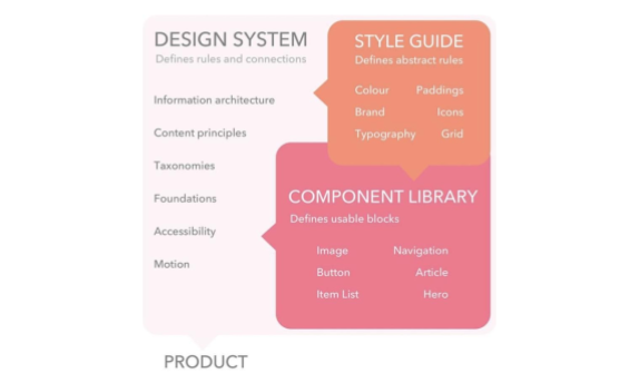
The core of my efficient design process is a robust template library. I've created a collection of pre-approved, brand-compliant templates that can be rapidly customized for different content types. This approach ensures visual consistency while dramatically reducing design time.
Design System Components
My infographic design system consists of these key elements:
Color Coding System for Information Types
Primary Data
Key statistics and focal points
Supporting Information
Context and explanations
Positive Trends
Growth and improvements
Negative Trends
Declines and challenges
Actionable Insights
Recommendations and next steps
Source Information
Citations and references
One of the game-changers in my workflow has been leveraging PageOn.ai's AI Blocks to quickly assemble and arrange visual components. This feature has allowed our marketing team members without formal design training to create professional-quality infographics by simply selecting and customizing pre-designed modules. The ability to create stunning infographics without extensive design skills has democratized our content creation process.
I've also established clear typography hierarchies for different information types. Headlines use our brand font at 24-32pt, subheads at 18-22pt, body text at 12-14pt, and citations at 8-10pt. This consistent approach ensures readability while maintaining visual harmony across all our infographics.
Optimizing the Creation-to-Publication Pipeline
The journey from initial concept to published infographic often involves multiple stakeholders and approval stages. I've developed a streamlined workflow that minimizes bottlenecks while maintaining quality control.
Creation-to-Publication Workflow
My optimized approval process reduces delays while maintaining quality:
                    flowchart TD
                        A[Marketing Brief] -->|PageOn.ai Vibe Creation| B[Initial Concept]
                        B --> C[Research & Data Collection]
                        C --> D[Draft Design Creation]
                        D --> E{Initial Review}
                        E -->|Approved| F[Content Verification]
                        E -->|Revisions Needed| D
                        F --> G{Final Approval}
                        G -->|Approved| H[Export for Platforms]
                        G -->|Revisions Needed| D
                        H --> I[Schedule Publication]
                        I --> J[Publish & Distribute]
                        classDef process fill:#FFE5CC,stroke:#FF8000,stroke-width:2px;
                        classDef decision fill:#FFB366,stroke:#FF8000,stroke-width:2px;
                        classDef endpoint fill:#FF8000,stroke:#E67300,stroke-width:2px,color:white;
                        class A,B,C,D,F,H,I,J process;
                        class E,G decision;
One of my most effective workflow improvements has been configuring PageOn.ai's Vibe Creation feature to transform marketing briefs directly into visual concepts. This AI-powered approach generates initial design directions based on our brand guidelines and the brief's content, giving our designers a head start and reducing conceptual work by up to 50%.
Standardized Approval Workflow Roles
| Role | Responsibilities | Timeline |
|---|---|---|
| Content Strategist | Brief creation, message alignment | Day 1 |
| Data Analyst | Research verification, data accuracy | Day 1-2 |
| Designer | Visual creation, revisions | Day 2-3 |
| Brand Manager | Brand compliance, visual quality | Day 3 |
| Marketing Manager | Final approval, campaign alignment | Day 3-4 |
I've implemented version control protocols to track revisions and maintain file organization. Each infographic project follows a standardized naming convention: [Campaign]-[InfographicType]-[Date]-[Version]. For example: "Q2Launch-DataStats-20230615-v3". This system, combined with PageOn.ai's collaborative features, ensures everyone accesses the most current version.
Pre-publication quality control checklists have been another valuable addition to our workflow. These checklists are specific to different infographic types (statistical, process, comparison, timeline, etc.) and include items like data verification, brand compliance, typography checks, and accessibility considerations.
Distribution and Promotion Workflow Enhancement
Creating great infographics is only half the battle—strategic distribution is equally important. I've developed systematic approaches to maximize reach and engagement across platforms.
After studying the Ultimate Guide to Infographics Design in Marketing, I've implemented a systematic approach for submitting to top infographic directories in our industry. This includes creating accounts on relevant platforms, adhering to submission guidelines, and preparing infographics in the required formats and dimensions.
Platform Distribution Strategy
I optimize our infographic formats and posting schedules by platform:
Platform-Specific Optimization Checklist
- ✓ LinkedIn: 1200×627px, business-focused captions, industry hashtags, weekday morning posting
- ✓ Instagram: 1080×1080px square format, carousel for complex data, story version, 5-7 hashtags
- ✓ Twitter: 1200×675px, concise key takeaway in tweet, 1-2 hashtags, question format for engagement
- ✓ Pinterest: 1000×1500px vertical format, keyword-rich description, 5-7 topic boards
- ✓ Email: 600px width max, linked to full version, clear CTA button, subject line testing
- ✓ Website: Responsive format, proper ALT text, schema markup, related content links
I've developed platform-specific sharing protocols with optimized captions and hashtags for each channel. These templates save significant time while ensuring consistent messaging across platforms. For example, our LinkedIn posts focus on business implications with industry-specific hashtags, while Instagram posts use more visual language and broader appeal hashtags.
Repurposing infographics across different marketing channels is another key strategy in my workflow. A single infographic can be adapted into social media posts, email newsletters, blog illustrations, presentation slides, and even print materials. This approach maximizes ROI on each infographic while maintaining consistent messaging across channels.
Measurement and Optimization Systems
Continuous improvement requires systematic measurement. I've implemented comprehensive analytics processes to track performance and refine our infographic strategy over time.
My measurement approach operates on three time horizons: daily monitoring for immediate issues, weekly analysis for tactical adjustments, and monthly reviews for strategic insights. This layered approach ensures we catch problems quickly while also identifying longer-term trends.
Key Performance Metrics by Infographic Type
Different infographic styles have distinct performance patterns:
I've created specialized dashboards for visualizing infographic performance metrics. These dashboards track engagement metrics (likes, shares, comments), traffic metrics (views, click-throughs), and conversion metrics (leads, sales) for each infographic. This comprehensive view helps us understand which design elements, topics, and distribution channels drive the best results.
A/B Testing Framework
| Element | Testing Approach | Measurement |
|---|---|---|
| Headlines | Question vs. Statement format | Initial engagement rate |
| Color Schemes | Brand colors vs. Topic-specific colors | Time on page, brand recall |
| Data Visualization | Charts vs. Illustrated graphics | Information retention, shares |
| Call-to-Action | Position (top vs. bottom) and wording | Click-through rate, conversions |
| Layout Structure | Vertical vs. Horizontal flow | Completion rate, social shares |
PageOn.ai's analytics integration has been particularly valuable for correlating visual elements with audience response. The platform helps us identify which specific components of our infographics (colors, chart types, image styles, text density) drive the highest engagement. This granular insight allows us to continuously refine our design approach based on actual audience behavior rather than assumptions.
Advanced Techniques for Workflow Evolution
As our infographic creation matured, I've implemented advanced techniques to further enhance our workflow and output quality.

One of the most impactful advanced techniques I've implemented is developing workflows for interactive infographics. These dynamic visualizations significantly increase engagement compared to static versions, though they require additional planning and development time.
Interactive Infographic Development Process
Our workflow for creating engaging interactive experiences:
                    flowchart TD
                        A[Static Infographic Creation] --> B[Identify Interactive Opportunities]
                        B --> C[Define User Journey & Interactions]
                        C --> D[Prototype Interactive Elements]
                        D --> E[User Testing]
                        E --> F{Meets Engagement Goals?}
                        F -->|No| D
                        F -->|Yes| G[Development & Implementation]
                        G --> H[Cross-Platform Testing]
                        H --> I[Launch & Monitor]
                        I --> J[Collect Interaction Data]
                        J --> K[Optimize Based on User Behavior]
                        style A fill:#FFE5CC,stroke:#FF8000,stroke-width:2px
                        style B fill:#FFE5CC,stroke:#FF8000,stroke-width:2px
                        style C fill:#FFE5CC,stroke:#FF8000,stroke-width:2px
                        style D fill:#FFE5CC,stroke:#FF8000,stroke-width:2px
                        style E fill:#FFE5CC,stroke:#FF8000,stroke-width:2px
                        style F fill:#FFB366,stroke:#FF8000,stroke-width:2px
                        style G fill:#FFE5CC,stroke:#FF8000,stroke-width:2px
                        style H fill:#FFE5CC,stroke:#FF8000,stroke-width:2px
                        style I fill:#FFE5CC,stroke:#FF8000,stroke-width:2px
                        style J fill:#FFE5CC,stroke:#FF8000,stroke-width:2px
                        style K fill:#FFE5CC,stroke:#FF8000,stroke-width:2px
Personalization has become another key focus in our advanced workflow. We've established protocols for customizing infographics based on audience segments, industry verticals, or even individual prospects for high-value accounts. This approach has significantly increased engagement and conversion rates compared to generic versions.
Impact of Advanced Infographic Techniques
Comparing performance metrics across different infographic approaches:
Using PageOn.ai's agentic capabilities has revolutionized how we transform complex marketing data into compelling visual narratives. The platform's ability to analyze data patterns, suggest visualization approaches, and even generate initial design concepts has reduced our conceptual work by up to 60% while improving the storytelling quality of our infographics.
We've also implemented progressive learning processes to continuously improve infographic quality. Each quarter, we conduct comprehensive reviews of our highest and lowest performing infographics, identifying patterns and insights that inform our design guidelines. This systematic approach to learning has led to measurable improvements in engagement metrics over time. The combination of interactive content for marketing strategy with data-driven optimization has proven particularly effective.
Transform Your Infographic Workflow with PageOn.ai
Ready to streamline your daily infographic creation process? PageOn.ai's powerful visualization tools can help you create stunning, data-driven infographics in a fraction of the time—no design skills required.
Conclusion: Evolving Your Infographic Workflow
Throughout this guide, I've shared my proven workflow system for streamlining daily infographic creation. By implementing these strategies—from establishing a solid foundation to leveraging advanced techniques—marketing teams can dramatically improve both efficiency and quality.
The key to success lies in systematic approaches at each stage: strategic planning, efficient research, streamlined design, optimized publication, strategic distribution, and data-driven measurement. When these elements work together seamlessly, creating compelling daily infographics becomes a sustainable, scalable marketing advantage.
I've found that PageOn.ai's visualization capabilities have been transformative in our workflow evolution, particularly for teams without dedicated design resources. The platform's intuitive interface, AI-powered features, and collaborative tools address many of the common bottlenecks in infographic creation, allowing marketers to focus on strategy and storytelling rather than technical execution.
You Might Also Like
Mapping the Architecture of Legal Reasoning: Visualizing Precedent, Analogy, and Case Law Application
Explore how precedent, analogy, and case law application form the foundation of judicial practice, with visual frameworks that transform abstract legal concepts into clear decision pathways.
The Art of Startup Storytelling: Creating Compelling Visual Investor Narratives
Transform your startup pitch with powerful visual storytelling techniques that captivate investors. Learn how to craft compelling narratives that convert complex ideas into funding opportunities.
Essential Elements Every Successful Startup Pitch Deck Must Include | PageOn.ai Guide
Discover the 9 essential elements every winning startup pitch deck needs, from compelling opening hooks to financial projections that captivate investors and secure funding.
Visualizing the CIA Triad: A Modern Framework for Cybersecurity Success
Discover how the CIA triad (Confidentiality, Integrity, Availability) forms the foundation of modern cybersecurity. Learn implementation strategies and visualization techniques for security success.